
This Stunning San Francisco Townhouse Is ‘City’ in the Front and ‘Jungle’ in the Back
The design takes advantage of natural light and beautiful views.

Joe Fletcher
You don’t really think of mullets when it comes to design and architecture, but the hairstyle comes to mind (in the best way possible) when you hear the description of this San Francisco townhouse. The three-bedroom, three-and-a-half-bathroom home is “city” in the front and “jungle” in the backyard, and it works so well.
David Lee and Marina Bourderonnet of FAME Architects were already working on a kitchen remodel in a Silicon Valley home for their clients, a middle-aged couple with a teenage son. Partway through the project, the clients decided to buy a new house and embrace city life by moving back to the city (aka San Francisco).

Joe Fletcher
So David and Marina switched gears to help their clients with their new home, which was move-in ready and remodeled recently, but felt generic and lacked character. “The main level had two main spaces, but despite being large, they both felt chopped up,” says David. “There were not any consistent datums and the home was staged to have too many different spaces. It felt like a furniture showroom.” Storage was also lacking throughout.
Additionally, the kitchen was too small for the couple’s cooking and hosting needs. Plus, the upper-level rooms “felt like boxes within boxes.” The primary suite in particular didn’t take advantage of the home’s natural light and city views.

Joe Fletcher
David and Marina’s clients didn’t have a set vision in mind, so it was up to them to create one. “During our design analysis, it became clear that the home represented a fresh start,” says Marina. “They wanted it to feel exciting, different, and reflective of who they are. The transformative feeling behind the vision led us to name the project the Nabi House.” The name is an homage to the owner’s Korean heritage and a nod to the butterfly sculpture on the ground floor of the home.
Joe Fletcher
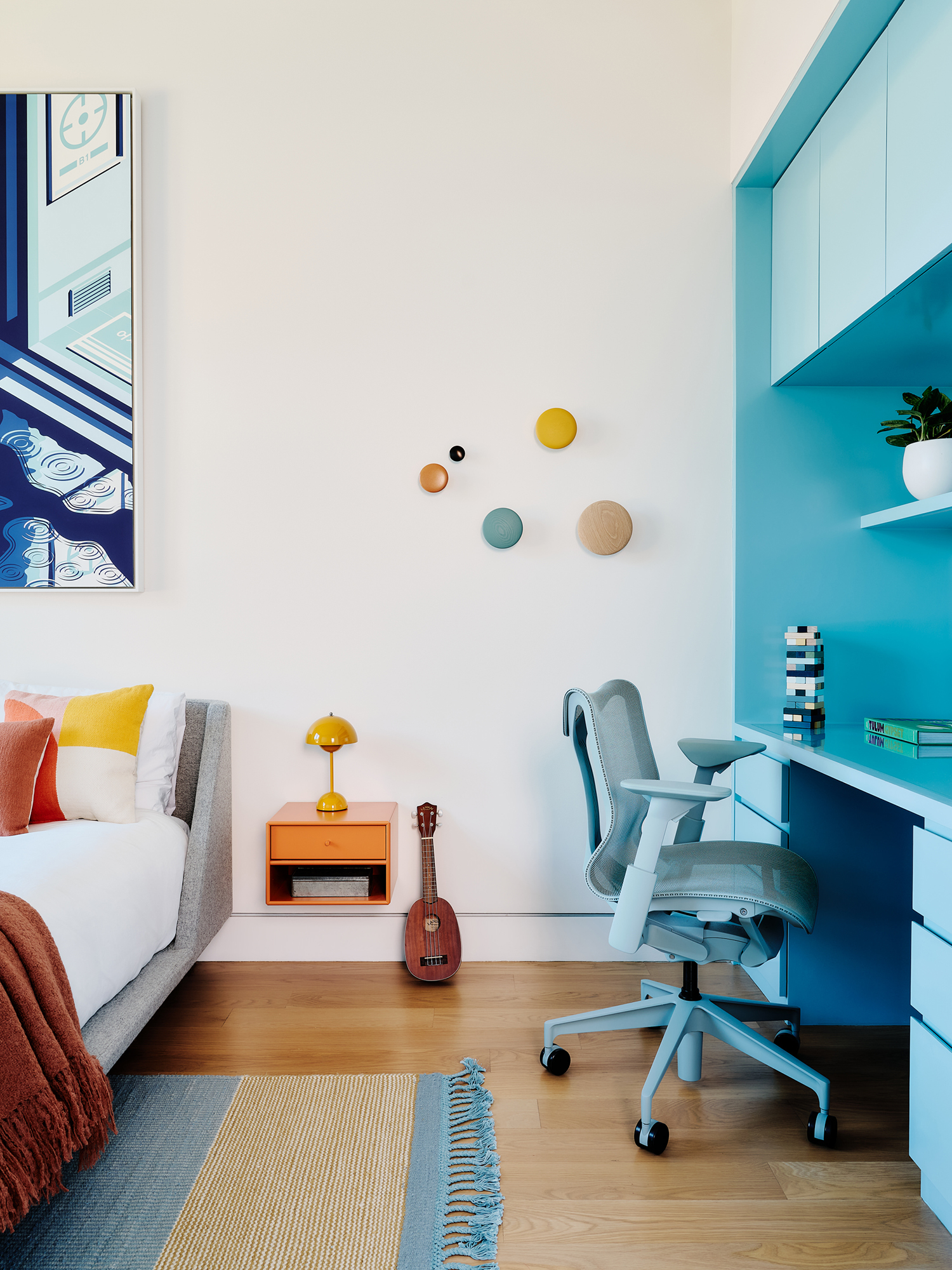
The duo were inspired by the surroundings (the lush backyard, street city views, and natural light) and the client’s particular way of living and their personalities. For example, the client loves color but didn’t want it to overpower the home, so they incorporated color moments throughout the home.
You’ll notice the first change the second you walk into the home. A large and dominating blank wall in the great room was a design challenge. “We couldn’t build it out and adding material would have been complicated and meshed with the aesthetics of the space,” David says. “So we came up with the idea of a large wall art installation with butterflies. This one gesture solved several things: We could occupy the wall in an effective but light manner, feature artwork that fit the theme of the great room, and we knew the client loved butterflies.”

Joe Fletcher
The living area was originally “chaotic” because it was both a dining and living space without cohesion. The team removed the dining area part and created horizontal datums to create a sense of cohesiveness. They also took advantage of the views in the room: “We framed the living room window which faces the city, turning the view into an artwork itself and creating a perfect reading nook,” says David.
Joe Fletcher
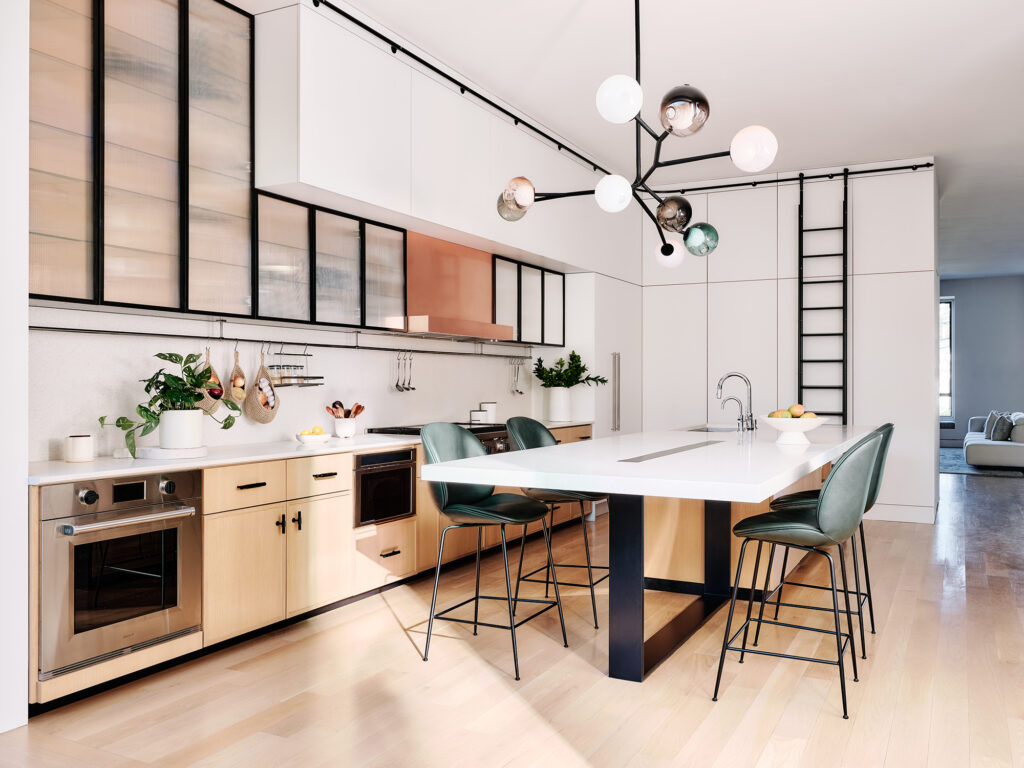
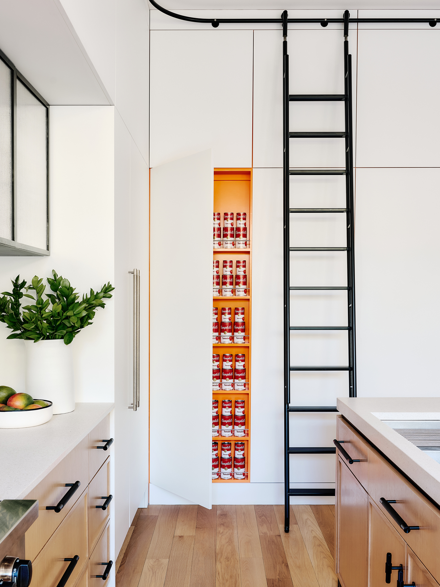
The tiny kitchen was one of the biggest renovations: it was transformed into an “action kitchen,” which works as a professional kitchen that’s aesthetically elevated and refined. It features a 16-foot cantilevering island that doubles as a dining table, a German-manufactured ladder, and a utensil rod with stainless steel spice racks. “Storage is always challenging to get in a townhouse,” Marina explains. “Instead of a typical pantry, we created a floor-to-ceiling shallow pantry. The outside face of the panels is white, but we painted the interiors ‘Orange Juice’ orange.”
Joe Fletcher
For the upper level renovation, David and Marina say the focus was on light and creating openness to fix the “box within a box” feeling. And each room upstairs features its own color to give character. “The biggest change was capturing views and daylight throughout the entire primary suite,” Marina says.

Joe Fletcher
Joe Fletcher
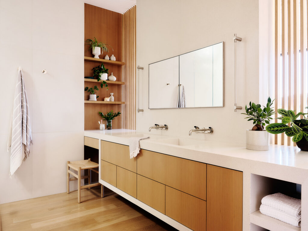
They created an open layout in the primary suite, so instead of using walls to enclose the bathroom, they used a screen, which diffused daylight and showcased views. Closet storage was embedded in the walls of the architecture. “This open layout creates a high-end resort feeling,” David adds.
Joe Fletcher
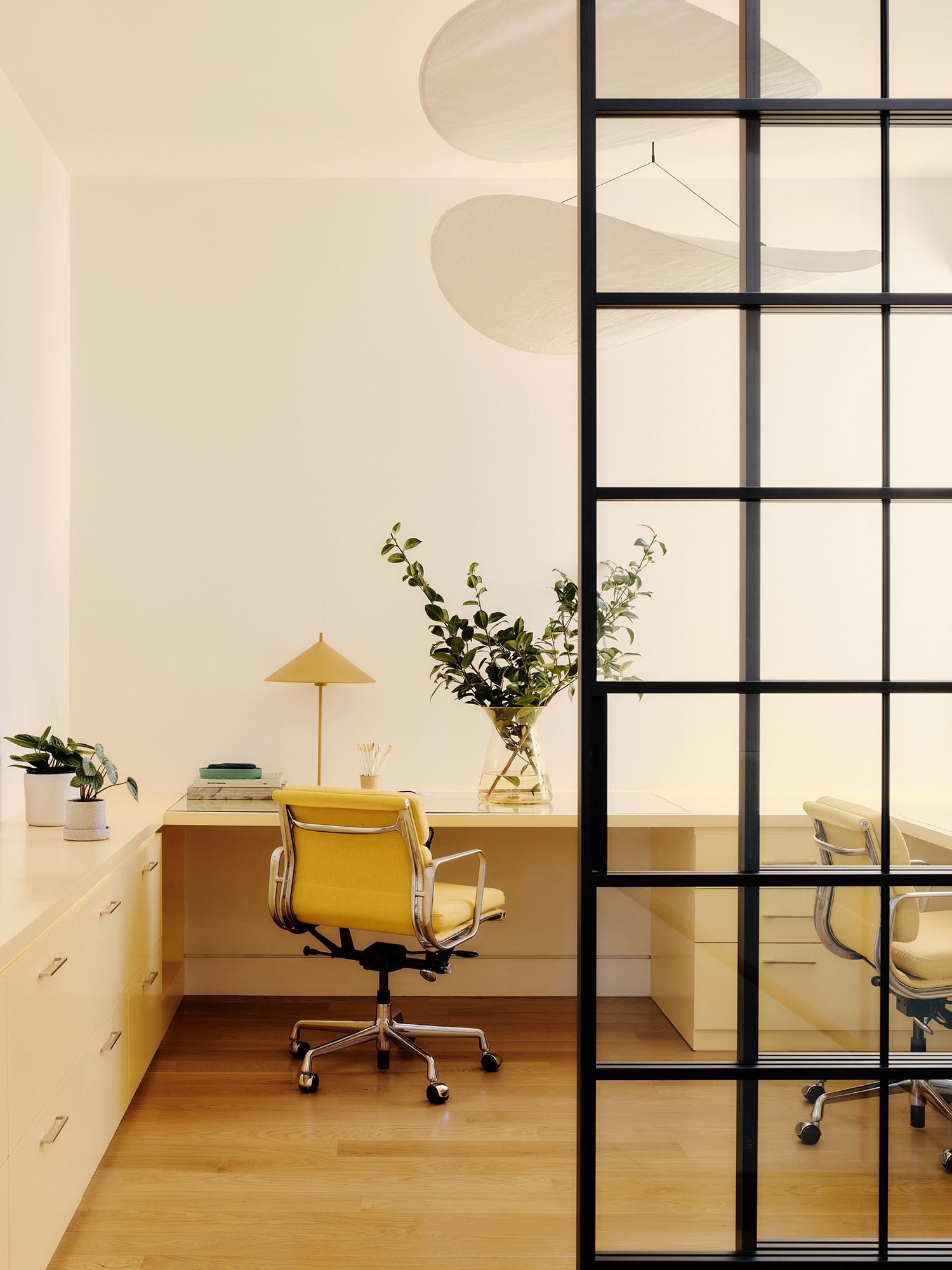
The design duo also transformed the upstairs by converting one of the bedrooms into an office with floor-to-ceiling glass doors and soft yellow millwork, which let more light in.
Joe Fletcher
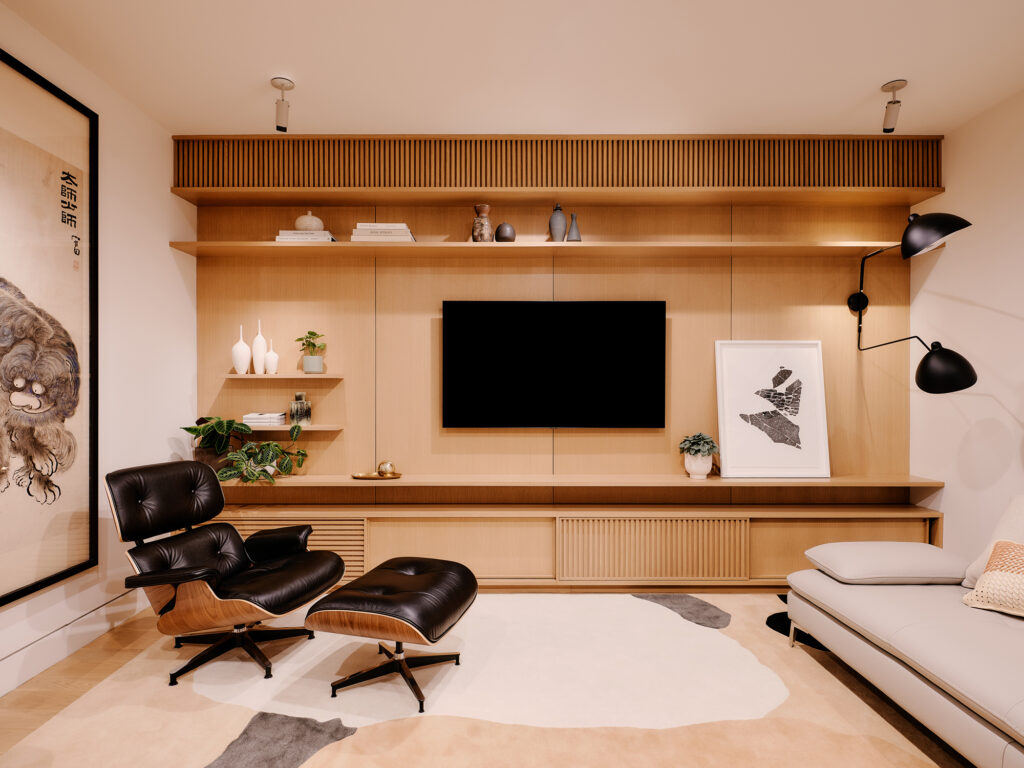
And the last room—the basement—is now an entertainment center that’s warmly furnished and gives a different feel from the rest of the open, airy house.
“They love it!” David says of how the couple feels about their newly redesigned home. “They love the color, light, and that it feels unique to them.”
