A J-Shaped Ranch House Went from Cramped to Spacious with a Very Strategic New Floor Plan
Now it’s an open, light-filled space.

Mikiko Kikuyama
This 1940s ranch-style house’s J-shaped layout was not doing it any favors. It felt long, narrow, and disconnected. The owners—a couple from the Bay Area with ties to India—had lived in the 1,300-square-foot Redwood City home for five years before they embarked on a makeover with the help of Hiromi Ogawa and Lynn Fisher of Ogawa Fisher Architects, and CB Builders.
The home had a series of tight, separated spaces, including a cramped kitchen that was really only meant for one cook. That didn’t work for the couple, who are avid cooks and like to spend up to 50 hours a week cooking, baking, curing, and fermenting in the kitchen together.

Mikiko Kikuyama
“Another main pain point was the entry—a tiny square at the front of the home, but it was the most heavily trafficked space, because it was the only connection between the kitchen and living areas,” Hiromi says. “Then, there was a rear deck that was arguably the most spacious area in the home, but it was rarely used because it was several feet lower than the house and felt disconnected.”

Mikiko Kikuyama
The main goal for Hiromi and Lynn was to transform the closed-off spaces in the home and make it into an open and functional place, without losing the charm of the interior or the scale of the home’s cottage-like exterior.
“Our clients asked for a larger, more functional kitchen, and a better connection to the outdoors,” Hiromi says. “They also dreamed of a home where they could feel like they were together in the same (or adjacent) space, even if they were doing different things—they wanted to be able to sense each other’s presence and to flow in and out of doing things together.”

Mikiko Kikuyama
The kitchen became the focal point of the new design. “After exploring several different kitchen locations and layouts, the winning design was an addition that closed the ‘J’ of the original house and turned it into an ‘O,’ or a doughnut,” Lynn explains. “This created a small, elevated exterior courtyard in the center of all the living spaces. This was a familiar and appealing architectural typology for the homeowners, too, as it reminded them of homes in India.”

Mikiko Kikuyama
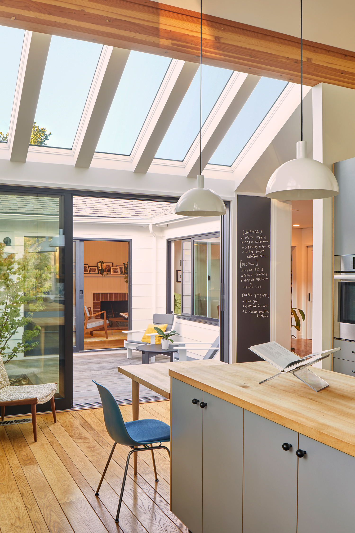
In the new kitchen addition, they vaulted the ceilings to bring in plenty of natural light and to showcase the backyard views. Design decisions and details were made with the couple’s love of cooking in mind: custom cabinets that are tailored to daily cooking habits and preferences; open roll-out shelves under the cooktop for storage; a long trough sink; open shelving; a butcher block counter on the island for baking; a large chalkboard to keep track of shopping lists and recipes; his-and-hers apron hooks; and even a curing cabinet with an inset metal mesh so items inside can breathe.

Mikiko Kikuyama
“From the new kitchen, you can access the central courtyard—an unexpected magical outdoor space in the middle of the doughnut—through large glass doors,” Lynn says. “The courtyard is bright and cozy, and also acts as a light well to all the surrounding rooms. On nice days, you can use the courtyard as a shortcut to the living room, which also has large glass doors.”

Mikiko Kikuyama
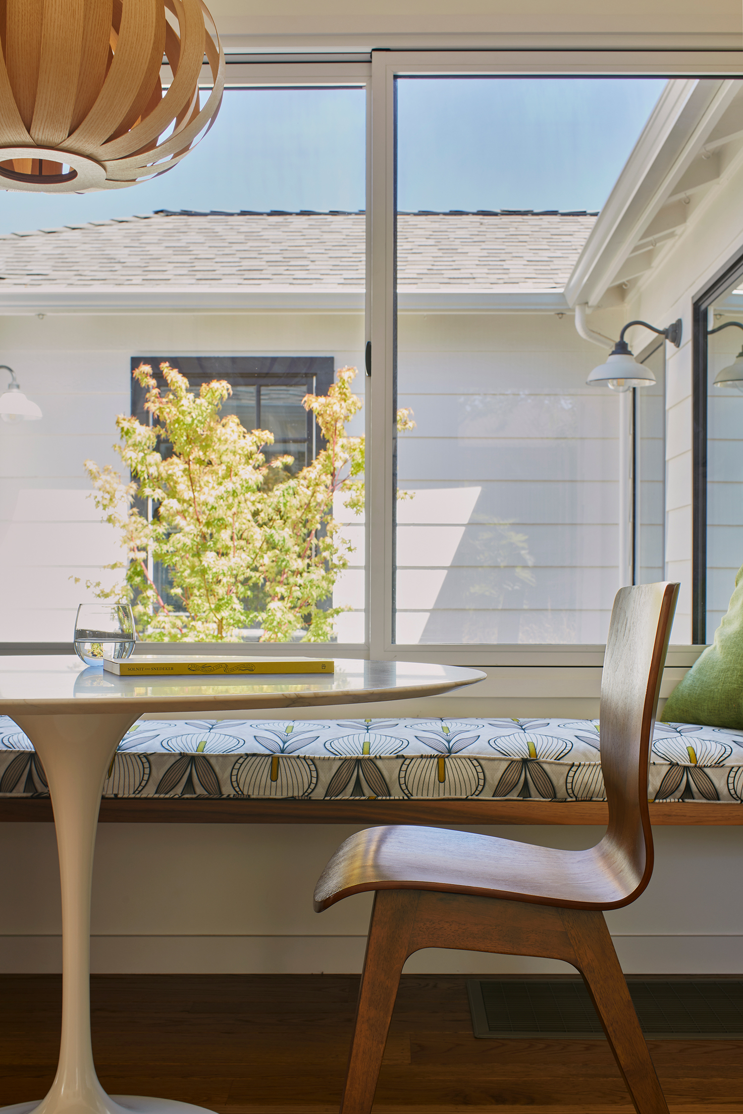
Throughout the rest of the home, Hiromi and Lynn made other layout modifications to open up the space and improve flow. “We repurposed a portion of the original kitchen for a relocated entry, which is closer to the garage for better flow and increased storage,” Hiromi says. “The remaining half of the original kitchen became a sitting/reading nook with a view of the courtyard.”

Mikiko Kikuyama
The living room, bedrooms, and main bathroom were updated with doors and windows optimized for views into the courtyard and other outdoor spaces. And a guest bathroom was added in the old entry space.

Mikiko Kikuyama
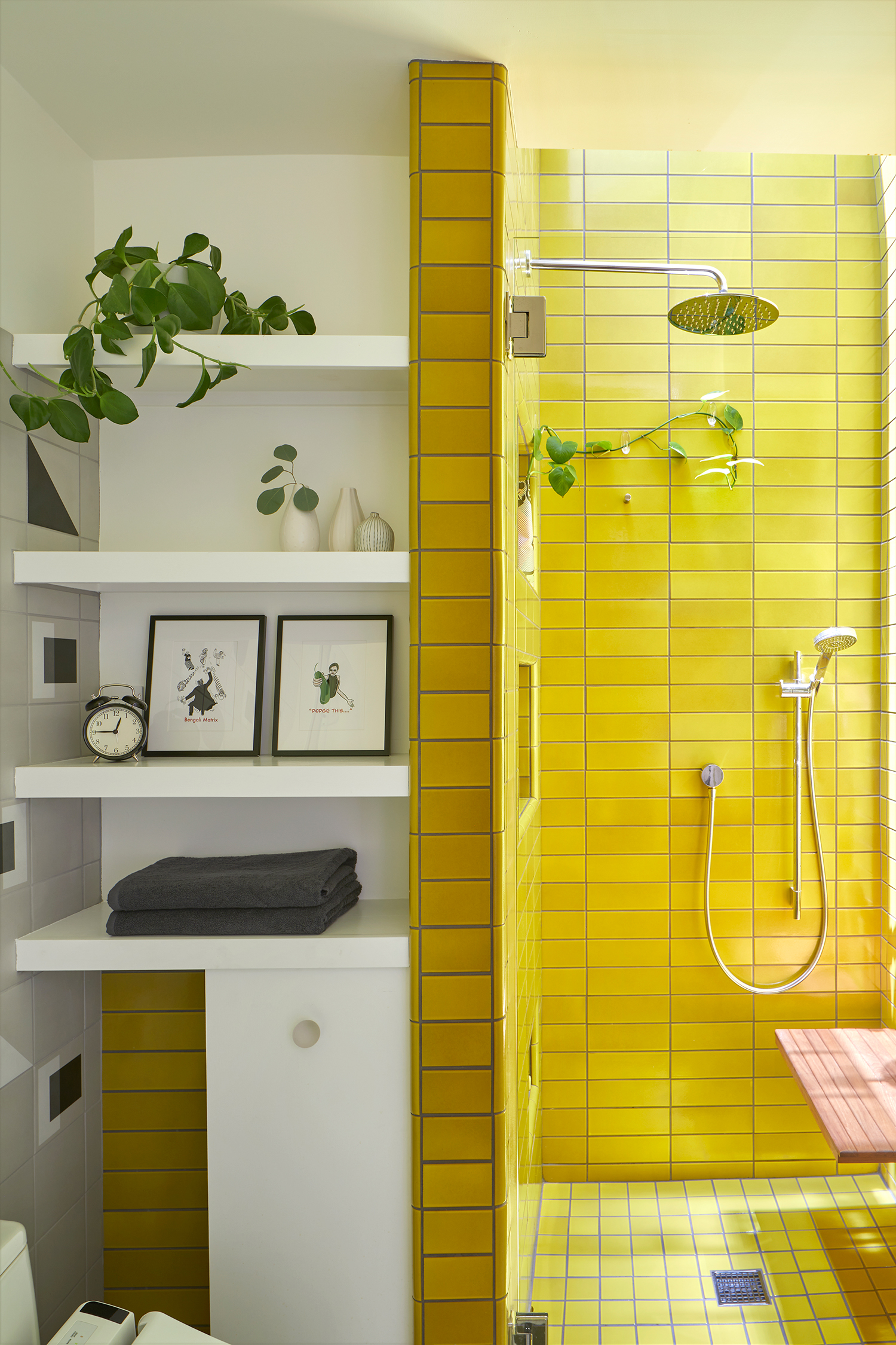
In addition to the architecture, the duo also oversaw the interior design as well. The clients weren’t afraid of color and texture, and they were open to the idea of having a different theme in each room, so Hiromi and Lynn had a lot of fun with that. “Pops of color are integrated throughout the home from the green wall in the reading nook to the blue-and-white ombré tile in the kitchen,” Hiromi says. “The clients mentioned that they loved yellow, so we were excited to finally use a Heath Ceramics tile (Bright Yellow) that Lynn has loved for a very long time. She was patiently waiting for the right client to come along!”

Mikiko Kikuyama
Their clients love the changes to their home, calling it cozy, coherent, uncluttered, and connected. And of course, they’re spending a lot of time in their dream kitchen. “We did something a little crazy this year, food-wise,” they said. “We celebrated as many days from around the world as we could by cooking—Chinese New Year, Persian New Year, Ethiopian New Year, Burmese New Year, et cetera. The kitchen allows us the space to play and evolve our food habits. The pantry is full of spices and tins of various kinds. The plum tree bore 40 pounds of fruit, and for two weeks we were making jams, fermenting, making scrap vinegars—not that we couldn’t have done these before, it just feels a lot easier now.”
