This Oakland Kitchen’s Makeover Was Inspired by the Homeowner’s Late Mother
It’s a beautiful space that balances old and new.

Max Maloney
This kitchen renovation in a one-bedroom, one-bathroom Oakland condo seemed like it was meant to be. Designer Gina Gutierrez of Gina Rachelle Design had met her future client, Allison, at a New Year’s Eve outing and had given out her business card. Not too long after the meeting, Allison came across the business card again and was inspired to renovate her condo’s kitchen as a “thank you” to her mother, who had passed away.

Max Maloney
“While this kitchen renovation was inspired by her mother, she primarily had the goal to create a space that ultimately represented her,” Gina explains. “She worked so hard to be able to buy this condo on her own as a single woman, so she really wanted to make it hers. She wanted to brighten it up, give it proper storage, and make it a place she can entertain.”
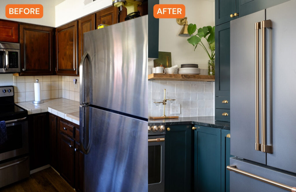
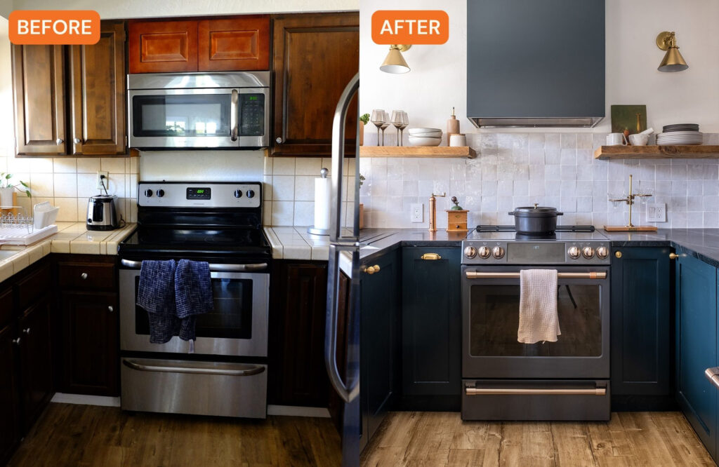
It was an older condo, so it had that too familiar stuck-in-the’80s style that you’d find in outdated homes. It had minimal lighting with a small doorway and very old cabinets. And while the kitchen had a good amount of storage, it didn’t have the right kind of storage that Allison needed. It wasn’t exactly a place you’d want to cook or entertain in.

Max Maloney
For design inspiration, they used Allison’s already-existing decor as a jumping-off point—she has a great collection of cool art from her travels and vintage pieces. Gina also used her own travels as inspiration: The tile work was inspired by Portugal and the materials have an Italian, Old-World feel.

Max Maloney
Balancing old and new was a priority, as Allison loves mixing both. “She loved the idea of a moody kitchen while also making it brighter,” Gina says. “So we started to pick materials that were really modern and fresh, but also spoke to the Old World and organic materials.”

Max Maloney
The biggest step for the renovation was opening the space up. “There was this entryway that was very small, almost as if a door was there before,” Gina explains. “We worked with an engineer to find out how open it could be without requiring restructuring work. With the guidance of the structural engineer, we were able to open that kitchen quite a bit. The fourth wall where the door used to be is now completely gone, which gives you more of an open concept feel. When you walk into her condo, you walk into the living room and see the little dining room area, as well as part of the kitchen.”
The rest of the changes included a full gut reno. They kept the original flooring, but added soapstone counters, new backsplash tile, and unique accents like sconces, wood shelving from Etsy, and unlacquered brass finishes.

Max Maloney
The cabinets were from IKEA with Semihandmade fronts, which Gina likes to utilize in projects where custom cabinetry is not within the budget. “While IKEA isn’t the top of the line, the mechanics of IKEA are very strong,” Gina says. “My husband, who’s an engineer, can vouch for them. The combination of IKEA cabinets with Semihandmade fronts can give you the feel of custom cabinetry without the custom price tag. It does take more planning on the design side to ensure sure the pieces fit together, but I think these turned out really beautiful and we were able to give her the storage she needed.”

Max Maloney
Other storage features include wine storage at the front of the peninsula and a pantry that sits on the counter next to the refrigerator. “You think a feature like this wouldn’t exist in a small kitchen, but to me it feels very Old-World and you’d see this in older Spanish homes,” Gina says of the pantry. “It gives her the storage she needs and because she had a peninsula, we weren’t afraid to take from the counter space.”
Allison loves the newly redesigned space and is getting a lot of use out of it. “I follow her on Instagram and love seeing when she entertains and has loved ones over, it’s special to see her enjoying the new space,” Gina adds.
We only recommend things we love. If you buy something through our site, we might earn a commission.
