Colorful Tile and Bold Wallpaper Give This Venice Beach Cottage Modern Spanish Style
From fun fireplace tile to bold wallpaper, this remodeled cottage is full of surprises

Christopher Patey
Interior designer Alexis Manfer was on a mission with this 1924 Spanish-style bungalow: to give it an updated look and layout (it was last remodeled in 1935!) while still staying true to the home’s roots. “I fell in love with the authentic Spanish flair of the home,” says Manfer. “We chose to move towards Spanish Modern [style], incorporating brighter materials with earthy textures, melding old with new.”
The brighter materials were also chosen to lighten up the feel of the house. “There were lots of brown hues such as dark wood floors, moldings, and tile making the house feel heavy, so we were excited to lighten up the interior,” says Manfer.

Christopher Patey
As soon as you enter the bungalow, one of the home’s biggest design features immediately catches your eye: the blue and white tiled fireplace. “These tiles were hand-painted by a local artist [sourced from Walker Zanger Tile] and add a special charm to the house,” says Manfer. “We selected tile designs with unique patterns in other shades of blue to tie in the kitchen cabinet color.”

Christopher Patey
While the blue tiles tie in the living room nicely with the kitchen, the biggest transformation occurred vis-à-vis the walls. Originally, the living space, dining room, and kitchen were all completely separated, creating a small, closed-off kitchen that was relegated to the back of the house. To fix that, the walls had to come down.
“We immediately went to work reconfiguring a space plan that allowed one to enter the front door and be able to see clear out the back of the house,” says Manfer. “We tore out two walls and then created a giant arched cased opening to provide structural support. The Spanish-style arched cased openings were a design feature we mimicked here, and in several areas throughout the home.”
The open design has a transformative effect on the entire space. “The new layout is spacious and has excellent flow from the moment you enter the home,” says Manfer.

Christopher Patey
A major eye-catcher in the kitchen is the Lacanche range and stovetop, tying in nicely with the backsplash and balancing the darker cabinetry. “We waited four months for it to arrive from France and it certainly did not disappoint. We hand-selected luxurious marble slabs to complement the white range and designed a custom vent hood with brass trim to complete the look,” says Manfer.

Christopher Patey
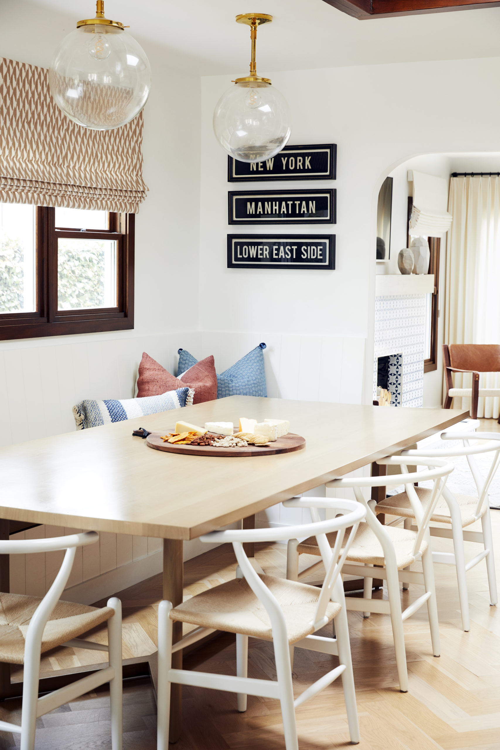
“The dining nook is one of my favorite spots in the house,” says Manfer. “We commissioned an impressive 9.5-foot custom dining table to perfectly fit the huge built-in banquette. This large oak table is very sturdy, and allows for tons of people to gather and hang out in the heart of the home.”

Christopher Patey
Fun fact: the bed frame and bedside tables were the first pieces of furniture that Manfer purchased for this home’s redesign. “The natural finish, interesting shape, and design of these items set the tone for the rest of the room,” says Manfer. The room’s theme was peacefulness, aiming to create an oasis through a neutral palette and lots of texture throughout the room.

Christopher Patey
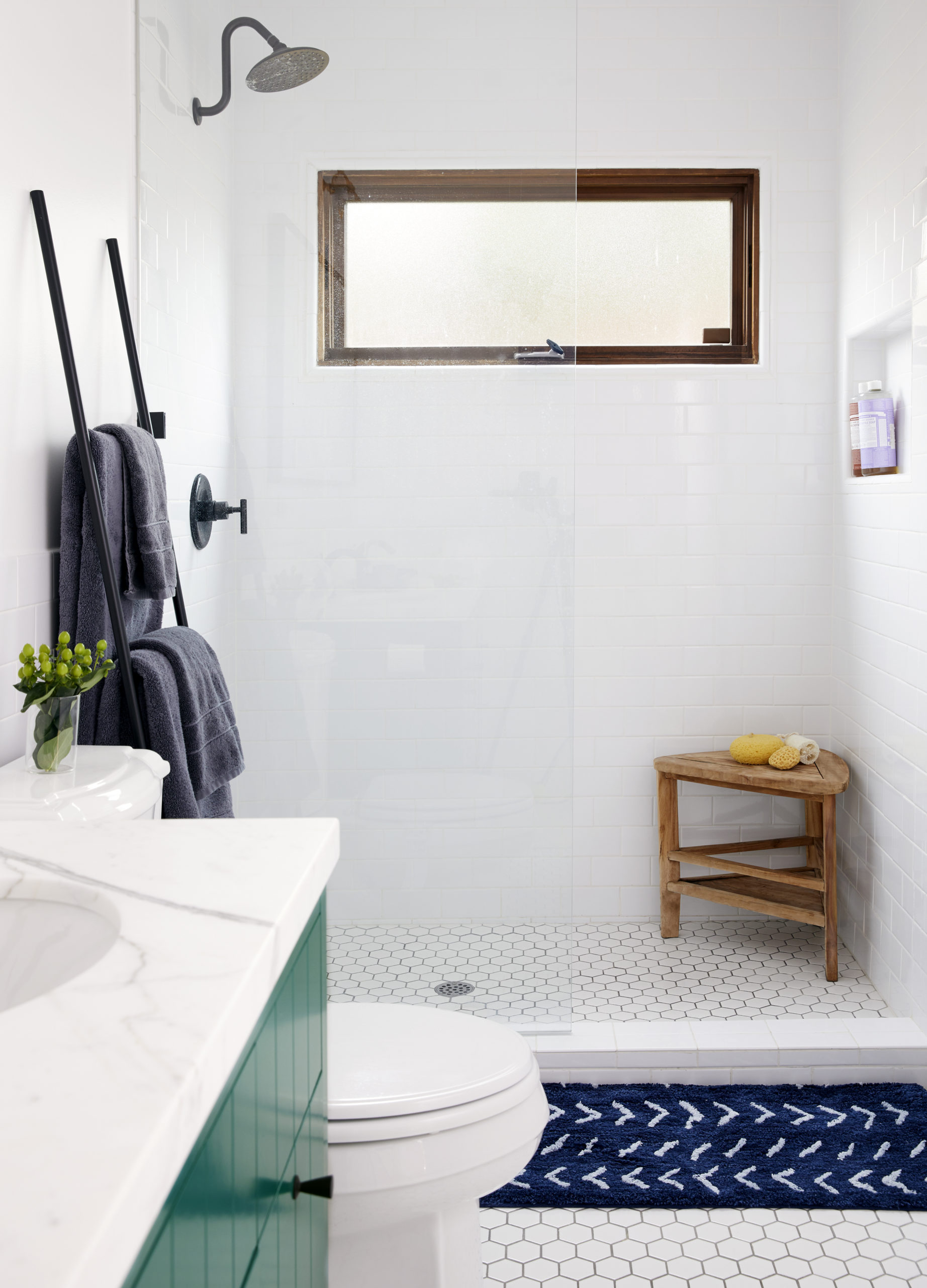
In the master bath, dark bronze ruled over the fixtures, hardware, mirror frame, and accessories. To balance that out? “A pop of green was the perfect color to brighten up the space and add a fun twist to the design,” says Manfer.

Christopher Patey
The bronze detail goes all the way up to the master bath window, and the hexagon tiles add an extra layer of dimension to the floor of the entire room.

Christopher Patey
“Our wonderful clients were unapologetically daring and allowed us to install a floor-to-ceiling jungle wallpaper in the nursery that looked like a page straight out of a storybook,” says Manfer. “The room was finished off with a cozy rug, warm light fixture, and pale wood accents to match the light oak floors.”
