The Main Problem with This Santa Monica House Was Actually Too Much Lighting
It needed a softer look.
Sara Ligorria-Tramp of Tramp Studio
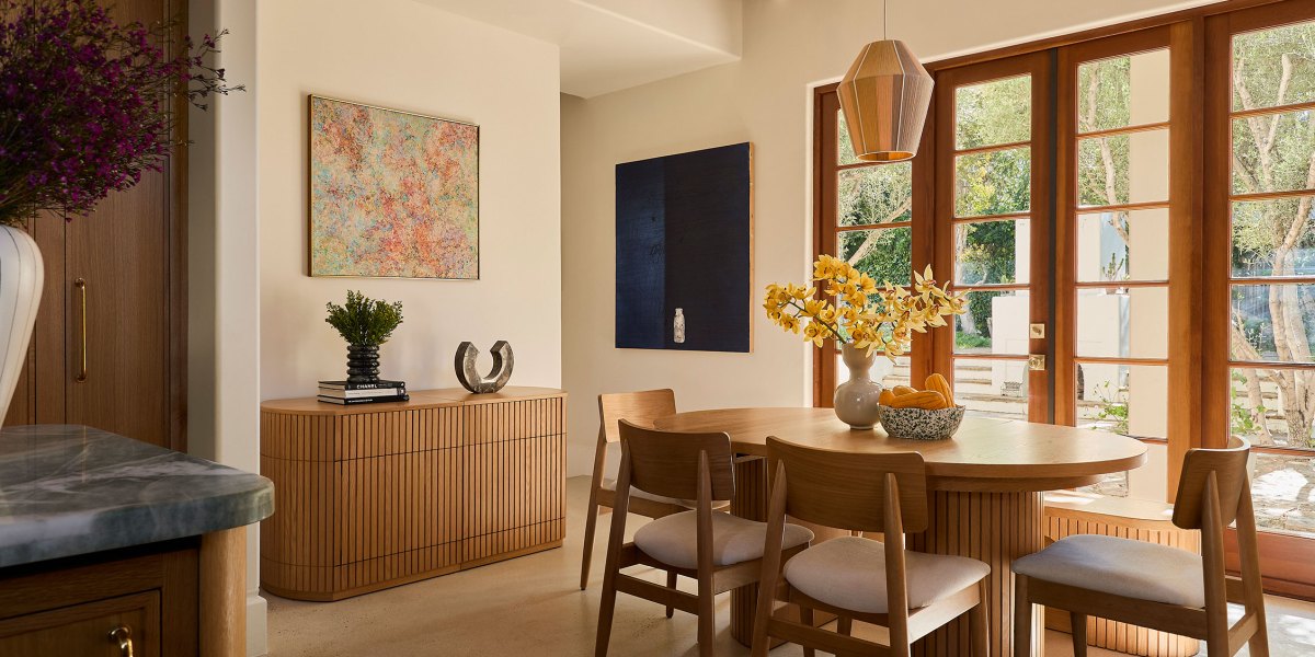
Normally with home renovations, the problem is not enough lighting, never an overabundance of it. But that wasn’t the case for this 3,550-square-foot Santa Monica, California, house, which had too many lighting fixtures in every room. Designers Celestin McGlynn and Lisa Nakamura of Spec + Sage ended up removing much of them so the home felt softer and more restrained.
Sara Ligorria-Tramp of Tramp Studio
The surplus of lighting was just one of the issues that needed to be tackled during the remodel of the home, which was originally a duplex and then rebuilt in 1992 as a four-bedroom, four-and-a-half-bathroom home for a TV actress and her family.
Sara Ligorria-Tramp of Tramp Studio
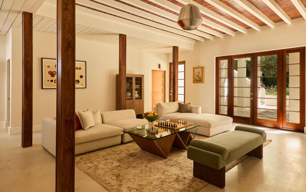
“This home’s flow was fragmented by various of interior walls, particularly in the downstairs area,” says Celestin. “For example, the living room was sectioned off from a hallway through by a half wall that ran the length of one side of the room, creating a dark passageway while simultaneously shrinking the living room space. Additionally, there was an unused wall that separated the dining room and kitchen that blocked the natural light through beautiful French doors from brightening the kitchen. By selectively removing walls, we were able to lean into the natural flow of the space without disturbing the character of each room.”
Sara Ligorria-Tramp of Tramp Studio
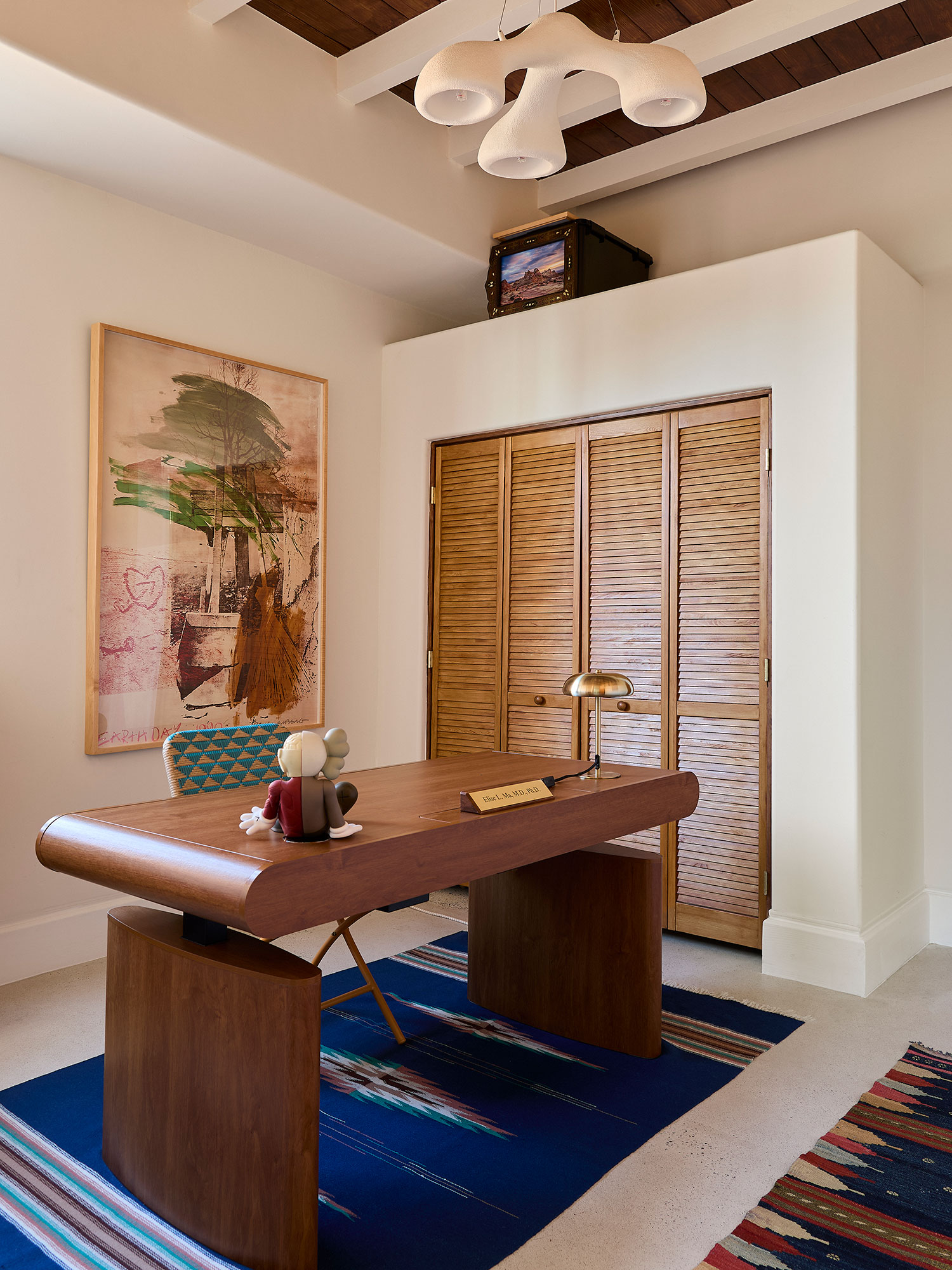
Celestin and Lisa’s clients—two busy doctors—wanted a space that offered a serene, restorative, calming, and de,eply personal experience after a long day of work. The designers say the goal was to create a modern Mediterranean oasis, where color was introduced lightly and gently, and the home’s natural wood elements felt organic and refined.
Sara Ligorria-Tramp of Tramp Studio
Inspiration for the design came from the owners’ interests and hobbies, which Celestin and Lisa say was essential to bringing joy into their home. Since the couple both love the outdoors, the designers brought in organic elements. They also have an extensive art collection and the husband’s grandmother was a talented artist—so it was through archive of artwork that deeper and richer colors were brought into the design.
Sara Ligorria-Tramp of Tramp Studio
“The entire home built with original plastered walls was another feature we deeply valued and wanted to maintain,” Celestin adds. “This played into the organic aesthetic we loved about the home so those elements were maintained and refreshed where needed.”
Sara Ligorria-Tramp of Tramp Studio
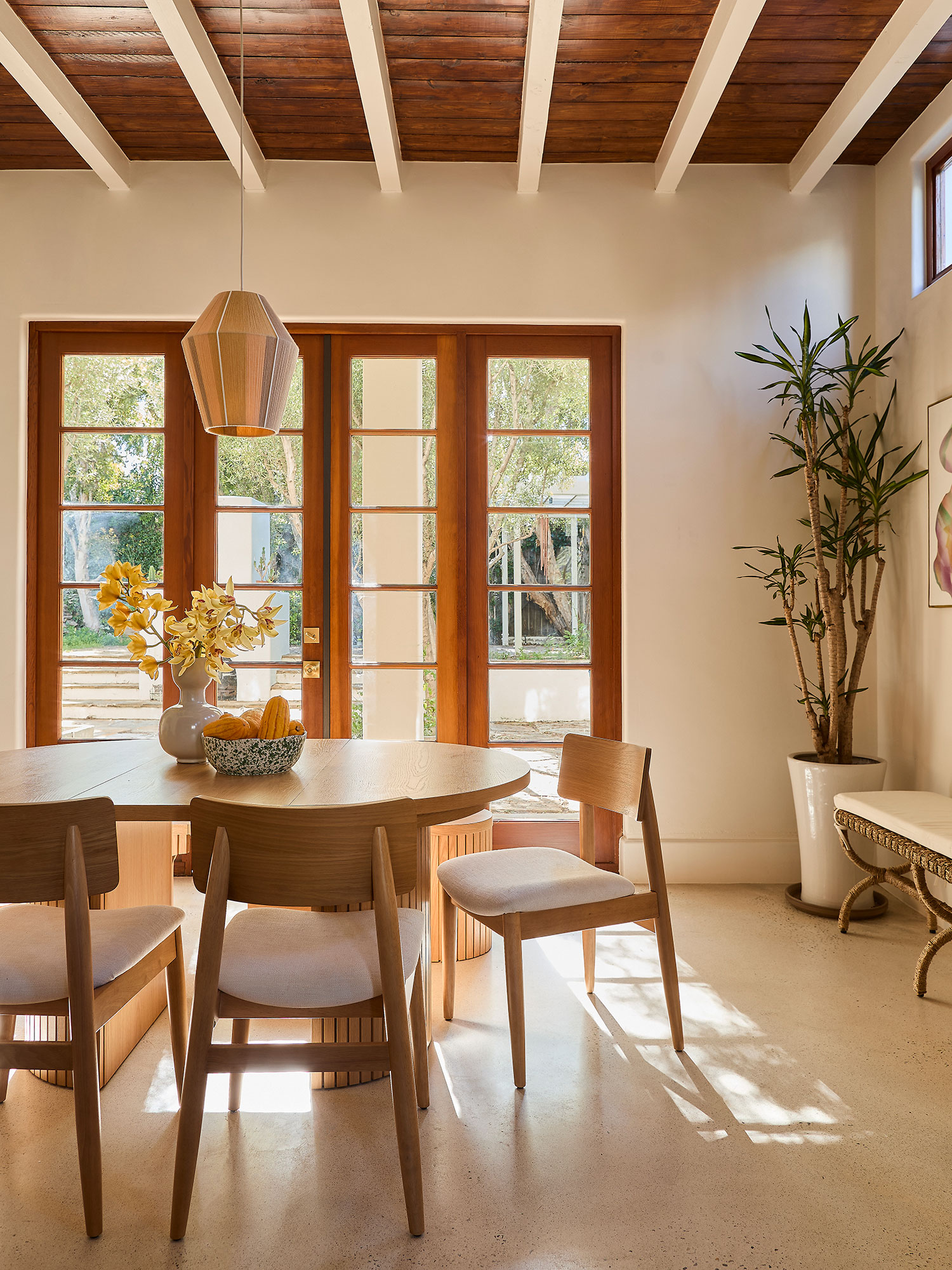
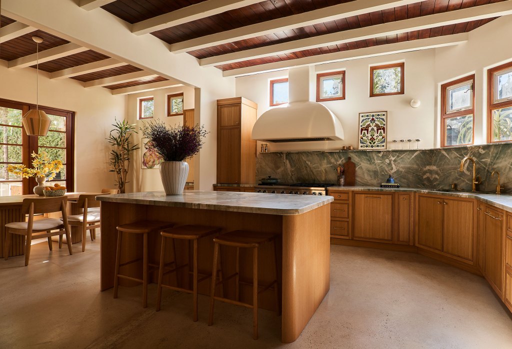
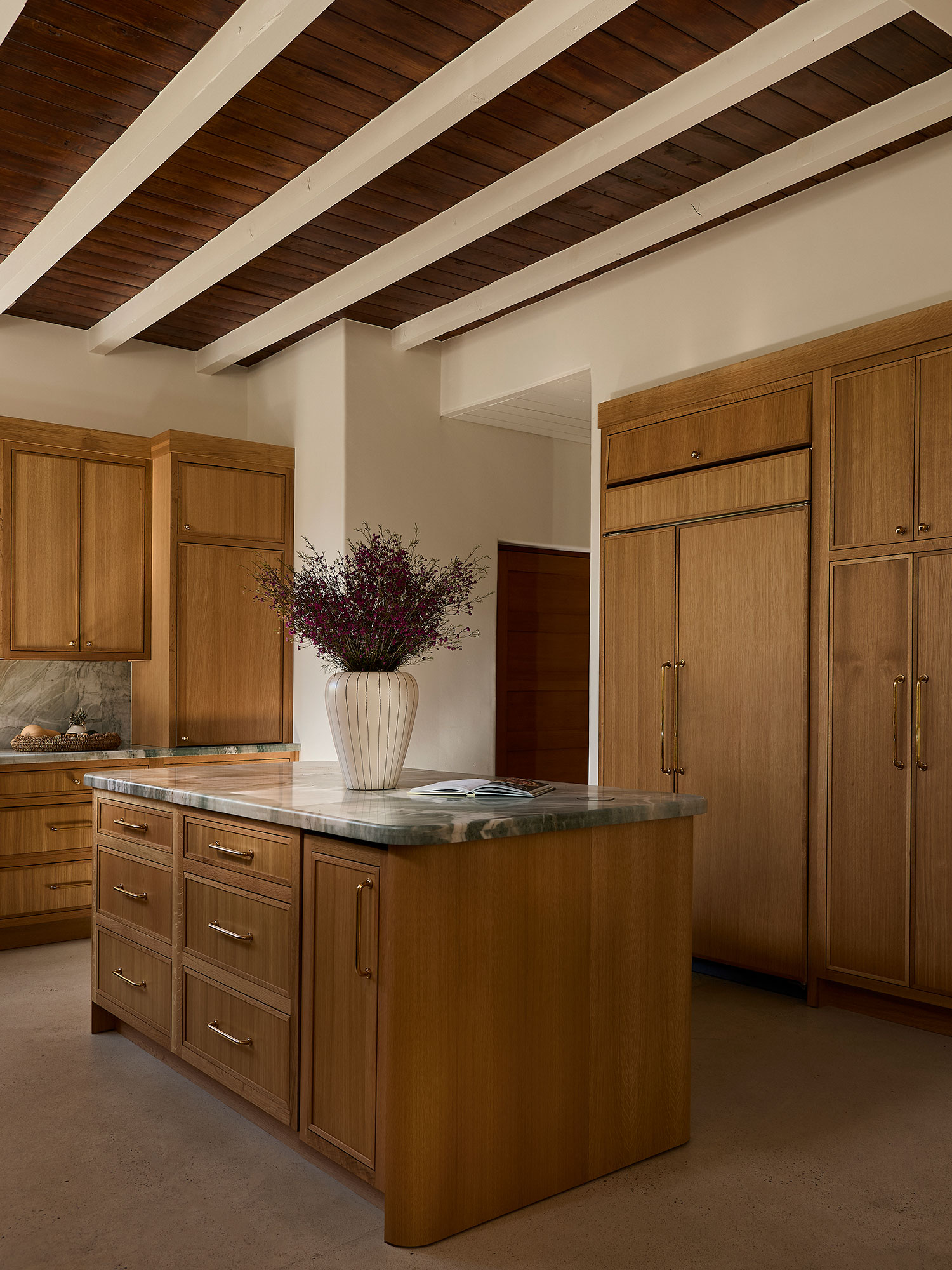
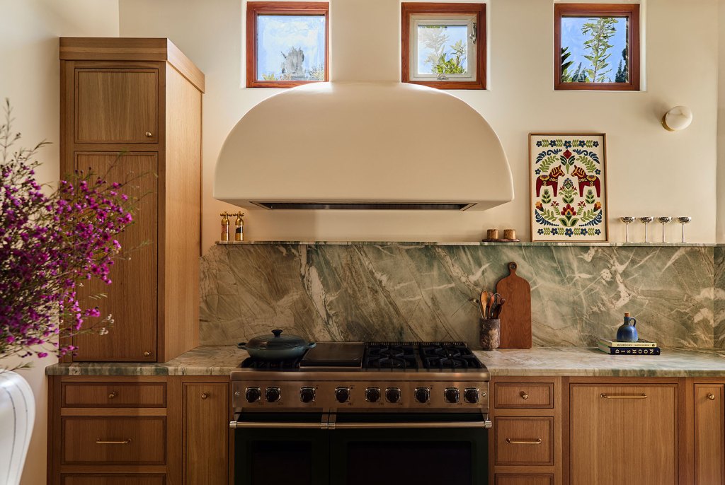
The kitchen got one of the biggest transformations as it was completely gutted and reimagined. They stripped and stained the wood ceiling back to its natural wood, which brought the space back to life while also adding depth and warmth. For a calm and seamless feel, the design team made sure that all the appliances were concealed with panel-ready fronts and appliance garages were built to store everything.
Sara Ligorria-Tramp of Tramp Studio
“Opening the interior walls brought in the natural light through the French doors leading to the back courtyard,” Lisa says. “It flooded the space with light and immediately uplifted the mood of the entire home.”
Sara Ligorria-Tramp of Tramp Studio
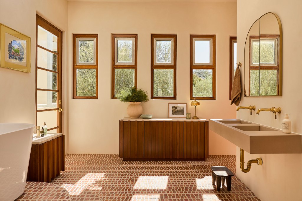
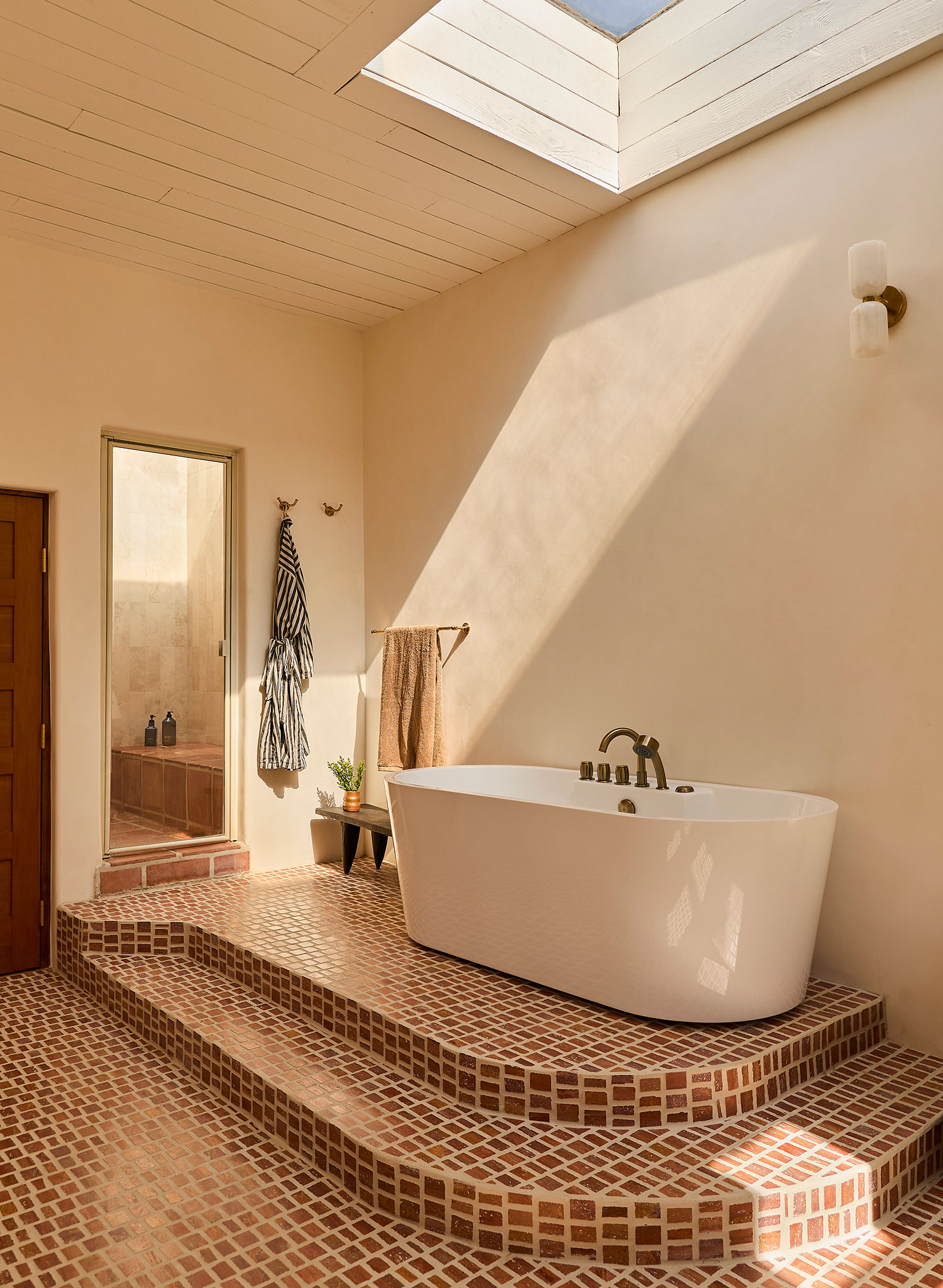
All four bathrooms in the home were fully renovated as well. Each bathroom has its own unique tile, but they are all cohesive through material, texture, and color tone. “One of our favorite elements to create was the step-up platform for the standalone bathtub in the primary bath,” Celestin says. “That beautifully showcases the red marble tiles as well as the openness of the overall space.”
Sara Ligorria-Tramp of Tramp Studio
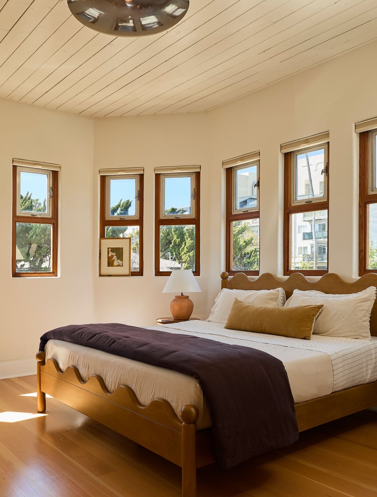
Throughout the home, existing wood elements were restored, sanded, and re-stained. New architectural details that still feel true to the home’s original design were also added.
“The clients truly love their new home,” Lisa says of their reaction to the finished design. “The abundance of natural light and organic materials make the space feel relaxed, grounding, and restorative. They are thrilled to have a space where they can go home to unwind.”