
A Couple Was So Obsessed with Teal and Blue That They Bathed Their Entire Condo in the Colors
The hues give a tranquil, relaxing vibe.

Vivian Johnson
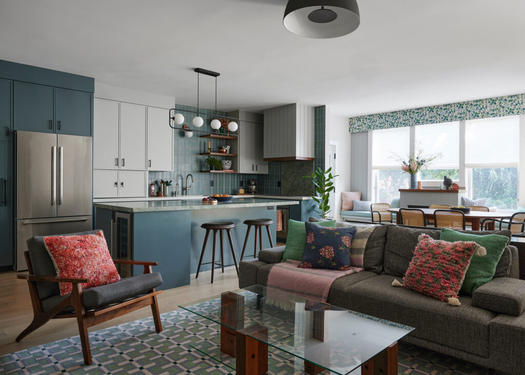
The homeowners of this 1,430-square-foot, three-bedroom condo in San Francisco’s Mission District were passionate about their favorite colors: hues of teals and blues. In fact, designer Jeannie Fraise of Lotus Bleu Design says her clients dress in these colors daily. So, it was a must that their home be swathed in the palette.
Vivian Johnson
“The wife, a work-from-home business and philanthropy consultant is a long-term resident of both the Mission and this condo, having lived in it for just over 20 years,” Jeannie explains. “The husband, a graphic designer, moved in gradually over some years until their marriage in 2019.” After spending so much time together at home during the pandemic, the couple went from making small tweaks to the home to deciding on doing a bigger and bolder remodel.
Vivian Johnson
When the wife first bought the condo, it was newly-constructed with builder-grade finishes. The space was dark and dated, plus the kitchen and bathrooms weren’t suiting the couple’s needs. And since the wife had lived in the home for so long, she had clear ideas on what worked and what was lacking. The challenge for Jeannie and team was to give her clients what they wanted while working within the space constraints of the condo since they had a limited ability to make structural changes.
Vivian Johnson
The couple’s goals were to maximize the space for optimal use and efficiency and turn it into a tranquil and relaxing space that’s an escape from the busy neighborhood outside. Additionally, they wanted to make their home a reflection of both their tastes. “Since they had not purchased the home together, it was important to both the husband and wife that the design, features, and furniture reflected their individual tastes and them as a couple,” Jeannie adds.
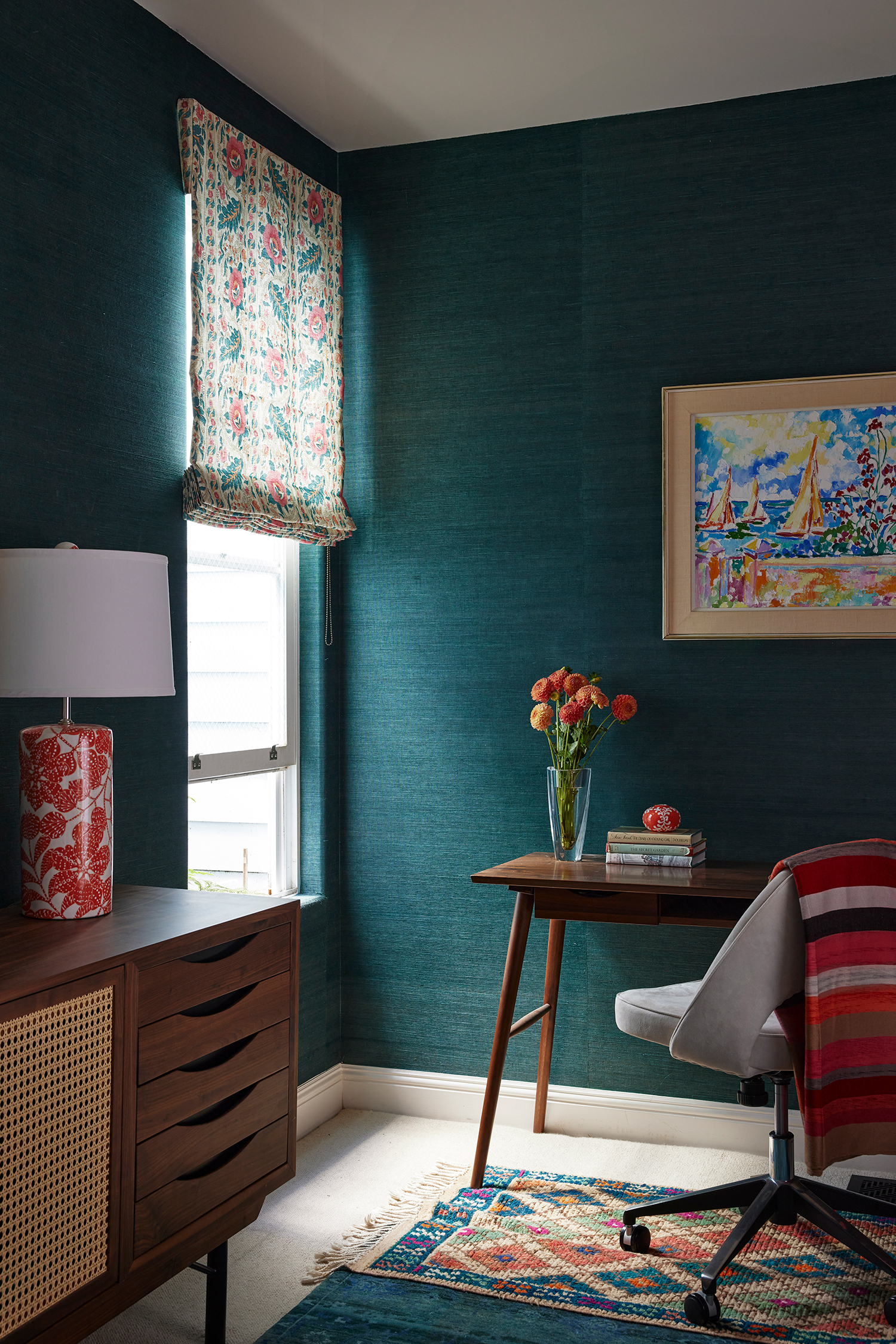
With those goals in mind, Jeannie and team got to work, letting the beloved color palette drive the design. They used custom-colored teal and blue wallpapers, tiles, fabrics, and rugs throughout the house to create a feeling of cohesion, peace, and personalization.
Vivian Johnson
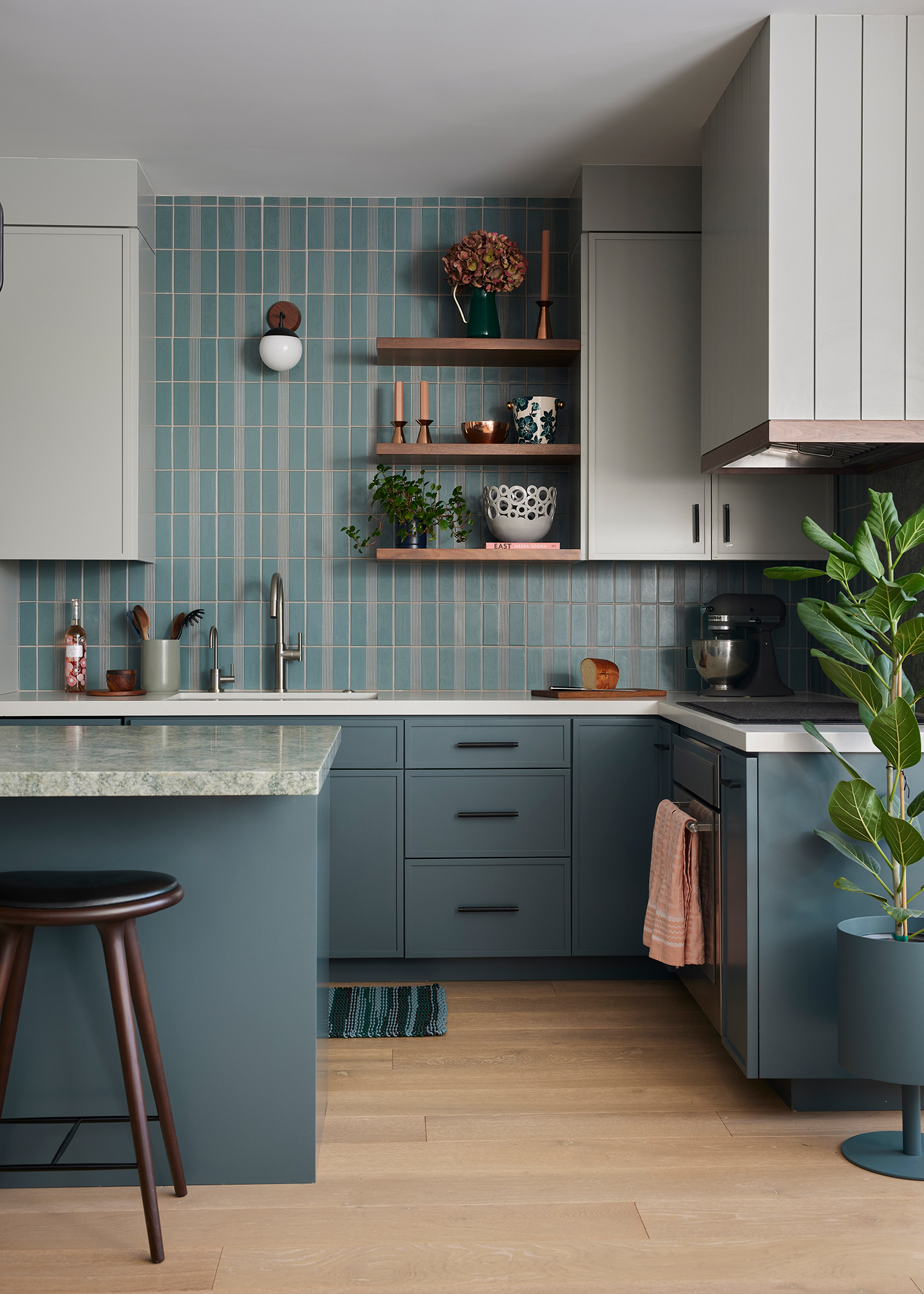
The kitchen was renovated to be a foodie and gourmet cook haven. The design started with a slab of Costa Esmeralda stone that was inspired by the counter at one of the couple’s favorite restaurants. “She had a thorough plan for everything she needed and together we made sure every drawer and cabinet had an important function customized to her needs,” Jeannie says of her client. “She is petite and even the prep area of the island has a pullout step built into the toe-kick.”
Vivian Johnson
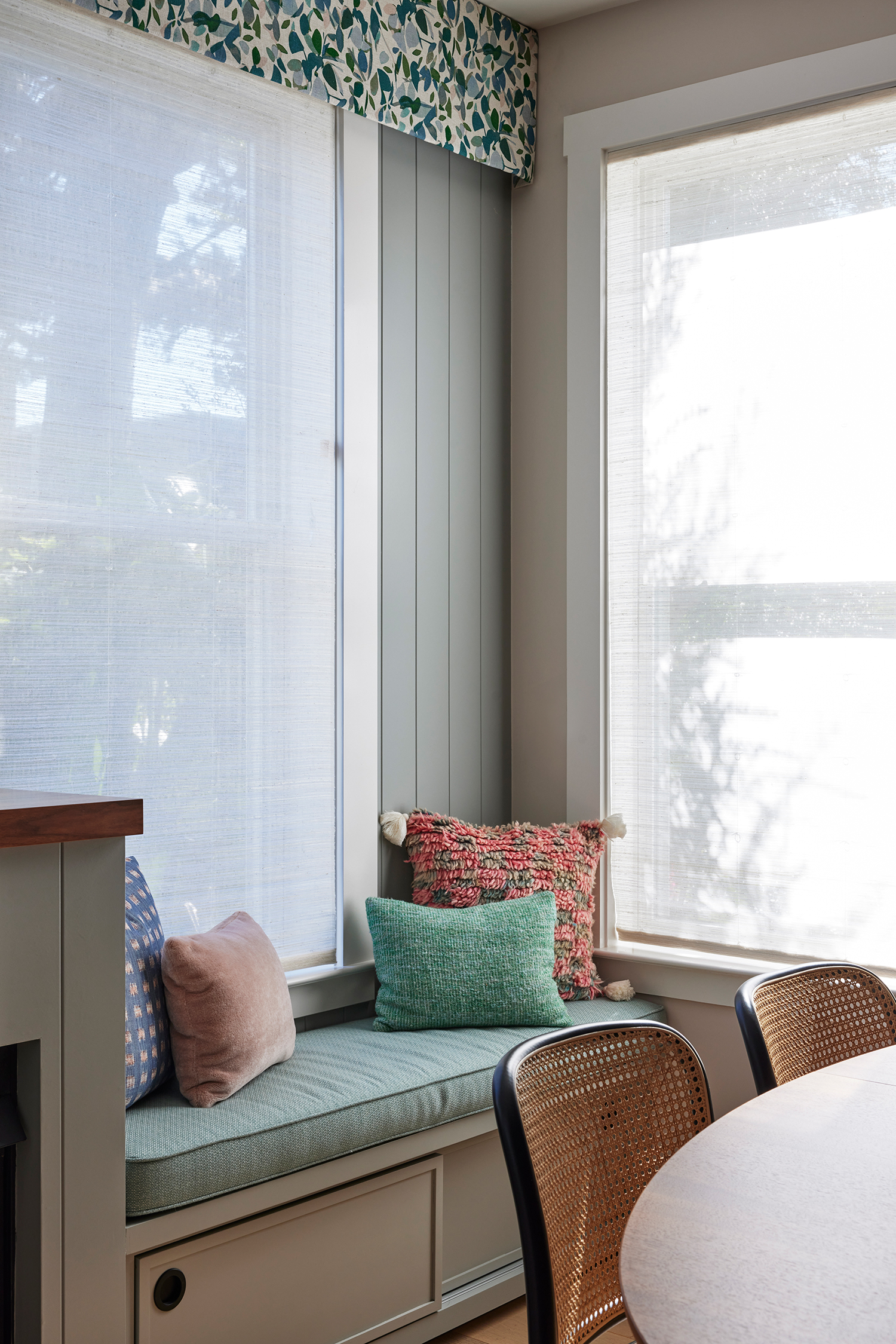
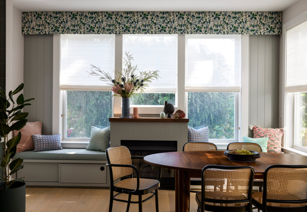
The window-lined fireplace in the dining area next to the kitchen got an overhaul, too. “We backed it with the same vertical paneling of the stove hood and new doors and flanked the newly trimmed fireplace with cozy benches,” says Jeannie. “Softened by a fabric valance with fluttering leaves mirroring the trees outside and fluffy wool pastel-hued cushions, it’s the perfect place to read or work.” A new oval dining table and caned chairs were added to the area—its rounded shape balances out the hard edges and brings lightness to the space.
Vivian Johnson
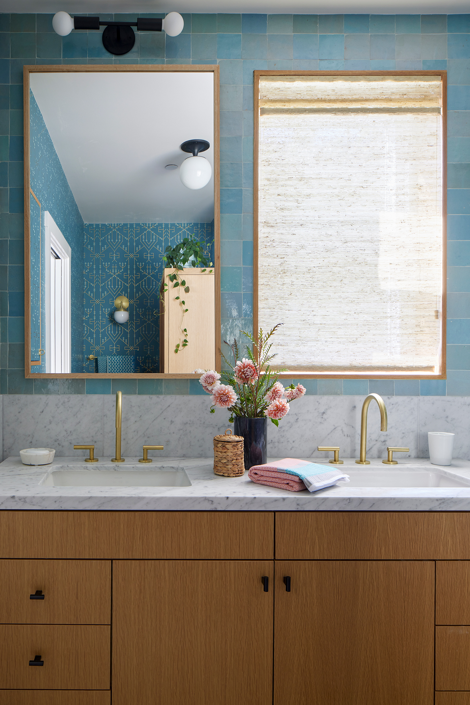
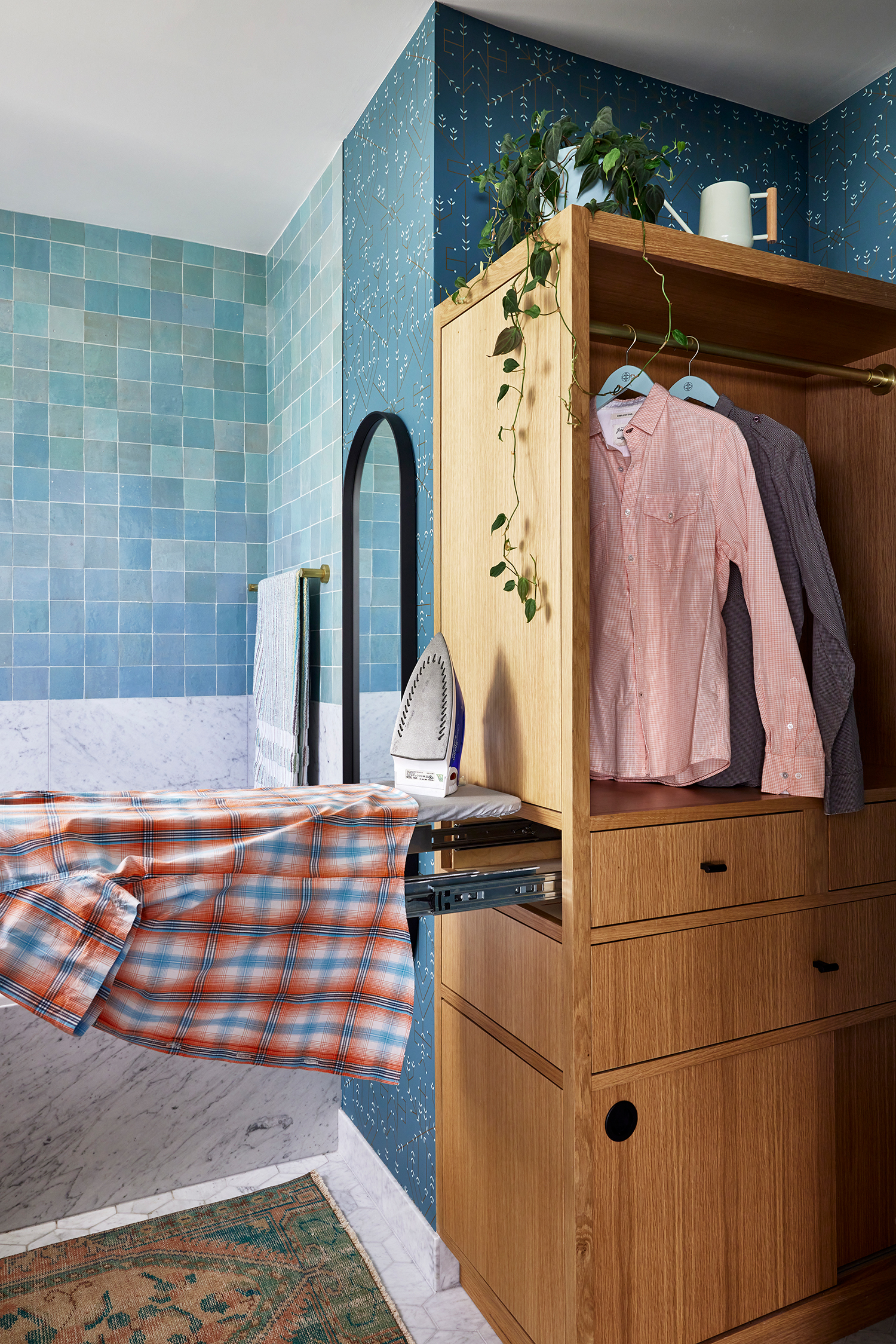
The primary bathroom also got a major update, with Jeannie and team having to work within the small footprint and restrictive existing conditions. But they managed to open up the space and make it feel lighter and spa-like. The efficient and innovative custom cabinetry maximizes every inch of the space—the cabinet next to the toilet incorporates a cabinet, drawers, a hanging space for clothes, a pull-out ironing board, and even a hidden kitty litter box; while the inset medicine cabinet next to the sink is hidden by a wallpapered door.
Vivian Johnson
“The tub is ample enough for a deep soak, while a shower above it has a glass panel rather than a door so as not to hinder the view of the tile, access to the controls, nor light from the window,” Jeannie explains. “Limited by the location of this existing window, a double vanity has a custom mirror above it with the same dimensions and oak framing as the window.”
Vivian Johnson
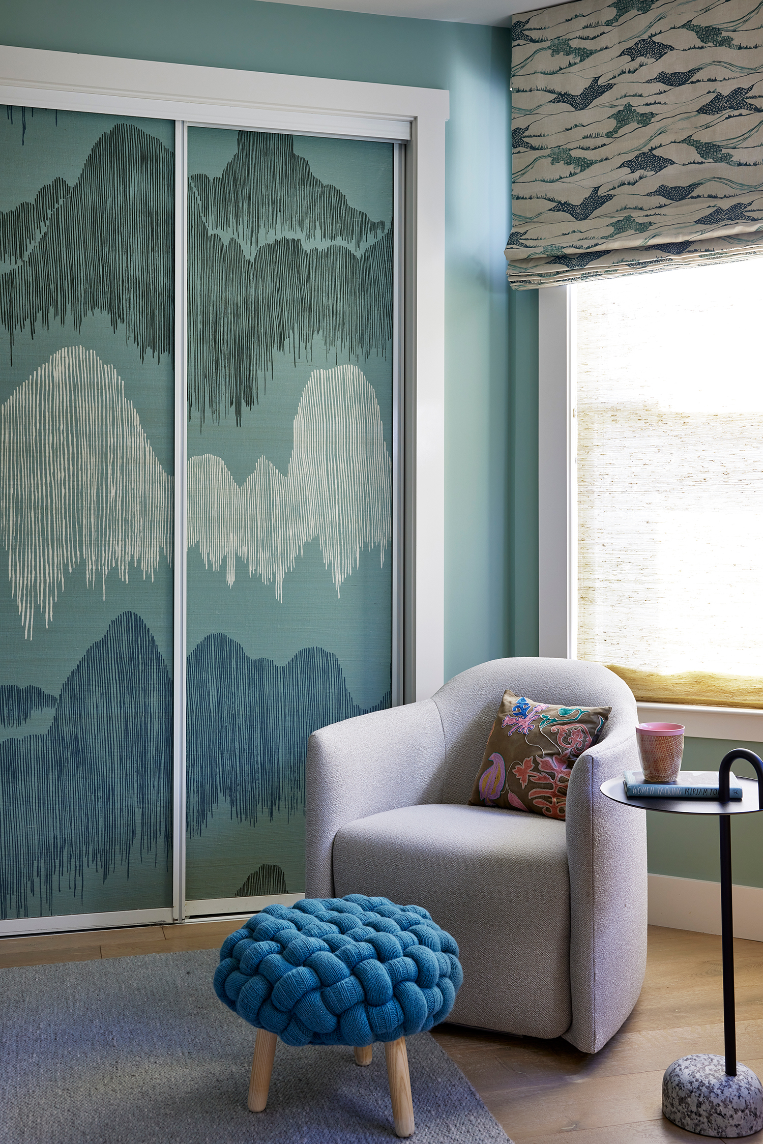
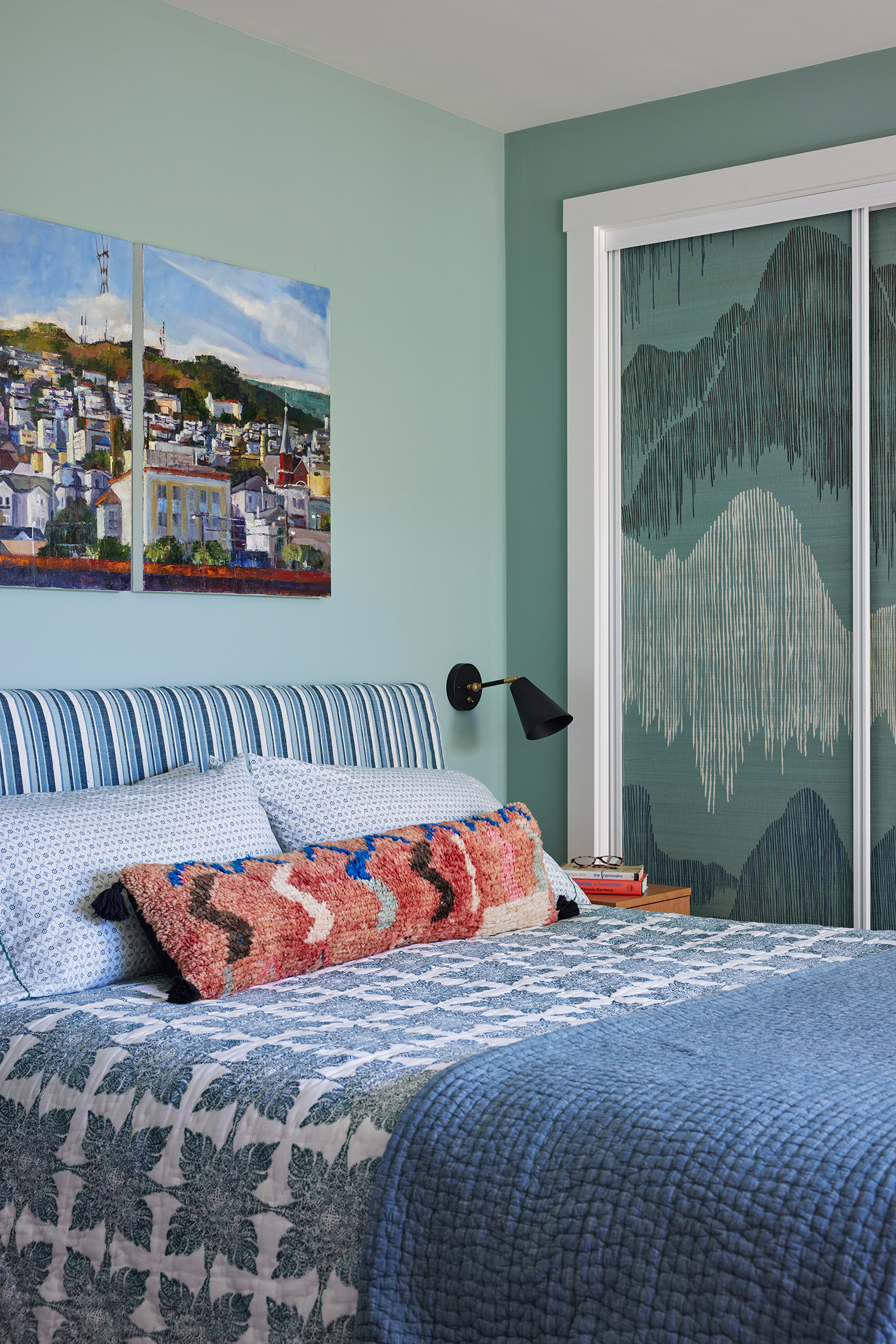
Next to the primary bathroom is the primary bedroom, where the dated mirrored doors got a stunning wallpaper makeover thanks to grasscloth from Kelly Wearstler that is reminiscent of Japanese painted screens. “The newly trimmed windows got fabric Roman shades echoing these motifs layered over elegant natural woven shades to filter the bright sunlight of the Bay window,” she adds.
Vivian Johnson
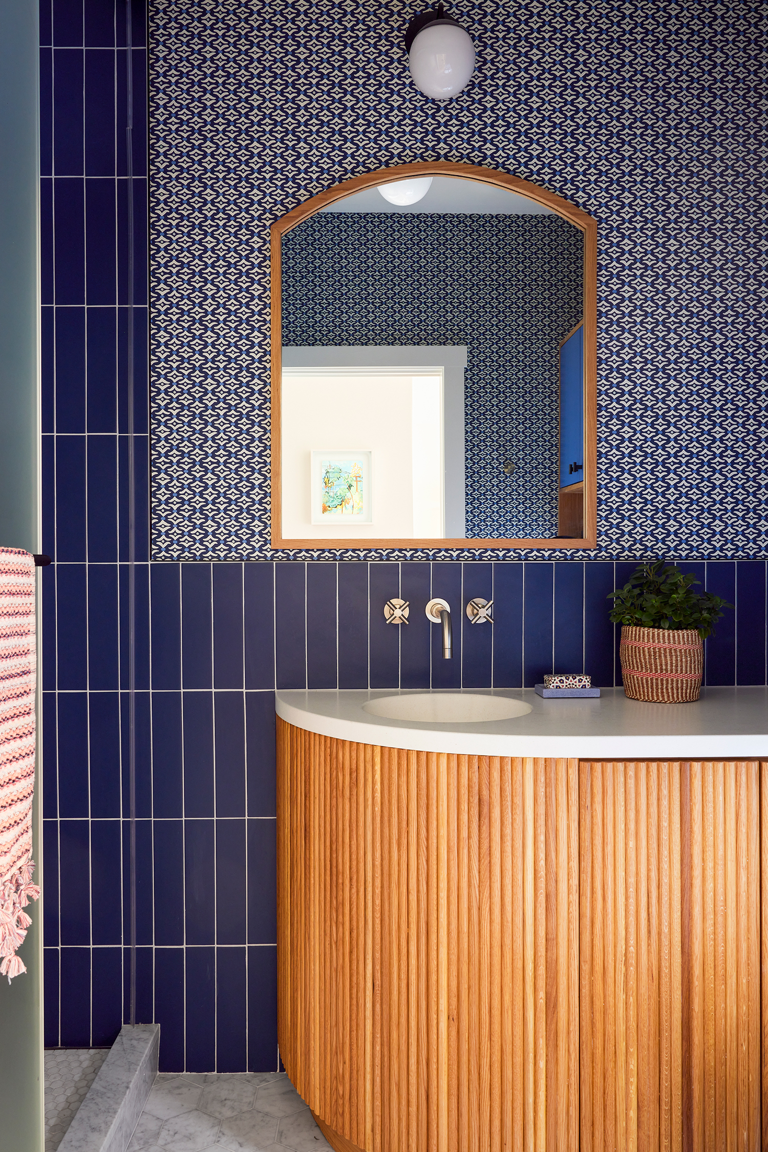
The guest bathroom and laundry space was another small-space challenge. Jeannie used darker blues, like the custom Galbraith & Paul wallpaper and Fireclay tile.
“The real and exciting challenge was how to fit both a shower in this bathroom and have it function as a laundry room with only a 5’ x 8’ space,” Jeannie says. “Using a beautiful curved and fluted wall-mounted vanity leaves enough space to navigate the room and provides the storage needed. Storage above the water closet and stacked washer/dryer add to this with cabinet doors in the brighter azure blue. The shower and stacked laundry are designed almost like a typical shower with a mosaic marble floor and drains, but here with a single frosted barn door. It can cover the washer/dryer so the room is a lovely guest bathroom, or you can slide the door in front of the shower and have the functionality of a laundry room.”
Vivian Johnson
A peaceful sanctuary from the busy transit hub and neighborhood outside, the home is exactly what the clients dreamed of. “As all the pieces came together, they were able to fully relax into this new-to-them, jointly-imagined home,” Jeannie explains. “Whether entertaining friends, savoring a morning coffee in living room and watching the sun spill over the new window seats, or savoring the calming spa-like vibes of the primary bath, they are both thrilled with how the project made the old feel new!”
