
This Home Is a Prime Example of How to Balance West Coast and East Coast Styles Perfectly
The design is the best of both worlds.

Aimée Mazzenga
For this Sherman Oaks, California, home it was all about East meets West Coast. The owners (a young couple with two children) wanted the five-bedroom, five-and-a-half bathroom house to be their “forever” home. So, it was important for designer Chloe Heath of Heath Interiors to design a space and choose pieces that were timeless and would last a long time.
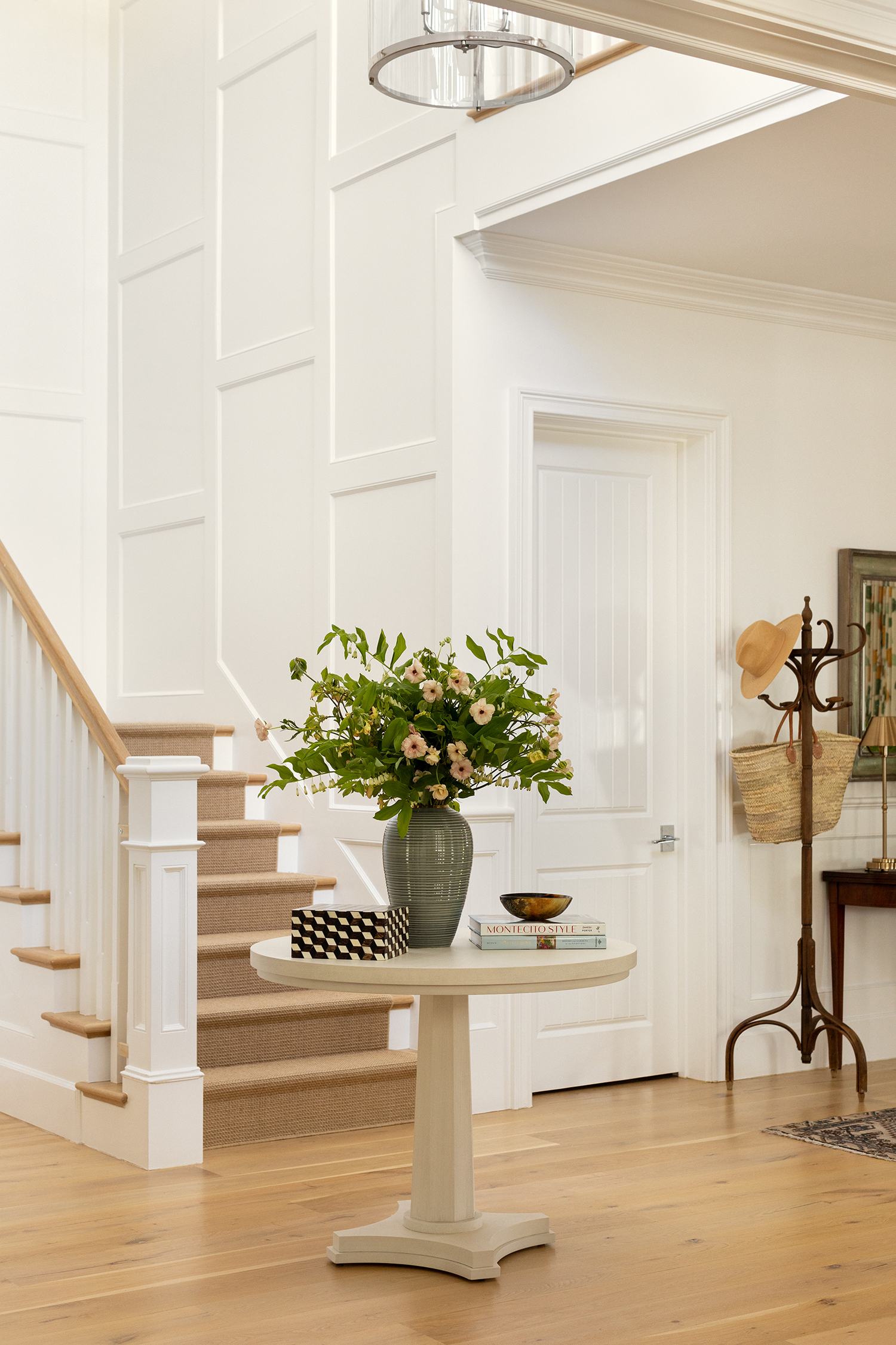
Photo by Aimée Mazzenga; Styling by Lucy Bamman
“For this project, we looked at references of traditional, East Coast interiors and also Southern California coastal design,” she says. “We referenced a few sets in movies like Father of the Bride to identify the layered, lived-in look that our clients wanted.”
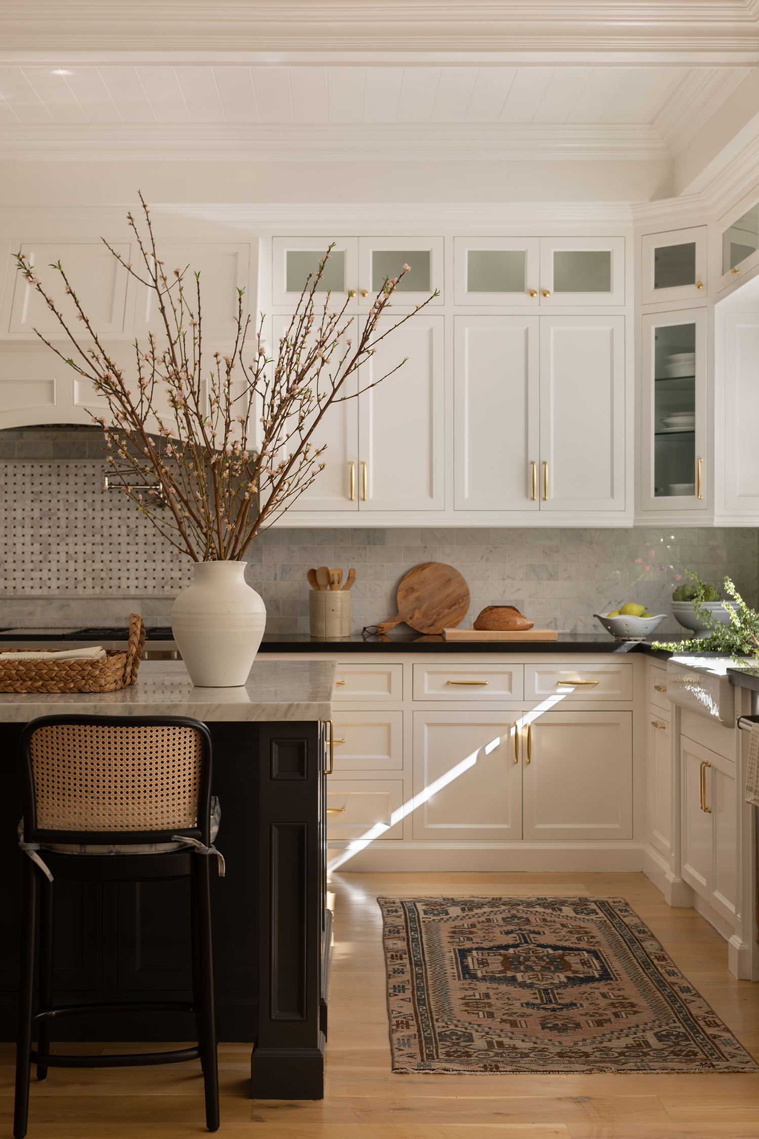
Photo by Aimée Mazzenga; Styling by Lucy Bamman
Before the makeover, the home was in pretty good condition since it was built in 2016. “The last occupants were renters, and there was some wear and tear that needed to be addressed,” Chloe explains. “We refinished the floors throughout the house and gave the whole home a fresh paint job (including the kitchen cabinets and other built-ins). Before we started, the house was mostly gray and white with chrome finishes, so that had to go ASAP.”
The homeowners wanted the space to feel holistically designed, right down to the artwork and style. They wanted the blank-slate home to reflect them and have warmth and character.
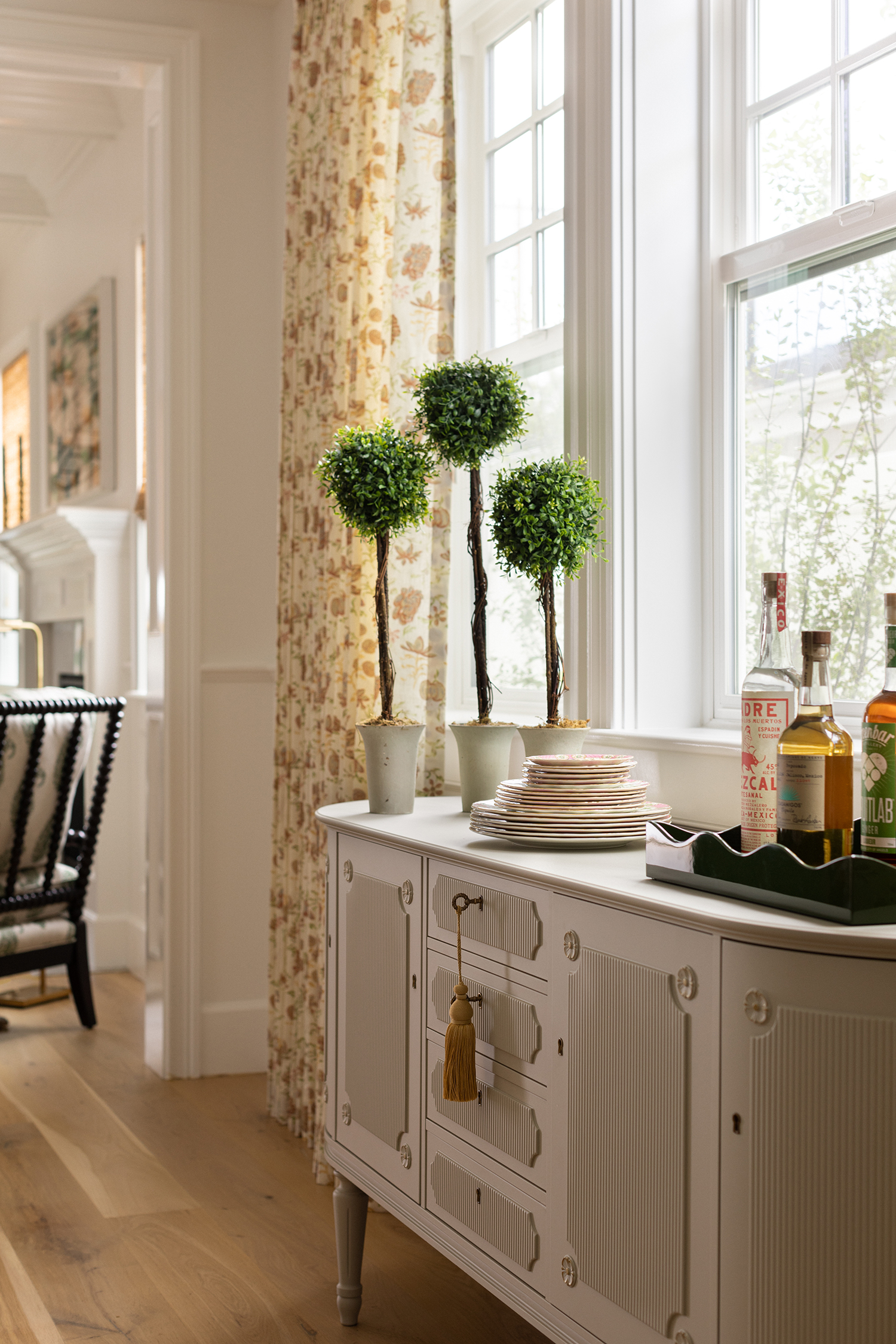
Photo by Aimée Mazzenga; Styling by Lucy Bamman
“I’m sure that ‘East Coast and West Coast’ means something different to everyone, but for this project, that meant balancing classical elements with playful touches and nothing overly fussy or formal,” Chloe says. “The use of color and pattern was powerful in accomplishing this. We knew that pattern in the textiles was going to be a driving force for the design, and we looked at a lot of options to get it right. Ultimately, it was all about balance.”
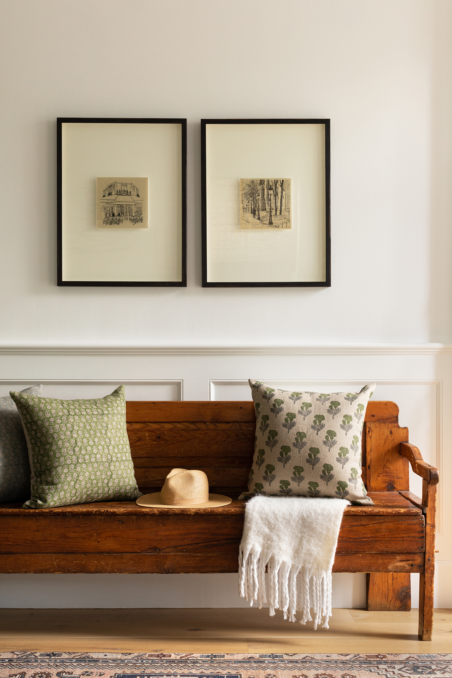
Photo by Aimée Mazzenga; Styling by Lucy Bamman
Throughout the home, Chloe and team refinished the floors and gave it all a fresh coat of paint. The entry was designed to be functional but also to make a statement. There’s a vintage bench with hidden storage, and in the center of the foyer, Chloe created a formal moment with a round entry table for florals and a catchall for keys and other small items.
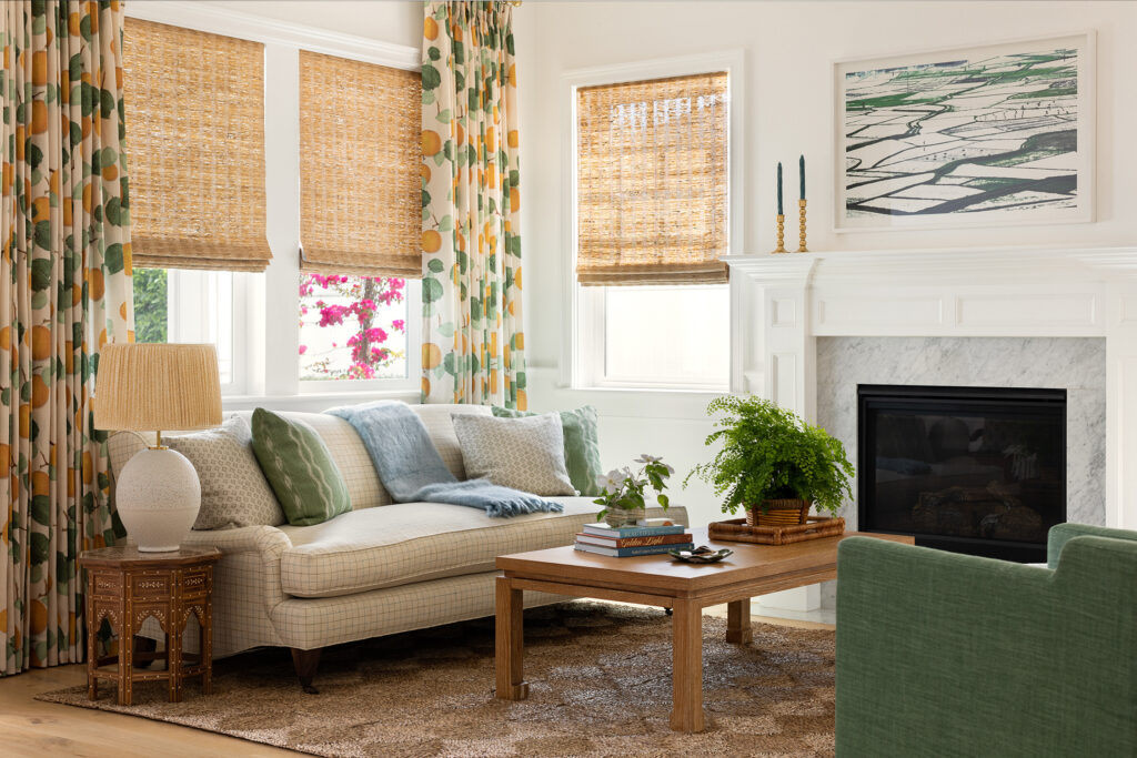
Photo by Aimée Mazzenga; Styling by Lucy Bamman
As you walk into the living room, you’ll notice it’s a smaller space but with a lot of personality. “The front living room is a playful and intimate space with a distinct look,” Chloe says. “We imagined this space as a great nook for reading or hosting post-dinner cocktails since it’s attached to the dining room.”
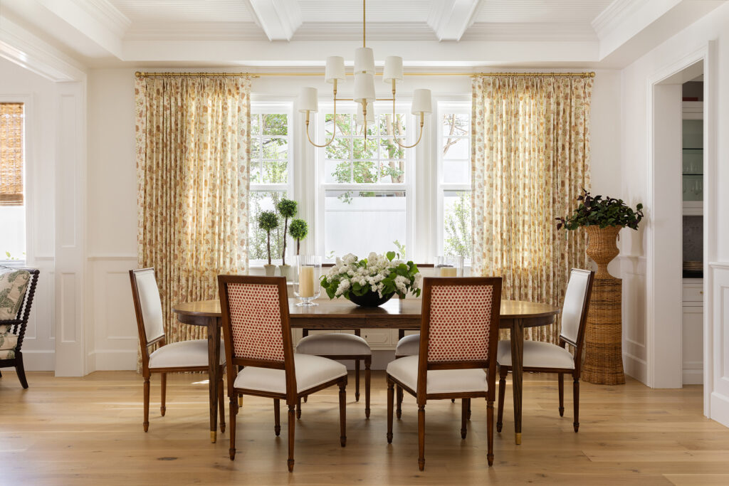
Photo by Aimée Mazzenga; Styling by Lucy Bamman
Since the couple loves to entertain, Chloe and team decorated the dining room so it could have a more formal feeling when the table was dressed. They chose an expandable table, comfortable seating with performance fabric, patterned drapery, and a vintage Swedish credenza that could hold special items like the china once owned by the client’s grandmother.
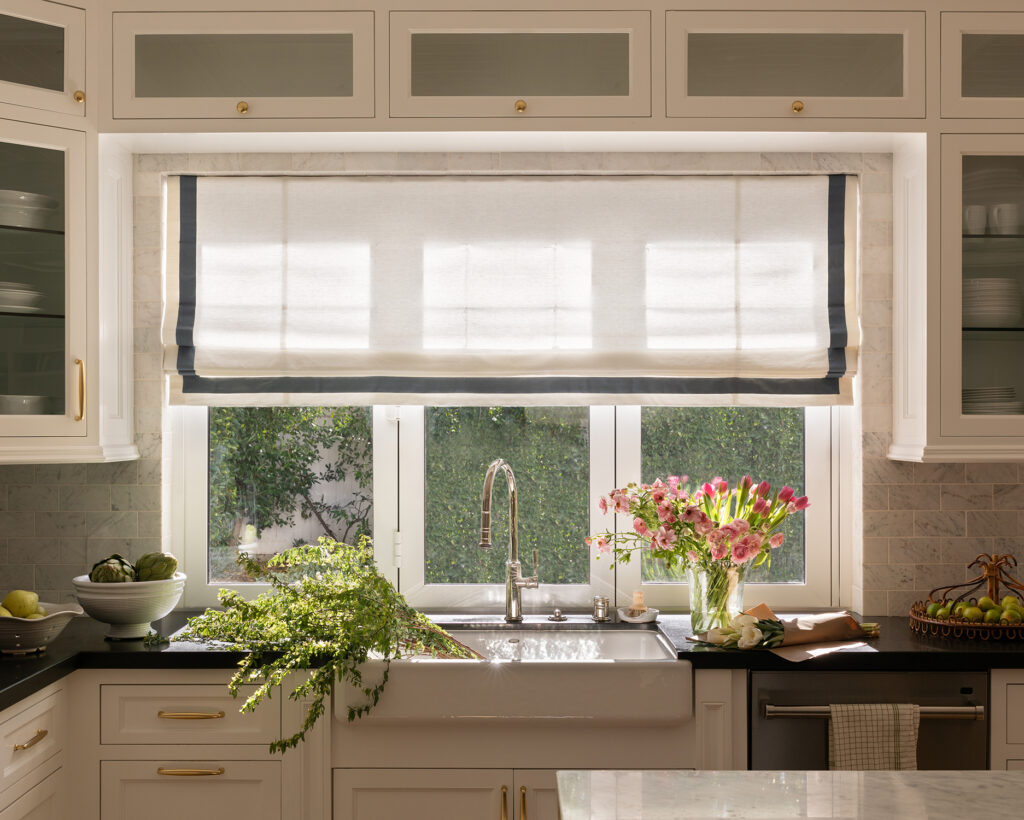
Photo by Aimée Mazzenga; Styling by Lucy Bamman
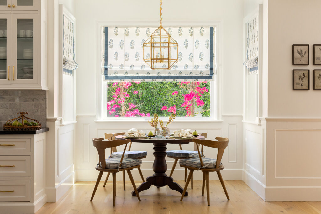
Photo by Aimée Mazzenga; Styling by Lucy Bamman
Luckily, the kitchen didn’t need major renovations. It got a facelift with new paint, cabinet hardware, plumbing fixtures, window treatments, counter stools, and furnishings. “For the cabinets, we chose a classic white on the perimeter with a dark iron on the island,” Chloe explains. “The breakfast nook was going to be a very high use space, but it is also a focal point.”
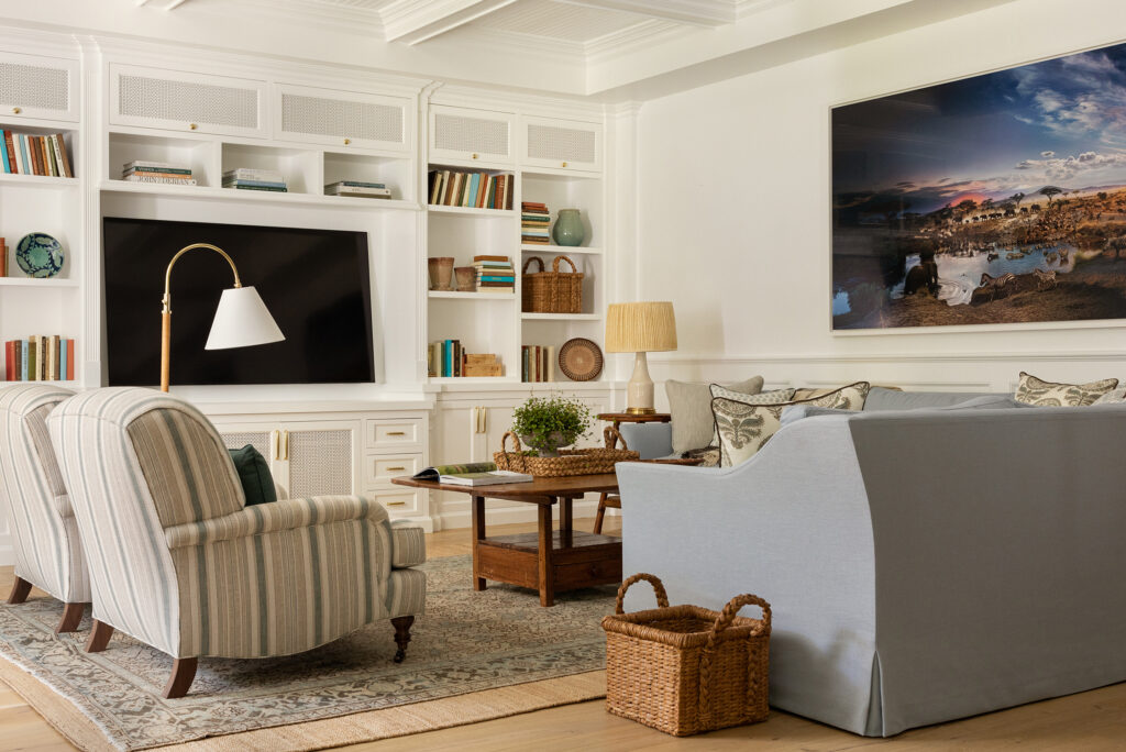
Photo by Aimée Mazzenga; Styling by Lucy Bamman
In the family room, furnishings and artwork make the space. The client’s dad is photographer Stephen Wilkes, so the team designed the room with one of his photographs in mind (and decorated other rooms in the home with his pieces). “We also swapped out the glass inserts on the built-in cabinets for a decorative panel that leaned more traditional and offered cover to hide items behind the doors,” Chloe adds.
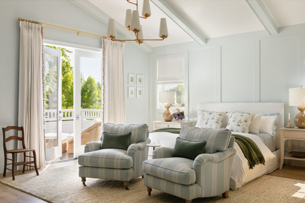
Photo by Aimée Mazzenga; Styling by Lucy Bamman
The primary bedroom used to be a blank, white box, but Chloe says painting the paneling and beams gave it a totally new look. Wallpaper, furniture, and window treatments complete the transformation.
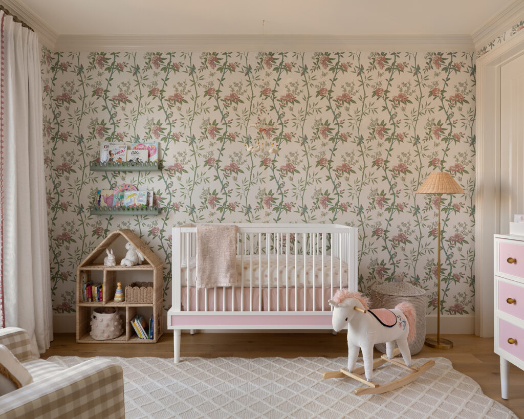
Photo by Aimée Mazzenga; Styling by Lucy Bamman
And in the nursery, the same combo of wallpaper, paint, furniture, and window treatments make the space sing. “Our client really leaned into making the nursery special and fully designed, which was a treat for us,” Chloe says.
Now the home is the perfect mix of traditional East Coast style meets casual, relaxed, and colorful West Coast style. And of course, Chloe’s clients love it. “Even still when we go to their home, they say things like ‘I can’t believe this is our home.’ Because we did so much custom furnishings and textiles, it was difficult to actually visualize the design, and the final install reveal still felt surprising in the best way!”
