This Is How a Boring Builder Spec House Finally Got Some Character
From builder flip to a family home.

Suzanna Scott
There are pros and cons to builder flips. The pro, obviously, is that everything is brand new. But Christine Lin, founder and principal of San Francisco-based contemporary design firm Form + Field, says there are more cons than pros. “The issue with a builder flip is that the design is usually secondary and therefore nothing looks or functions ideally,” she explains. “There are so many things that you wish were better and designed with you in mind. However, you may not want to change it because you don’t want to be wasteful and throw out brand new materials and finishes. It becomes a very difficult position to be in as a homeowner—deciding what to replace versus keep especially with limited time or budget. You have to make a lot of compromises.”
This builder flip in the hills of Oakland was no different, but Christine worked with her client, Shilpa Shah, co-founder of Cuyana, on giving the space character. “The main project goal was to take a character-less builder spec house and create a home,” Christine says. Shilpa wanted the home to be warm and welcoming for her family (husband, three boys, and a dog), visiting parents, and friends. Calm and peaceful was also a must, with no opportunity for clutter.
“Shilpa had a well-defined sense of what she wanted for the home: high contrast, warmth, texture, and a particular shade of blue-green. We’re modernists and her penchant for clean lines and low fuss made us a great team!” Christine explains. “The design was influenced by the clean lines and warmth of Scandinavian design, and texture also played a big part in driving design decisions. You can see the contrasting textures in the upholstery, textiles, and rugs that we selected, and while we use patterned textiles and rugs, it’s sparingly and many of the patterns read as textures.”

Suzanna Scott
The biggest area the design team needed to remedy was the kitchen. While it was brand new, Christine had to do some major work on the island area. “The original island was too close to the wall of cabinetry so two people couldn’t work in the space. There was also a very awkward built-in breakfast nook area attached to the island. We decided to gut the built-in to create one large island and move the island closer to the dining room,” she says. They added a dark countertop material and minimal black pendant lighting for contrast.

Suzanna Scott
In the dining room, Christine added a minimal ceiling fixture so it wouldn’t obstruct the sweeping views of the Bay Area visible from the kitchen. They ordered a custom oak dining table that was designed to seat up to 10 people and a custom oak and walnut banquette to hold servingware. Shilpa kept her existing dining chairs and added bench seating. And the final touch was a rug to add some warmth—and since it was an outdoor one, it could withstand and kid or pet messes.

Suzanna Scott
“To create some character in a white box builder flip, we came up with the idea to paint these short wall sections in the main living spaces to add some visual interest in a large space with short ceilings (the ceilings are only eight feet high here and were originally a huge concern for the client),” Christine says. The vertical sections of color help break up the wide horizontal lines of the space and thus helps make the ceiling feel higher than it actually is. Christine and team added enough seating for eight people in the living space. Ripplefold curtains were also added to the long window/bi-fold wall (which extends to the music room), creating softness and adding shade.

Suzanna Scott

Suzanna Scott
Next to the living room is the music room, which became a cozy hangout spot with floor cushions and a low coffee table. And on the lowest level is the family/media room, which is perfect for movie nights and family time. “We made it cozier with all the throw pillows, organic shaped coffee table, and the irregularly textured rug,” Christine says.

Suzanna Scott
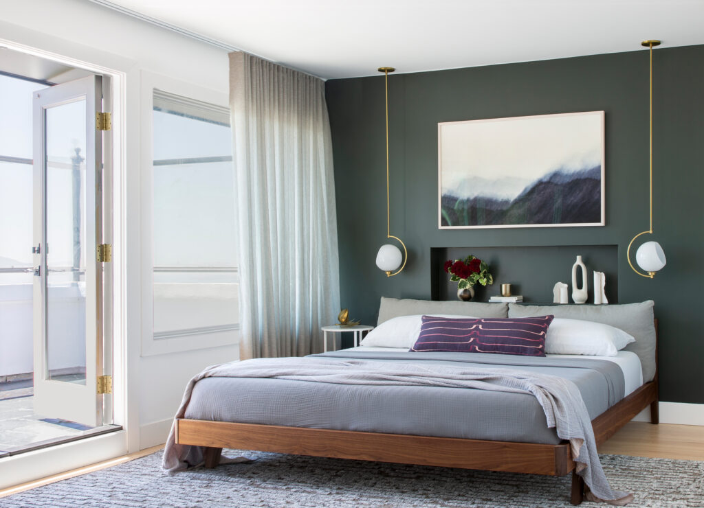
Upstairs, the bedrooms were made cozier and homier with paint, artwork, furniture, and decor details. “This space receives a lot of sunlight and there’s a wall of white closet cabinetry opposite the windows, so to create some contrast we painted the headboard wall Farrow & Ball’s Studio Green which is a beautiful dark green,” Christine says. “Because there wasn’t a lot of room for nightstands, we added a niche in the wall above the headboard and added pendant lights to the sides of the bed to maximize space.”

Suzanna Scott
An office was also added in the upstairs hall by the bedrooms, which was originally an awkward space. Custom millwork transformed the space—now there’s hidden storage for a printer and files (and even linens), and a floating shelf and desk.

Suzanna Scott
Looking at the home, it exudes character and personality. And Shilpa and her family are thrilled with the result: “We love our house and are thrilled by everything we chose every day. It feels like us.”
