Inside a San Francisco Home Inspired by ‘The Gilded Age’ and ‘Bridgerton’
Historic design inspired its renovation.
Jessica Brydson Photography
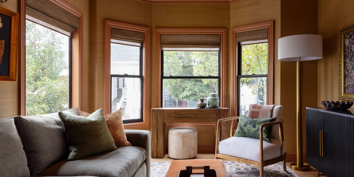
This 1907 San Francisco Edwardian house would make Agnes van Rhijn of The Gilded Age and Violet Bridgerton of Bridgerton feel right at home. The two period shows were inspiration for its renovation, after all.
“They are fascinated by the rich details in how people lived back ‘in the day’—from crown molding to faucets to colors to the fabrics used in upholstery,” Tim Tattersall of t3 Interior Design in Palm Springs says of the homeowners, who are big fans of the shows. “In essence, they wanted a return to that warmth to welcome them home when they walked through the door.”
Jessica Brydson Photography
Tim had worked with the couple before on their 2,000-square-foot second home in Indian Wells. A few months after that project was completed, they asked him about helping with their place in San Francisco “because they realized their second home was far nicer than their official primary residence.”
Jessica Brydson Photography
After working on homes in Hawaii for 15 years and now in Southern California for four years, Tim relished the opportunity to work on the Edwardian home and design something he’s never designed before.
“It was intellectually stimulating in a way that nothing Hawaiian or classically Californian had ever presented to me,” he says. “I relished in the research, watching period shows on TV, and thinking of new ways to put materials together that I don’t normally do.”
Jessica Brydson Photography
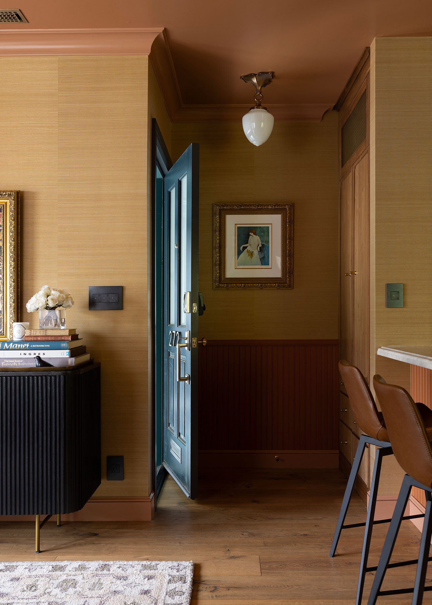
Unlike the desert house, this one was smaller in scale at only 835 square feet with two bedrooms, one-and-a-half bathrooms, and a small living room.
While the exterior of the house was all original, the interiors didn’t match because sometime in the 1960s or 1970s the original crown molding, baseboards, wainscoting, and cabinetry were removed, basically stripping the home of its historic character.
Jessica Brydson Photography
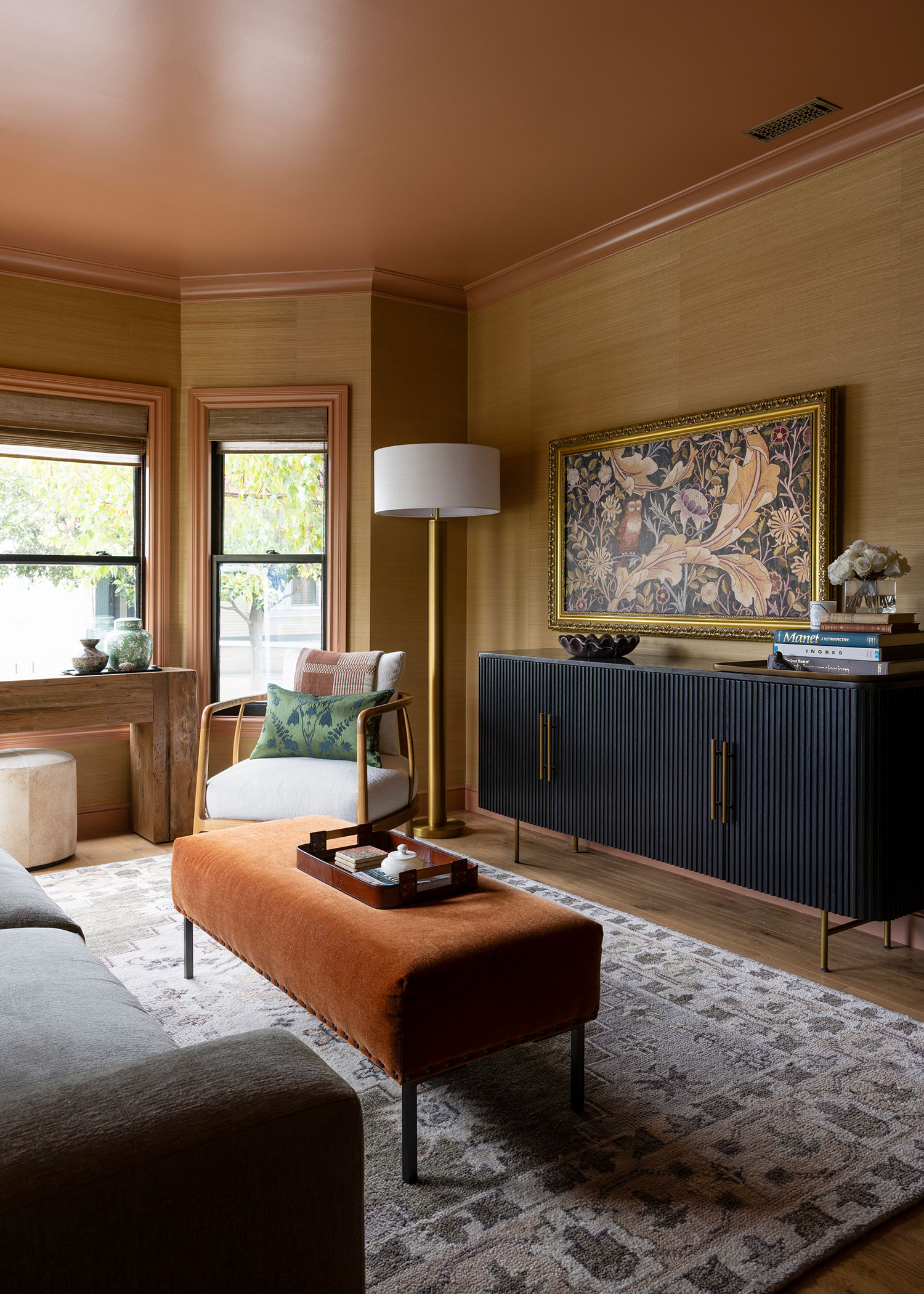
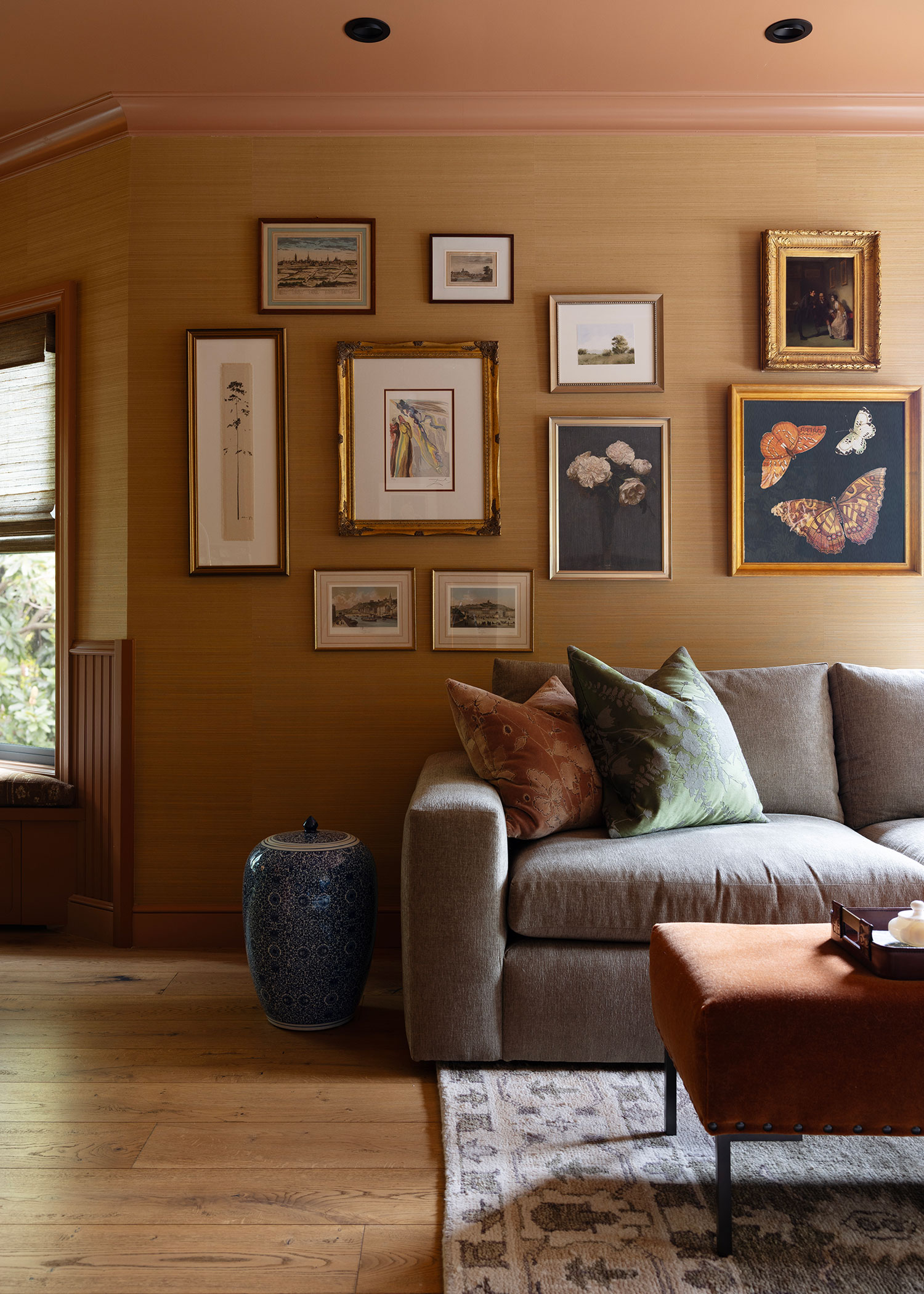
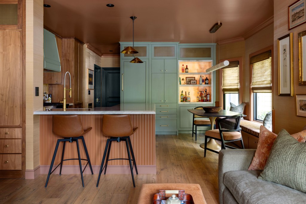
Along with the period-inspired details, the homeowners also requested no white walls or ceilings—only rich, warm hues and tones, which fit right in with the historic aesthetic.
“Because earthy jewel tones were the fashion at the turn of the century, we chose earthy grasscloth wallpapers for almost every room in the house—which then dictated the color direction of the ceilings,” Tim adds.
Jessica Brydson Photography
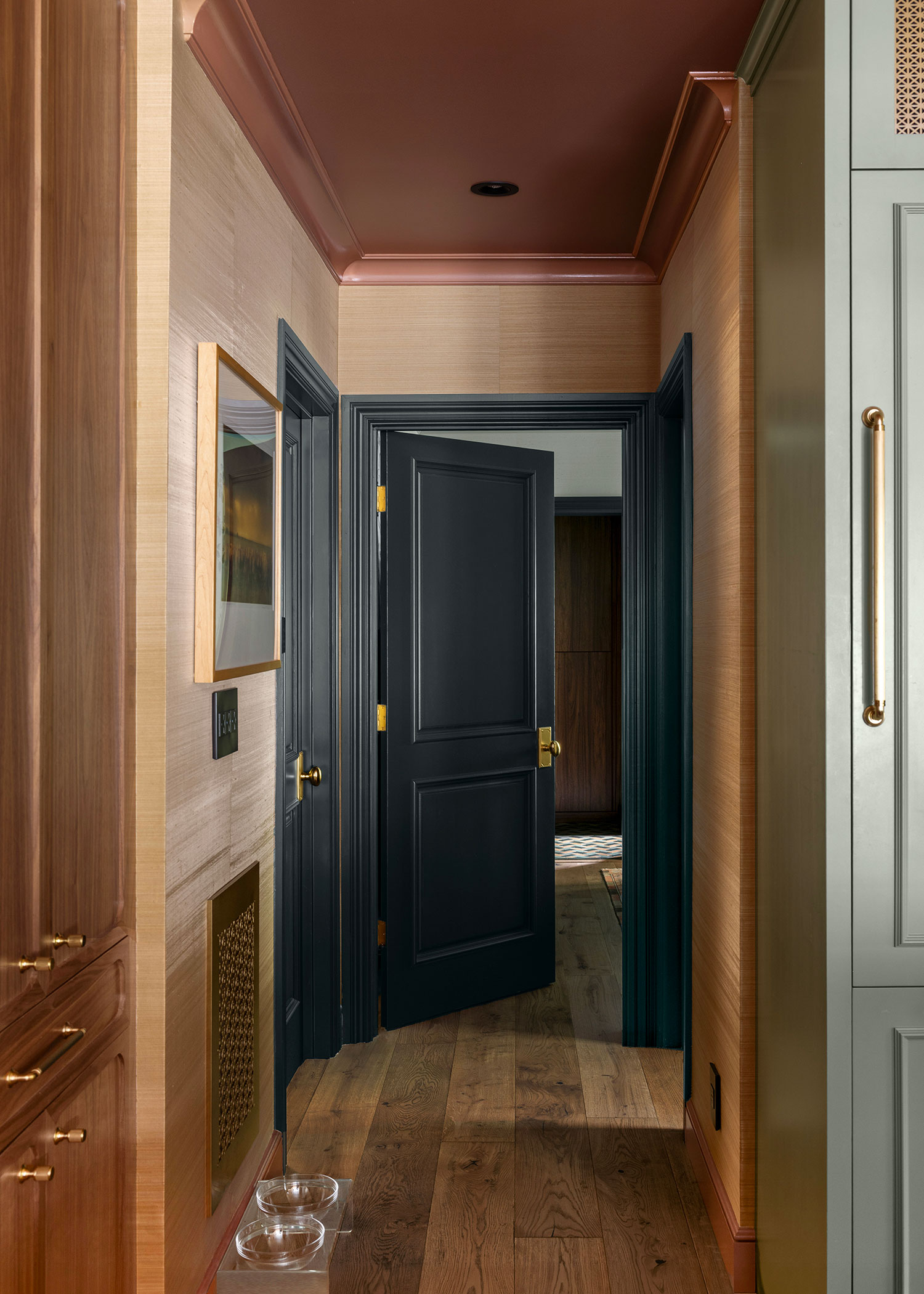
All the windows were replaced, except for the ones facing the front since they are original and historic to the building. The air vents were moved from the floors up to the ceilings to free up floor space. All the interior doors were painted Iron Ore by Sherwin-Williams.
Jessica Brydson Photography
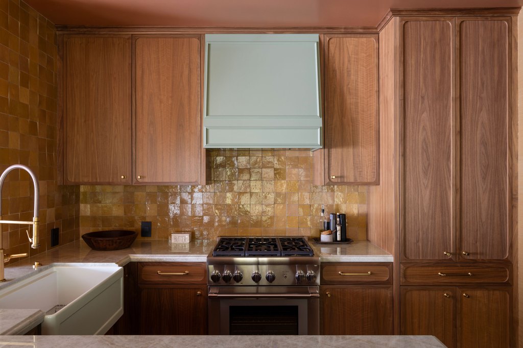
“The kitchen is a great example of how we made it feel as if it could have been a kitchen at the turn of the last century,” Tim explains. “Though the range is modern, the hood’s aesthetic is vintage; the refrigerator is brand new but hidden behind cabinet doors; the counters and walnut cabinetry have a definite warmth inherent within them.”
Jessica Brydson Photography
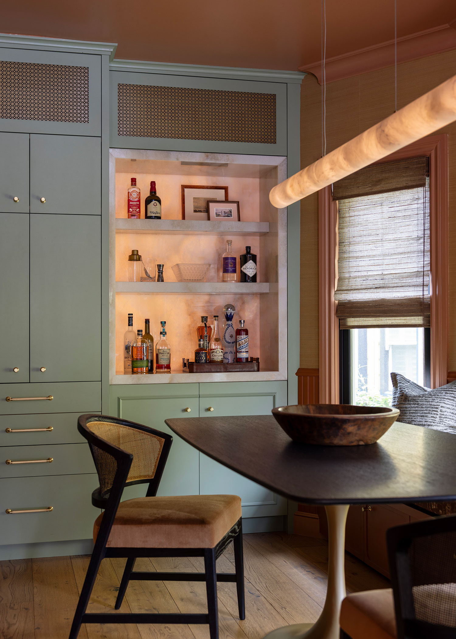
The bar in the kitchen and dining room design is one particular feature that’s not quite period-accurate but was something the owners wanted. Tim designed a backlit bar with translucent onyx and Taj Mahal stone counters. He used two different cupboard styles in the kitchen to make the refrigerator and bar look like a piece of furniture rather than standard cabinetry.
Jessica Brydson Photography
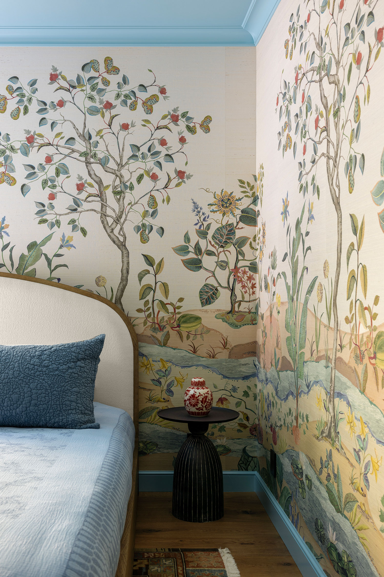
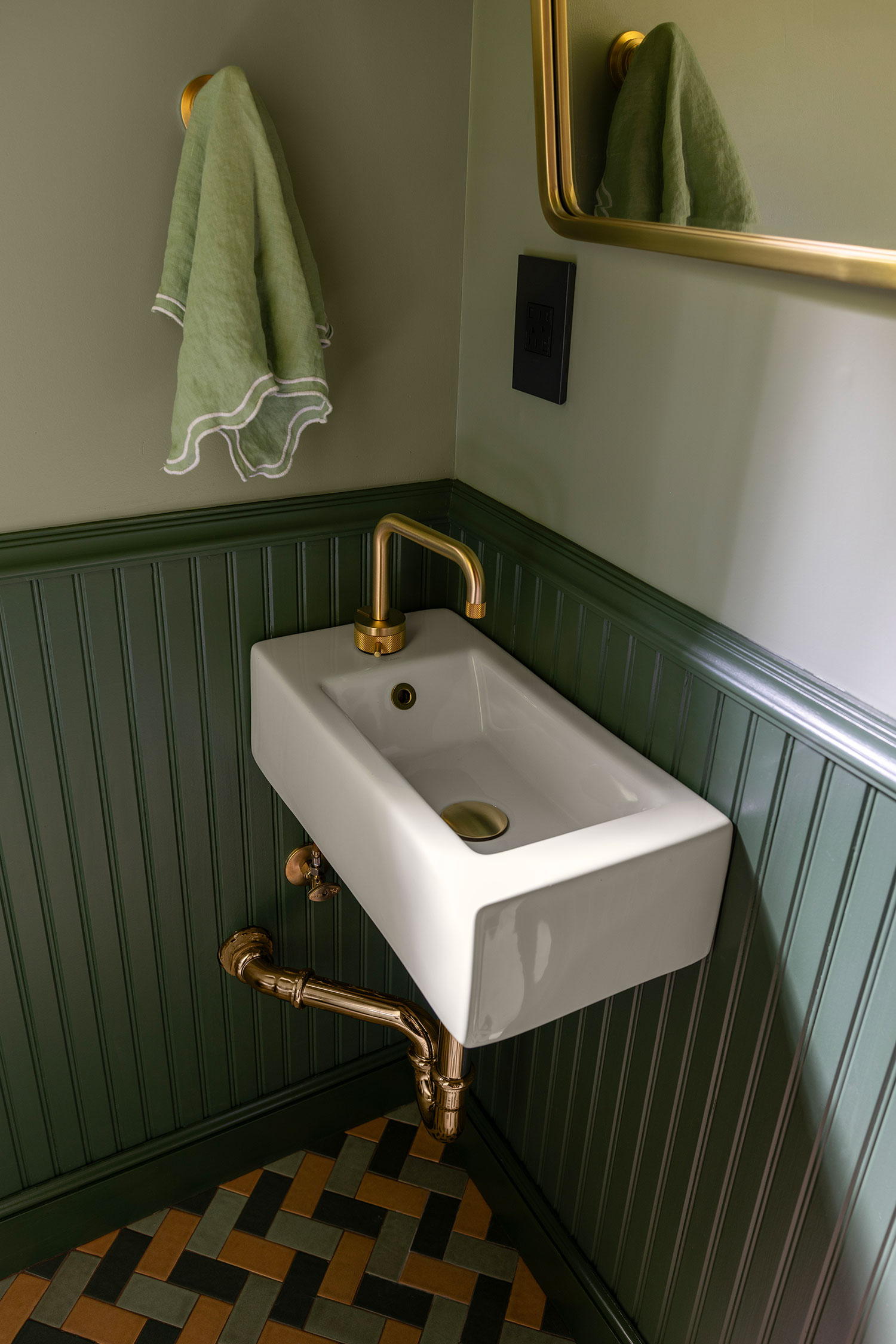
In the bedroom, a stunning mural of a garden wraps around the four walls with a blue sky ceiling overheard. Off the bedroom is a walk-in closet with a half bathroom attached. Wainscoting was added to the space, and the bath tile style is similar to the one in the main bath.
Jessica Brydson Photography
Jessica Brydson Photography
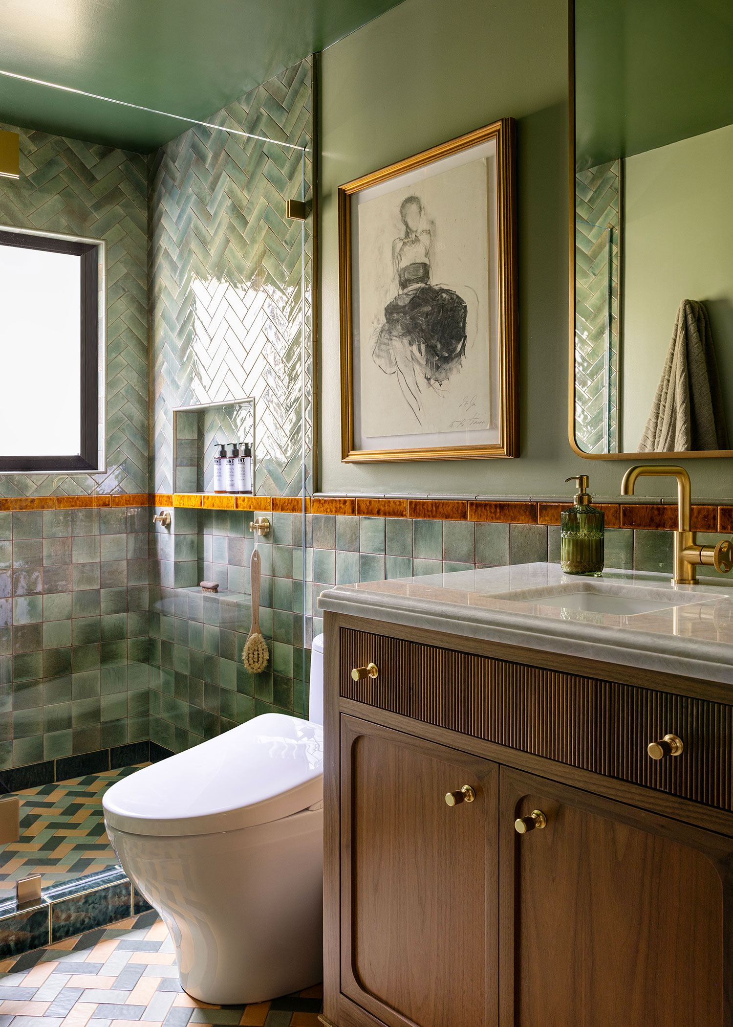
“The main bathroom became a study in tile layout with various patterns converging all together in a tight space,” says Tim. “Green was chosen as it is a favorite color of the owners—and a classic color used at the turn of the last century.”
Jessica Brydson Photography
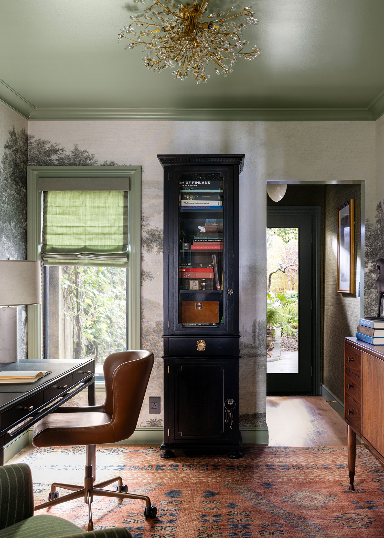
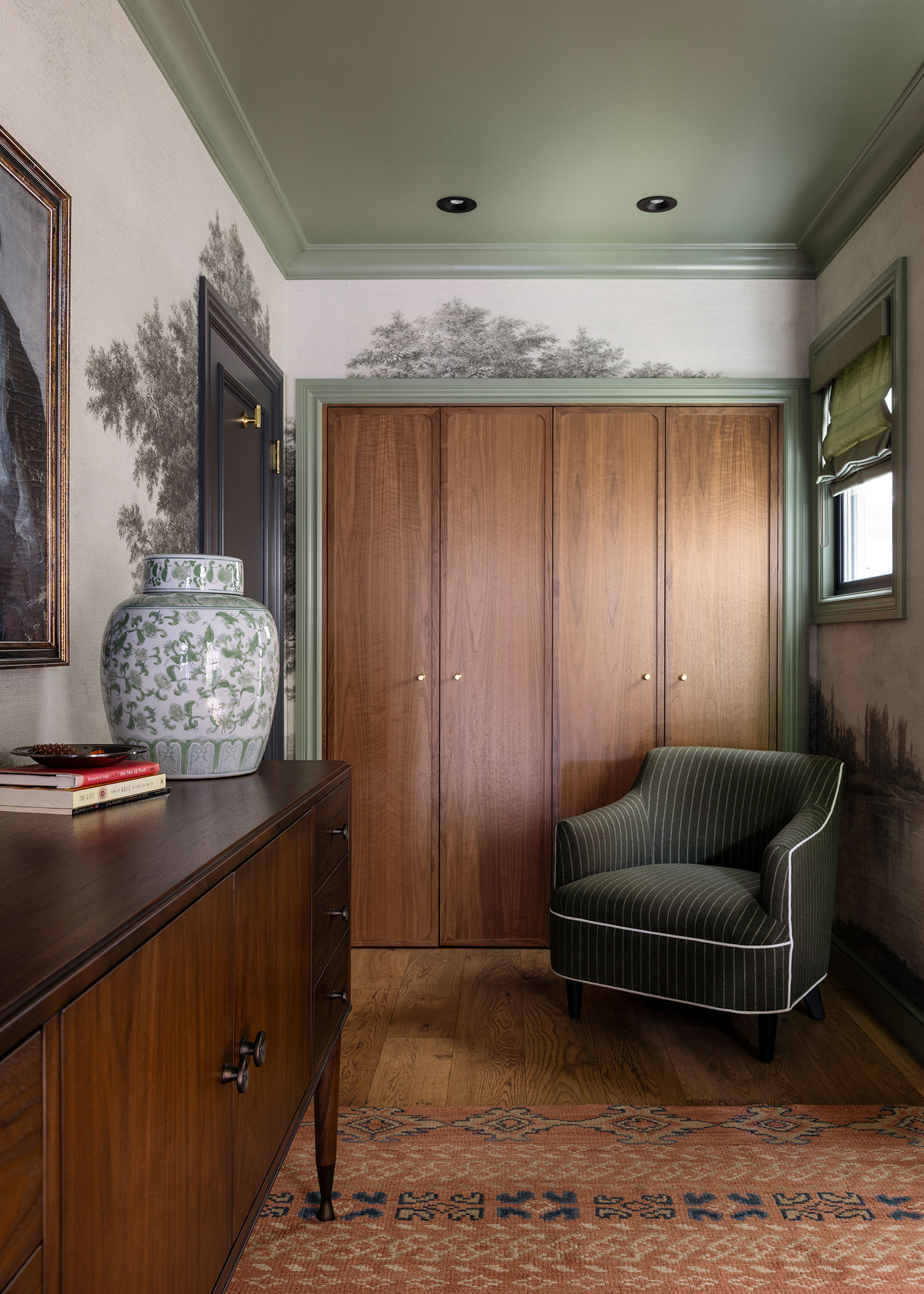
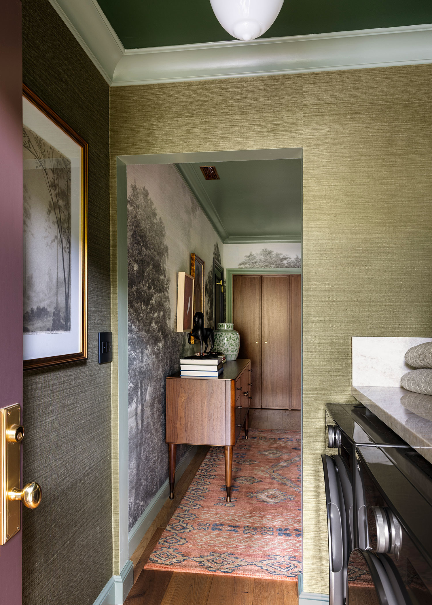
The second bedroom was transformed into an office with a wraparound forest-themed mural and a green ceiling. The laundry room next to the office features a glass door that leads to a full backyard.
Jessica Brydson Photography
To stay true to the period design, Tim and the design team were very careful of concealing modern amenities and fixtures. The switches and outlets are all black, and the ones in the kitchen backsplash are pop-out style, so they are hidden in the wall when not in use. The ceiling heat ducts are custom gold mesh in an era-inspired pattern. There are also gold mesh cupboard covers over the refrigerator and bar to hide speakers, internet gear, a heat duct, and electrical drivers. Other tech devices are cleverly hidden or chosen to blend in with the design: the printer is concealed in a shelf inside a closet and the television is a Samsung Frame TV with an ornate gold frame.
Jessica Brydson Photography
While the home went through a major overhaul with almost new everything, the rooms manage to feel like they’ve looked that way for ages—timeless and elegant.
“The project was a dream from start to finish—I actually told the owners that if I had to live in San Francisco that I would want to live in their house. But, alas, they’re pretty happy in their new home,” Tim says.
Wallcoverings: Phillip Jeffries, Osborne & Little, Serena & Lily
Cabinetry: Ralph King Cabinetry
Hardware: Rejuvenation
Plumbing: Graff
Tile: Pratt & Larson, Gleeze
Furniture: Arhaus
We only recommend things we love. If you buy something through our site, we might earn a commission.