Are Gray Floors Ever Okay? Designers Share Their Honest Opinions
Discover their hot takes on this cooling trend.
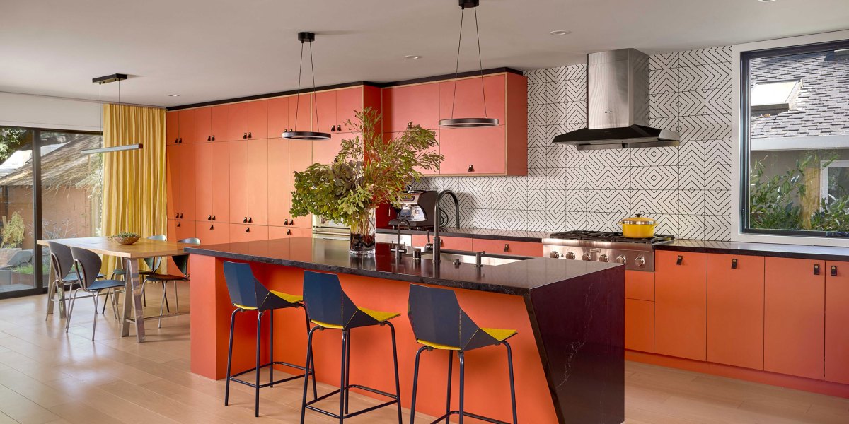
Design by Shialice Spatial Design; Photo by Natasha Lee
The biggest decorating conundrum is happening right under your nose. And, no, we’re not talking about how to pick a properly proportional rug for your room. Instead, the entire design community is laser-focused on your floors. More specifically? The color of ‘em.
While rich, warm woods like oak and walnut imbue a welcoming charm, grayish, cool-toned floors are beelining it to “ick” territory. For designers like Lauren Lerner of Living with Lolo, it’s not hard to see why.
“We moved away from cool-toned wood and tiles a while ago because they were everywhere, and in Arizona especially, they fight the light instead of working with it,” explains the Scottsdale-based designer. “Our climate has warm, direct sun most of the year, and gray floors can read flat or even a little cold against that.”
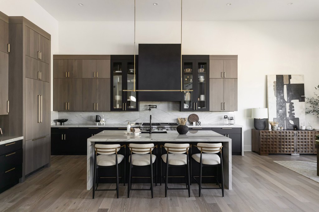
Design by Living with Lolo; Photo by Life Created
Alice Cheng of Shialice Spatial Design says the underfoot garnered an ultra-trendy, and fleeting, reputation over the years. “It attempted to mimic the minimalist, neutral look of Scandinavian interiors popular in the 2000s and 2010s,” the Los Angeles designer explains. “But the floors were often plucked out of context and applied without the balance of other design elements that made those inspirational spaces successful.”
Gray floors might come with inspired pretenses, but do they really deserve all the flack? Not so much, some designers say. For Kishani Perera, who runs her eponymous design firm in Los Angeles, the aversion to cooler surfaces is a natural part of the trend cycle.
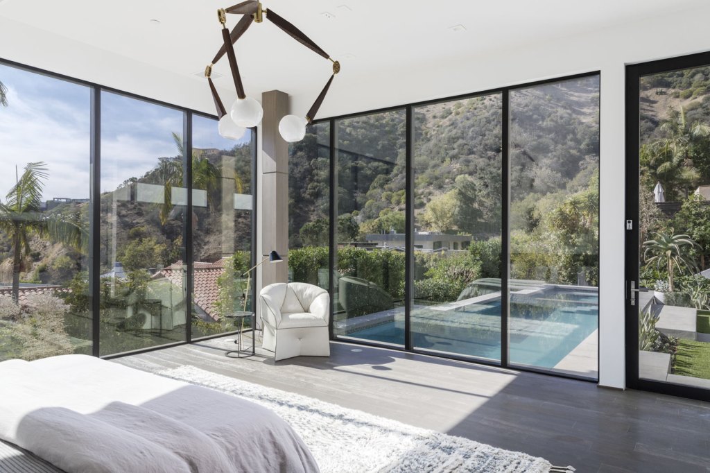
Design by Kishani Perera; Photo by Anthony Barcelo
“Anything good eventually over-saturates our lives and feeds,” she says. “We get tired of it, and then it comes back as the latest and greatest thing!” Translation: If you can’t stand this detail now, wait a few years. Chances are, popular opinion will do a 180-degree pivot.
“The fact that a trend comes to fruition indicates that a particular thing is worthy and beautiful, which is why everyone embraces it,” Perera adds. “If that’s the case, it will ultimately stand the test of time, even if the overt love ebbs and flows.”
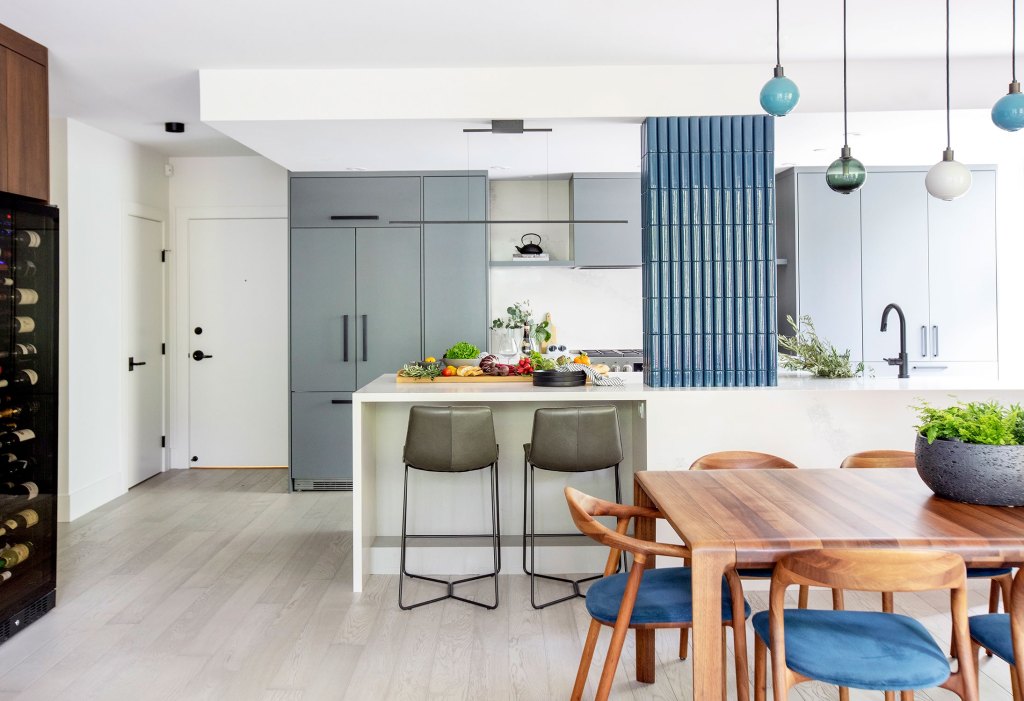
Design by Knight Varga Interiors; Photo by Janis Nicolay Photography
Vancouver-based designer Trish Knight says there’s a time and place for most details. “I don’t really believe that any material is completely in or out,” says Knight, who is one-half of a design firm called Knight Varga Interiors. “It’s always about how it’s used and whether it makes sense for the space and the client.”
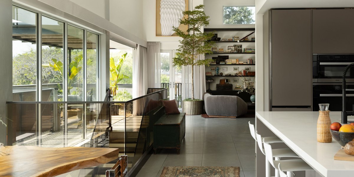
Knight recently used a Hakwood grey oak hardwood in a residential project and said the cooler tones paired grayed-out blues and greens in the kitchen millwork and soap tile on the column. “Getting the right gray in hardwood is difficult, but that doesn’t mean it can’t still be beautiful,” she shares. “If the tone is right and it works with the rest of the palette, I would absolutely use it again.”
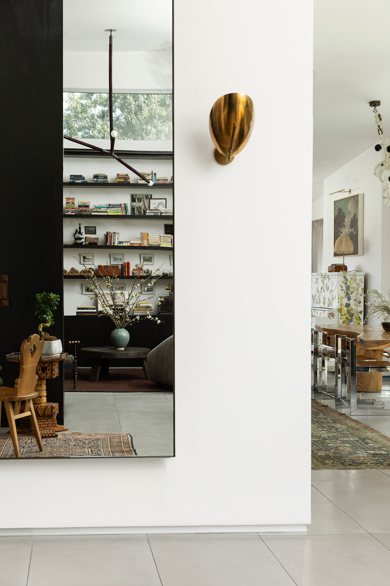
Design by Shialice Spatial Design; Photo by Natasha Lee
Cheng agrees and says gray-toned floors can feel appropriate in “modern and contemporary” spaces and even incorporated them in a recent project. “[The home] already had large-format gray tile, and we chose to keep it because it still worked as part of the building’s more contemporary vibe,” she shares. “It created warmth and balance through other materials, colors, textures, and furnishings.”
And, should the vibe not call for frosted floors? Get creative. Lerner says her design firm often “inherits” gray floors and has found clever ways to work around them. “Gray isn’t a dealbreaker,” she says. “ We warm up the room around it, [so] the floor stops being the thing you notice.” Layered wood tones in furniture, creamier paint colors, as well as brass and bronze fixtures can create the illusion of a cozier space—yes, despite the gray ground.
Keep Reading:
The Latest