
This Is How You Fix a Weird and Sterile Remodel
The home’s design now matches its architectural history.

Margaret Austin Photography
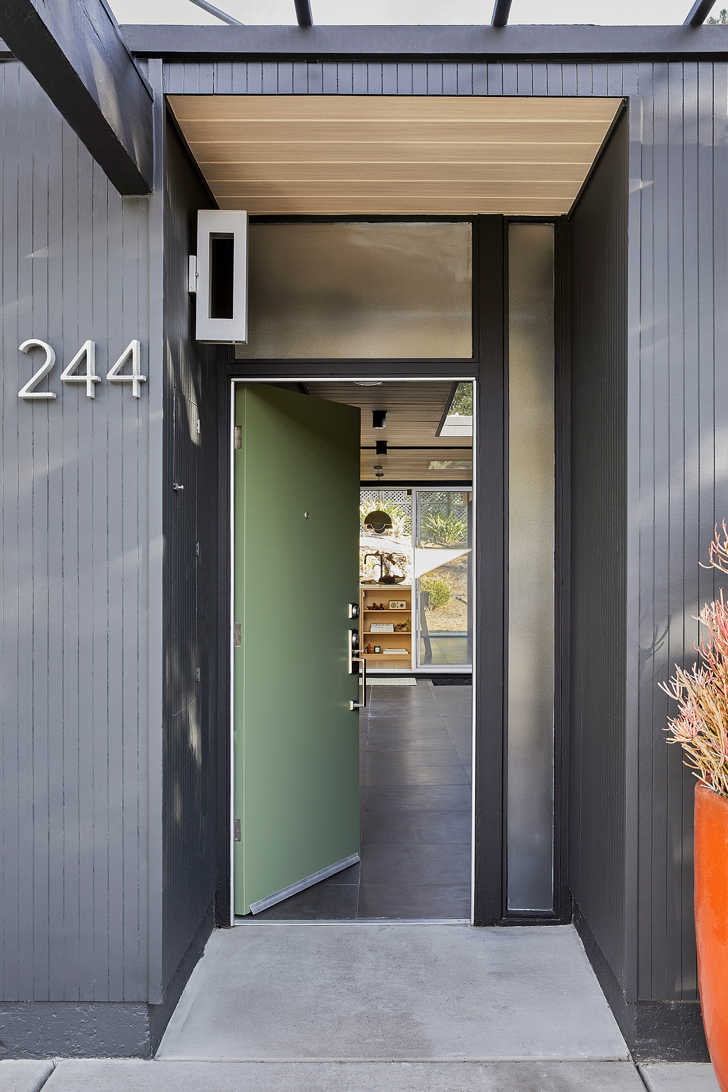
Everyone has their own design aesthetic, and that’s welcomed. If everyone liked the same things, the world would definitely be a lot more boring. But sometimes a design aesthetic doesn’t quite match its surroundings, like what the previous owners did to this 1958 Eichler E-111 home in the San Mateo Highlands.
Margaret Austin Photography
The previous owners had remodeled the kitchen and bathroom in the four-bedroom, two-bathroom house, but the aesthetic was a mix of sterile Mediterranean and traditional design—not exactly a fit for a modern Eichler. The flow of the kitchen and primary bathroom were awkward. The primary bath had a lot of sharp corners and edges, a big Jacuzzi tub that didn’t get much use, and poor air circulation. The guest bathroom, while cozy, needed a finish upgrade.
Margaret Austin Photography
“The previous owners were much taller and had designed much of the home around their height,” interior designer Cathie Hong says. “The laundry/mudroom originally included the tankless water heater, and radiant floor boiler. Between the two, the room was like having two copper-legged octopi, which left no room for storage. Due to all the venting, the original laundry room caused the rest of the house to feel drafty.”
Margaret Austin Photography
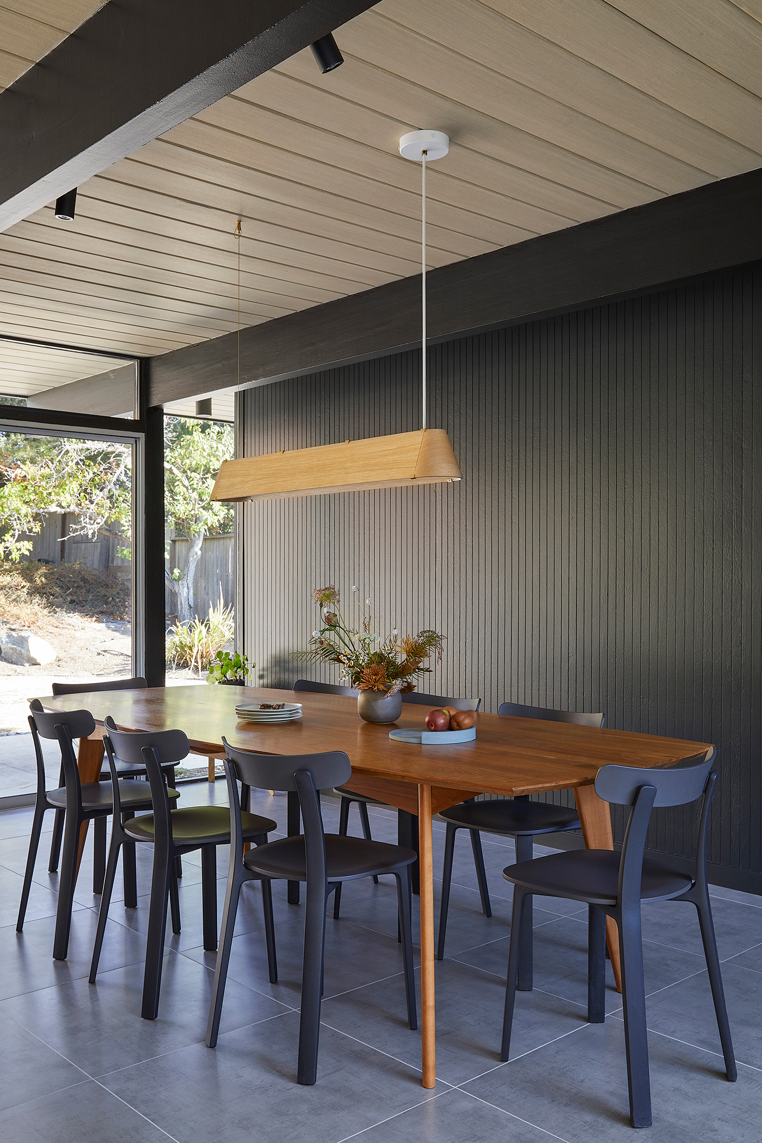
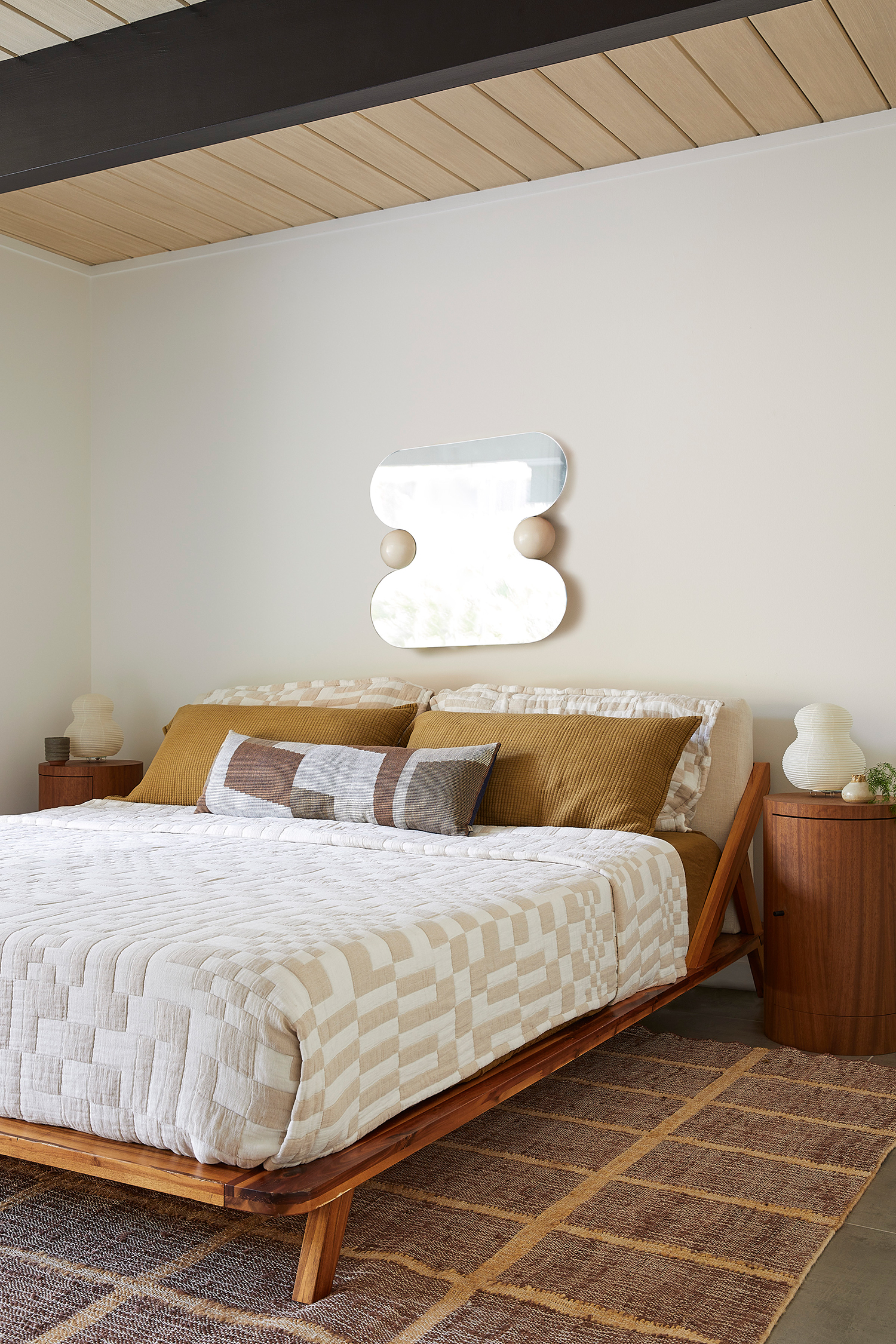
Cathie’s clients, a couple with two kids, had lived in the home since 2015 and decided they were ready to remodel. “They wanted a more functional, inviting layout with a cohesive, modern aesthetic throughout,” Cathie explains. “Eichlers are notorious for lacking storage, so they also wanted to maximize storage with cleverly considered built-ins and layouts that made the rooms feel more open. Their specific model of Eichler doesn’t have very tall ceilings and has exposed beams throughout, so they wanted to maximize the airy open feeling with their selection of finishes and materials.”
Margaret Austin Photography
Renovating a historic home isn’t exactly a piece of cake, Cathie says: “Designing for and renovating Eichlers are uniquely challenging because of the lack of crawl space or attic space, making electrical, plumbing and layout changes much more challenging than a typical home. They’re absolutely stunning, but certainly don’t come without their challenges.”
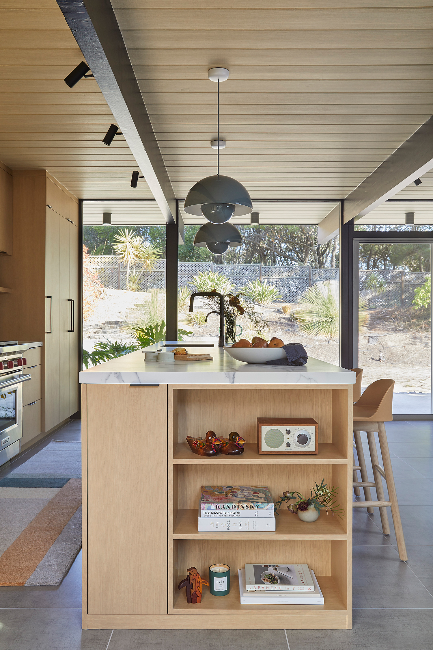
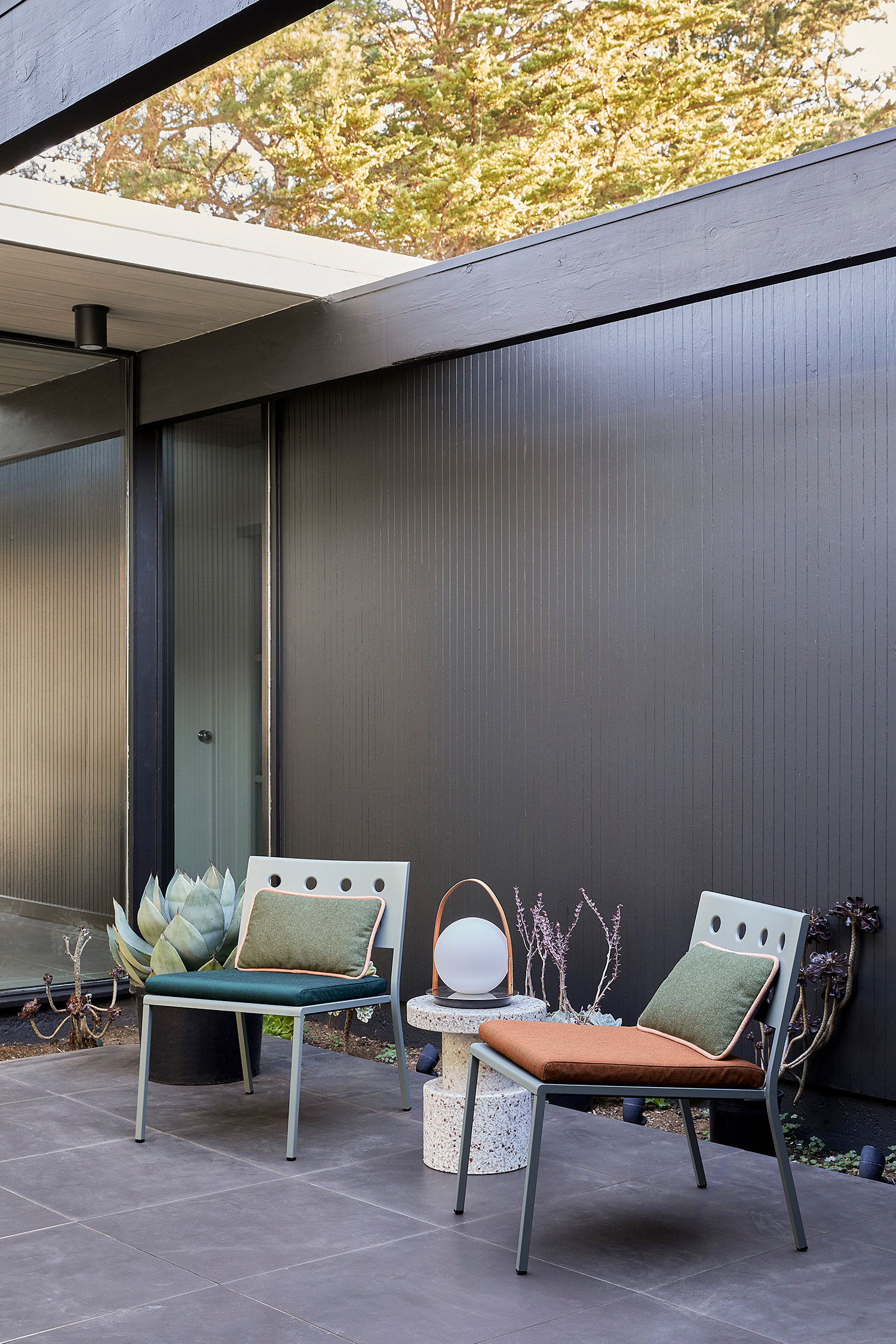
But Cathie and her team created a design direction that took into account the clients’ preferences, while also staying authentic to mid-century Eichler architecture. They also mixed mid-century and Japandi aesthetics: “muted white oaks and off-whites, satin brass fixtures and globe lights, but also micro-terrazzo, classic Heath mosaic tiles, walnut cabinets, and matte black fixtures.”
Margaret Austin Photography
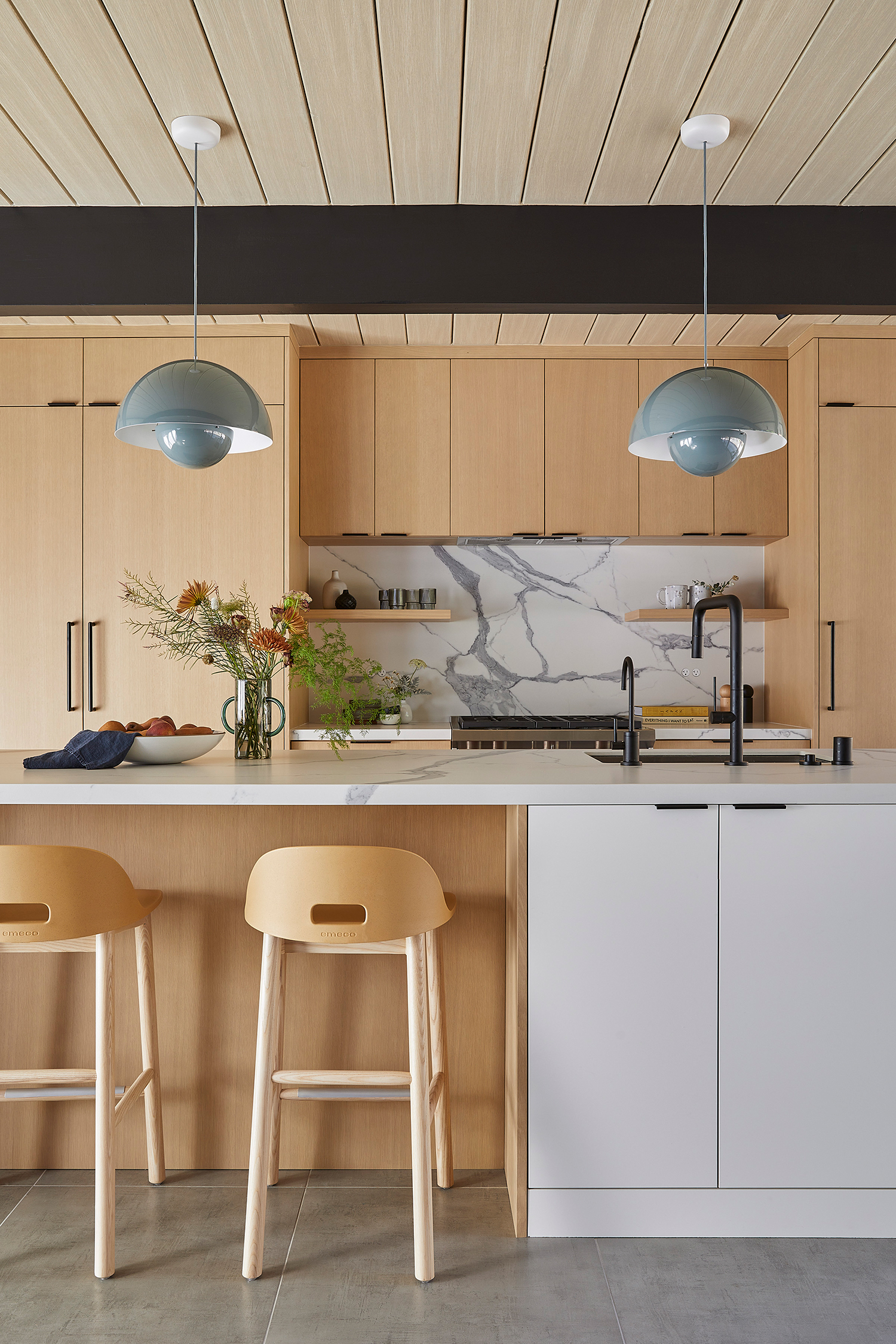
In the kitchen, the footprint of the space didn’t change, but the flow was made better because they reconfigured the galley layout to an open layout. “The original kitchen had dated white shaker cabinets, satin nickel fixtures, and a painted gray backsplash. We warmed it up with European style white oak and white cabinets, matte black fixtures, marble-like countertops, and playful blue pendants.”
Margaret Austin Photography
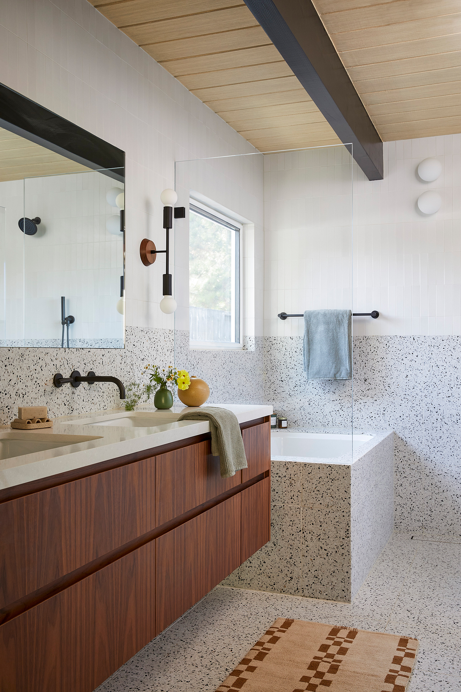
The primary bathroom with the unused Jacuzzi, tiny shower, and cramped space was opened up by swapping out the bulky fixtures for smaller, sleeker ones. They added a smaller built-in tub within a curbless wet room. The outdated brown travertine tiles were replaced with floor-to-ceiling terrazzo and white ceramic tiles, and the ill-fitting white shaker vanity was swapped for a floating walnut vanity.
Margaret Austin Photography
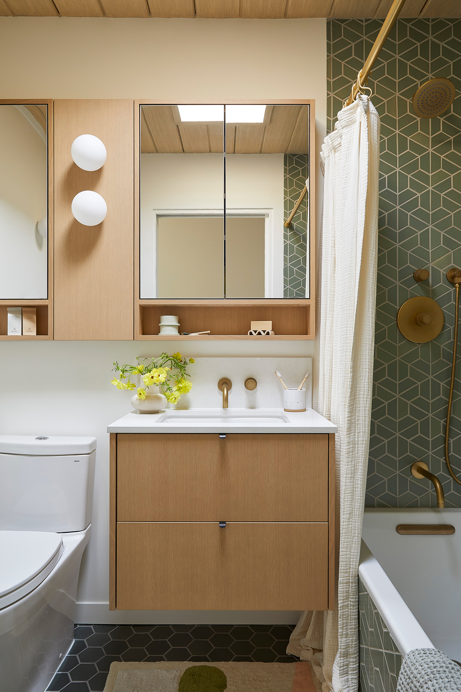
The layout of the guest bathroom wasn’t changed, but all the finishes and fixtures got an upgrade—now there’s a floating oak vanity, custom medicine cabinet mirror with an integrated shelf and globe sconces, and green Heath ceramic tiles in the shower and on the floor.
Margaret Austin Photography
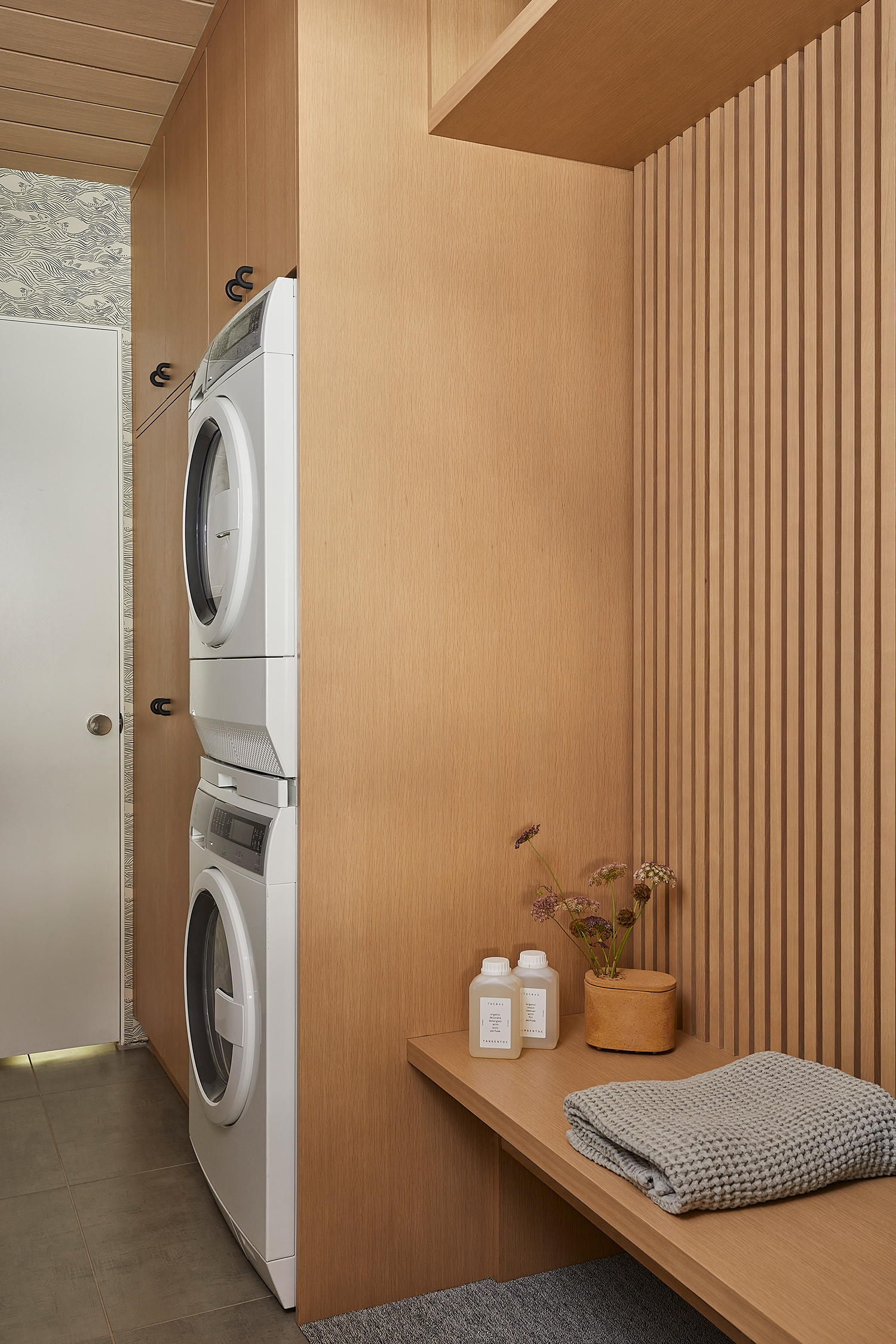
And the problem laundry/mudroom was fixed to become a functional and stylish space. “Midway through construction, we decided to relocate the water heater to the garage and clean up the pipes to make room for a proper laundry and mudroom, complete with tall linen cabinets, a built-in bench with room to store some shoes, a slat wall detail, and some hooks for hanging backpacks. We added a whimsical wallpaper as the cherry on top,” Cathie explains.
Margaret Austin Photography
Now the home is modern, warm, and functional for a busy family of four. “The owners feel that the selection of materials, colors, and unique little details make their home feel warmer and the flow much more natural; it complements the Eichler design principles,” says Cathie. “They have tons of storage space and their counters are no longer cluttered with coffee gear and cookware. They couldn’t be happier to call this their home!”
