Before & After: A Carpeted ’70s Bathroom Gets the Spa Treatment
The improved space is also now full of functional details.

Before photo: Gina Caulkins; After photo: Jessica Brydson
It all started with a wall tile sample for this Marin bathroom makeover. Before designer Gina Caulkins of California Daydreams Designs worked on any concepts with her clients, she showed them a wall tile and it became one of the jumping off points to designing a dream bathroom. And what, exactly, was her clients’ idea of a “dream” space? “A spa-like haven where they can relax with a bath and glass of wine at the end of a busy day,” Caulkins says. “They really wanted to have a wet room (shower and bath in the same space) and also wanted to remove the makeup vanity in favor of gaining more storage.”

Before photo: Gina Caukins; After photo: Jessica Brydson
And with those ideas, there was a lot of work to be done. When her clients bought the home they had originally planned to remodel the bathroom (their primary bathroom) down the road, but they soon discovered that the tub and shower were leaking into the kitchen located directly below the room. Not only did it have the leak problem, but it also looked out of date. “Brown mosaic tiles were everywhere—covering the funky ’70s party tub, the walls, the floor, the vanity counter, the makeup vanity, and the water closet floor. While the original tub looks massive, it was actually very shallow and not functional for the wife who likes to relax in the tub nightly. The bathroom also had carpet, which is definitely not ideal!”

Before photo: Gina Caulkins; After photo: Jessica Brydson
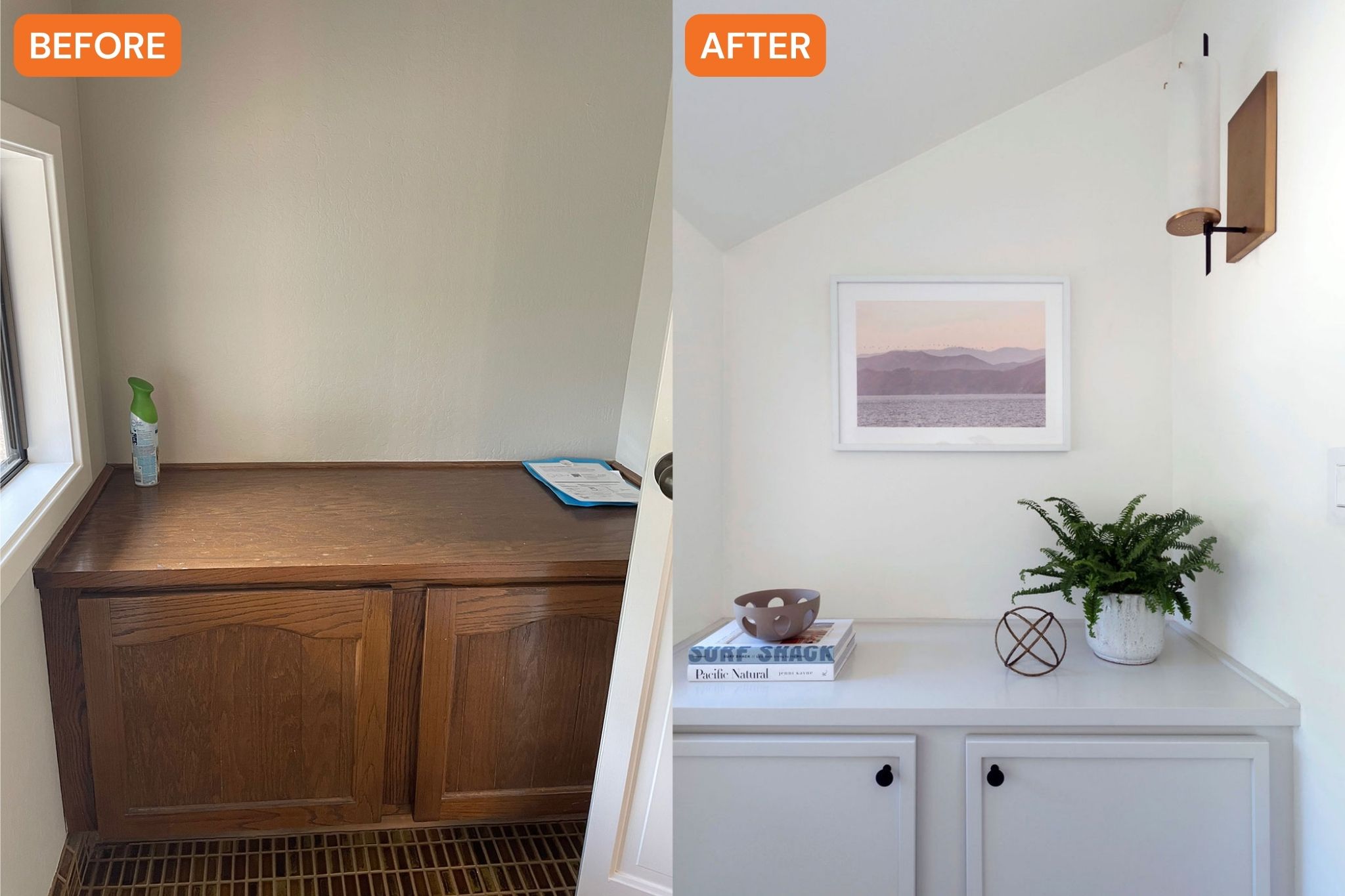
The good news is that Caulkins didn’t really have to change the layout that much, she and her team (which included construction by In Home Renovations) just made some functional updates to make the space work harder. “The tub/shower combo was changed to a freestanding tub within the wet room,” Caulkins says. “We removed the makeup vanity and added a dresser instead—something they mentioned would be very nice to have in the space because the husband didn’t have any drawer for clothing. We added a pocket door to the closet to reduce the visual noise and make the bathroom feel calmer. We removed the saloon doors on the water closet and replaced them with a pocket door to give the bathroom more space and create a better flow.”

Before photo: Gina Caulkins; After photo: Jessica Brydson
Other notable changes include adding a curbless entry with a glass panel for that “luxury spa feeling,” installing two large medicine cabinets for even more storage, replacing lighting, designing a custom white oak vanity to bring warmth to the space, replacing the floor vents with Aria’s vents that blended into the new floor, and of course, removing the outdated carpet and swapping in floor tile. And since the couple has two toddlers, Caulkins placed a machine washable rug in the middle of the bathroom to warm up the space and also give a place for the kids to play while their parents get ready in the morning.

Jessica Brydson

Jessica Brydson
As for that wall tile that was the starting point for the whole renovation, well, it was used not only in the “wet room” area with the bathtub and shower, but it was also extended to the wall where the vanity sits for a “wow” moment, Caulkins says.
Now the bathroom is light, airy, and looks and feels so relaxing. But it’s not just a beautiful space—it’s also very functional with plenty of storage, from the extra medicine cabinets to the closet to the dresser. And who won’t say no to some extra storage, especially in a bathroom? Caulkins’ clients are thrilled with the finished room. “They absolutely love it and could not be happier with how it turned out!” she says. “They really trusted us and our vision from day one and we are thrilled with the end result—it’s quite a dramatic before and after!”
Read the Current Issue Here!
Get one year of Sunset—and all kinds of bonuses—for just $29.95. Subscribe now!
