These Seattle Empty-Nesters Turned Their Dysfunctional Craftsman Into a Modern Bungalow
The kids left, so a Washington couple created the perfect space to age in place.

Kara Mercer
“It always starts with something small,” laughs Alix Day.
At least that’s how a recent kitchen remodel began in a cozy bungalow within the Wallingford neighborhood of Seattle. Its longtime owners—two empty nesters who’d lived in the house for more than three decades—tapped the architect and interior designer when they were ready to update their dysfunctional Craftsman, thanks to newfound space and time due to two grown kids out of the house.
A few years back, they’d added a small dining nook that ended up being too tiny for their family. And they were done trying to make it work. But more than just the kitchen had the potential to be reimagined. The dining room windows opened up to the street and were configured in such a way that made it nearly impossible to conceal with curtains. The adjacent powder room was so small that guests might knock their knees against the tub.

Kara Mercer

Kara Mercer
As part of the process, Day likes to encourage clients to think about how they want to grow into their house—not just how it might serve them now. “As we’re aging, it’s thinking about: ‘How are you going to age into this house and retire in this house and have grandkids in this house?’” the architect and interior designer explains.
So, Day took on a two-floor renovation to turn this cramped Washington pad into a better-functioning modern bungalow. To create a more expansive kitchen and sitting area, her team blew out a wall and relocated the windows. She added French doors painted in Benjamin Moore Midnight to frame the views of the backyard garden.

Kara Mercer

Kara Mercer

Kara Mercer
Originally, the homeowners wanted more of a modern industrial farmhouse feel. It evolved to nod more toward a refined Craftsman, with shiplap wrapping the walls and a walnut island in the middle of the kitchen.
“Let’s break from something that feels a little trendy and give you something that feels classic and you’ll love forever,” Day recalls thinking. “If the bones of the house have that resilience to them,” she adds of elegant patina, “that will age over time and you’re going to be so much happier.”
They kept the kitchen cabinets simple, for example, built in that Old World style you’d find in traditional homes but finished with flat fronts to create a juxtaposition between their clean lines and the shiplap. She added Clé zellige tile for a touch of glamour and darker, veined soapstone countertops that also carry over into the farmhouse-style sink. (Day likens soapstone to “your favorite pair of denim jeans” since it “ages perfectly over time” and can feel softer than other types of stone.)

Kara Mercer

Kara Mercer
Most of the homeowners’ heirloom furniture and vintage art remains but is rearranged. To create cohesion, Day refinished the dining table, added new flooring in the back of the kitchen, and sanded and restained the rest of the hardwood. “I find that matching old, original circa floors and going all light with new floors, they’re never going to quite match up,” Day says. “So, I normally try and incorporate a little stain.”
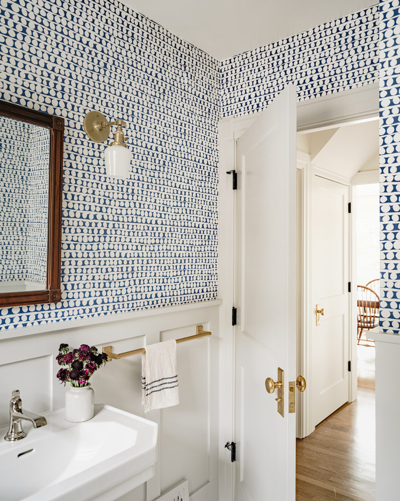
In the aforementioned powder room, Day got rid of the clawfoot tub to create more space, and added paneling plus whimsical Rebecca Atwood wallpaper found by the client. In the den, she took a risk—much to one homeowner’s initial reticence—and painted the walls a moody, dark blue. (It’s Farrow & Ball Railings custom-blended to be 50% darker.) But it paid off: That cozy library and TV room is now the homeowners’ favorite room.
The best part is to hear them describe how their house now feels the way it always should have been. “That’s always what I’m trying to aim for,” Day says.

Kara Mercer

Kara Mercer
To keep the home timeless yet functional while the couple continues to age in place, the final touch was to transform the downstairs basement from a former kids’ hangout into a space the couple could use for guests or rent down the road. Here, Day stayed with the original industrial vision: She added an exposed steel beam to open up the structure and create space for a kitchen. A local company, Deco-Pour, poured a thin polishable concrete overlay to the existing slab (it was originally only 2 inches thick) that added about a half-inch of floor.
The countertops are made from the leftover soapstone and the cabinets are painted the same blue as is in the den. But instead of utilizing the walnut wood, Day went lighter and crafted floating shelves from white oak and paired them with a table and chairs that the client found on secondhand marketplace OfferUp.

Kara Mercer
With the overall goal to give the clients a better-functioning space that could accommodate their future life stages and not require yet another redo, the clients are already putting Day’s work to good use. When their daughter graduated from college, she utilized the downstairs basement as a transitional apartment for a few months.
“That’s what I’m always trying to make sure on any project,” Day says. To create “a house that they can grow with.”
Read the Current Issue Here!
Get one year of Sunset—and all kinds of bonuses—for just $29.95. Subscribe now!
