
These Paint Colors Will Be Trending in 2024
New neutrals, shades of blue, moody hues, and more.

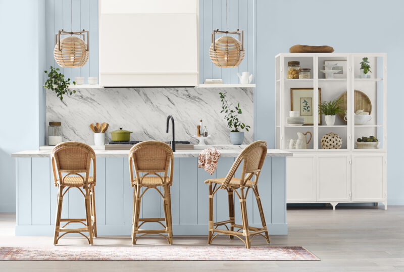
Courtesy of Behr
It’s that time where we’re looking ahead to see what’s in store, trend-wise, for 2024. And on the design front, many paint brands have already made their predictions. Like Pantone’s Color of the Year, the color picks by paint brands can give us a clue as to not only what will be gracing people’s walls in the new year, but also what trending hues we might see in furniture, textiles, and accessories.
For 2024, expect to see a lot of blue, from an ethereal blue-violet to a serene and steely blue to a bright and breezy shade. There’s also some deep, dark hues to create cozy rooms. And there’s plenty of “new” neutrals to consider and possibly give gray a run for its money. See all the paint colors for yourself below.
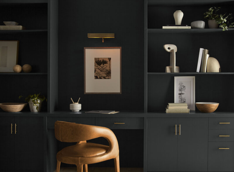

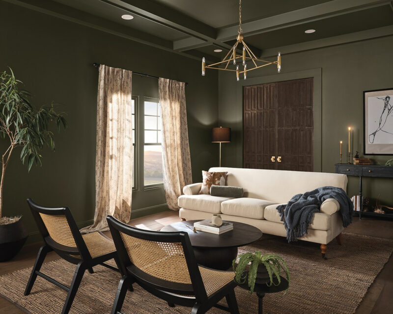
Cracked Pepper PPU18-01 by Behr
Cracked Pepper isn’t your usual pitch-black hue—in fact, it’s a soft black that feels pretty warm. Research conducted by Behr found that more than half (54%) of Americans say black tones in the home “create a new energy/vibe.” And more than half of millennials (61%) believe black tones “instantly give the home a fresh look.”
And the folks at Behr think that the bold color can help people express themselves confidently. “As we look into 2024, creating a sense of comfort and belonging will continue to drive design decisions—but now, as life returns to its more familiar rhythms, it’s time to allow our senses to come alive,” Erika Woelfel, Vice President of Color and Creative Services at Behr Paint Company said in a press release. “From heightening the aromas of a dining room to feeling the softness of a living area, Cracked Pepper enhances the natural expression in any space.”
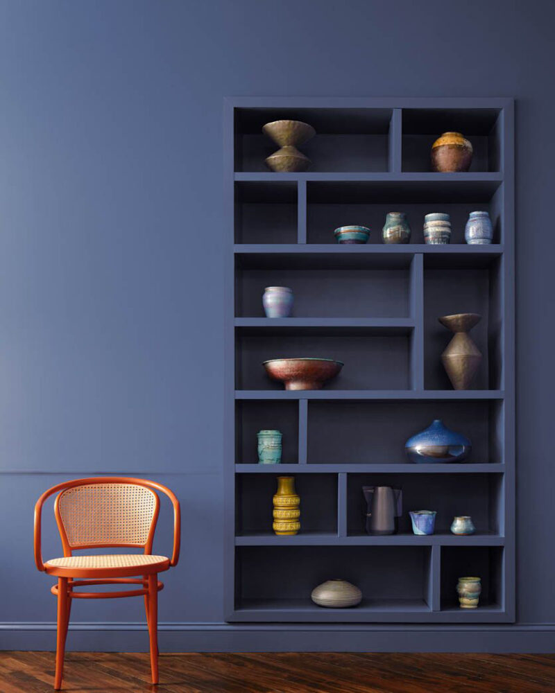

Blue Nova 825 by Benjamin Moore
Benjamin Moore’s color of the year is otherworldly. The paint brand describes the blue-violet hue as inspired by the brilliance of a new star formed in space, and the Benjamin Moore team believes it will spark new adventures and experiences. The color goes along with the company’s Color Trends 2024 Palette, which includes softly saturated hues, like a clean and classic white, a pink-coral mix, a deep pine green, and a violet with a hint of gray.
“Blue Nova 825 is an alluring mid-tone that balances depth and intrigue with classic appeal and reassurance,” said Andrea Magno, Color Marketing & Development Director at Benjamin Moore, in a press release. “The Color Trends 2024 palette tells a story of duality—juxtaposing light against dark, warm and cool, showcasing complementary and contrasting color pairings. These contrasts invite us to break away from the ordinary to explore new places and collect color memories that shape the hues used in our homes.”
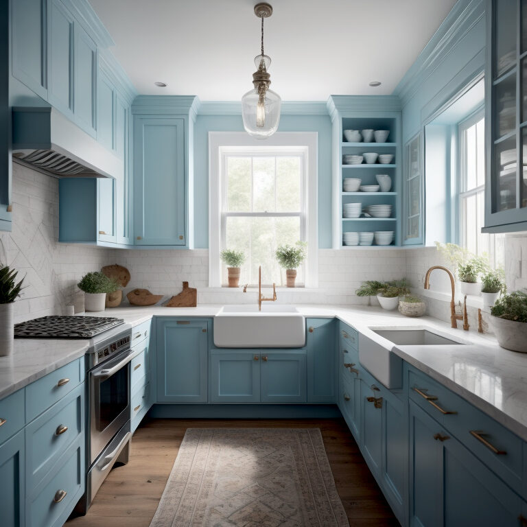

C2 Thermal #752 by C2 Paint
This bright blue is C2 Paint’s pick for 2024, and it’s described as both invigorating and calming. “C2 Thermal reminds us of a vast blue sky and the infinite array of blue hues nature offers to help restore and redefine our mood. This bespoke pale yet punchy blue is poised for adventure and brimming with hope, evoking feelings of loyalty, trust, and confidence. Its contradictory nature has the dual ability to uplift us and provide a sense of calm and tranquility,” said Philippa Radon, Interior Designer and C2 Paint Color Specialist.
C2 also introduced two additional complimentary hues to go with Thermal—Brulee #546 (a soft apricot with honeyed vanilla) and Marshland #918 (a mid-olive green). “Color is never seen in isolation,” Radon explains. “Just look out the window and see how many colors interact with each other. Our annual capsule tells a story where our colors become the characters: the lead being Thermal, with Brulee and Marshland as support roles.”
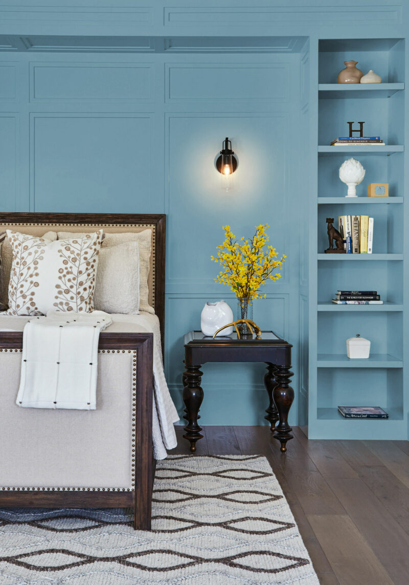

Skipping Stones (DET657) by Dunn-Edwards
Described as a “serene and steely blue with hints of green and gray,” Dunn-Edwards’ Skipping Stones is a dreamy paint color that will leave you feeling calm.
“Skipping Stones feels like a daydream and can add a sense of mystery and thoughtfulness to any space,” said DeMing Carpenter, color expert at Dunn Edwards. “It’s part of the resurgence of blue and represents a shift away from the bold, warm-toned colors we’ve seen gain popularity over the past few years. This blue is timeless and versatile, fresh and serene.”

Ironside 422-7DB by Dutch Boy
Keeping in mind the idea that the home has become a sanctuary for well-being, the team at Dutch Boy unveiled the dark olive Ironside paint hue as its color of the year. And the deep shade helps satisfy the ever-growing interest in darker, moodier colors.
“Creating a space for wellness should be a driving factor in everyday life,” said Ashley Banbury, NCIDQ and color marketing manager, Dutch Boy Paints. “That’s why taking a natural approach to healthy living and safe spaces is a pivotal part of the current landscape. Dutch Boy Paints’ 2024 One-Coat Color of the Year—the stunning, strong Ironside—incorporates all the above in one bold color and can be applied in one single coat.”

Limitless by Glidden Paint by PPG
Don’t call Limitless yellow—consider it a new, modern neutral. The honey beige color is a warm color that goes with just about any design style, works in any space, and complements both warm and cool tones.
And classic, go-to gray has met its match with Limitless, according to the team at Glidden. “This modern neutral is as adaptable as its name implies and is taking the place of cool neutral tones that are so last year,” Ashley McCollum, PPG Color Expert, Glidden Brand, said. “With the selection of Limitless, gray is officially cancelled. What can we say—warm neutrals just hit different.”
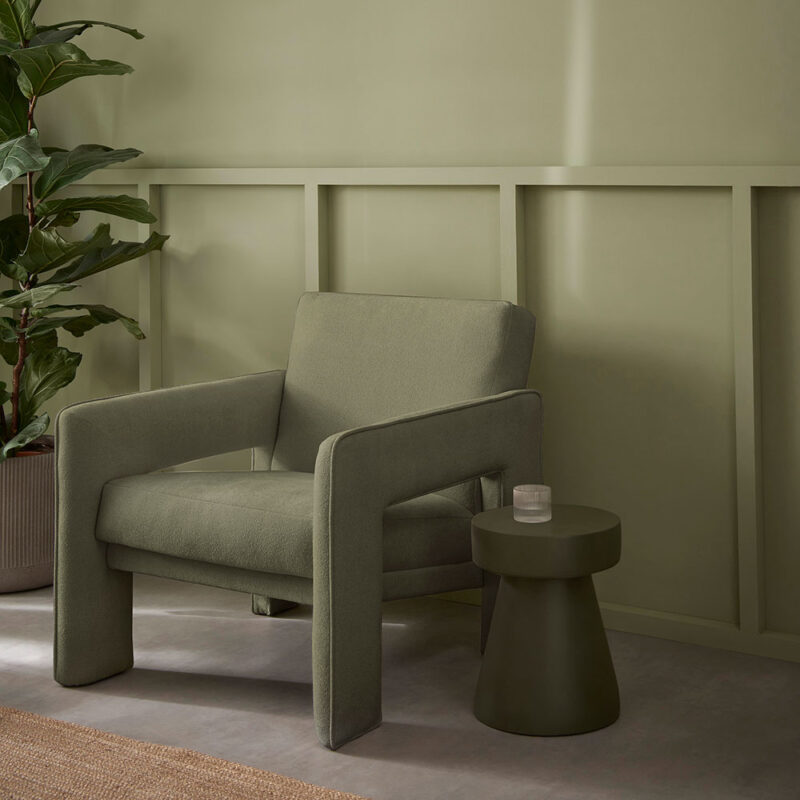

Viridis by Graham & Brown
Graham & Brown’s pick is a muted green color that was selected as the color partner to the company’s design of the year for wallpapers and murals, New Eden Emerald, a dramatic forestscape design featuring exotic bird life and rocky terrain.
The shade is versatile and natural, making it another “new” neutral pick that can stand in place of grays and grieges. “Viridis, a soothing mid-green hue, reflects harmony and stability, enabling those in its vicinity to relax and revitalize,” explained Graham & Brown’s Head of Design Maryanne Cartwright. “Viridis is the color of growth and health, mirroring nature and expressing renewal and life. It evokes a feeling of abundance and a plentiful environment whilst simultaneously providing a restful and secure feeling. We see our homes as a haven, a place to spend time with family and friends, and this is the perfect hue to create a welcoming color palette.”
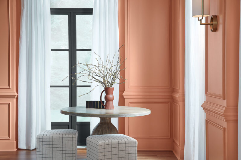

Persimmon HGSW6339 by HGTV Home by Sherwin-Williams
Persimmon is an earthy and warm terracotta shade that’s also uplifting and energizing. It’s part of HGTV Home by Sherwin-Williams’ 2024 Color Collection of the Year, Renewed Comfort, which is a set of comfortable, soft, and gently vibrant shades (like a dark red with warm undertones, crisp white with hints of beige, and pastel blue with cool tones).
“Persimmon balances the energy of tangerine with grounded neutral undertones, making it perfect for spaces like living rooms and kitchens as it promotes positive relationships and conversation. The beautiful shade helps rejuvenate a space while bringing unique design visions to life,” said HGTV Home by Sherwin-Williams Color Marketing Manager, Ashley Banbury.

Upward SW 6239 by Sherwin-Williams
With a name like “Upward,” this paint color was made to inspire you to look forward. The blue shade is breezy, happy, and calming—and don’t we all need something a little light and uplifting these days?
“Upward SW 6239 represents the gentle forward momentum in all of our lives,” said Sue Wadden, Director of Color Marketing at Sherwin-Williams. “It brings to life that carefree, sunny-day energy that elicits a notion of contentment and peace. With this color, we invite our consumers to take a pause and infuse a new sense of ease and possibility into their spaces—one that doesn’t overwhelm, but rather establishes meditation and tranquility.”
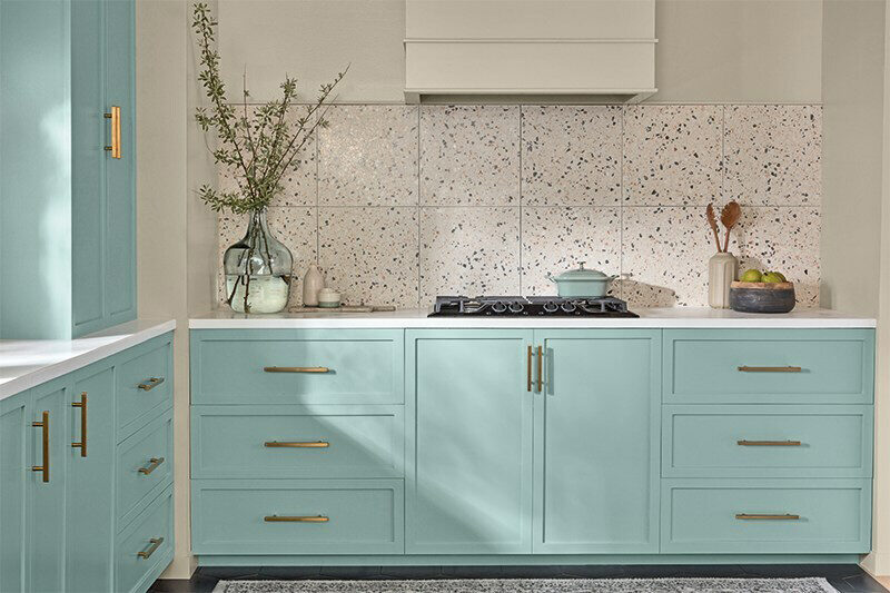

Renew Blue (8003-37D) by Valspar
The color experts at Valspar chose Renew Blue, a blue with a touch of grayed sea-green, with the idea that homeowners want to make their spaces a place to recharge, relax, and entertain.
“Renew Blue is an incredibly versatile and all-season shade that anyone can envision in their space. Inspired by fleeting elements like fog, mist, clouds, and glacier lakes, Renew Blue elevates the everyday mood, encourages self-expression, and evokes a feeling of balance and calm, with a twist of unique spontaneity,” said Sue Kim, Valspar Director of Color Marketing. “Blue is a classic shade that has become the new neutral for today’s home and can be mixed and matched to fit a variety of design styles and applications.”
