
Move Over, Color-Drenching—This New Paint Trend Is Going to Be Everywhere in 2026
Plus, how to get the look at home.
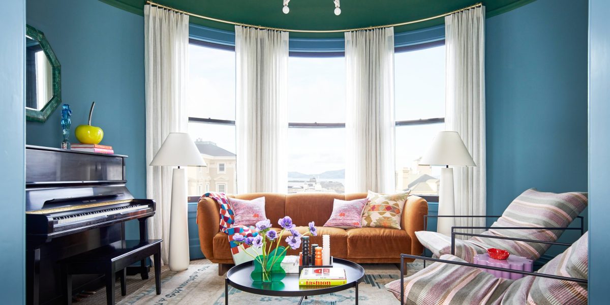
Design by Studio Munroe; Photo by Thomas Kuoh Photography
The secret’s out: In the interior design space, color is so in. Some people may prefer to drench their spaces in a punchy pigment—and others might prefer the unexpected shock of dopamine decor and primary shades—but if you want to stay ahead of the color curve? Meet color-capping, the next big paint trend.
Unlike color-drenching, which washes a room in the same hue, capping is where certain elements like the ceiling, trim, and door are swathed in a separate shade.
“It is essentially the use of color scales,” explains Ruth Mottershead, creative director of Little Greene. “To envelop a space, taking colors of different strengths from the same color family across all elements, ceilings, walls, and woodwork to envelop a space in tonal color.”
The beauty of color-capping lies in its versatility. Mottershead says the trend can be applied to virtually any interior, from period properties to newer builds, and practically every aesthetic. While “traditional” color-capping has a more tonal approach—Mottershead is a big fan of using similar shades such as Little Greene’s Royal Navy, Dock Blue, and Smalt—you better believe West Coast designers are giving this trend their own spin.
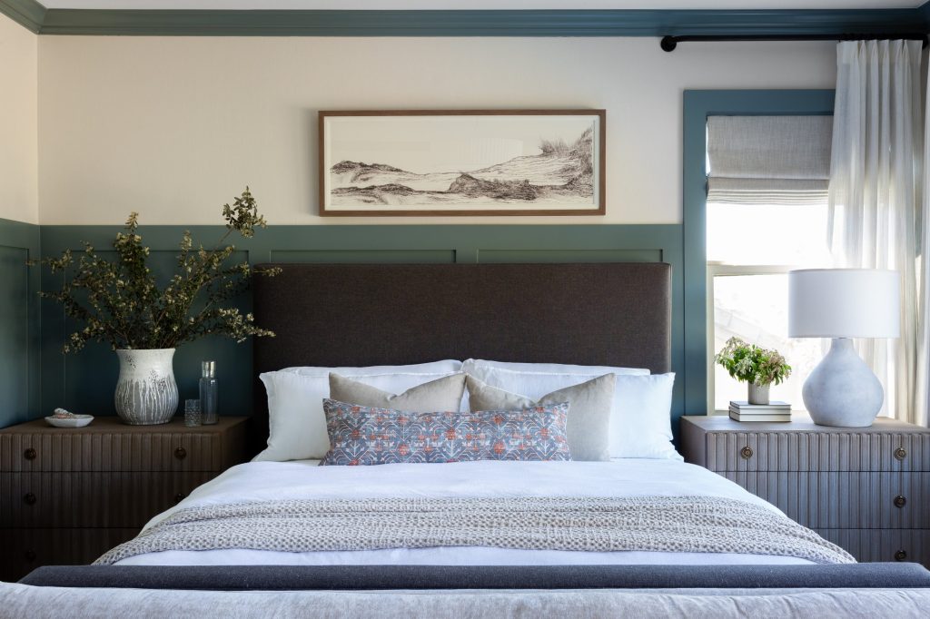
Design by Lindsey Brooke Design; Photo by Amy Bartlam
Take Lindsey Brooke, a Southern California designer who’s using this trend to apply calculated pops of color. “It adds depth and personality without overwhelming the room,” she explains. “It’s a way to be a little braver with color while still feeling safe.” Brooke likes to create synergy between her color palette and a home’s architecture, so intentionality is key.
“People want their homes to feel considered, but not overwhelming, and color-capping hits that balance,” the designer explains. Not only does she opt for “rich, muted tones”—soft charcoal, warm greige, dusty olive, and blue are all fair game—but she treats these accents as more than a decorative stripe.
“When the line hits at an awkward height or the color feels too sharp or high-contrast, it can look busy or accidental,” Brooke says. “The best way to avoid that is to think about proportion first, where the room wants the line to land and choose a color that feels grounded and connected to the rest of the space.” The result? A colorful room that’s also timeless and tailored.
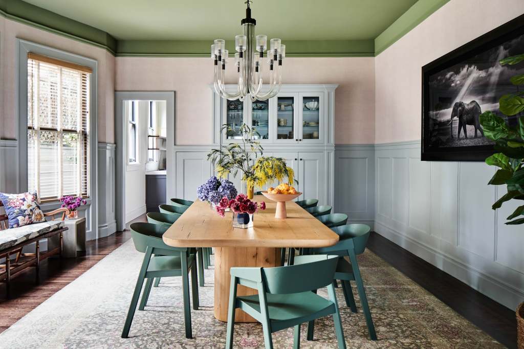
Design by Studio Munroe; Photo by Thomas Kuoh Photography
Some designers prefer to practice restraint, but if you want to go for the bold? Take a cue from San Francisco designer Emilie Munroe, who uses color-capping as a masterclass in joy-sparking design. “It is more elegant and whimsical than a full drench as you utilize coloration on separate surfaces, creating balance and nuance,” she says.
Instead of capping a room in one, tonal color, Munroe prefers a mélange of statement-making shades. It’s that unexpected palette that creates a huge visual impact—one that’s far better than an accent wall, which Munroe calls uninteresting and lacking intention. “Color-capping is an economical and unique wow factor for the win,” she adds.
When incorporating shades into your color-capping, there’s a fine line that separates a space that’s cool and one that’s chaotic. The secret to bridging the gap, Munroe says, lies below. “The ceiling acts as a direct balance of the floor,” she explains. “Selecting an appropriate color is straightforward, as you will draw from a highlight color on a floor covering or larger upholstered item.”
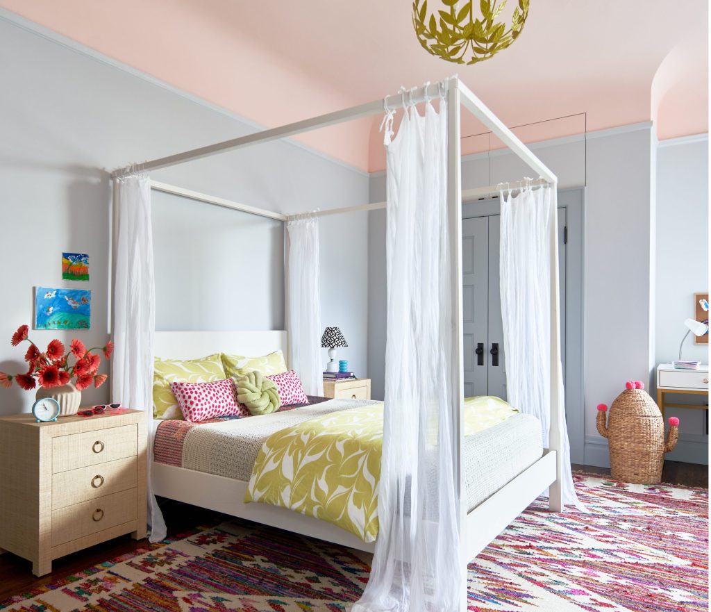
Design by Studio Munroe; Photo by Thomas Kuoh Photography
If you want to embrace color-capping to its fullest, Mottershead has one rule: If you can, please avoid stark white surfaces. “They will interrupt the use of color, drawing the eye and limiting the enveloping feeling these creative design schemes deliver,” she says.
Otherwise? Consider this your cue to embrace color, whether you opt for a careful assortment of shades or a full-fledged rainbow.
