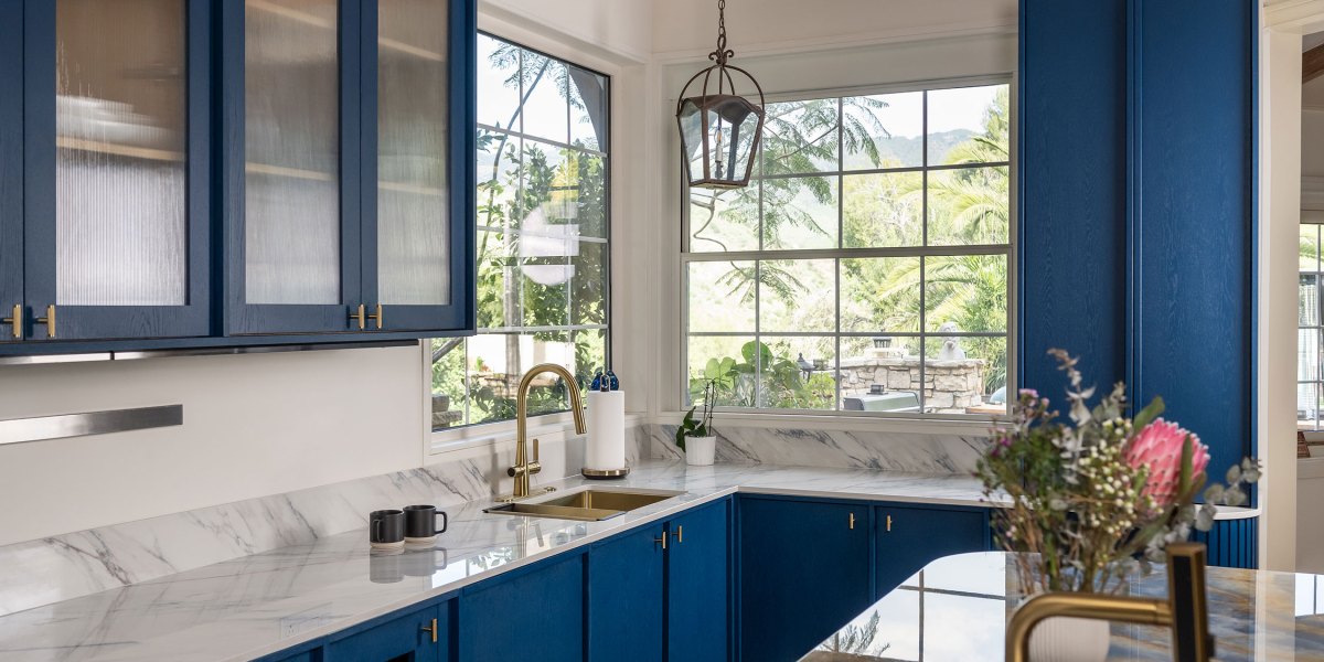
This Kitchen Went from a Big Pain Point to a Bright and Welcoming Family Hangout
It had a whole host of issues.
Lauren Andersen/SEN Creative
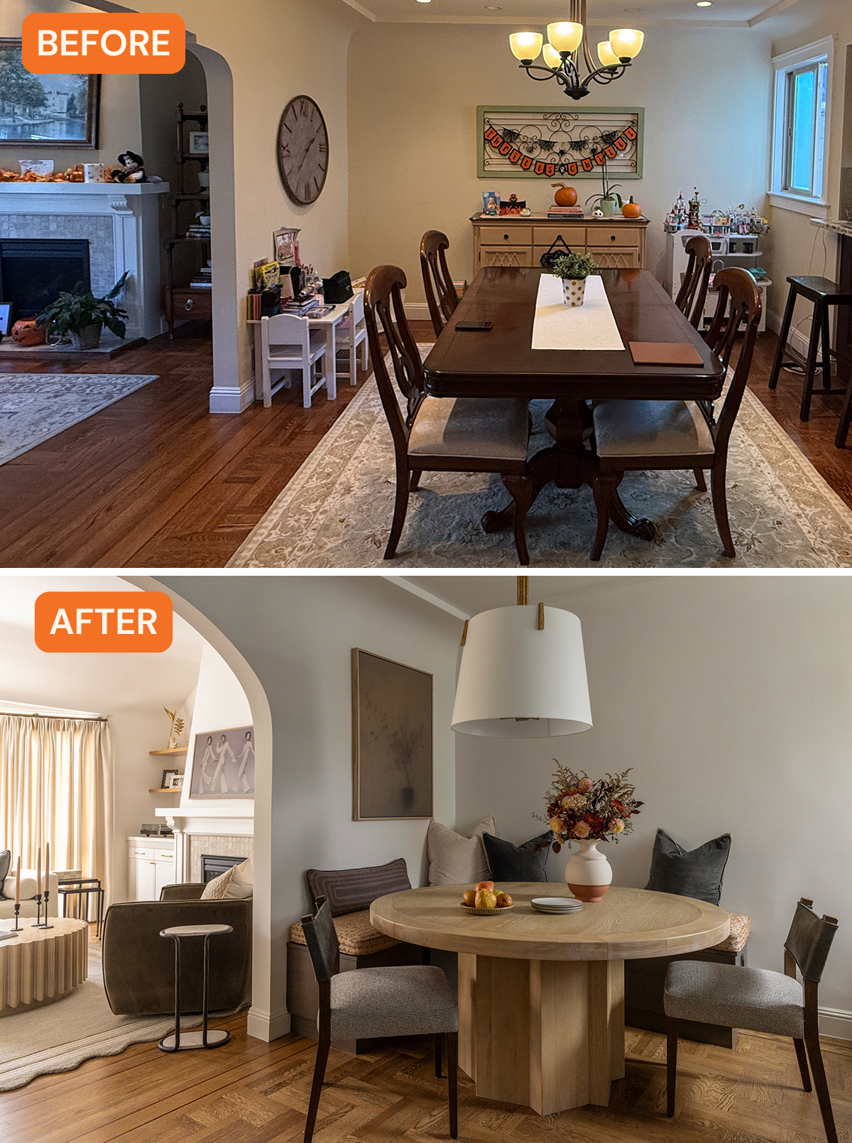
A 2,300-square-foot San Francisco home with four bedrooms and four-and-half-bathrooms was charming yet dated all over, but the biggest pain point was its kitchen. Interior designer Gina Gutierrez of Gina Rachelle Design says it had a collection of compounding issues.
Lauren Andersen/SEN Creative
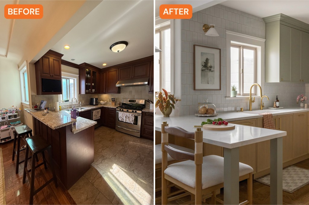
First, the layout was a standard U-shape with limited counter space, not ideal for the homeowners—Stephanie and Paul Johnson—who love to entertain and cook.
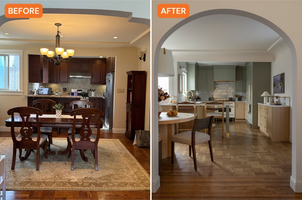
“The kitchen and dining room were essentially divided into two separate, disconnected areas, and the entryways into both spaces felt closed off, which made the whole zone darker and more confined than it needed to be,” Gina says. “An oversized refrigerator was eating up usable real estate, and an oversized sideboard in the dining room was blocking circulation.”
Lauren Andersen/SEN Creative
More Videos From Sunset
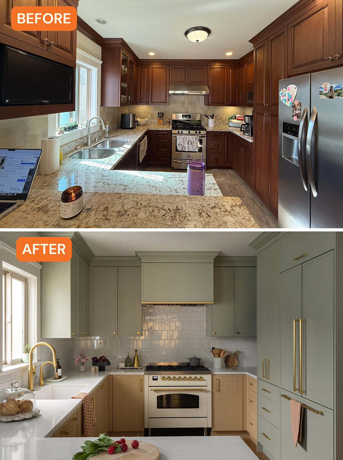
Second, storage was limited. There was no dedicated pantry, the cabinetry was dark and traditional, and there wasn’t a good place to put kitchen essentials like a coffee maker, cutting boards, or countertop appliances. Additionally, the lighting placement was ineffective, the appliances were outdated, there weren’t enough outlets, and the flooring was mismatched.
Lastly, and most importantly, the space did not feel like the homeowners (who also have a young daughter, Phoebe). It wasn’t their style at all.
Lauren Andersen/SEN Creative
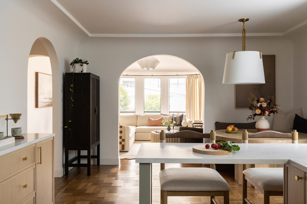
“They’re a family that really lives in their home—they love watching TV together, doing arts and crafts, playing board games, and hosting friends and family for dinners and social evenings,” Gina explains. “They’re active in their community, involved in Phoebe’s school, and the kind of people who love a good concert or live event on the weekends. Entertaining was a big part of who they are, and they were eager to have a space that finally reflected that.”
Lauren Andersen/SEN Creative
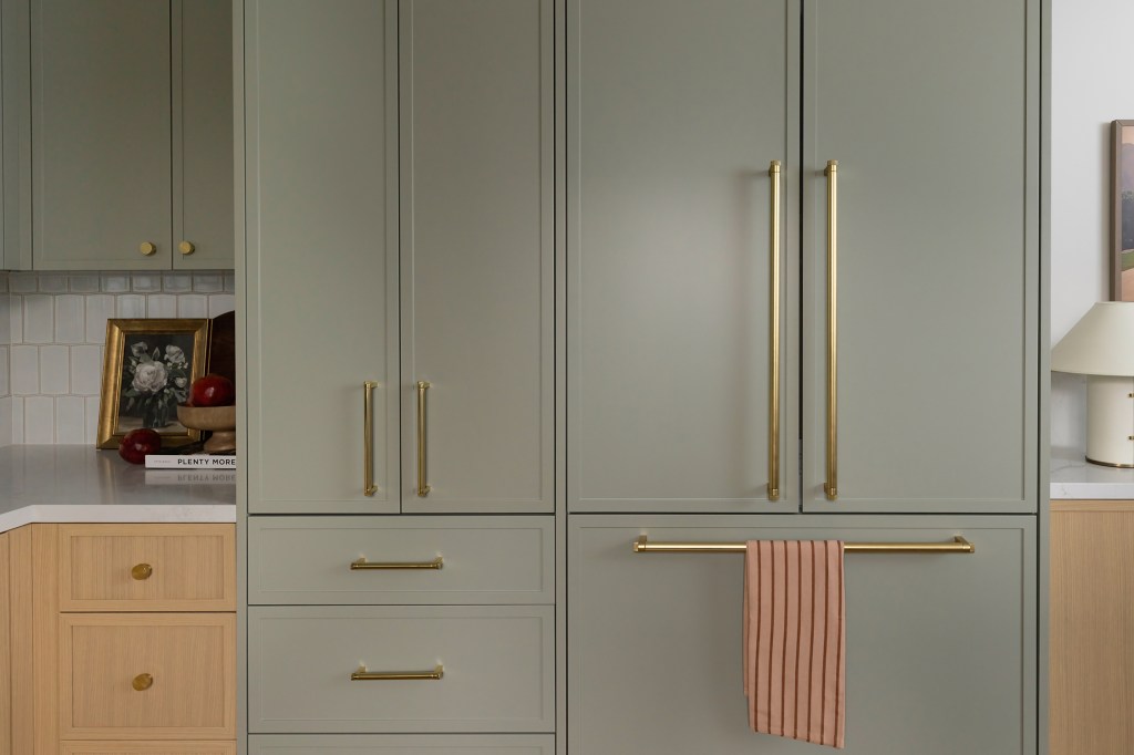
The overarching goal, Gina says, was a hipper, fresher aesthetic that reflected their personality—traditional touches with modern flair. The space needed to be more functional and since the kitchen and dining room were open-concept, they wanted the areas to feel connected.
Lauren Andersen/SEN Creative
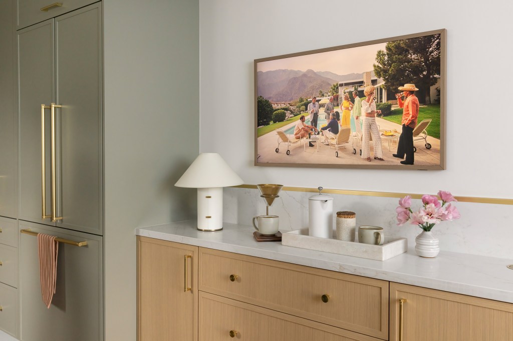
“On the practical side, the wishlist was detailed and well-considered,” Gina says. “They wanted taller cabinetry to maximize storage, corner pull-outs with no wasted dead space, a panel-ready refrigerator that would blend seamlessly into the cabinetry, and a 36-inch range that could serve as a true focal point—one capable of serious cooking, from weeknight dinners to weekend flapjacks and grilled burgers. Consistent flooring throughout to tie the spaces together was also on the list, along with more electrical outlets, a larger sink, a better dishwasher, and an ice maker built into the refrigerator.”
Lauren Andersen/SEN Creative
Also on the wishlist was a dedicated coffee bar storage for wine glasses and bottles, beverage drawers, hidden storage underneath the banquette, and a spot for a flat-screen TV near the banquette.
Gina and her team presented Stephanie and Paul two different design concepts: one with softer elements like lighter cabinetry and an airy palette, and the other with darker tones, heavier patterns, and edgier lighting and details. The Johnsons chose a blend of the two.
Lauren Andersen/SEN Creative
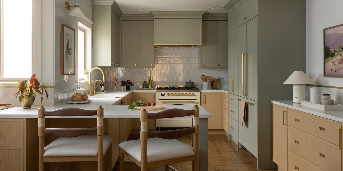
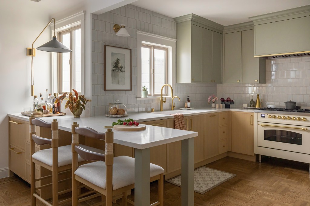
“The result is a kitchen that’s layered and full of personality—black accents paired with brass finishes for contrast and sophistication, oak elements and green tones for warmth, and that bold-yet-grounded feel,” Gina says “It hits a balance that we’re really proud of: bold, warm, vibrant, and timeless all at once.”
Gina and team opened up the area between the dining room and kitchen, which created a taller, more expansive feeling. They removed one blank wall for a full wall of cabinetry and storage.
Lauren Andersen/SEN Creative
“The cabinetry itself was a major upgrade—taller, lighter, and packed with thoughtful details,” Gina adds. “Functional corner pull-outs eliminated all the wasted dead space. We added specialty drawers for arts and crafts supplies, a built-in spice drawer, cutting board storage, and dedicated space for countertop appliances to disappear when not in use. The pantry was completely reorganized.”
The outdated appliances were swapped in for a panel-ready refrigerator with a built-in ice maker and water filtration system, a 36-inch range with a center griddle, a statement range hood, and a better dishwasher. Other new features include a larger sink, countertops, backsplash, and recessed can lighting on dimmers. There’s also a full wine and bar station and a peninsula with two bar stools.
Lauren Andersen/SEN Creative
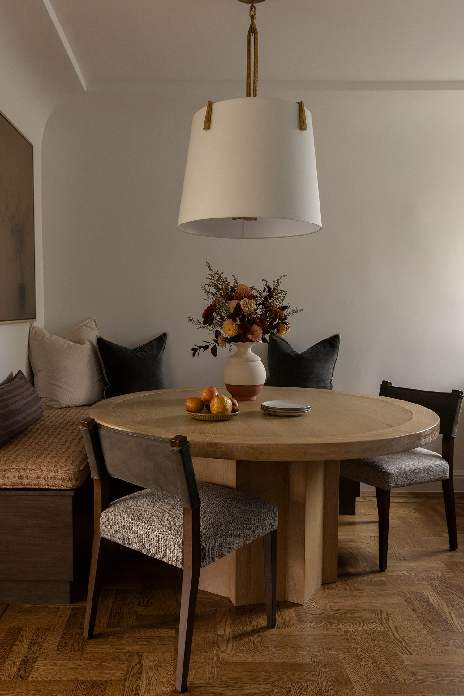
The highlight of the space, though, is the custom dining banquette which can seat up to eight people and includes the hidden storage that was on the couple’s wishlist. It’s accompanied by a 60-inch dining table with two additional chairs. The whole area can accommodate 12 people.
“The result is a truly multifunctional family space where cooking, homework, entertaining, and everyday life can all happen at once—comfortably and beautifully,” Gina says.
And the homeowners agree, saying the kitchen and dining room went from a dark, dated, and disconnected area to a bright, cohesive, modern family and entertaining space. They add that it feels warm and welcoming, and better suited to their lifestyle and personality.
The Latest