
The Smart Details That Turned This Kitchen into a Family-Friendly Space
A strategic layout makes all the difference.

Christopher Lee Foto
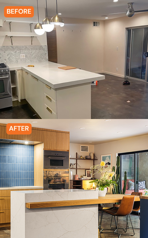
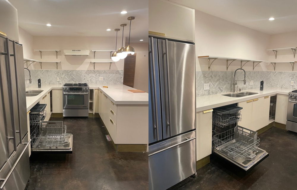
The kitchen in a three-bedroom, two-bathroom house in the Silver Lake neighborhood of Los Angeles had been remodeled a few years ago, but it was in need of a revamp for a growing family. “My clients, Nat and Jonny, reached out to me at the end of last summer to request a design consultation for their kitchen in a relatively new house that they had purchased,” explains interior designer Kevin Grace. “They had recently adopted a beautiful baby girl and wanted to make the kitchen more user-friendly and safer for the ‘soon-to-be’ growing child.”
Christopher Lee Foto
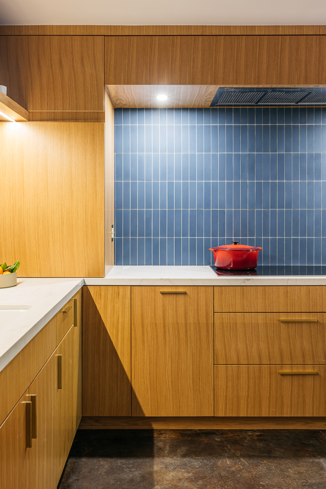
Kevin and his clients realized that the kitchen would be more functional if they changed its footprint and gave it a warmer, more modern look. Nat and Jonny had “storyboards” that had a modern Swedish and mid-century feel, which Kevin says made more sense with the style of the house.
Christopher Lee Foto
Christopher Lee Foto
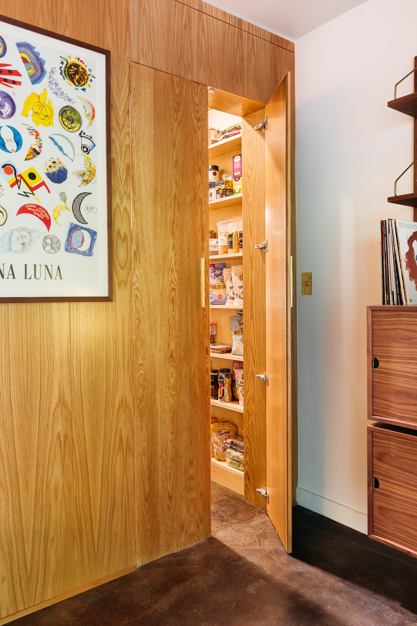
The main goal was to open up the space and add a lot more storage since the original design had no upper cabinets and just a small pantry behind the stove wall. “We wanted to remove the connected island and design one that sat in the middle of the room that had a floating table for dinner and feedings,” Kevin explains. “This allowed us to expand the stove wall by another 4 feet, making the stove more centered to the room and adding more square footage to the pantry. We extended the custom wood from the cabinets around the corner and onto the opening of the panty to conceal it from the rest of the space.” The pantry is now nearly double in size with recessed lighting and custom shelving.
Christopher Lee Foto
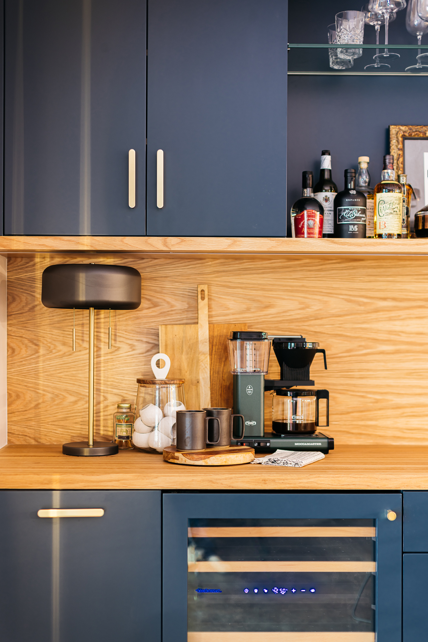
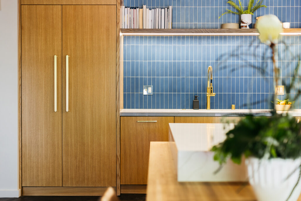
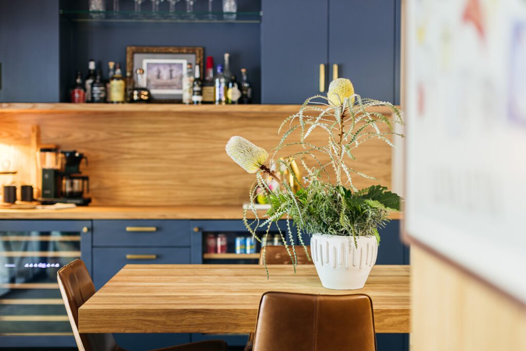
Kevin and team also created a “coffee/bar” station in a wall space that originally housed metal bakers’ racks. “We were able to not only create a great location to make a morning cup of coffee and cocktail, but also ensure more storage, including a wine fridge and a mini fridge for soda and mixers,” he says. “We purposely had these custom cabinets sprayed a dark blue color to play off the light blue cement tiles in the kitchen above the sink and electric stove.”
Christopher Lee Foto
Christopher Lee Foto
Now the kitchen has both plenty of personality, and most importantly, functional storage and details. The wood and hardware lend so much warmth to the space, while the blue tiles and cabinets add character and a modern touch.
Christopher Lee Foto
“Although the project took just over three months to complete, I am super proud of how everything turned out and also super proud of the patience my clients had while managing a new baby and construction. Not an easy task,” Kevin adds.
