
A Kitchen with a Closed-off Footprint Is Reimagined for a Family That Loves to Cook
The original design was somewhat modern, but dark and lacked style.

Natalia Robert
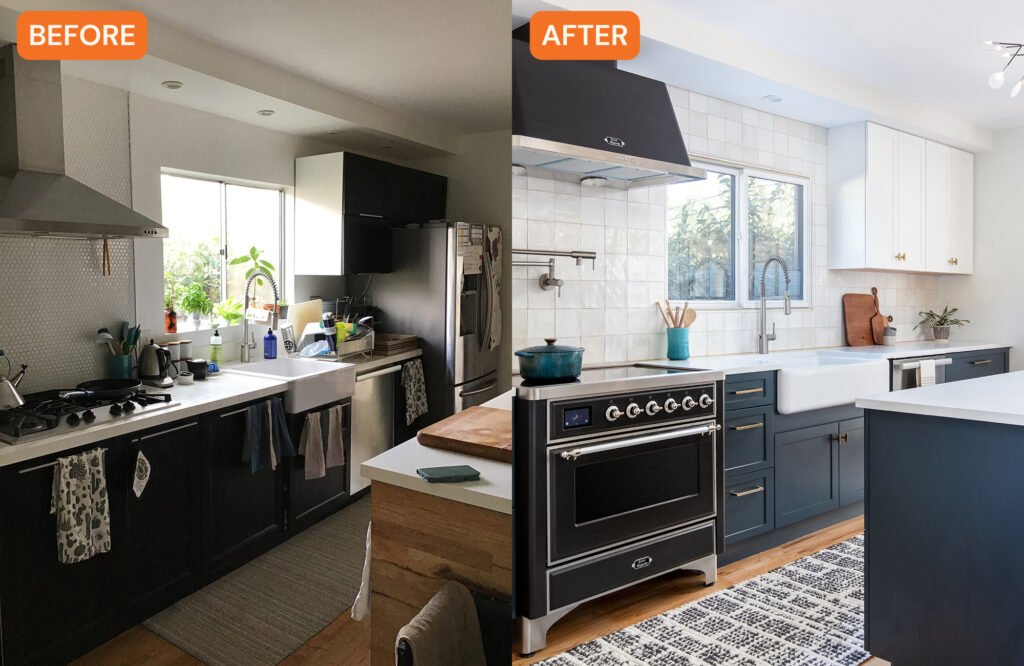
Layout and flow is so important in a kitchen, often the hub of the home where everything happens—cooking, eating, gathering, et cetera. If a space doesn’t have the best layout, it can feel cramped and inefficient. That was the case in this San Diego kitchen in a 1922 Craftsman-style house.
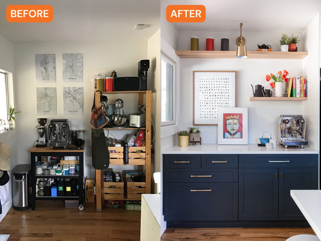
“Before the remodel, the kitchen felt closed off from the rest of the home due to the tight walkway into the space,” says Jennifer Verruto, founder and CEO of Blythe Interiors. “In addition to the disjointed flow, the kitchen’s layout wasn’t super functional—there was limited counter space and a makeshift coffee bar area that needed a lot of help.”
Natalia Robert
In addition to the layout and flow issues, while the kitchen was somewhat modern, it felt dark and didn’t have a lot of style. Jennifer says there was no “wow factor”—the space needed some personality and charm.
Jennifer’s clients wanted a sleek and modern design that had color and personality. They also wanted to incorporate some mid-century modern design details, but still keep some of the home’s original Craftsman charm.
Natalia Robert
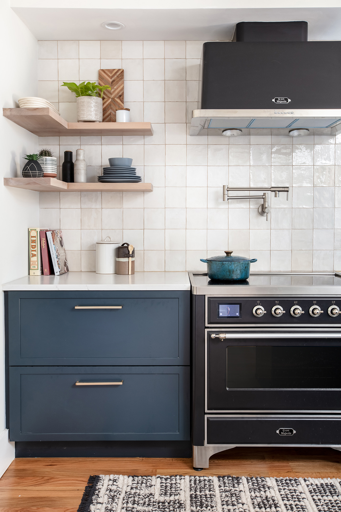
“They love to cook, so we needed to rework the kitchen footprint and create a smarter use of the space that included extra counter space and plenty of added storage for their large coffee and tea collection,” Jennifer adds.
To get started, the Blythe Interiors team expanded the tight walkway into the kitchen, which created a better flow in the home overall and added tons of natural light.
Natalia Robert
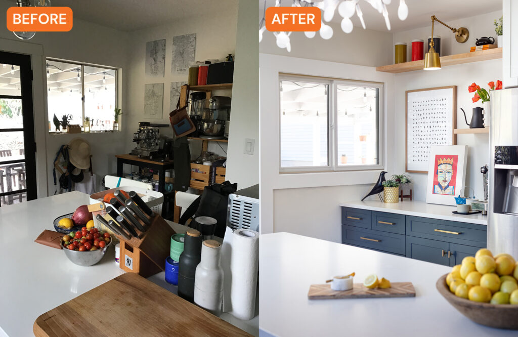
“We also reworked the kitchen’s footprint to create a smarter layout while maximizing storage space,” Jennifer says. “We removed the double stacked ovens on the left wall and replaced them with a gorgeous range and modern hood. By eliminating the stacked ovens and moving the refrigerator to the opposite side of the kitchen, we provided extra counter space that they previously didn’t have. This also freed up a lot of wall space which allowed us to feature this beautiful square artisan tile that we carried from counter to ceiling, making the space feel bigger and brighter.”
Natalia Robert
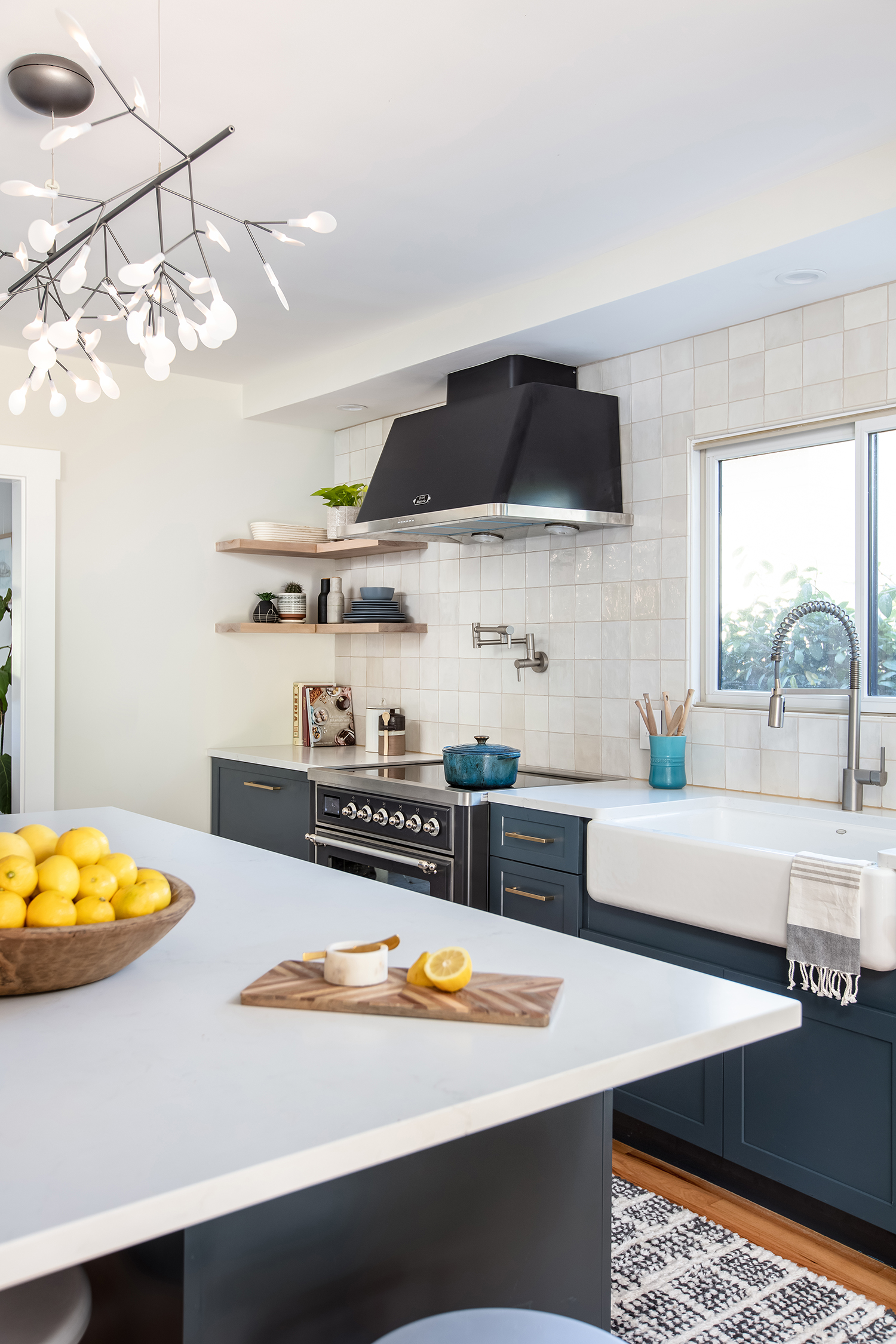
The design team painted the lower cabinets a deep blue color that added character and style, and then they balanced that richness with white upper cabinets and floating shelves for more storage and to create more visual interest. They also replaced the center island and hung a modern luxe chandelier.
Natalia Robert
“For the coffee bar niche, we added lower cabinets that offered lots of much-needed storage and organization,” Jennifer says. “To mirror the opposite wall, we used floating shelves which open up the space vertically and allow for the display of decor and accessories, adding practicality and style.”
Now the kitchen is brighter and more colorful, with efficient and functional features, perfect for home chefs. It looks modern, but doesn’t look out of place in a Craftsman-style house. “The homeowners are thrilled with the finished design and feel like it’s positively impacted their quality of life,” Jennifer adds.
