
This Is How Two Designers Got a Cramped Kitchen to Work Harder
It took some smart and creative design decisions.

Lauren Anderson/SEN Creative
When it came to the kitchen in their three-bedroom, two-bathroom 1930s San Francisco home, the owners wanted keep the current square footage and layout, but adjust the space to make it work harder for their family’s needs (they have two daughters). So they brought in Allie Allen and Sasha White of Shiny Shed Collective to oversee the renovation of the 144-square-foot L-shaped room.
Lauren Anderson/SEN Creative
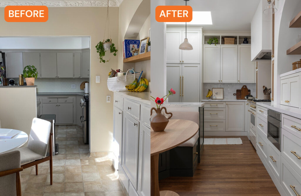
Allie and Sasha’s clients wanted to find ways to maximize storage and update dated aspects of the kitchen, like the linoleum floors and counters and the older appliances. Functionality was key since it’s a small kitchen and they love to cook.
“Our clients did not want to remove the atrium which is something we love about this renovation,” Allie says. “It’s typical to see a kitchen renovation utilize every last square foot possible to add aspects like a large standing island, but our clients wanted to optimize the available space without removing the charming central patio in the home.”
Lauren Anderson/SEN Creative
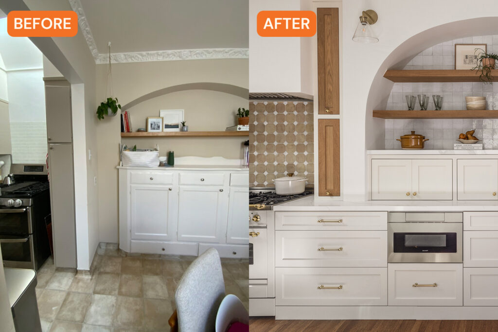
The design duo decided to extend the kitchen to the breakfast nook area in order to create a more open feel. “This would do two things. One, it would make the kitchen feel larger and less cramped,” Sasha explains. “Two, it would allow for some useful and creative design elements. Additionally, we wanted the space to feel cozy, and elevated but still like it belonged in the home. We mimicked the existing arches in the rest of the house in the kitchen and highlighted parts of the original architecture, like the bay window, by adding in a built-in banquette.”

Lauren Anderson/SEN Creative
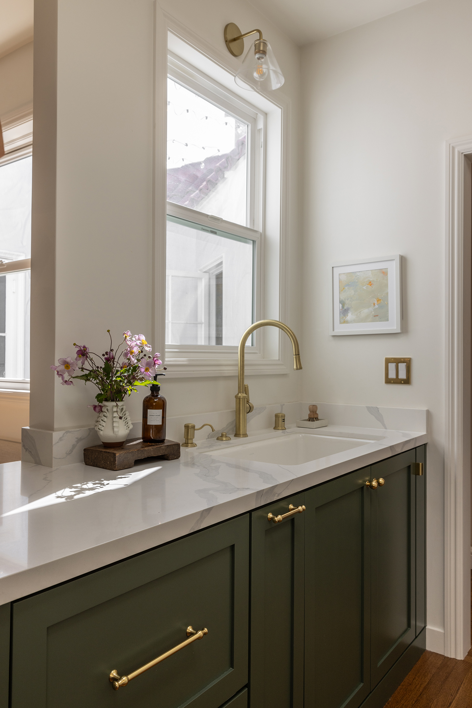
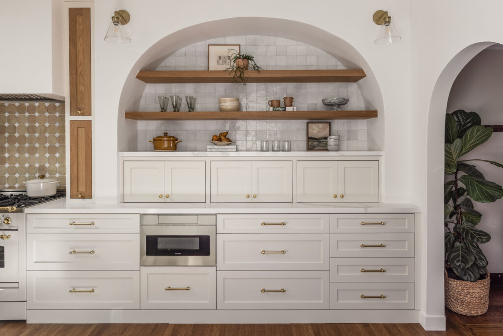
To improve functionality, they got creative and installed an appliance garage that was tailored to the clients’ everyday appliances, hidden spice racks, and a stepping stool that’s stored in a thin cabinet to the right of the sink. The stove is both a statement piece and a hardworking appliance. “The stove, which is a real showstopper, was chosen because we knew that stove wall was going to be a big design element,” says Allie. “The Italian ILVE stove has gas burners, which were important to our clients, but an electric oven. It’s a real statement in the design of the room.”
Lauren Anderson/SEN Creative
As for the design and color palette, originally the clients wanted a primarily white kitchen, but as things progressed, they became open to adding wood tones, terracotta, and some color. The addition of warmer tones and colors helped make it easier to pay homage to the home’s Spanish style, which was another goal.
“We tried to use a lot of natural materials in this space,” Sasha explains. “We worked with Amber Flooring to bring in new wood flooring in the kitchen to match the wood flooring in the rest of the home, [and] we used a mixture of zellige tiles and terracotta tiles from Tile Fever for our backsplash. We also used beautiful ceramic pendants that have a great texture to them.”
Lauren Anderson/SEN Creative
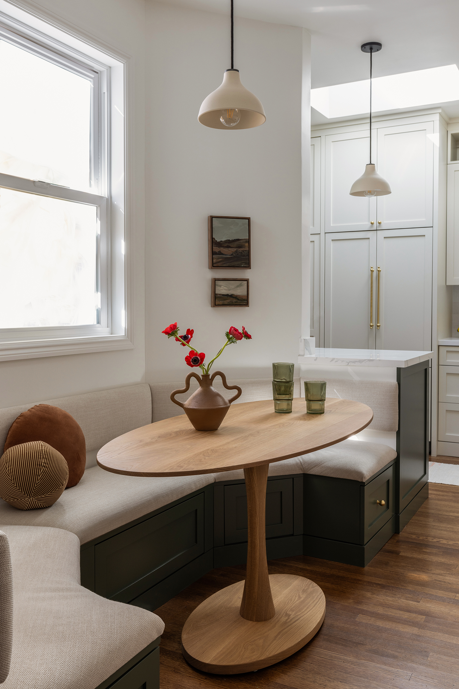
Allie and Sasha say the best update to the kitchen was what they call the “eat-in kitchen.” After opening the kitchen to the original breakfast room, they were able to create a built-in breakfast nook with a comfortable bench seat.
Lauren Anderson/SEN Creative
“Our clients are so thrilled with the kitchen and message us all the time saying how they’ve practically abandoned their dining room, opting to spend all of their family meals in the banquette in the kitchen,” Allie says. “It makes us so happy to picture their girls doing homework at the custom table we designed, while Mom and Dad are making dinner. One of our goals as a design studio is to bring joy to the everyday lives of our clients, and it’s fulfilling to know we’ve accomplished that.”
