5 Artwork Mistakes That Could Actually Make Your Home Look Cheap
Designers share their quick fixes.
Design by Kirk Riley Design; photo by Julie Mannell
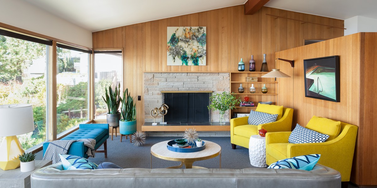
A picture’s worth a thousand words, so why not let a carefully curated selection of art do all the talking in your home? Not only can the right mix of paintings and photographs jazz up otherwise bare (and boring!) walls, but it can also pack on the personality. But beware: Though art can enhance your space, it’s possible to get it so wrong.
Half the battle is choosing the right mix of works that really speak to your style, but the other half? Well, it all lies in the details: Scale, frames, and even the right height. With any of these common mistakes, even world-renowned art can look cheap. Don’t worry, the pros are here to help. Below, a handful of designers are sharing their biggest art faux pas—and their simple fixes. That way, your beloved artwork can render you (and your guests) speechless.
1. Choosing Mainstream “Masterpieces”
Design by Courtney B. Smith; photo by Bess Friday
Great art should reflect your taste, not be a dead-ringer for something your neighbor, in-laws, and cousin also have in their spaces. “Designing your home can fall flat if the art is a repeat of what we see in big-box stores,” says Sandy Baisley, co-owner and principal designer of Re-Find in Boulder, Colorado. “To mass-produce art and sell it at a low price point, something has to be compromised, and we typically see printing quality and materials integrity suffer as a result.”
Baisley particularly draws the line at word art, which typically veers into tacky territory. “Labeling a room with a sign is a bit bizarre for your home,” she says. “We know the bathroom is a bathroom. Go for chic, and drop the shabby, please.”
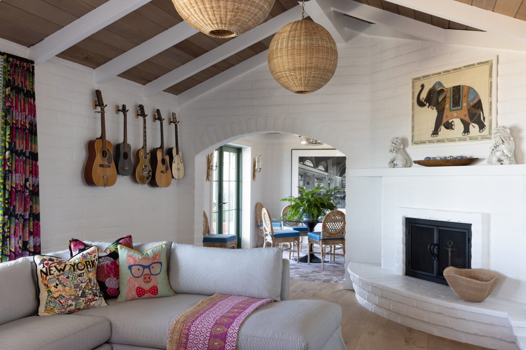
Sidestep the big-box retailers and look for pieces at antique stores or local art fairs, which are rife with one-of-a-kind works. “Meaningful textiles or objects help convey a home’s narrative,” shares Courtney B. Smith, an interior designer who splits her time between Marin County in Northern California and Massachusetts. “We framed a vintage Asian elephant textile, embraced a guitar collection as art, and installed an African juju hat in this project (pictured above)—reflecting a family who travels extensively, loves music, and embraces culture and connection.”
For a virtually free piece, bust out the supplies, ask the little one in your life to create their own masterpiece, and put it in a chic frame.
2. Frame Fumble
Design by Re-Find; photo by Syd Fuller
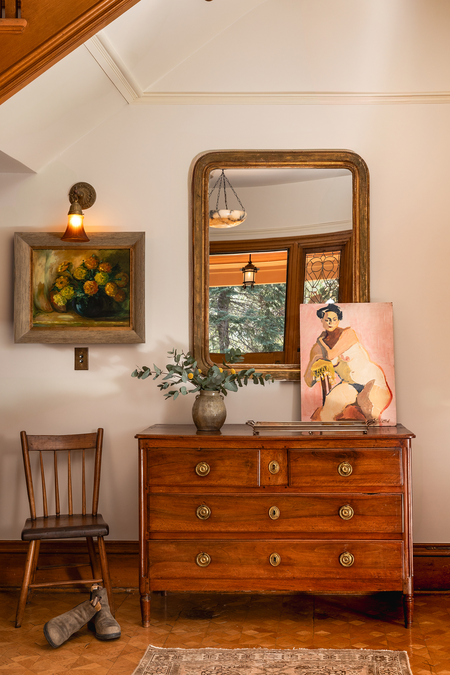
While we’re on the subject, let’s talk about your frames. Designers insist you don’t need to spend top dollar on your frames, but you shouldn’t skimp on quality, either. “A poorly chosen frame can make even beautiful artwork feel disconnected or dated,” says designer Meridith Baer, who services Northern and Southern California. “It should complement both the piece and the overall aesthetic of the space.”
Natasia Smith, co-owner of Re-Find, says materials matter. A high-end wooden frame you spotted at a vintage store will usually have more staying power than a plastic one you found online. And, like most home decor, a frame can be DIY-ed to your liking. “Sometimes you can just replace the glass, swap out the matting, or find a great vintage frame,” Smith says. “Your local framer can be a wonderful resource for advice and material sourcing.”
3. Sloppy Scale
Design by Shweta Pathak/House of Suris; photo by Taylor Roberts
When it comes to selecting art, size matters. “It’s easy to collect smaller art pieces from galleries or travels, but too many small pieces can lose their impact,” says Heather Kirk, founder of Kirk Riley Design in Seattle. “A dramatic piece, properly scaled for the room, gives the space a more elevated and collected look.” For Kirk, the right size is a happy medium: It fits the wall well, but allows enough of the wall to show for “breathing room.”
When in doubt, Shweta Pathak of House of Suris says to avoid pint-sized prints and photographs. “A tiny piece floating on a large wall can diminish the architectural presence of the space and create visual imbalance,” explains the Seattle-based designer. “When in doubt, larger-scale artwork almost always creates a more elevated and intentional look.”
4. Improper Heights
Design by Peggy Haddad; photo by Amanda Proudfit
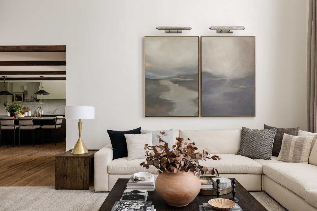
“Most homeowners hang art too high, and it’s something I notice right away and can ruin a room for me,” says Peggy Haddad, an interior designer based in Denver, Colorado. To have your artwork seamlessly blend in with the rest of the room, hang your pieces about 60 inches above the finished floor, which is what Kira Young of High Tide Design in San Diego says is standard for eye level.
The exception, however, is when you’re hanging art above furniture or a mantel. In that case, Haddad recommends hanging your pieces about four to six inches above your furniture.
5. Jumbled Gallery Wall
Design by Re-Find; photo by Syd Fuller
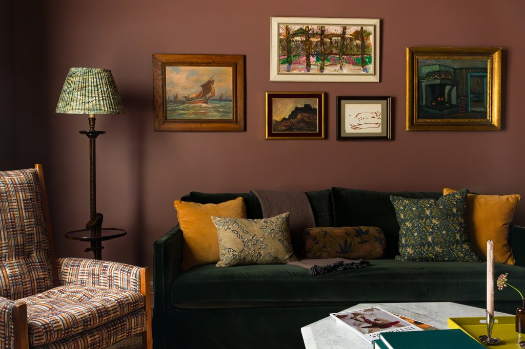
Though a gallery wall can bring some personality to your walls, Baisley says it can read hodgepodge. “The ‘hang and pray’ method is not something we suggest,” she adds. The magic, Baisley and Smith explain, rests in coming up with a plan. “Tape out the boundaries of your hanging space on the floor and arrange your pieces within it before making any holes in the wall,” Smith recommends.