A Landscape Designer’s Tips for Creating an All-Seasons Outdoor Living Room
This Seattle entryway by landscaper Scot Eckley shows how you can create a multi-functional patio no matter the size of your outdoor space.

Miranda Estes
If you ask landscape designer Scot Eckley to point to his best work, the small garden courtyard with outdoor living space that he created for one Seattle couple is it.
“This is a little garden where every decision counts,” says Eckley, noting he’s so proud of it he brings new employees to check it out. “It’s a garden where we have multifunctional spaces, and no detail wasn’t considered. It’s just really thoughtful and cohesive.”
The clients, Yann and Angie Christensen, a software architect and a crime-victim advocate, respectively, wanted Eckley to make the most of their small entry space of 507 square feet. On their list: to screen the front patio off from the busy street, create a new entryway for the house itself, add an outdoor living room to make the most of indoor/outdoor living, and include a “spa deck” for Yann where he could bring his laptop and work during the day.
As a result, this garden is like a Bento box; each piece fits together just so, while Eckley’s attention to the smallest details—from creating garden views while seated at the fire pit, to screening the front door without enclosing it—can be seen throughout.

Miranda Estes
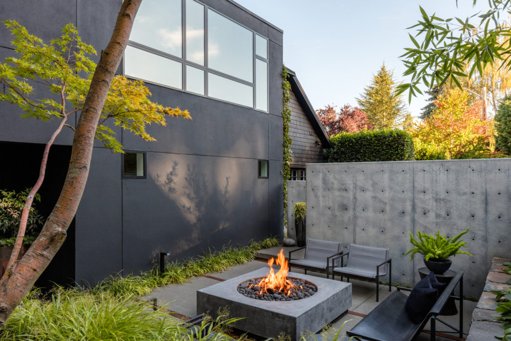
One thing this garden is not, however, is “pretty” in a conventional way. Contrasting tones are used in both the hardscape and the plantings, and brutalist materials like concrete and steel give the space an edge. (Albeit one softened with textural plants like Mahonia ‘Soft Caress’ and Fatsia Japonica).
“You don’t hire us because you want a ‘pretty garden,’” Eckley says. “You hire us because we will create an incredible outdoor space that’s super functional and comfortable, and is beautiful on the crappiest, gloomiest, wettest day of the year.”
Here, Eckley breaks down the elements that tie this small space together, with tips on how anyone can emulate his principles in their own yard.
An Outdoor Room with a View

Miranda Estes
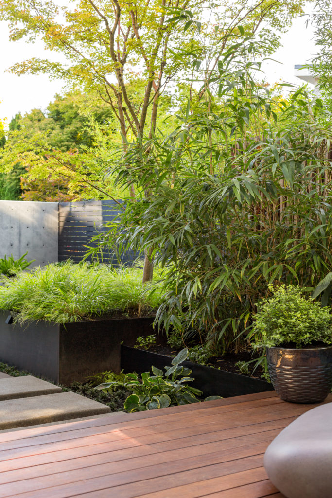
Eckley didn’t want people looking down at the ground, so he elevated the plantings in gunmetal steel raised beds, which gave the outdoor living room an eye-level view. “The space was designed to be really rich when you’re sitting down,” he says, “because that’s the way you’re going to appreciate the garden most of the time.”
TIP: To lift the eye in your garden, low beds or planters at 2 feet high or less will give you eye-level views of your plants when sitting down.
A Carefully Planned Escape

Miranda Estes
The Christensens wanted to use the available square footage to create more living space outdoors. They also wanted a way to beat the heat in the summer. “Yann and Angie really conceived of this garden as a respite—a way to get away from the sun here in July and August,” Eckley says, noting that the house itself, not the plantings, created the bulk of the shade they needed.
The street, meanwhile, is a mere 10 feet away from the edge of the fire pit, so creating extra privacy was a concern. Eckley addressed this by adding overlapping concrete walls, punctuated by a well-placed Japanese maple.
TIP: Use walls, screening fences, and bamboo to create privacy from the street and adjacent homes. If heat is a concern, consider locating your outdoor living room in the shadow of your home.
The Plants Are Saying ‘Hi’

Miranda Estes
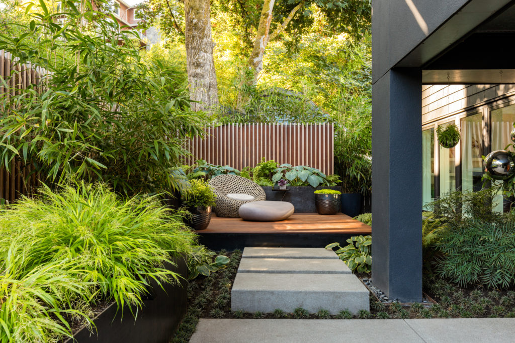
Since guests have to walk by the outdoor living room to get to the front door, a row of pavers leads the way. To create a small foyer of sorts, Eckley hung silver orb planters that catch the light but don’t completely wall off the space from the rest of the garden.
TIP: For a small-space entryway, consider lightly screening it while creating a moment of visual interest. “The mirror ball planters block your view and create a boundary at the front door,” Eckley says, “but it’s like those little planters are greeting you.”
Compare and Contrast

Miranda Estes
As our home and design editor Christine Lennon has pointed out, dark tones are very on trend right now. But that doesn’t mean the look is gloomy—quite the opposite. To contend with the darkness of Seattle’s rainy days, Eckley created contrast with plantings of ferns and hostas that pop in bright green shades against darker backdrops. Textural plants like Japanese forest grass spill out of steel planters to add drama to the look.
TIP: “To see if your plant plan works, take a black and white picture of your plantings,” Eckley says. “You’ll immediately see if there’s good contrast in color, size, leaves, and texture.” He adds: “If it looks good in black and white, it’s going to look good when you plant it.”
Keeping It in Perspective

Miranda Estes
One of the things Yann wanted was a spa-like area in a corner, but the couple also wanted it to be open to the rest of the garden. “They had these dreamy concept images of very lush places you’d see in Bali,” says Eckley. To give the space its own identity, he added lighter wood tones and used perspective to add depth. (In one brilliant detail that tricks the eye, Eckley used cedar for a screen with gunmetal steel behind it and textural plants in front.)
TIP: To create a sense of perspective, “use backdrop screens and plant plants with really big, bold textures right in front of them,” says Eckley. “This will make the plants appear to advance toward you.”
To give a deeper insight into this idea, Eckley waxes poetic in the best possible way: “Think about if we were standing next to each other in Seattle, and we were looking out at the view to infinity,” he says. “The things closest to us would have texture, the things further away would have less, and then we’d hit the horizon where everything turns blurry and gray. … We provided really high contrast colors between plants, and contrasted that with the backdrop to add depth.” A unique perspective on garden design, indeed.
