Serene or high-impact? Wallpaper or tile? Showstopping moments abound in bathrooms—the trick is knowing when to go big or pull back. Here, five ideas for making your bathroom the star of the show.
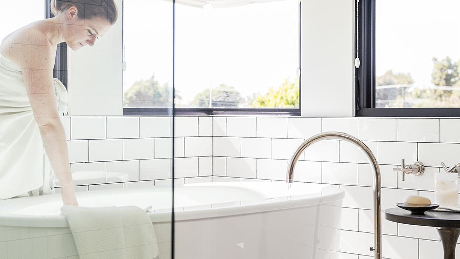
Neutral shades rule in this calming vignette from the 2014 Sunset Idea House. (Thomas J. Story)
1. Give it the spa treatment
We’ve never met a deep-soaking tub we didn’t like. To preserve the airy mood in the master bath of the 2014 Sunset Idea House in Manhattan Beach, California, designers Krista Schrock and David John Dick of DISC Interiors kept the materials palette simple. A white oak vanity and tone-on-tone concrete tile on the floor (visible in the top image) add texture without overwhelming the eye. Glass shower walls and pale window shades allow the room to be infused with light.
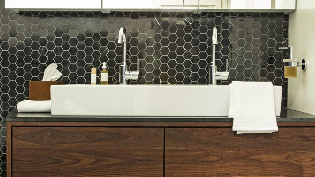
A clever combination of custom and off-the-shelf materials provide maximum impact in the master bath above. “We wanted to select tile shapes that were timeless and thus easier to find, since this project was expedited and we were moving quickly,” says designer Lynn K. Leonidas, who worked on the space with project partner Andrea Faucett. Black marble hex tile is juxtaposed with honed granite counters for drama; the handsome wood vanity was custom-made by San Francisco–based Kaimade. The trio of mirrors/medicine cabinets was purchased at retail and mounted in a row for a custom look.
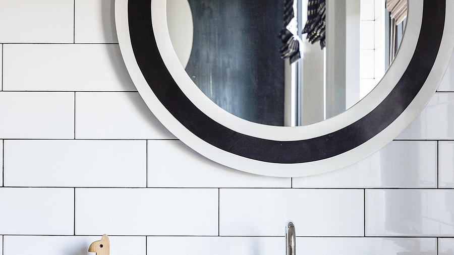
A black-and-white mirror pops against simple subway tile at the 2014 Sunset Idea House. (Thomas J. Story)
3. Reflect yourself
In the family bath at the 2014 Idea House, a bold circular mirror brings attitude when contrasted with relatively low-cost subway tile. Echoing the mirror’s black-and-white border, black grout gives the tile additional dimension while also emphasizing its larger-than-usual scale.
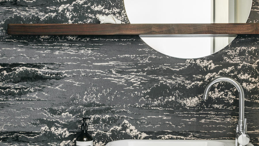
Marmara wallpaper by Osborne & Little serves as a meaningful motif for the Balboa residence’s owner…
4. Pack a punch with wallpaper
“We knew that wallpaper would be most cost-effective and impactful when used in a small space,” says designer Lynn K. Leonidas of her and project partner Andrea Faucett’s decision to use an Osborne & Little wallcovering in this powder room. “The wave pattern speaks to the location of the house—close to Ocean Beach in San Francisco—and the lifestyle of the clients, who like to surf.” Leonidas’s advice: Use wallpaper in a bathroom without much exposure to moisture, such as a powder room. As for the unusual mirror and shelf? “We wanted a mirror design that was asymmetrical to reflect the project’s other asymmetrical elements—including the angled tub in the master bath and the vanities and built-in cabinetry throughout the house.”
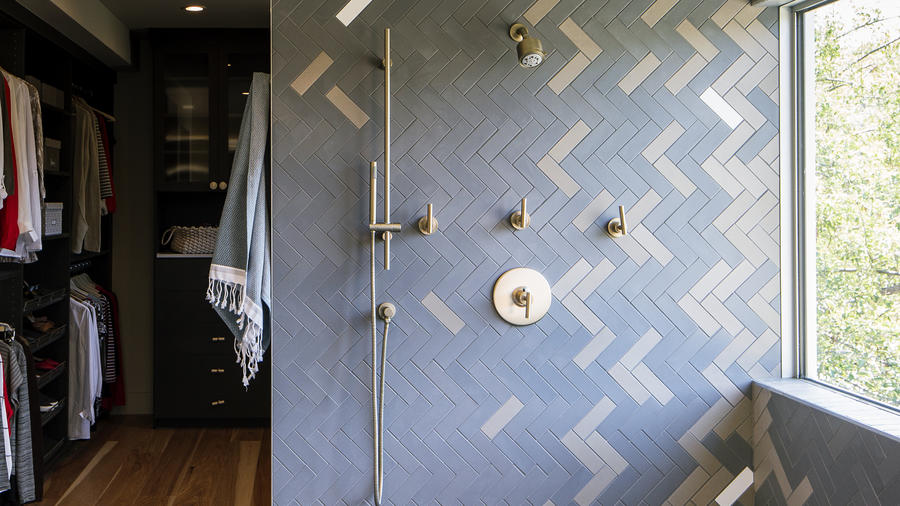
Take a classic pattern—in this case, herringbone—and tweak it for an unexpected design moment. That was the idea behind the master bath at the 2015 Sunset Idea House in Denver. Megan Hudacky of CKY Design used Heath Ceramics Classic Field tile in Steam, White, and Cast Iron Gray down the walls and onto the floor, placing the lighter tiles randomly and then more densely around the edges. Given the ample light in the space, “I knew the room wouldn’t feel dark, but really rich instead,” says Hudacky. Happy bathing.