Every Single Room in This Seattle Home Has a Stunning Garden View
It’s easy to see why the architect nicknamed this remodel project “The Garden House.”

Haris Kenjar
When architect Jay Coupard was brought in to consult on a construction budget for adding a second floor to a Seattle home, it was easy to see that that wasn’t the best route. Not only was the project not right for the working budget, but also it wouldn’t allow the homeowners to truly appreciate the greenery surrounding the abode. “Maintaining a single-level house was the best use of their budget and best opportunity to allow the garden spaces to influence the home and not be dominated by a taller two-level structure,” says Coupard.
Instead, Coupard and his team focused on a gut remodel of the single-floor home, adding an additional 750 square feet. Once construction was complete, designer Andy Beers of Ore Studios was brought on board after the family realized the furniture they had wasn’t going to work in the new space. “We helped [the homeowners] define how they wanted the furnishings and decoration to feel, and then sourced pieces that supported this point of view,” says Beers.

Haris Kenjar
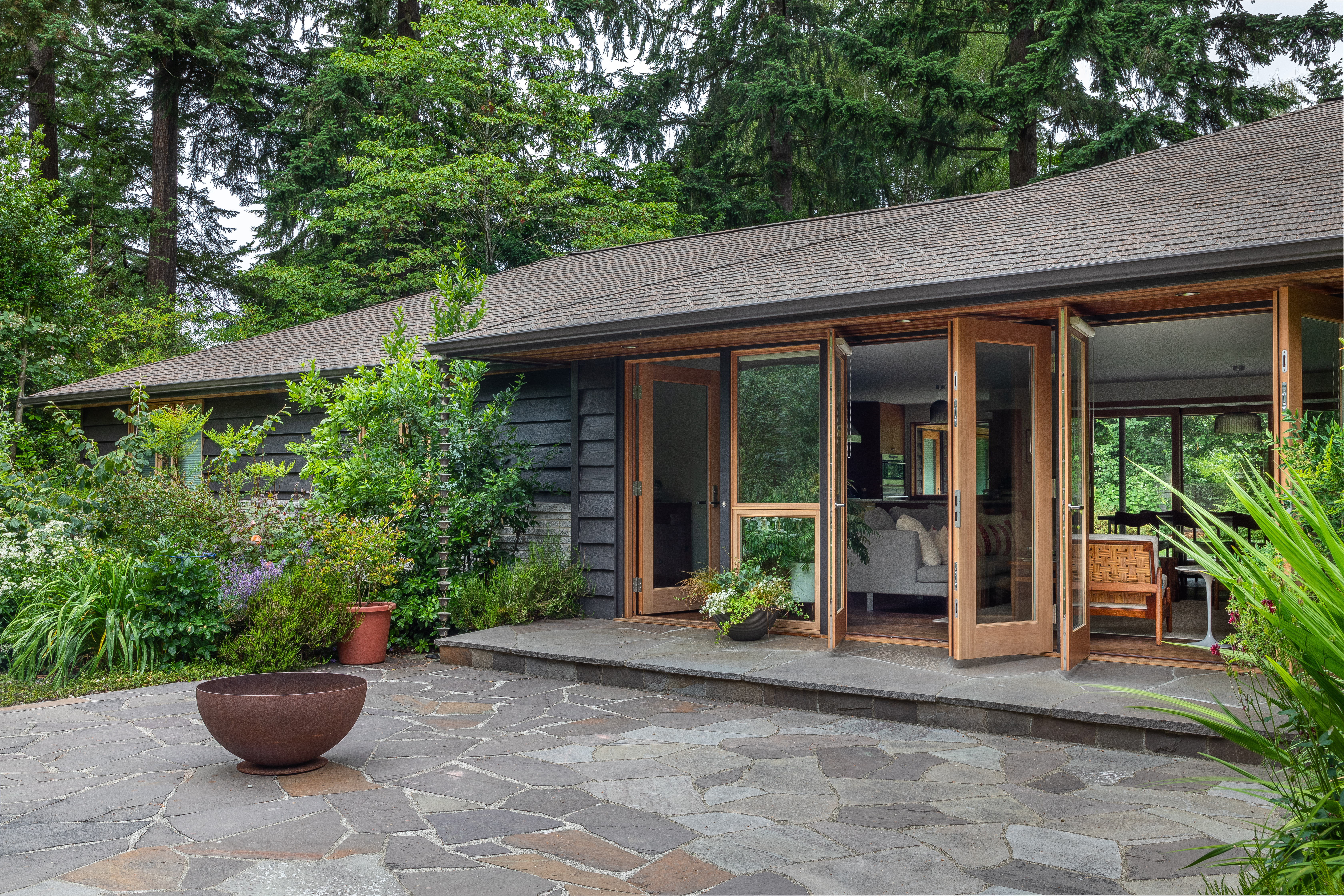
During the remodel, Coupard left some of the exterior masonry and siding intact, while enlarging the stone patios for a new indoor-outdoor layout. “The flagstone entry patio is surrounded by mature planting beds as well as a raised vegetable garden. Each side of the garden receives light at different times of day, and this patio is often used in the evening,” says Beers.

Haris Kenjar
Coupard was tasked with creating three spaces for the home: a private family area, an entertaining area, and a guest area for extended family visits. And overall, he aimed to open up the home to the garden spaces. “The house had surprisingly little access to an already developed, nice garden,” says Coupard. He opened up the center of the home as the entertaining space, linking both this space and others to the gardens with windows and doors as a primary visual feature throughout the rooms.
Furnishing the new great room was a big focus for Beers in his design. “It serves as the family’s main hangout space, but also a major circulation space,” he says. The low ceilings and horizontal scale in the room made for a challenge, but Beers looked for furniture that was off the floor so the room would feel light and give plenty of visibility.

Haris Kenjar
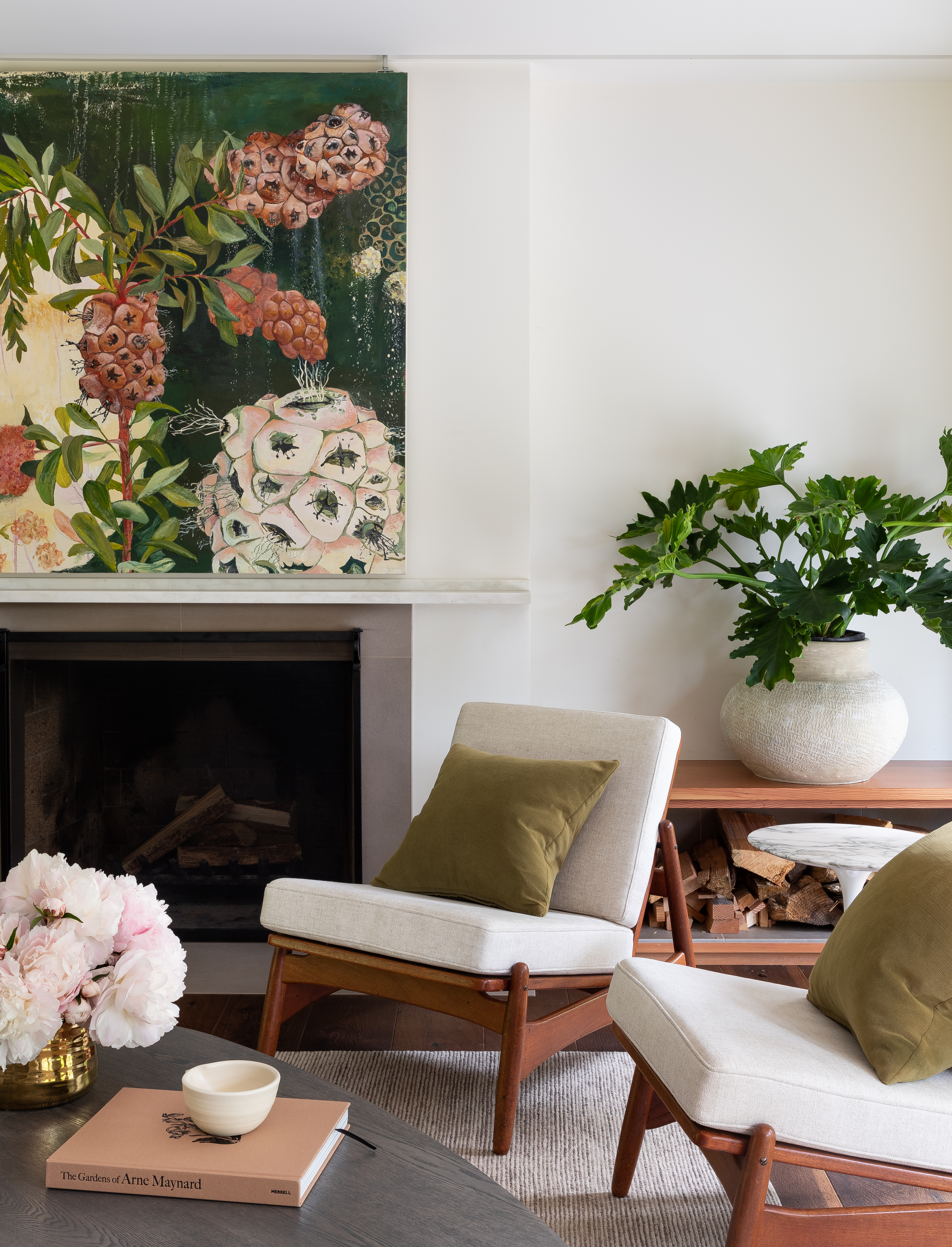
The great room’s color story was pulled from the room’s finishes and the art. Beers chose the saddle leather Ole Wascher chairs to complement the Douglas fir doors, the gray sofa was chosen to match the fireplace surround, and the green and pink pillows tie into the painting, which slides to reveal a hidden television.

Haris Kenjar
When Coupard opened up the center of the home for the entertaining space and better garden views, he had to relocate the kitchen into a smaller space—a hard sell, but one that made the most sense. “The kitchen was moved off to the side into a smaller area, developed to both accentuate its intimacy and visual connection to the other public spaces,” says Coupard.

Haris Kenjar
Another challenge? Those low ceilings. But Coupard used the horizontal visuals to his advantage. “Instead of attempting to use visual means to create the illusion of greater height, we decided to accentuate the horizontal, the ground plane, and the garden,” he says. “Most of the openings in the house attempted to capture the foreground plane and create an indoor-outdoor connection.”
The kitchen ended up being the architect’s favorite part of the house. Why? “The contrast of its physical intimacy and big visual connection to the children’s garden,” he says.

Haris Kenjar
“The clients have great taste and were hands-on in the best possible ways—the dining tabletop was actually fabricated by the client out of walnut slabs that she selected in Oregon,” says Beers. “The homeowners were both game to try things outside their comfort zone, especially when it came to adding strong colors and textures to the house.”
Beers and his team helped the client commission a base from local Seattle furniture maker Chadhouse to pair with the tabletop, and found two different sets of vintage Moller chairs to go around it, but had them upholstered together to match.

Haris Kenjar
One of Beers’ favorite features in the home was the use of Douglas fir throughout. “We embraced the amber color of the wood early on, and the use of cool grays along with pinks and greens in the decoration help tie together the wood with the gardens outside,” he says.


