This Pasadena Craftsman Featured in ‘Back to the Future’ Gets a Fresh Update
It’s a home with great history.

Jenna Peffley
The ‘80s film Back to the Future (and its subsequent sequels) are total classics, and while fans will most definitely remember the comedic one-liners, storylines, and iconic characters, there are also some noteworthy architecture and design moments. Doc Brown’s home in the film is the Gamble House in Pasadena, California, a stunning, historic example of the Arts and Crafts movement designed by influential 20th century architects Charles and Henry Greene. Movie fans still flock to the location to take photos and go on tours.

Jenna Peffley
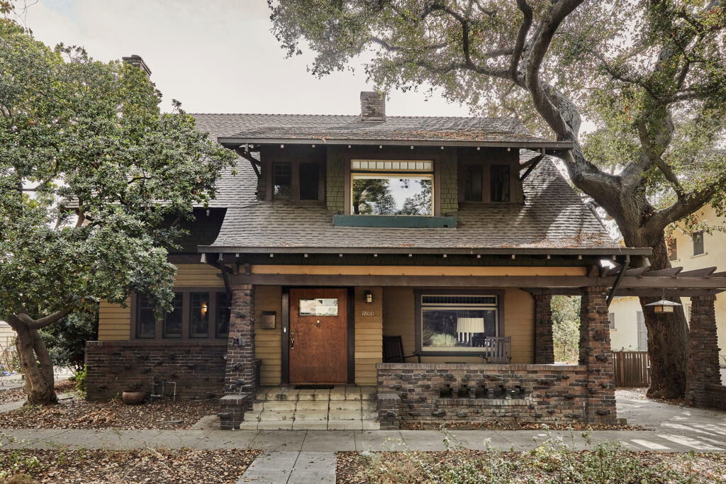
The Gamble House isn’t the only Arts and Crafts home that makes an appearance in the first film—the four-bedroom, three-bathroom Pasadena Craftsman that we’re featuring today also had its movie moment. “This house has a great story. It was the house in the movie Back to the Future,” explains designer Jamie Haller, who oversaw its renovation. “The tree in the front yard is the one that Marty McFly hung from when spying on his mom in the 1950s scene of the movie.”

Jenna Peffley
Jamie, who is also known as the “Craftsman Healer” because of her experience in restoring these historic homes, was already familiar with the house before her clients, a couple with small children, even contacted her. When it was on the market, she had studied it on multiple occasions through 3D tours since her family was looking for a similar home. “I already loved the house before they reached out so when they did I found it kismet that I would get to be a part of its new future,” she says.

Jenna Peffley
The home had last been updated in the ‘90s and it was well cared for, so it didn’t need a full restoration. The main goal was to update the space and make it a home the family could grow in. “The clients wanted to feel inspired and have an emotional connection with their space. They wanted to add color and pattern but wanted it to feel authentic and modern for their family,” Jamie says.

Jenna Peffley
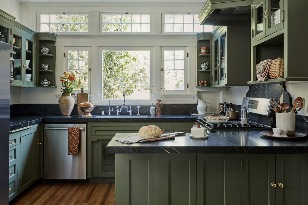
In the kitchen, the wood cabinets were in good shape but needed some attention. Instead of replacing them altogether, Jamie and the owners decided to keep the original cabinetry and update it with paint. “It did lack perfect functionality; some of the doors operate in a way less than ideal, with less functionality than we could achieve with new cabinets. But then there is cost and soul,” Jamie says. “To have replaced them would have been very expensive. And they were lovely, so we decided to paint them to save on cost and preserve something already beautiful.”
The counters and sink were updated and minor adjustments were made to the cabinet boxes to adapt to the sink changes. “We replaced the floors, adjusted the electrical, and I call this a Craftsman ‘zhuzh.’ It’s more than paint and less than a remodel but done with vision,” Jamie says.

Jenna Peffley
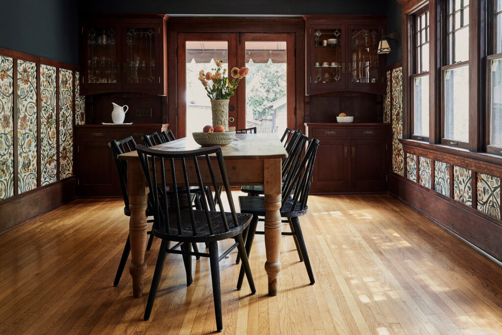
Most of the other updates, aside from the kitchen, were decorative, like creating a paint and wallpaper palette to add color and pattern to the space. Jamie says the wood was actually in great shape, so they only restored some areas with new flooring. Lighting was updated and there was also a small furnishings budget to play with.

Jenna Peffley
All of the accents and accessories look like they were meant to be in the home or have always been there—Jamie says she sourced from a mix of places: online, flea markets, Craftsman-focused salvage shops, and other design boutiques.

Jenna Peffley
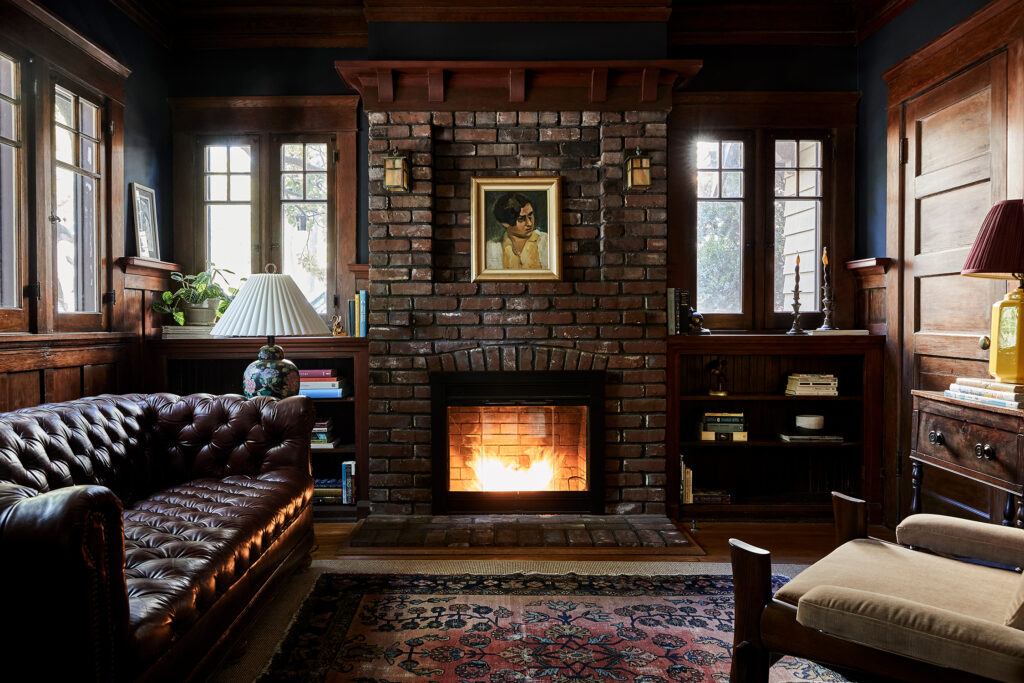
“Honestly the way I love to approach styling is to show up with it. We didn’t choose every pillow and mirror upfront before. As I found things or fabrics I would reach out and say, ‘Hey! I just found this perfect mirror for your mantle up in Ojai while on vacation.’ I would shoot her a text and we would buy it. Sometimes things appear,” Jamie says.

Jenna Peffley
One hiccup they ran into during the process was a paint job gone awry. “I actually felt bad for the painter. He painted the living room the wrong color,” Jamie explains. “We wanted to paint it a creamy white. The owners really wanted a bright living room. The painter got confused and painted it Studio Green (basically the darkest green you can get). Of course it was fixed, but that was a lot of work to get it back to creamy white after going dark. The funny things is that the Studio Green didn’t look bad—it actually looked great and we did keep it in the little entry… sometimes mistakes are interesting.”
All’s well that ends well, though, for this home. It’s equal parts historic, modern, charming, and personable. The owners are so happy with the space—and Jamie can say she’s conquered yet another Craftsman project.
