Two Architects Erase Everything Basic About Their Family’s Ranch House
Two principals at the modern architecture firm EYRC took their typical three-bedroom mid-century ranch house and turned it into a simple, Zen haven.

Paul Vu
Takashi Yanai and Patricia Rhee, the “Y” and “R” in the L.A. and San Francisco-based EYRC architecture studio, are partners at work and in life. And their home reflects their shared aesthetic: smart, streamlined, simple. The couple resided in their Mar Vista, California, ranch house—which started out as an unremarkable Trousdale tract house on a family-friendly street—with their two children for years before they took their work home with them and reimagined it completely.
“We had fairly typical aspirations when we were looking for a house back in 2010,” says Yanai. “Friendly neighbors, an OK school district, close to the beach. When we found this ranch, it was a very basic house, and not in the style that we might design, but we liked the layout. It was just enough and more than it had to be.”
“It reminded me of the suburban world I grew up in Maryland,” says Rhee. And it reminded Yanai of his own childhood in Santa Monica, just a few miles away, but different than it was in the 1980s.

Stephen Schauer
“At a certain point, we thought we might design a house from scratch somewhere else,” Rhee says. “But the kids liked the neighborhood, and we did, too. So we decided to make an imprint here.”
Yanai has been the head of residential design at Ehrlich, Yanai, Rhee, and Chaney since 2004, and Rhee oversees commercial projects the firm designs, like the Cronkite School of Journalism at Arizona State, and the upcoming Pendry Hotel and Residences in West Hollywood. They were of the same mind about what they wanted in a home—essentially a simple, functional, black-and-white living space, free of excess adornment, utilizing simple materials like plywood.

Paul Vu
The result of their efforts is a Zen sanctuary that’s emblematic of Yanai’s unique work, which melds California modernism with Japanese minimalism. The first step in this radical change was to tackle the exterior. Plans were developed with the landscape masters at Terremoto to create a garden that combined Japanese principles of seasonal color, movement, and structure, with regional plants—no mowed grass allowed. Then, they made the house disappear.
“The color we chose is called Black Magic, and it’s fitting. It’s like a vanishing act,” says Yanai, of the aptly named Sherwin-Williams color. “We wanted to erase the house, erase the past. Typically, when we design a house, the exterior color is one of the last decisions we make. In this case, it was the first.”

Paul Vu
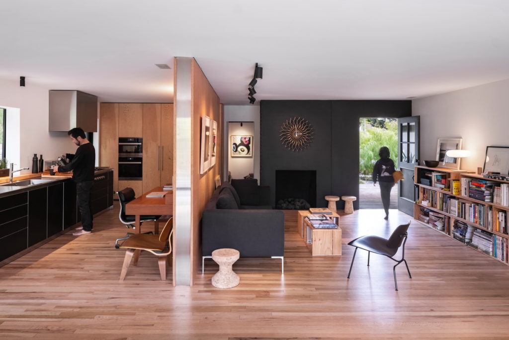
The next step was to open up the inside. The couple liked the orientation of the house, which placed the living room in the back, with access to the garden. They removed molding and trim, and kept only one wall separating the living area and the kitchen. They stripped and restored the red oak floors, and sealed them with a flat, no-sheen finish. Retractable glass doors at the back of the house open it entirely to the rear garden. The furniture—rustic plywood book shelves, a custom dining table, an Eames-inspired storage unit and display cabinet, a black sofa, and some simple stools—is spare and deliberate.
The custom Bulthaup kitchen they installed, which Yanai describes as the “spendiest” element of the house, elevated the interiors completely.
“We had considered more economical kitchen systems,” says Yanai. “But I design houses on larger budgets for a living, and I felt odd not using a kitchen that I wouldn’t recommend to a client. It’s a simpler version than what we’d do for a larger home, but I wanted to walk the walk. I recommend these kitchens because I believe in them. A designer kitchen is functional and fun to use, and we believe it’s worth the investment.”

Paul Vu
With two young teenagers remote schooling, and a busy couple working from the dining table and kitchen office space, you’d think that the tight quarters would seem confining or claustrophobic. Yanai and Rhee say the opposite is true. Furnishing a home sparsely, with efficient storage, is freeing and allows more time for pursuits more meaningful than buying tchotchkes.

Paul Vu
“We have a seventh-grader and a tenth-grader now, and we’re always moving past each other, or sitting together,” says Rhee, who is happy to have them close by. “There’s a little art cart that we roll up so they can draw at the table. They’ll do gaming and videos. We have everything we need.”
“I think of it as living simply,” Yanai says. “Being minimal is more of an effort than it needs to be. When you live simply, you decide what are the things that are most important to you and try not to go beyond that. Our life is as simple as it should be, and no simpler.”

Paul Vu
