This L.A. Ranch Home Is Full of Mid-Century Inspiration—and Family Heirlooms
The designer’s remodeled home is full of beautiful antiques from her late grandmother

Jessica Alexander
Interior designer Amy Elbaum gets her inspiration from her late grandmother. “She was an interior designer, and I spent a lot of time with her growing up and learned a great deal from her about art, antiques, and design,” says Elbaum.
Today, her remodeled, one-story L.A. ranch home is full of antiques her grandmother left her. After buying the home in October 2016, Elbaum extensively remodeled the three-bedroom house, from repairing the much-needed new roof and HVAC, to taking out the laminate wood flooring and removing a few walls to create an open floor plan. Impressively, much of the remodel was done in eight weeks.
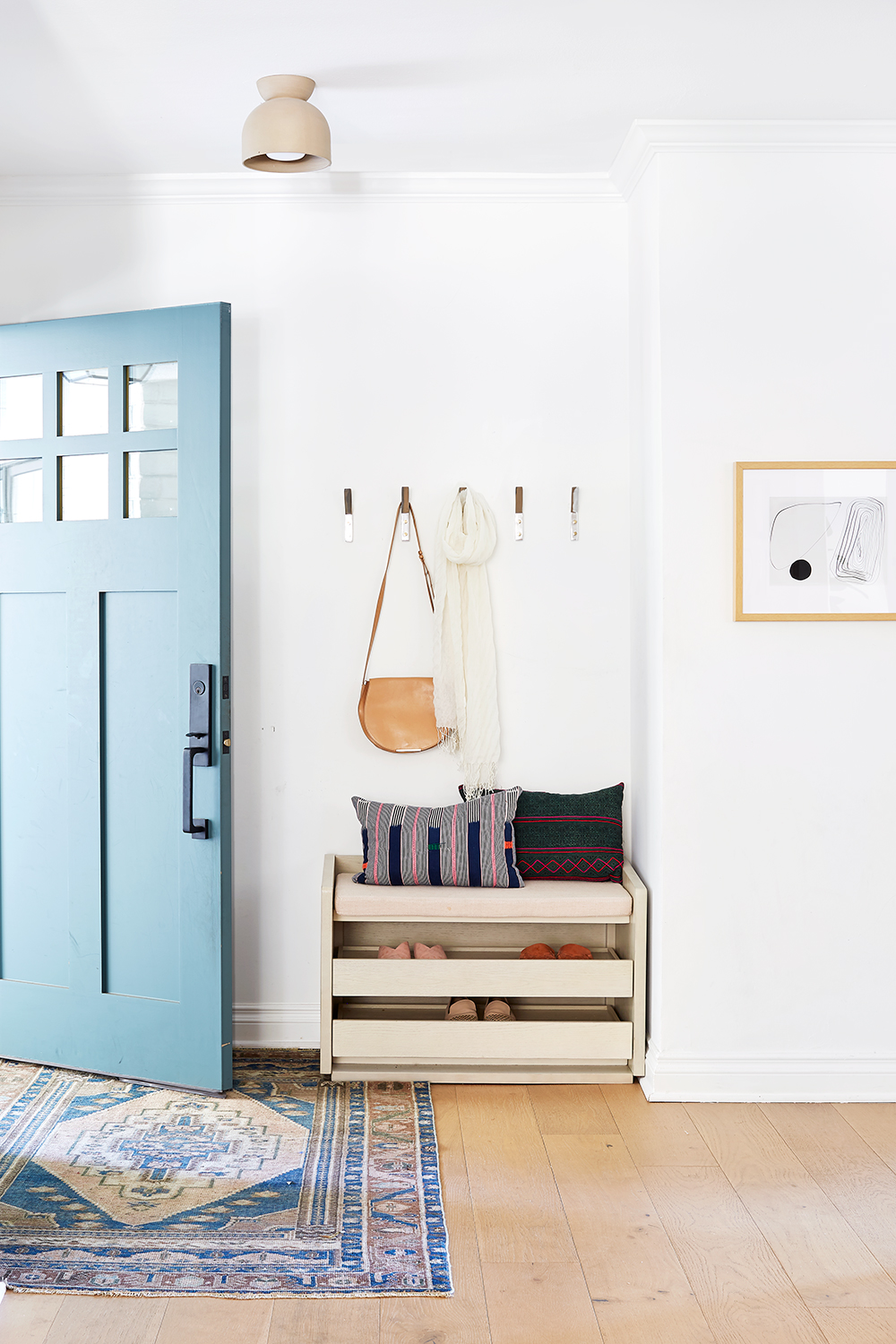
No space was wasted in Elbaum’s entry. “We had a very tight space between the wall and the door to fit some shoe storage and seating,” she says. “I searched for months until I found this piece on Wayfair—it is a lifesaver to keep the kids’ shoes organized.”

Jessica Alexander
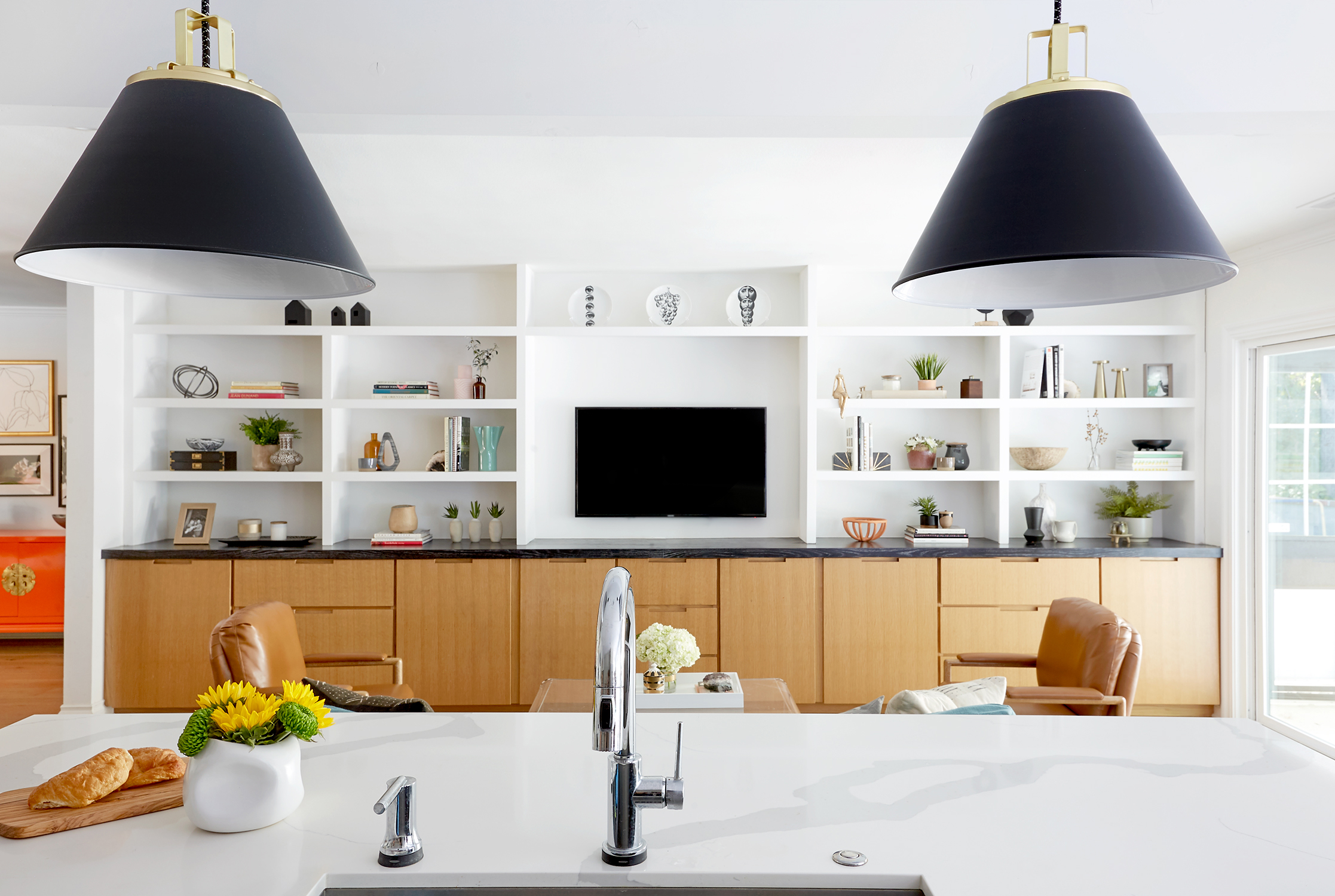
The new floor plan included an open family room that connects the entry with the kitchen. The big eye-catcher in the space is the built-in furniture. “This custom built-in storage is absolutely the best thing we put in our house,” says Elbaum. “The oversized drawers and cabinets were designed specifically to hold bigger toys (it can be so hard finding a place to store trucks!). It is so easy to clean up after the kids play by just tossing everything back in.”
The built-in also provides the perfect display space for the antiques from Elbaum’s grandmother. “There are Fornasetti plates on the top shelf above the TV, and in the built-in are the design books she left me,” says Elbaum.
Jessica Alexander
Opening up the floor plan between the family room and kitchen wasn’t so easy, though. “The biggest challenge was removing a load-bearing half-wall in the kitchen that was creating a division between the family room and kitchen,” says Elbaum. “When we started the demo, we found a post within the wall that was structurally important. We decided to move some money around in our budget to be able to put a huge beam across the kitchen so that we could remove the post. It was the best decision, as now the two spaces flow perfectly together.”

Jessica Alexander
During the renovation, Elbaum removed the entire original kitchen and reworked the configuration, designing it with the new open layout in mind. The large center island looks out into the family room and stands just beyond the couch, with a breakfast nook to the side.

“I knew I wanted a soft gray for the cabinets and was able to find the perfect color, Sherwin Williams Mindful Gray, through an old photo I had pinned on my Pinterest board,” says Elbaum. “I wanted dramatic hardware, so I chose oversized pulls for all the cabinets and drawers and coordinating knobs on just the island.”

The breakfast nook off the kitchen is one of Elbaum’s favorite features of the house. “We knew we wanted a center island but we didn’t have room for counter stools because of the proximity to the family room sofa. There was a perfect bay window being under-utilized, so we built a bench into the nook and placed an oval dining table around it so we can now easily fit five people around the table.”

Jessica Alexander
The dining room sets a major mood, especially with the two-tone chairs. “I found these vintage chairs on Chairish; they were upholstered in a bright red fabric. I couldn’t decide if I wanted the new fabric to be plain or patterned, so I did one fabric on each side,” says Elbaum.
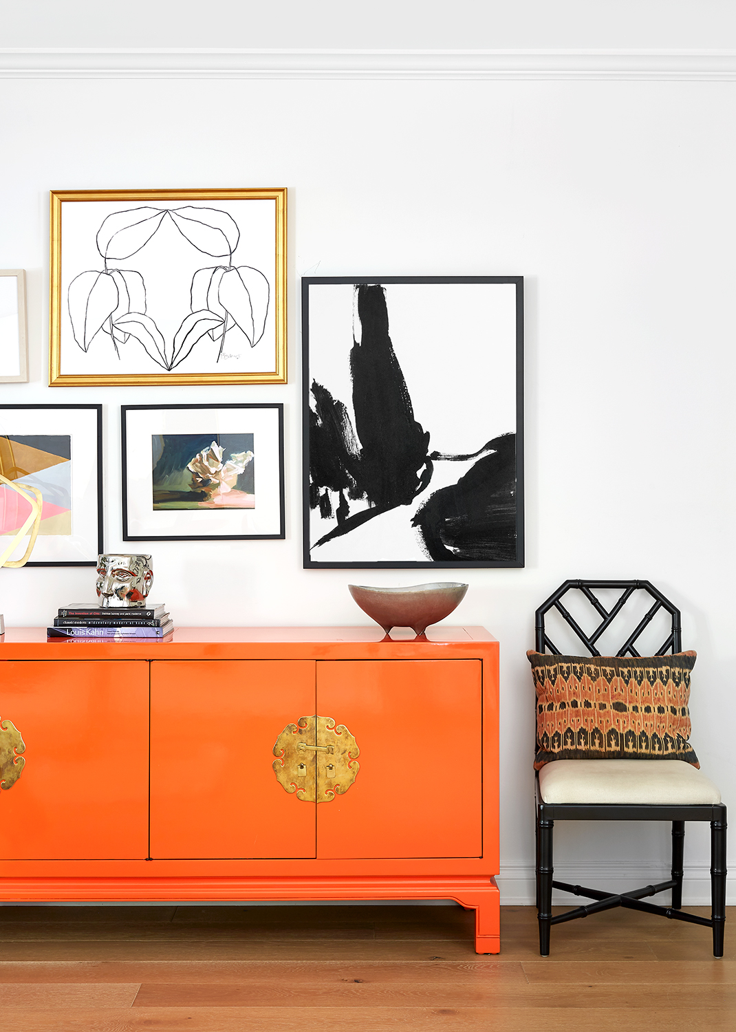
The swoon-worthy dining room continues with a colorful credenza. “I bought the vintage credenza online from Scout Design Studio and had them lacquer it in an Hermès orange,” she says. “My grandmother loved Hermès, so it was kind of like a tribute to her.”
It’s not the only tribute, as the black side chair features a vintage pillow from her grandmother as well.

The sprawling ranch home also includes a living room packed full of mid-century modern pieces, with a vintage wood-and-tile side table from Elbaum’s grandmother.
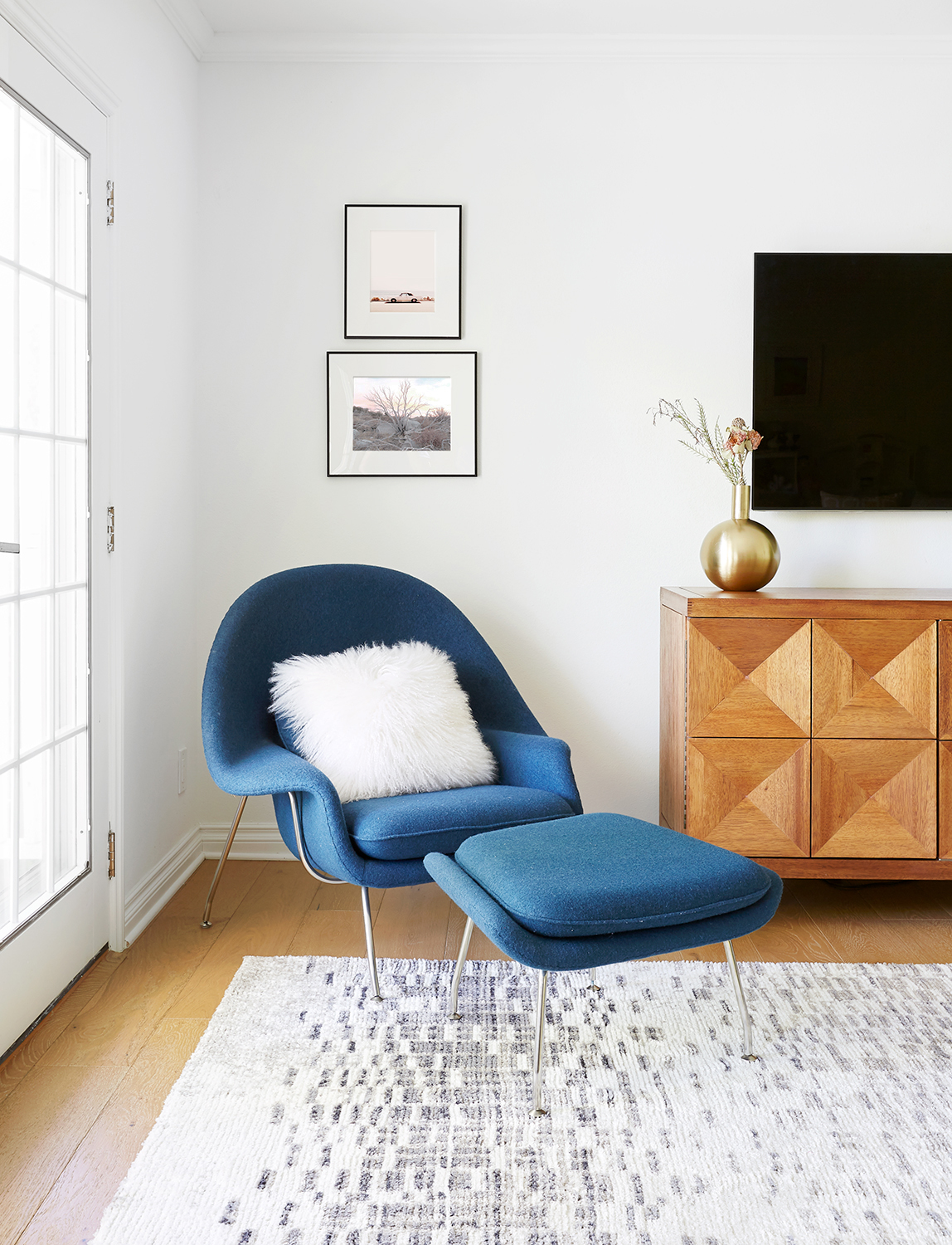
“I purchased the Saarinen womb chair a few years ago—it is totally timeless. No matter where we have lived, it is always easy to find a place for it to fit in,” says Elbaum.

The master bedroom was the last space Elbaum finished in the house. “I took my time figuring it out,” she says. “I knew I wanted this space to be dramatic and dark. I received this wallpaper sample in the mail from Lindsay Cowles and immediately saw my vision—we used it on the headboard wall and painted the rest of the room black. To warm it up, we upholstered the bed in a camel-colored leather and the bench in an olive green.”

The dramatic master bedroom also includes a fireplace, with two antiques from her grandmother beside it. The antique rope chair adds a soft balance to the dark walls, while the dark horizontal print over the fireplace meshes with the space beautifully.
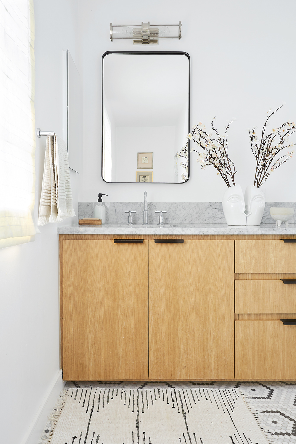
Elbaum’s other favorite space in the house? The master bath. “ I fell in love with the mosaic tile we used for the floors immediately and designed around that,” she said. She loves how the white oak vanity brings warmth to the space, along with plenty of storage. On top of the counter, an antique vase brings a fun touch to the room.
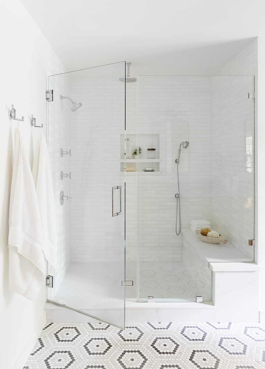
“The existing bathroom had a small shower and large spa tub, but we wanted a big walk-in shower with all the bells and whistles—which we were able to accomplish by getting rid of the tub completely,” says Elbaum. “ I love how we mixed metals in here—all the plumbing fixtures are polished chrome, which is timeless and classic.”
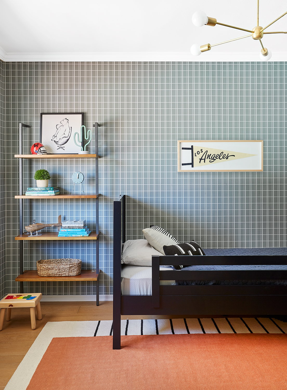
For her young son’s bedroom, Elbaum made a design call while he was still in his crib that could last into his teens. “I knew it would work overtime as we changed his room over to a ‘big boy room’ because it is so timeless,” she says.

Between the kids’ bedrooms, the home features a Jack-and-Jill bath, which Elbaum completely remodeled. She focused on durability and low-maintenance design. “I wanted something bold and fun for the kids, but instead of a typical cement tile I went with porcelain, which is much easier to maintain,” she says.

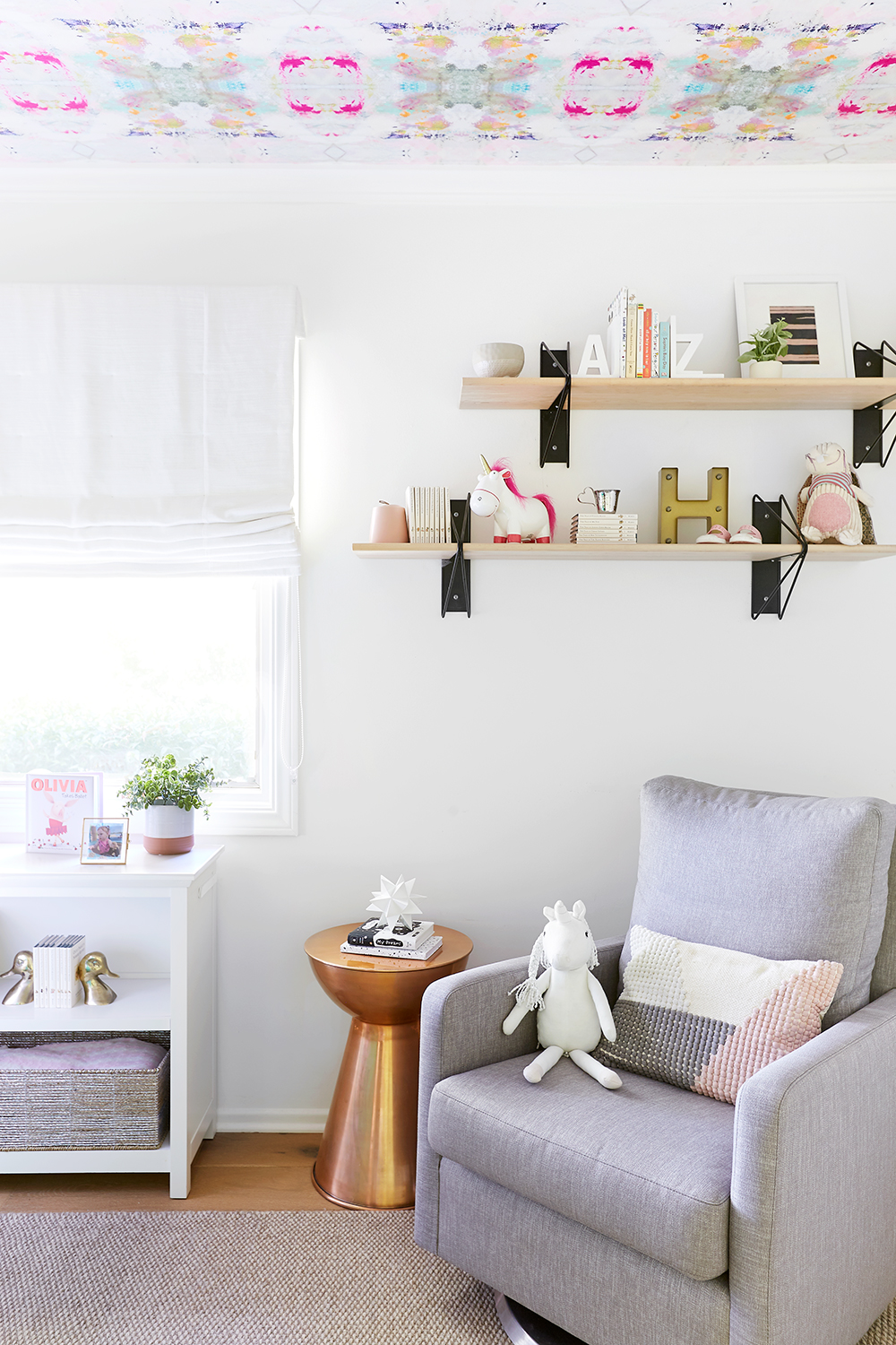
Finally, in the nursery, she steered clear of going too girly, while bringing in fun color inspiration for her youngest. “I fell in love with this wallpaper from Kerri Rosenthal and had them put it on the ceiling so the baby could look up at it and feel inspired,” says Elbaum.
