Before & After: A Kitchen with an Awkward Layout Gets More Storage, Including the Most Luxurious Pantry We’ve Ever Seen
Plus, it has the prettiest design details.

Thomas Kuoh
Every kitchen needs good storage, but not every kitchen has good storage. Some are small and need a lot of hacks to find a spot for everything. Some can be the right size but with not enough cabinet or drawer space. And others are just not using their storage potential fully, like this kitchen in San Rafael, California.

Thomas Kuoh
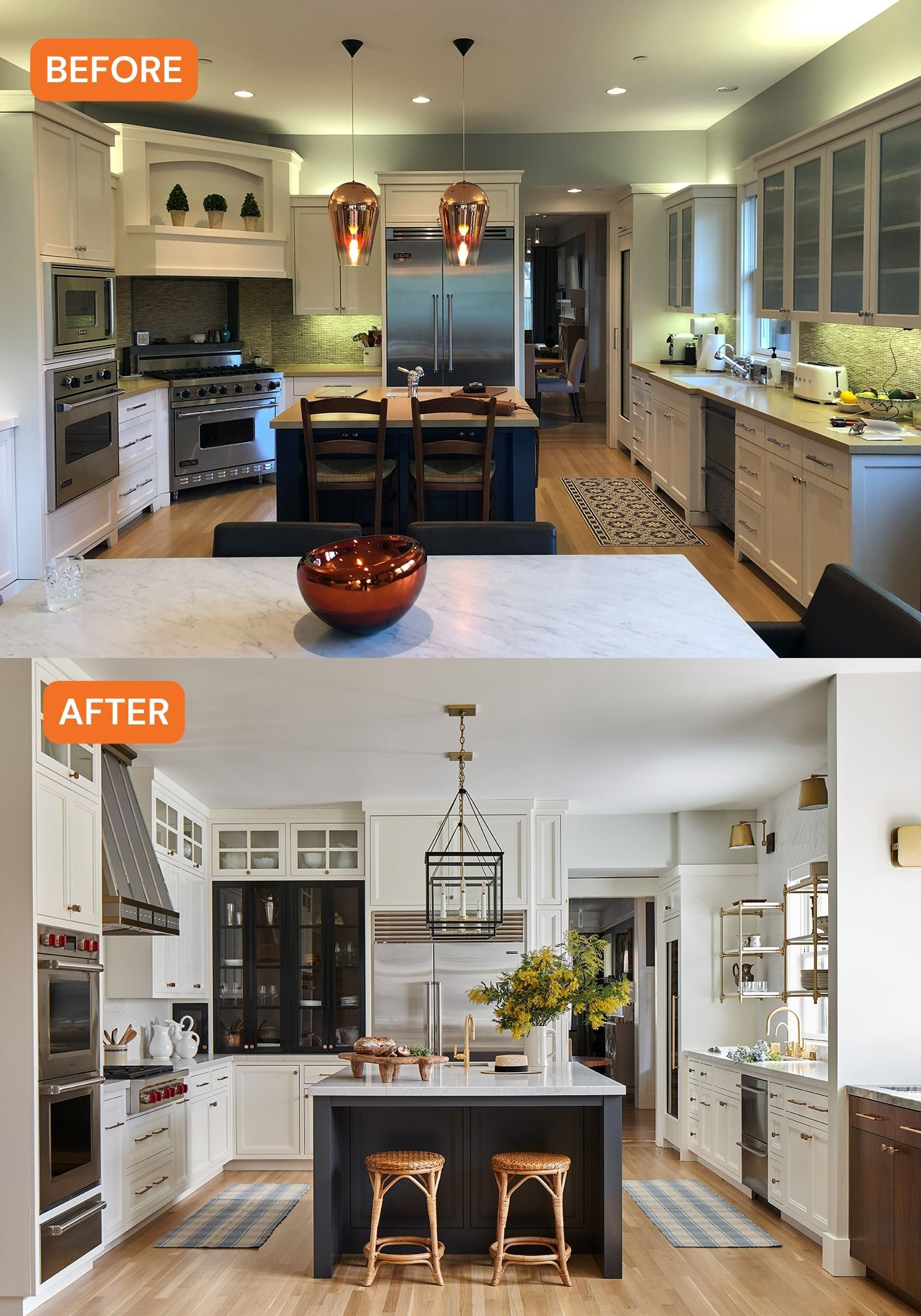
“The layout of the original kitchen severely underutilized the opportunity for storage,” says interior designer Corine Maggio, founder of CM Natural Designs. “It was also a little awkward in the corner where the stove was angled and the corner of the island jutted towards it. The finishes were also a bit dated and underwhelming. It’s a good enough sized space but felt small. And there was a lack of a proper pantry. Or at least a pantry that would fit my client’s standards.”
Corine’s client wanted the kitchen to be highly functional, purposeful, high quality, and beautiful. “This is a client who loves to entertain, travel, and generally enjoy the finer things in life. They love to cook and have an appreciation for all things related to foods and the arts. Designing for them was fun and collaborative,” she adds.

Thomas Kuoh
The biggest part of the renovation was fixing that awkward stove corner. Corine and team squared that area off and moved the stove down. “This allowed for a beautiful feature cabinet with the glass and black framed doors with the walnut interior,” Corine explains. “It also allowed for more space for the person prepping near the prep sink in the island and the person cooking at the stove. It also gave us space to be able to increase the size of the island. We moved down the double ovens so they served as a visual bookend to the kitchen but also, in doing so, gave space for the stove to be moved down.”

Thomas Kuoh
She and her team also brought the cabinetry all the way to the ceiling. “This gives the kitchen a much more spacious look and feel, plus it adds more storage and eliminates the dust-collecting situation from the previous kitchen,” she says. “And even though we increased the storage throughout, we still prioritized using every bit of space, which you can see from the narrow cabinet we added to the right of the fridge. You access it from the side and, even though it’s narrow, it’s a surprising amount of highly functional storage. These little types of details are always my favorite.”

Thomas Kuoh
Corine left most things where they were on the sink wall but ended up replacing the heavy uppers with floating shelves. “The shelving flanking the sink is also a favorite,” Corine says. “It’s a highly used space because of the proximity to the sink and dishwasher and I love it when the parts of the kitchen that are used everyday can be made even more beautiful by the thing that also makes them functional. It can make the daily chores like putting dishes away a more pleasurable activity.”

Thomas Kuoh
The original pantry got a makeover, too. “We busted through the original pantry closet and stole space from a weirdly large and random closet that was in the adjacent bathroom. This allowed for a very generous and luxurious butler’s pantry,” Corine says.

Thomas Kuoh
For design details, Corine’s client was attracted to two-toned kitchens and mixing metals, which you can see throughout the space. “The Urban Electric pendants above the island are also a favorite. They’re not an obvious choice for the space yet they tie everything together. They’re stunning without being too distracting. And then there is so much to love about the butler’s pantry,” she says. “The blue moon quartzite counters are absolutely showstopping and the antique mirror-front cabinets make the space feel so luxe. I just love the moodiness of the colors and finishes. Every time I walk in there I feel underdressed.”
And as for what Corine’s client thinks, considering they have been thinking about redoing the space for many years, they find it a dream come true that it’s complete.
