This Kitchen’s Ceilings Messed up Its Layout and Made It Feel Cramped—Here’s How It Was Transformed
It’s now open, airy, and inviting… what more can you ask for?

Kelley Kish Photography
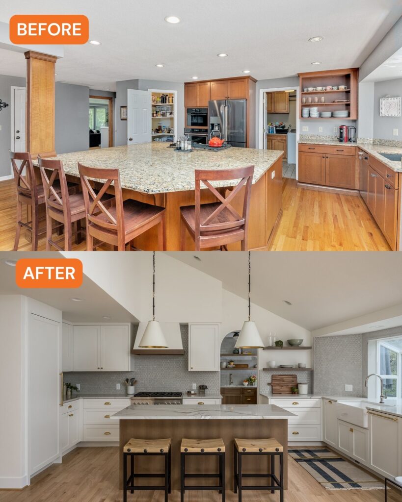
The problem with this Portland, Oregon, kitchen wasn’t that it had a small footprint and no space at all—on the contrary, it had pretty good square footage, but its 8-foot ceilings and beam post-and-beam construction made its layout feel off. Additionally, some outdated features and appliances made it less inviting. Interior designer Kelly McDougall was hired by the homeowners (a couple with two sons) to completely redo the space (and the entire three-bedroom, three-bathroom home).
“The kitchen had undergone at least one major remodel with a prior owner,” Kelly says. “It was open to the great room, but had a very visible beam and post supporting the second story that was incorporated into the kitchen island and living design. For this reason, the island was oversized and took up more space into the living room making furniture layout awkward.” It had a generous floor plan, but the ceilings made the room feel small and confined. The layout also included a corner pantry that took up space but wasn’t super functional.

Before: Courtesy of Kelly McDougall; After: Kelley Kish Photography
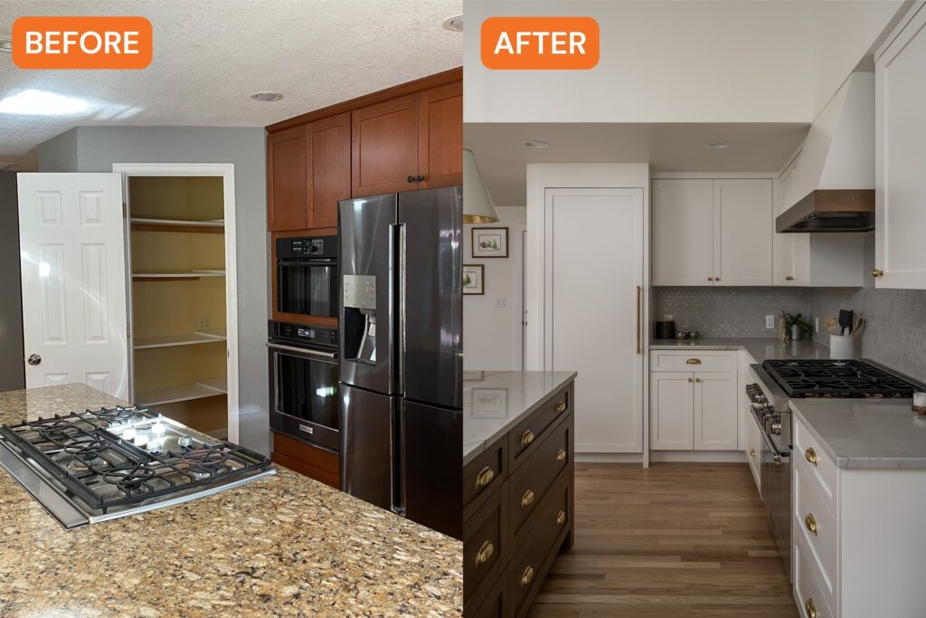
Kelly’s clients had a good idea of what they wanted to do with the room. Removing the beam and column and vaulting the kitchen and living room was number one. “They wanted to remove the corner pantry and partially enclose the kitchen from the entry to have more wall space for the refrigerator, range, and cabinets,” Kelly adds. “The other idea was to move the laundry room [off the kitchen] to a closet we created in the hallway and capture the room off the kitchen as the new walk-in pantry.”
Since everything in the old kitchen needed editing, they donated the cabinets and appliances and started fresh. The only thing they really kept were the original red oak floors. “We were able to lace in new red oak planks where needed and add them to the new pantry which was previously a sheet vinyl floor,” Kelly says.

Before: Courtesy of Kelly McDougall; After: Kelley Kish Photography
Kelly and team created a half-vault over the kitchen and living area, which added height and drama, and made it feel less small and cramped. They got rid of the corner pantry, too. “Squaring off the old corner pantry wall and adding a little more length to the side of the room with additional framing and drywall provided just enough space to create the perfect working triangle,” she explains.

Kelley Kish Photography
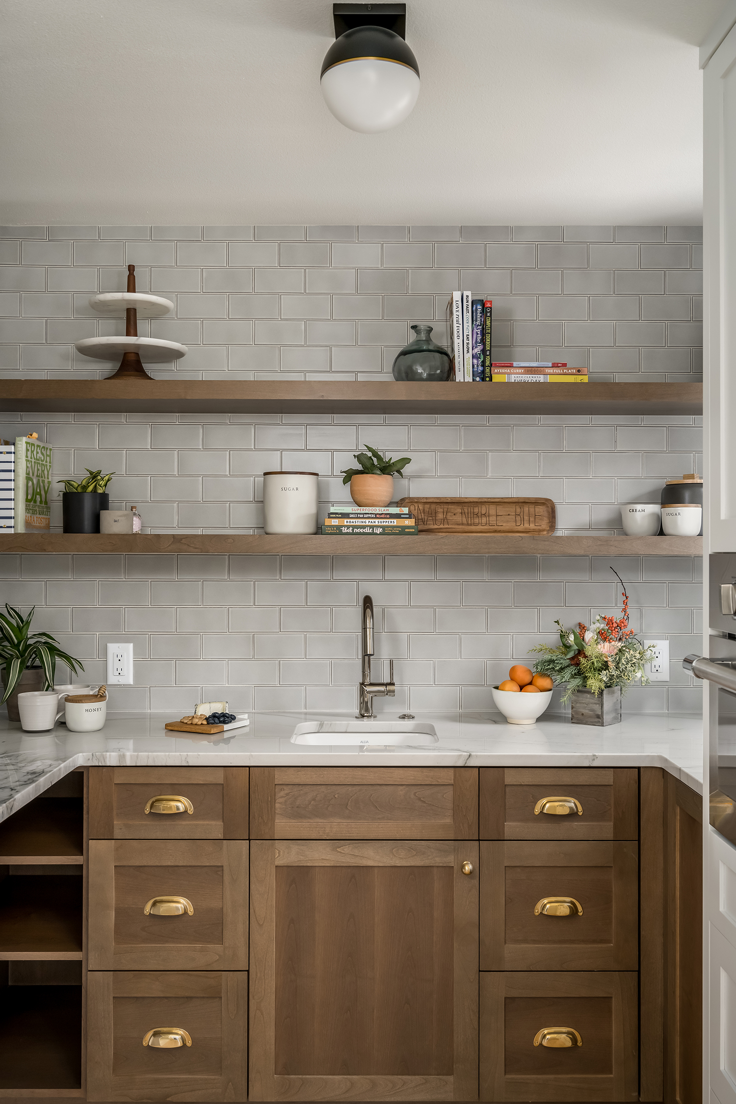
For the new walk-in pantry, they had originally designed it to be enclosed with a pocket door, but they realized the door wasn’t feasible because of the shelving and electrical that needed to live on and in the wall. Kelly ended up doing an arched doorway instead, which ended up working out perfectly because her client had mentioned her love of archways but they originally weren’t able to incorporate any in the design. “The arched doorway was the perfect solution and added such character and charm to the space!” Kelly says. “We decided to jump all-in and make the pantry intentionally visible with stained cabinetry and shelving, and a different pattern of the same backsplash tile as the kitchen.”

Kelley Kish Photography
Now the kitchen is the perfect place to gather, prep, and cook, without anyone feeling cramped or in the way. The vaulted ceilings give an airy and open feel to the space. And everything is super functional for the family of four, from the sizable island to the walk-in pantry with plenty of storage and surface space. “They absolutely love the design!” Kelly says of her clients. “It was exactly what they wanted and feels like an authentic representation of themselves.”
