
This 1,700-Square-Foot Beach Cottage Got a Charming, Americana-Inspired Glow-Up
A beloved home is renovated for future generations.

Christopher Lee Foto
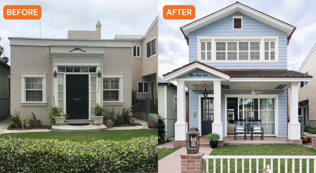
This Sears-Roebuck-era bungalow in Huntington Beach had been well-loved for over 15 years by its owners. The high-school sweetheart owners had frequented the beach for many years, even calling it “their place.” And after earning success later in life, they achieved their dream of buying a home in their special spot. Many memories were made there with family and friends over weekends and summer months.
But the little house needed an update, so with the owners’ two adult sons grown and starting families of their own, the couple decided it was time to expand and upgrade the home to fit their growing, multi-generational family.
Christopher Lee Foto
“The goal? A comfortable and beautiful second home base to spend extended periods of time as they looked ahead at the next 20 years of their lives,” explains Christine Zippert of CC Zippert.
Christopher Lee Foto
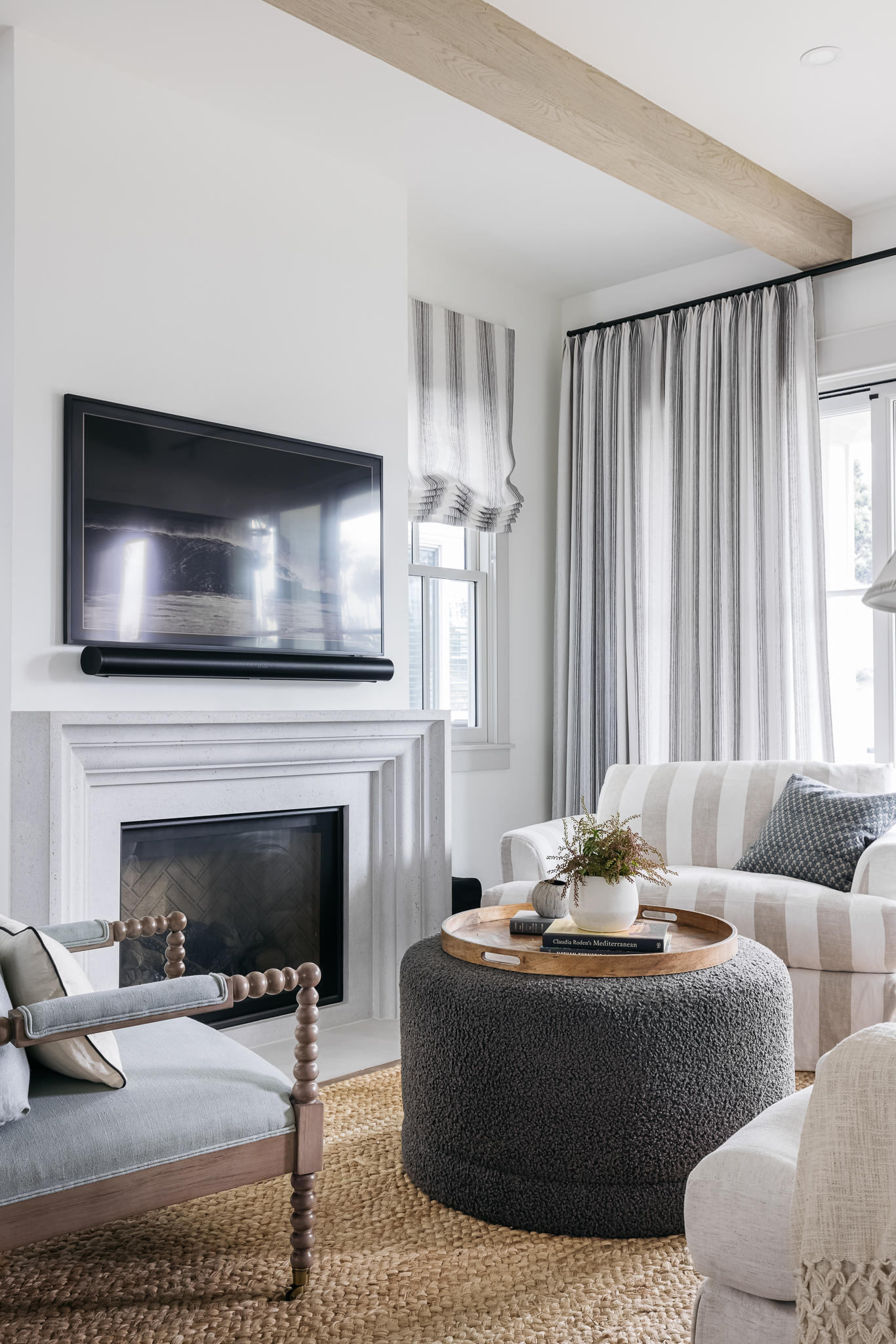
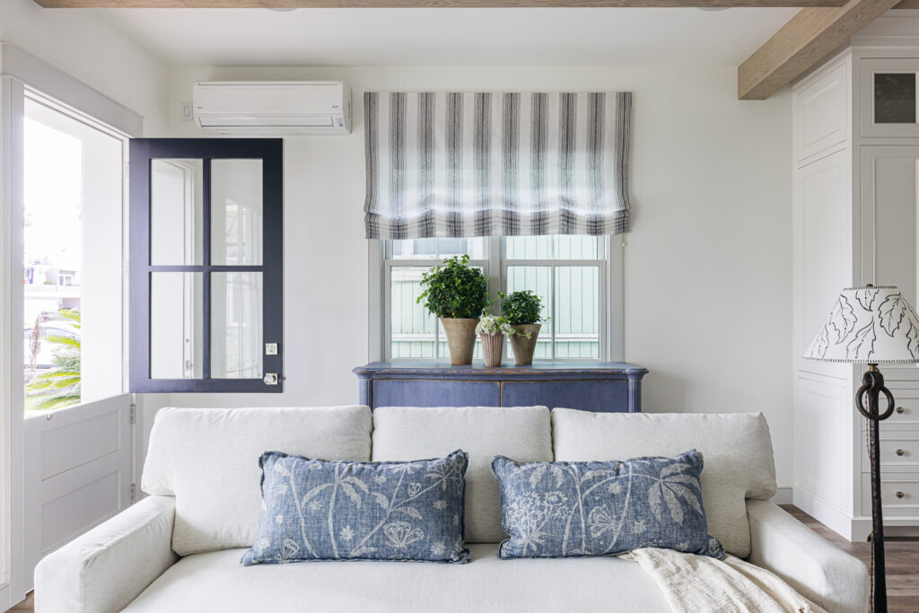
While the owners loved that the home was salt-worn, sandy, and cozy, they knew they needed to make it more comfortable to house their loved ones and future generations. New doors, windows, drainage, plumbing, and insulation were needed.
Christopher Lee Foto
“It was also carved into small little rooms which made it hard to fit the family’s growing boys and busy toddlers. All of those interior walls also made for a dark house,” Christine says. “There was a second floor from the original house over the garage off the back of the house, but the front of the house looked like a tiny single-story box. There was a lot of potential.”
Christopher Lee Foto
The first priority of Christine’s clients was to maintain the charm of the home. The neighborhood had transformed over the years, with neighbors knocking down bungalows to create huge properties, and they didn’t want another coastal farmhouse or Tuscan villa new-build. Their second priority was to create an efficient, well-designed floor plan that didn’t seem too oversized. They wanted the home to feel like it was appropriately sized to the property, like it was always meant to be there.
Christopher Lee Foto
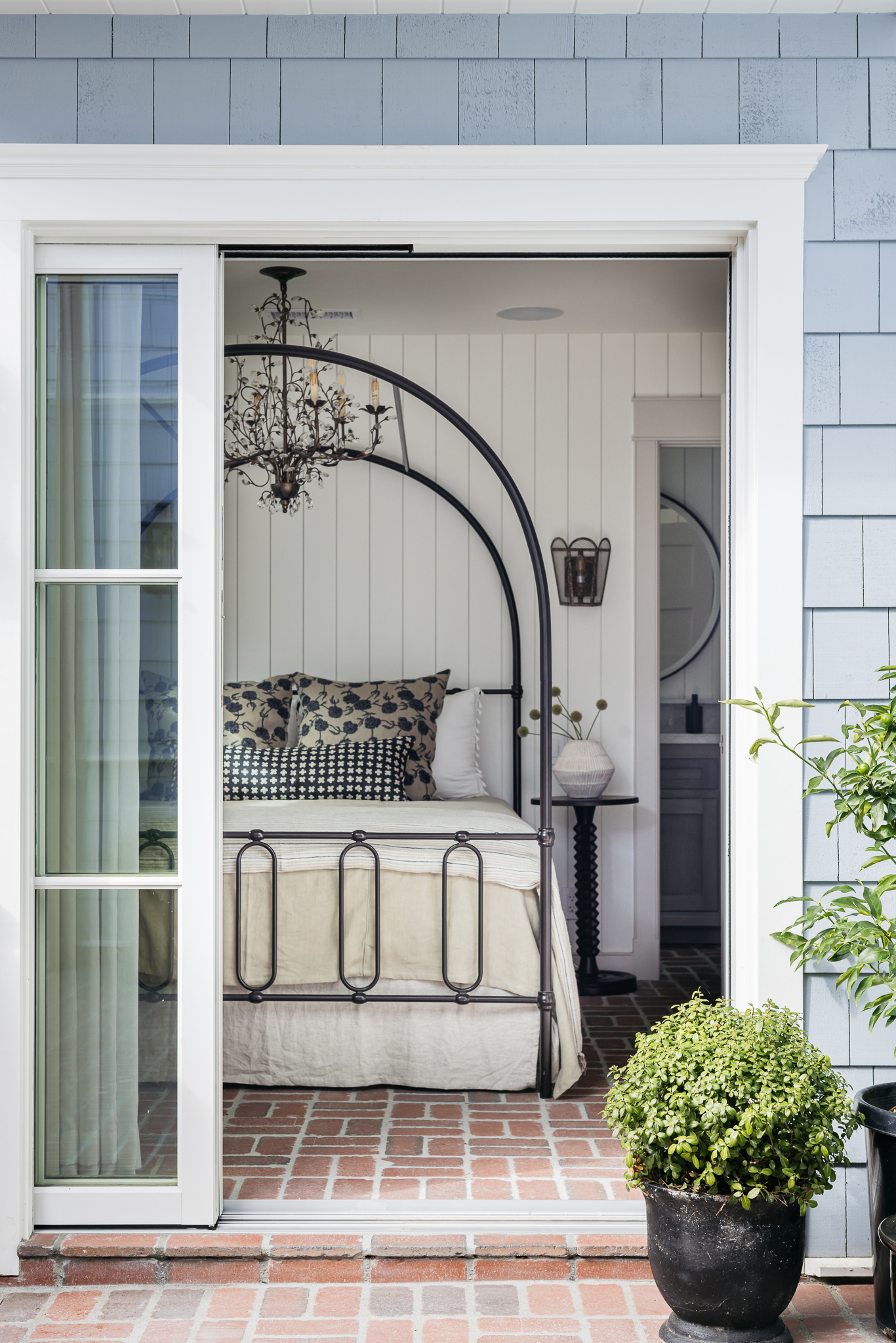
The biggest inspiration for the renovation was the home’s original courtyard. “What made the original house most charming, which you could never tell from the street view, was this little courtyard in the center of it all, with terraced balconies leading to the second floor and rooftop deck—it looked like you were in New Orleans and felt like a private oasis,” Christine says. “So, when we set out to do the renovations, we knew we wanted to preserve this courtyard, and build the rest of the renovation around it—this was really the heart of every design decision we made—how do we draw you to this heart of the house no matter what floor or room you’re in?”
Christopher Lee Foto
The couple also gravitated towards homes with clapboards and shingles, so Christine and team landed on a Nantucket-inspired home with classic Americana detailing for the style.
Christopher Lee Foto
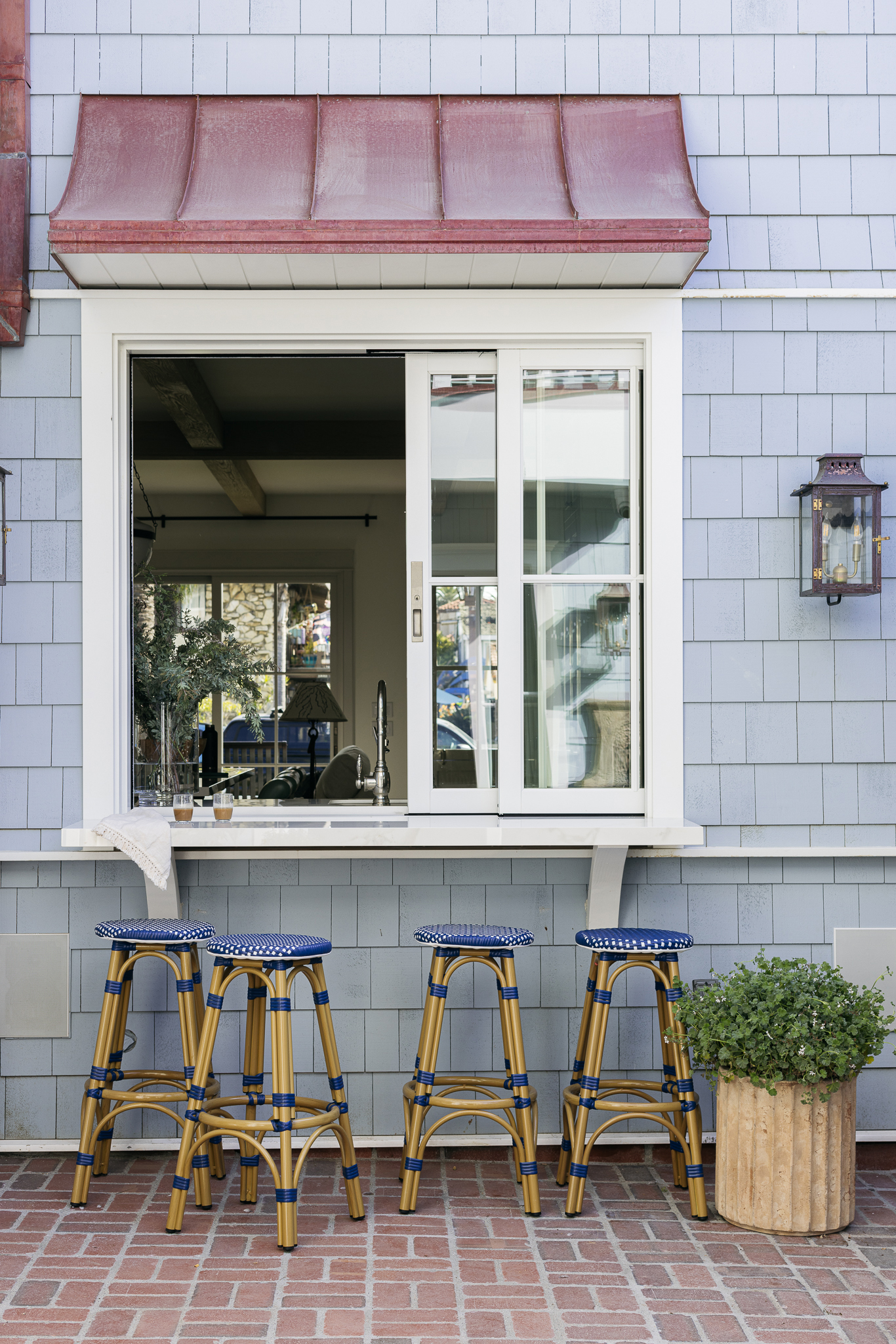
Aside from keeping a few walls from the original structure and the original stairwell, everything else was taken down to the studs. “The first thing we did was make sure we integrated the millwork design with the window and door placement,” Christine says. “It’s so essential when creating a living space that moves seamlessly from inside to outside. The countertops run seamlessly from inside to outside the kitchen, the brick in the courtyard runs seamlessly into the first-floor bedroom, the front sliding doors open up directly to a heated porch.”
Christopher Lee Foto
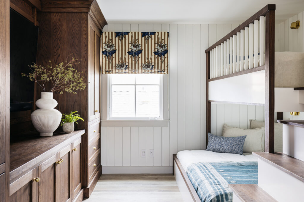
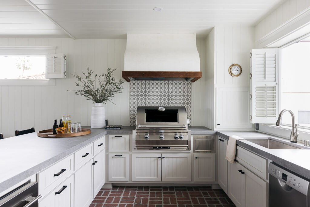
The design team added a bunk room that sleeps six, a fourth bathroom, made the existing rooms and bathrooms larger and more open, and added a 745-square-foot covered patio and another kitchen on the second floor.
Christopher Lee Foto
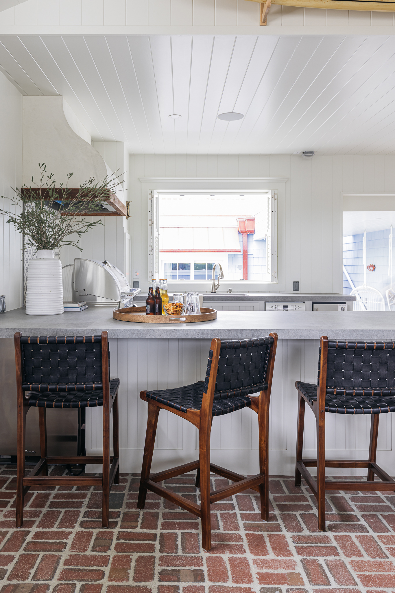
A second kitchen might be a no-brainer in a sprawling compound, but some might say it seems silly in a regular-sized beach house, but this one was added for good reason. Christine and team wanted the house to be multi-functional, for both quiet weekend escapes and big entertaining moments. The two kitchens make it possible.
Christopher Lee Foto
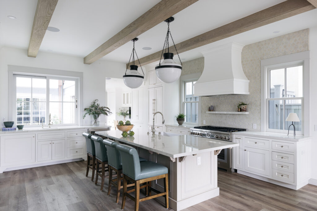
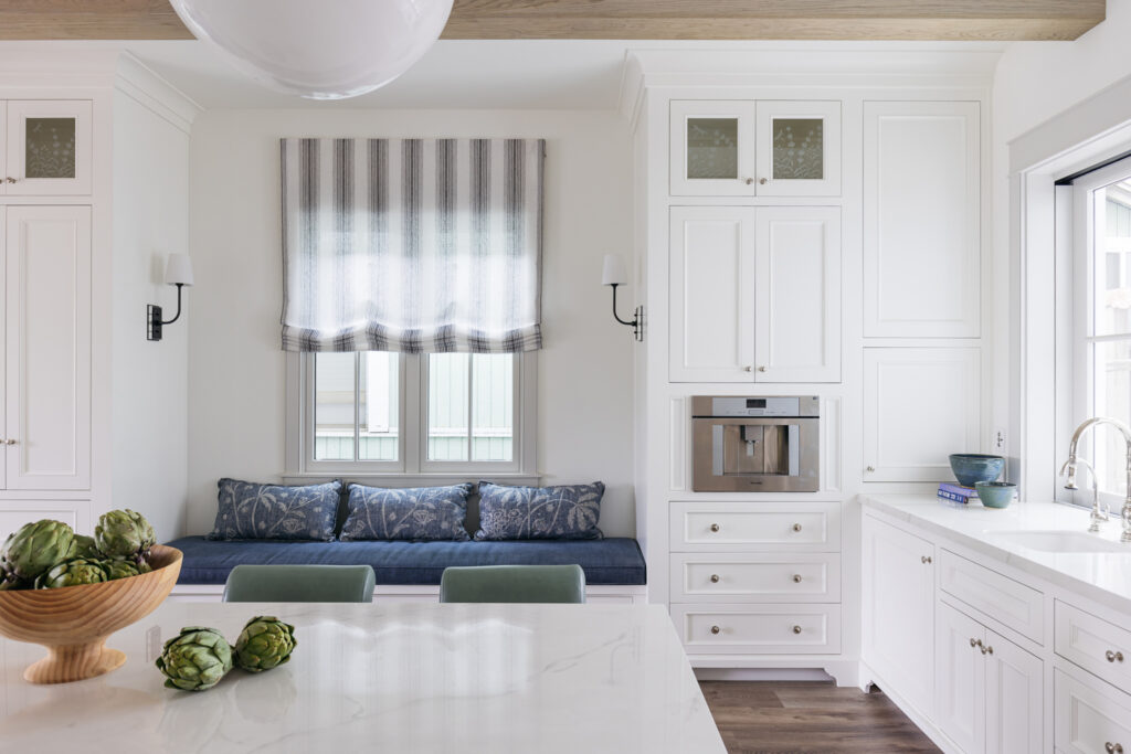
“Downstairs, we have a beautiful kitchen that is a gathering spot for the home—with plenty of island and bench seating, a coffee bar with a built-in espresso machine that services the courtyard in the mornings, and professional-grade appliances for family meals,” Christine explains. “Directly above this kitchen, we designed an indoor-outdoor kitchen that serves as an entertainment hub for game nights, post-beach hangouts, and weekend barbecues. We installed a dumbwaiter that connects the two kitchens to make moving beverages and food items quick and easy.”
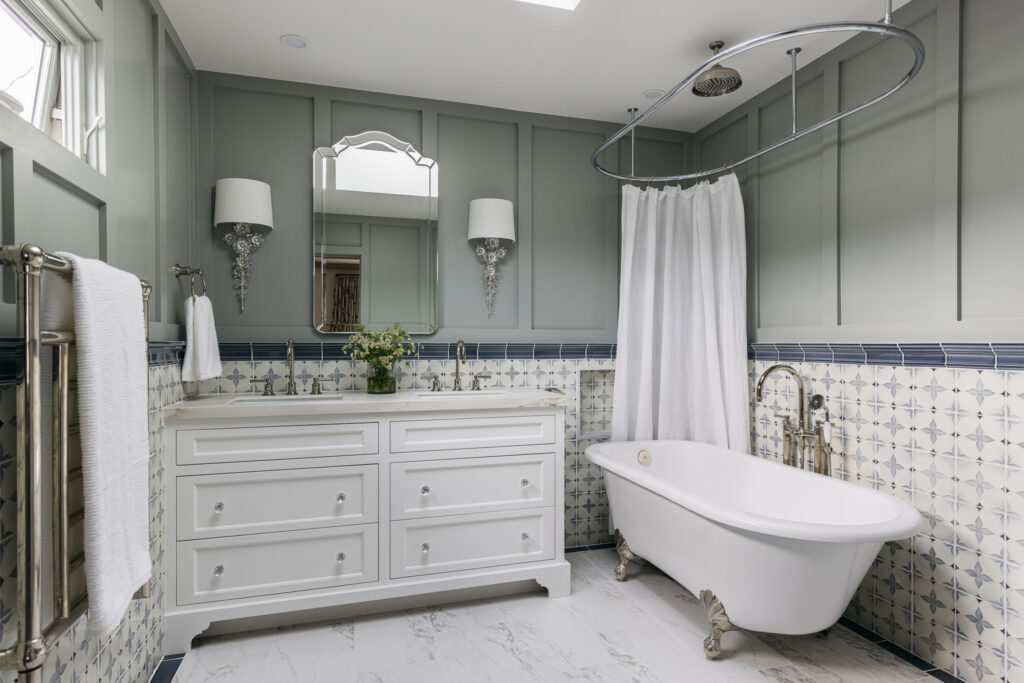
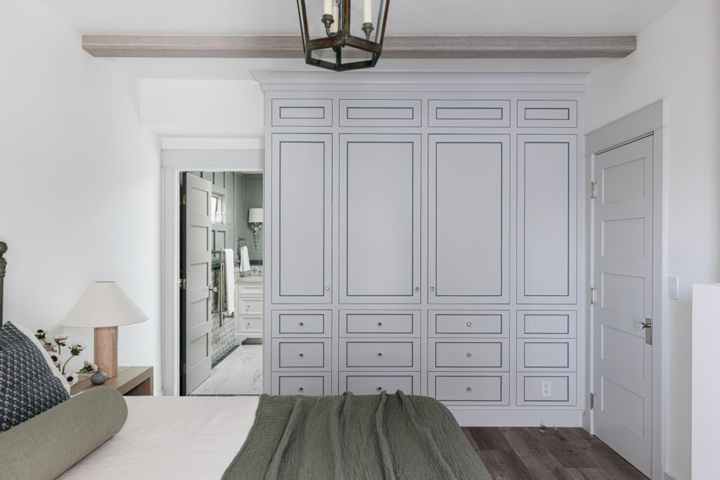
For the finishes, they went with materials that were durable and easy to maintain, since it’s a second home that gets a lot of beach traffic. DuChateau luxury vinyl floors that are impervious to water were added and marble-look porcelain from Dekton was used in the kitchen and bathrooms. Reclaimed brick was used inside and outside as well.
Christopher Lee Foto
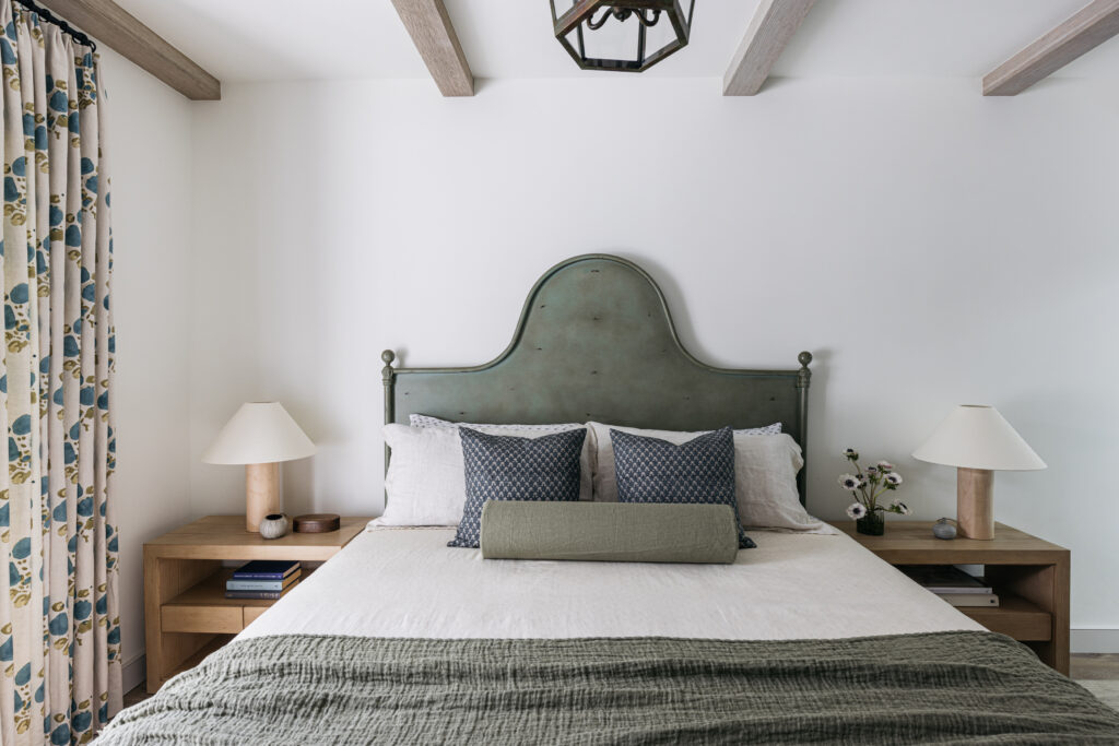
“The secret to using some of these more durable, man-made materials while making the house look classic and timeless, is making sure to strike a balance—all of our millwork is solid wood (no MDF that can disintegrate in the moisture),” says Christine. “We used exterior-sealed limewash and plasters in the rooms to create ambiance and durability, and used living finishes on many of the plumbing fixtures, where the patina would add to the charm.”
Christopher Lee Foto
Light fixtures, furniture, and window treatments add warmth and a collected feeling—like vintage and patina finishes on bedroom chandeliers and sconces, raw copper and verdigris lanterns and bulkhead lights, and collected furniture from different eras.
Christopher Lee Foto
The house is now a 2,500-square-foot three bedroom, four-bathroom home with two indoor-outdoor entertaining areas and a rooftop deck. And it’s exactly what the homeowners envisioned. “It is both charming and durable, has traditional lines but a lot of contemporary technology and materials hidden inside—from a whole-home Lutron smart system to large La Cantina sliders integrated throughout the space,” Christine adds. “We love homes where you can’t quite tell how the space came to be—it spans different periods, feels impossibly custom, and yet it’s hard to see the designer’s hand. This home does these things and I think it’s why our clients and their friends are so happy to escape there.”
