
Inside a Stunning Sea Ranch Home That Embraces Color
Whimsy and cheerful hues were blended together.

Adam Potts
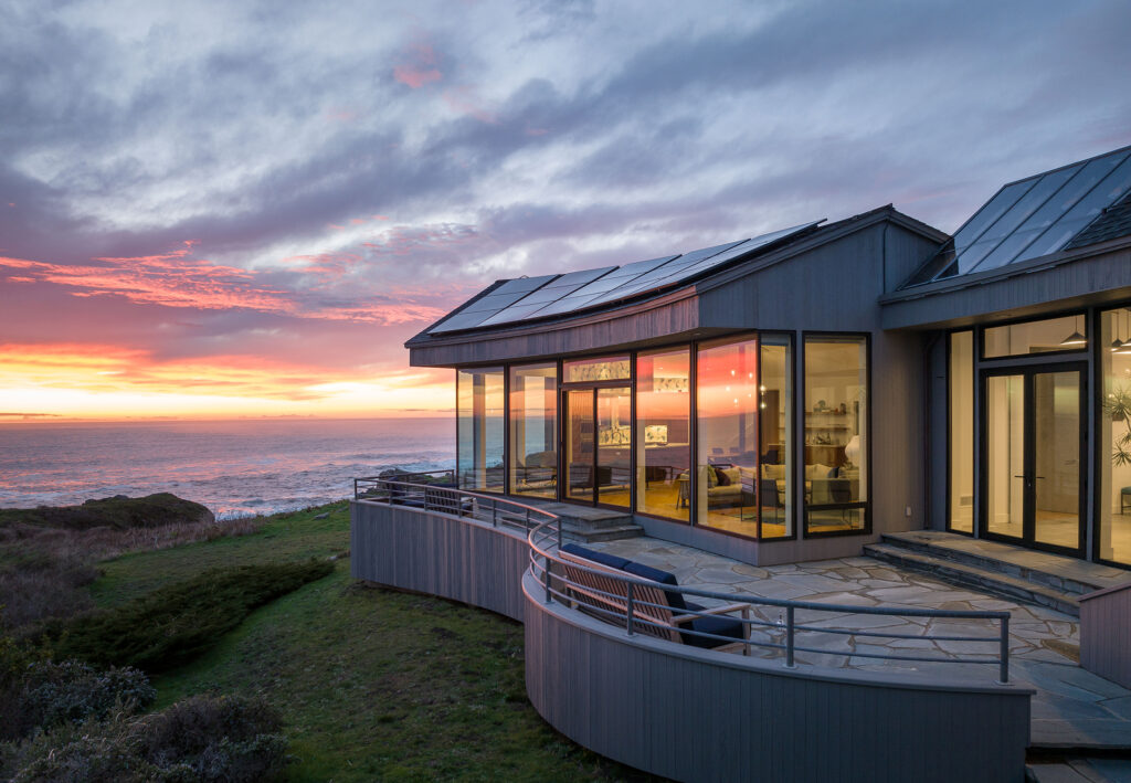
The natural surroundings and architecture of Sea Ranch are unmatched. Built in the 1960s, the residential community along the Northern California coast is a modernist utopia, with homes that are designed and built to fit in with the landscape. So working on a Sea Ranch home is a big responsibility, one that designer Rachel Chulew of DesignHaus 24 recognized for this renovation project, an oceanfront home in the community.
Adam Potts
“Working on this home, in a renowned community, with great clients is nothing less than a perfect privilege,” she explains. “This privilege is balanced with responsibility to honor what makes this community so iconic. No design decisions were taken lightly and I’m proud to become a small part of that tradition. There is a lot of renewed energy and focus around Sea Ranch right now and it’s exciting to build upon the story of Sea Ranch.”
Adam Potts
Her clients’ home is a 4,724-square-foot space over three levels with four dedicated bathrooms, three-and-a-half bathrooms, and multiple living spaces. “The clients are a young family who were staying in a nearby rental and were taken with the area’s raw landscapes,” she says. “They weren’t looking to buy, but this home caught their attention because of its incredible oceanfront location and the opportunity to breathe new life into such a unique home.”
Adam Potts
The interior finishes of the home were untouched from when it was built in 1993 and were very specific to its original owner, Rachel explains. The new owners wanted to create a space where their big circle of family and friends could gather—something that was comfortable for all ages and free of pretension. Keeping the unique Sea Ranch design elements was important, as was blending color and whimsy.
Adam Potts
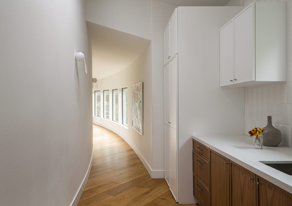
The clients weren’t attached to the home’s original style, so Rachel and team viewed it as a blank slate. But the biggest challenge of the renovation was the unique layout. “The original architect Elee Tsai titles the home, ‘Project C,’ which is fitting, as the home is made up entirely of curves,” Rachel explains. “There are essentially no straight lines or right angles. This special, singular style challenged our team (which included architect Stuart Hills of Apparatus Architecture and builder Shawn Bettega of Bettega Construction, Inc.) to create a workable, open floor plan and furniture layouts that flowed within these concentric patterns. We wanted to bring warmth and livability to the space while tempering potential dizzying patterns in staying within the circular shell.”
Adam Potts
Since the clients wanted to use the home to host a large number of guests, they requested plenty of different seating options for both living and dining, plus enough sleeping space. “We had to get creative to make enough comfortable accommodations and maintain the feeling of a cohesive home without having it feel like a boarding house,” Rachel says.
Adam Potts
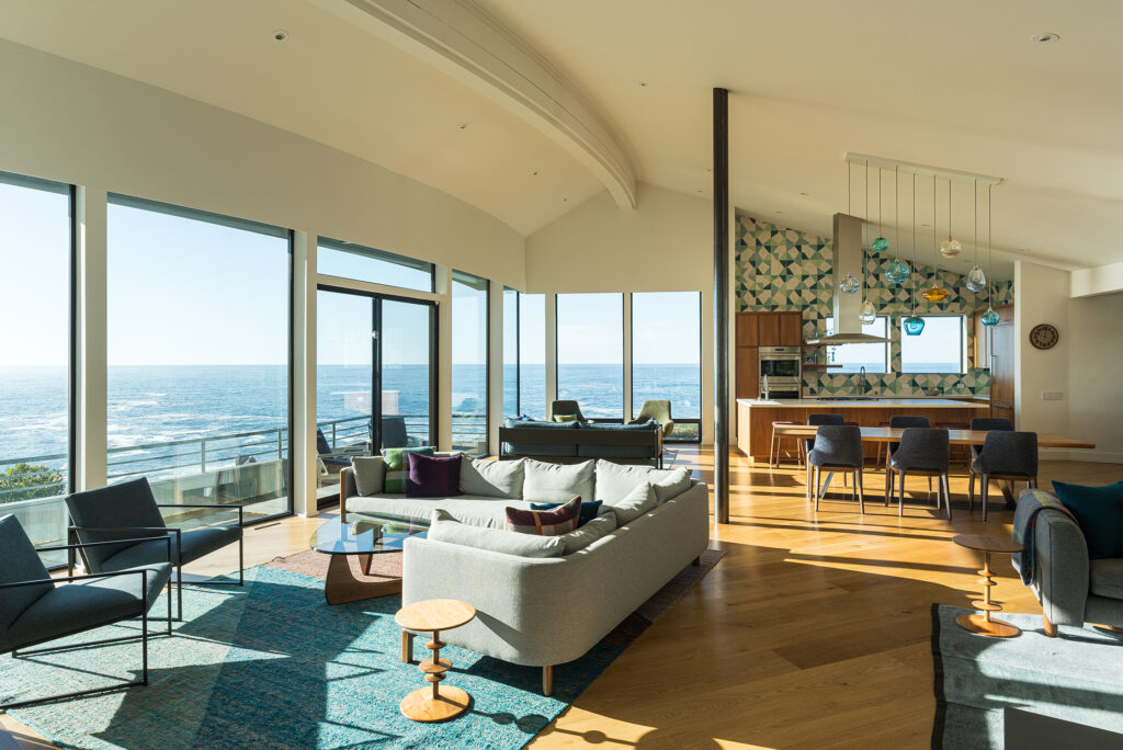
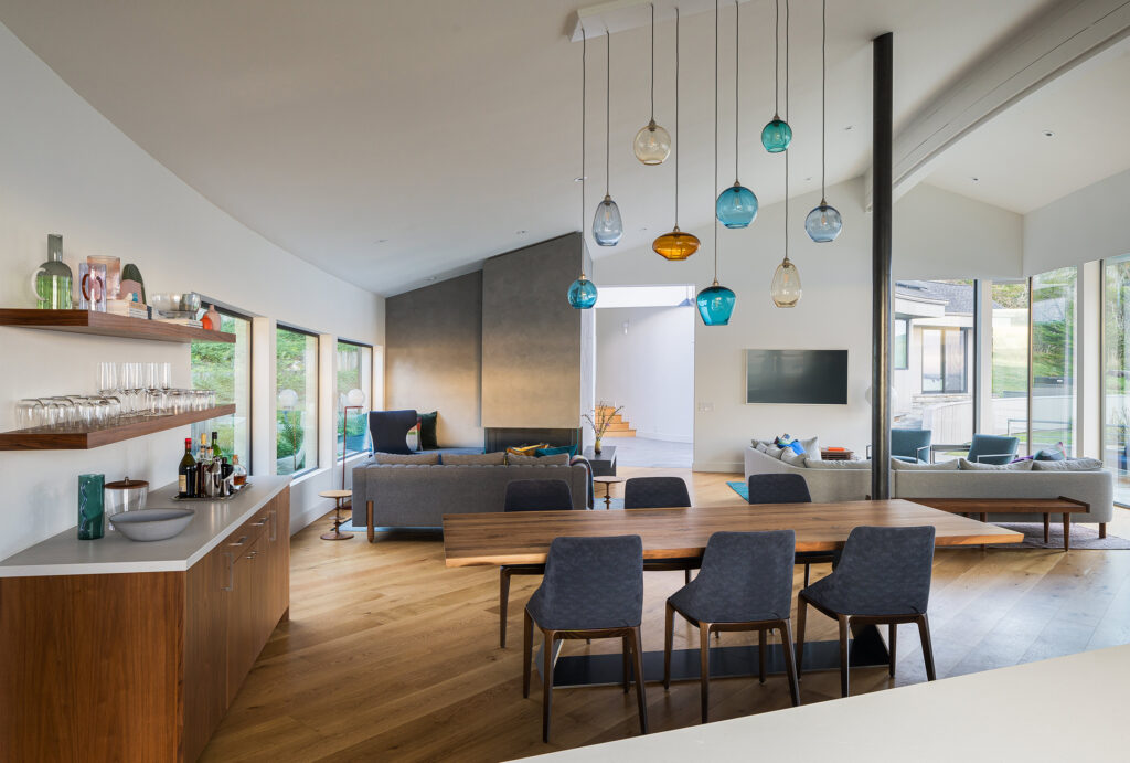
The clients worked with the architect to open up the living spaces so the views could be taken in from all area. A great room was created, which includes the kitchen, dining area, and three different seating areas. “With so much open space, each area had to flow together, and yet still have individual definition,” says Rachel. “We anchored each layout with something inviting—a fireplace, a set of Pierre Frey-wrapped swivel chairs, or an oversized Nani Marquina rug—to differentiate each of them. In the guest bedrooms, we had custom Murphy beds designed into greater built-ins to allow for flexible guest use.”
Adam Potts
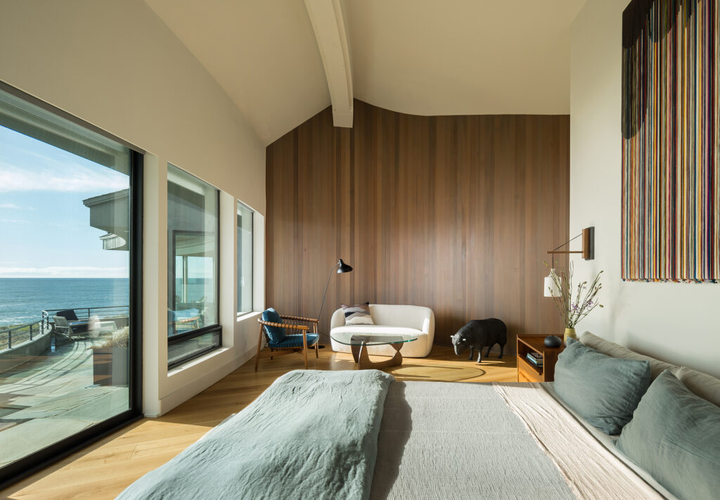
Rachel and team kept the primary suite serene and chic. They wrapped select interior walls with cedar plank siding, like the primary bedroom lounge area, a nod to that ubiquitous Sea Ranch style.
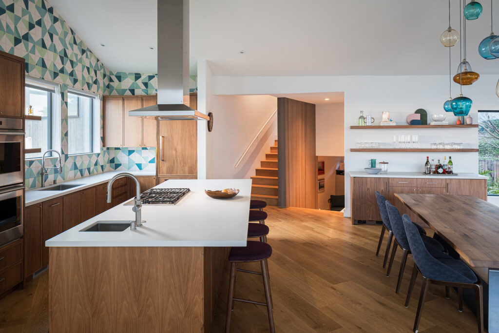
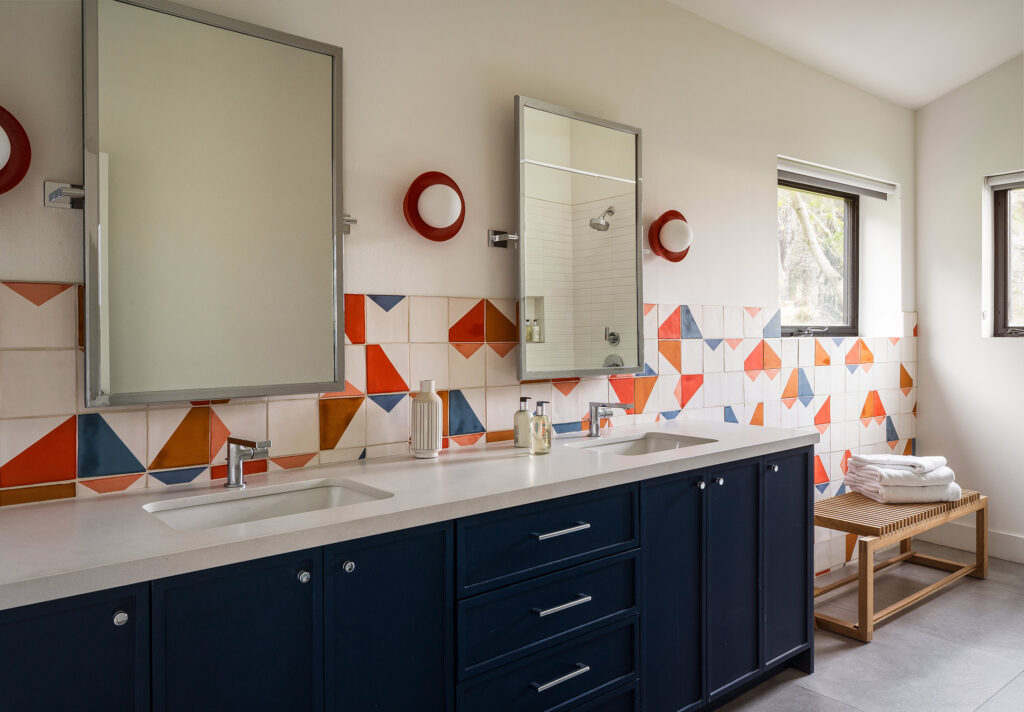
“Sea Ranch itself is the best design template you could ask for. The landscape, the distinctive architecture, the iconic Chapel and the community spaces—they all found their way into the home’s aesthetic somewhere,” Rachel explains. “Barbara Stauffacher Solomon’s art direction at the Moonraker Recreation Center really stood out to me and was integral in defining the home’s colors, shapes, and visual goals. The cabinetry and colors brought forward in the furniture and fixture choices, specifically tile selections throughout, all speak back to her bold graphic designs.”
Adam Potts
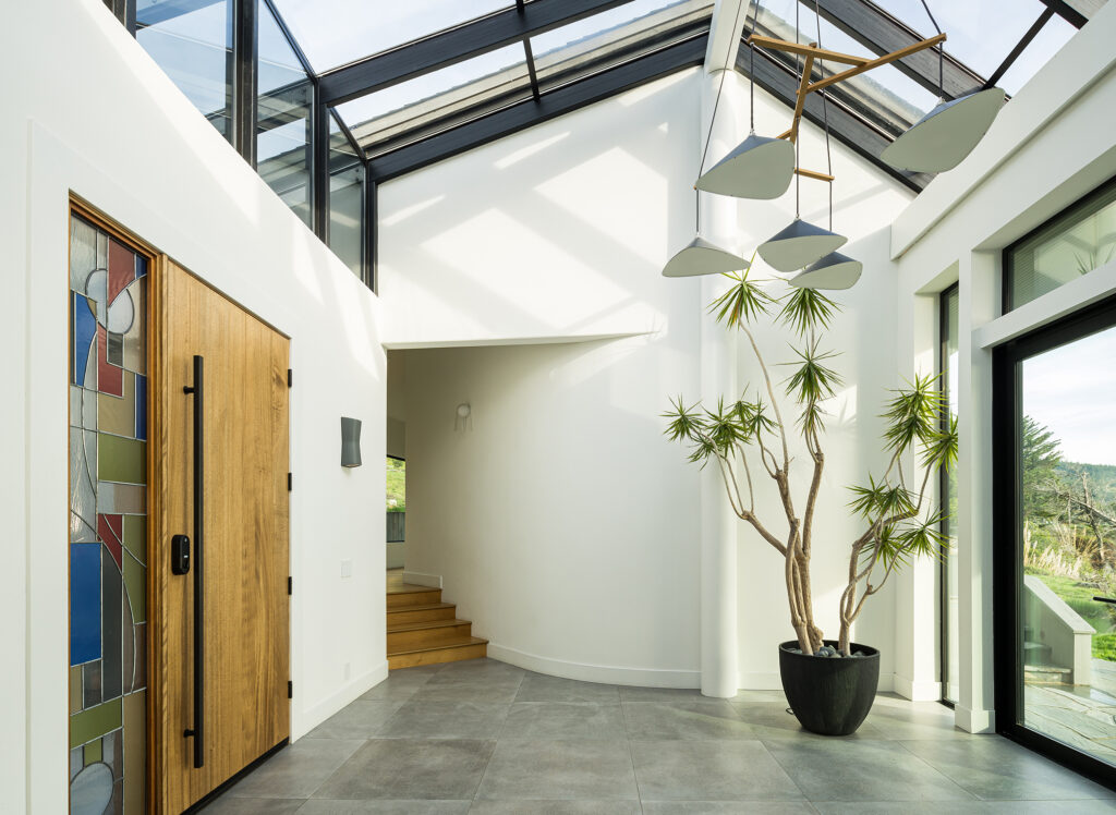
The Sea Ranch inspiration also informed artwork decisions. “We worked with artists to bring Sea Ranch-minded works into the home, looking to hit the right notes in color and composition without going overly thematic,” Rachel explains. “Some of the standouts include the custom fiber art by the superbly talented, Marco Querin, over the primary bed, and stained glass entry art by consummate artisans, Michelle and David Plachte-Zuiback. Marianne Smink of Smink Studios was another great artist who worked with us to bring tile work to new heights throughout.”
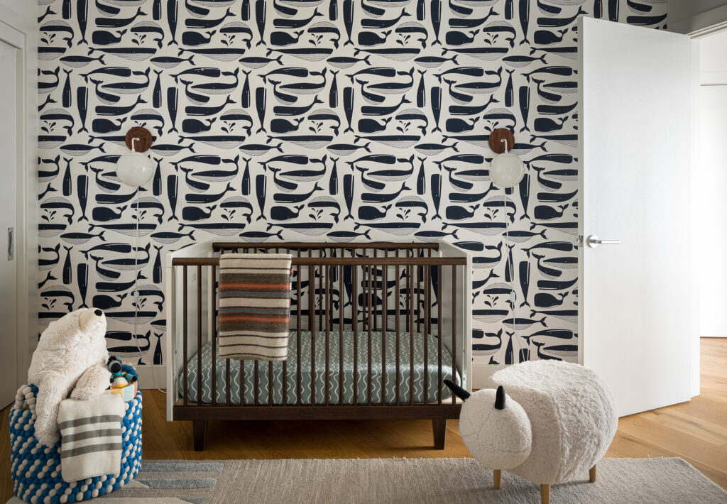
Adam Potts
Since the home is in such a historic community, there were specific guidelines for renovations, but Rachel says they were easy to embrace because she personally celebrates those same ideals. She says she was more than happy to select Dark Sky-rated light fixtures for landscaping. They also kept any exterior changes minimal.
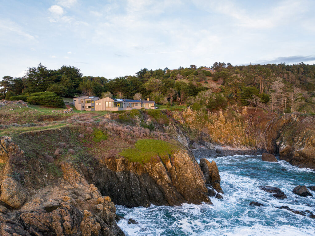
Adam Potts
“Good design easily integrates with smart guidelines,” she adds. “Most crucial to the process was having the right players involved in seeing the process through. To that end, the architect and builder are both experienced in The Sea Ranch and were able to navigate regulations seamlessly.”
