Short on Space, Long on Charm: This Laguna House Is Coastal Cottage Perfection
Swipe these great ideas from interior designer Raili Clasen, and you won’t need an ocean view to feel like every day’s a beach day.

Ryan Garvin
Most houses are either sophisticated and sleek or whimsical and colorful. In the Venn diagram of interior design philosophies, there isn’t much overlap between the two worlds. Maybe that’s what drew us to this Laguna Beach cottage designed by Raili Clasen (pronounced Reilly). It’s chic and also joyful, with bright and bold accents to liven up its streamlined layout. And it’s packed with stealable ideas that have a great SoCal spirit, while never hitting that “beachy casual” nail on the head too hard.
Clasen has spent her entire career translating surf and beach culture into great design, first at Quiksilver, and then when she shifted gears to interiors in 2016. Most famously, Clasen outfitted Kelly Slater’s surf ranch (featured here in Sunset in 2019). And she has a small side hustle designing wood-and-rope hangers for Crawford Craft, made to display a prized board.
“I started dabbling with houses in 2012, but I didn’t stick a sign in the ground as an interior designer until 2016,” she says. “My own house was on a local home tour, and from that it was featured in a couple of magazines. I started Alice Supply Company, selling cool home products like dustpans and brooms. People would see what I did with that brand and ask me about my house. So I printed up business cards and got some work.”
She started small, doing a kids’ bathroom here, a kitchen reno there. Then a little over five years ago, she dove in. While the majority of her work happens in that stretch of California between Los Angeles and San Diego, about a quarter of her jobs are in the Park City area. Her clients, like the owners of this cottage near Victoria Beach in Laguna, like her confidence with color and her modern spirit, and the fact that she doesn’t take it all too seriously (see the abandoned flipper installation in the guest bedroom). The owner, an entertainment executive, wanted a place where friends could pile in for a weekend, something fully efficient with zero fuss.

Ryan Garvin
“It’s a 1918 cottage in a really cute mini-neighborhood that hugs the cliff. It’s walking distance to a beautiful beach,” says Clasen. “It needed a ton of work, but there was no space to add on, to build up or out, with city building codes and a small lot. So we had to deal with a very small footprint. We had an 8-by-8 bedroom that she wanted to put eight beds in! That cracked me up.”
The best part: The clients gave Clasen full creative license. “She had no rules! She was like ‘Bring it on.’”
After gutting the house completely, and turning a coat closet into what Clasen calls “the world’s smallest powder room,” and another closet into a laundry area, every single inch of the house was put to use.
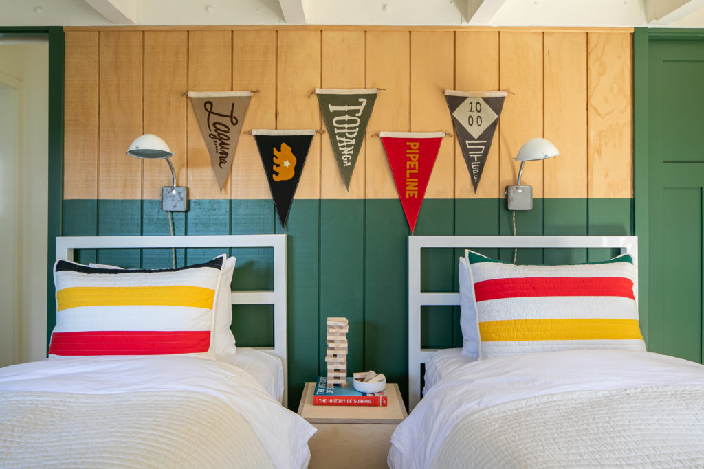
In a kids’ bedroom, two twin beds have trundles. They can squeeze four kids in there. And then there’s a guest room with a queen-sized bed.
“Not one square foot of this house can relax,” Clasen jokes. Though its design means its residents can.
A few surfy accents remind you of the sense of place. The flags hanging over the powder-coated steel twin beds are stitched with the names of famous surf beaches, made by a company called Slightly Choppy. The quilts on the beds are by Pendleton.

Ryan Garvin
And the single-fins installation in the third bedroom was a way for Clasen to have even more fun.
“That wall was empty, and I thought it was a fun place to put a little installation in there. I was at a local thrift shop and they sell one-off [swim] fins, which are not very useful,” she says. “I guess people lose one of their fins and they’ll donate the other one. It made me laugh.”
Starting with a canvas or pure white walls (Benjamin Moore Chantilly Lace), Clasen added strokes of vivid color, like Sherwin Williams Bright Olive paint and Portola Paint terracotta wash. Clasen used her expert eye for color with tile, too, creating a half wall in the bathroom with two shades of Zellige tile by Clé.

Ryan Garvin
“I love a half-wall,” she says. “It makes a very simple statement. The dark blue tile was for the ocean, and the light blue was the sky. We added vintage ship pendant lights, too. It’s a real ode to the sea.”
The kitchen required some expert-level planning to find room for a pantry, and make sure all of the appliance doors didn’t bang into each other when they were opened.

Sunset’s Wellness Issue 2022
More from this issue:
- How Seth Rogen Turned Meditative Practices into Houseplant’s Homewares
- Booze-Free Bars and Shops Are Finally Gaining Momentum in the West
- Warmer Weather Is Around the Corner: Your February and March Garden Checklist
- These Wellness Getaways Offer Next-Level Spots to Soak
- New Nostalgia Is on the Menu at Seattle’s Hottest Filipino Restaurant
“You want to open the oven without crashing into the dishwasher, right?” she says. Using open shelves to store plates and glasses instead of upper cabinetry makes the room look bigger. “In a space that small, it’s so important.”
Because the back door of the house is also located in the kitchen, there needed to be sufficient room for sandy kids and adults to move in and out.
“You get out of the back of the house through the kitchen,” says Clasen of the spatial constraints and the tight layout. “We kept it as wide as we could so people could pass through easily.”
A built-in banquette seats a group at meal time. The bench cushions are made from performance fabric for an easy wipe down, and the Windsor-style wooden chairs are painted a mustard yellow. Two basket pendants from Pop and Scott layer in some natural materials, as Clasen mentioned before. The low-maintenance floor is 3-inch strip oak with a wax finish that takes a beating beautifully, and feels authentic to the era when the home was built and “isn’t too precious.”
In the living room, a custom sectional was designed, in durable washed linen, to fit the space exactly. A couple of accent chairs can be moved inside from the small deck when they need extra seating.
Dropping into Clasen’s world feels like an instant beach vacation. Just don’t ask the designer herself to get in the water.
“Obsessed with surf culture, but terrified of the actual ocean,” Clasen admitted in one Instagram post. If Clasen’s tongue-in-cheek design strategy doesn’t make you smile, her frank self-awareness and disposition will.
Get the Look

Ryan Garvin
The floor tile is made of hand-printed cement tiles from Morocco made by Concrete Collaborative. “We wanted to have some fun on the floor, bring in the California desert colors, to make it feel like a retreat,” she says.

Ryan Garvin
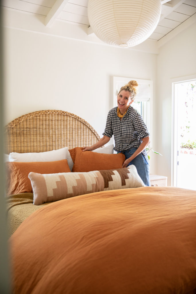
“The bed is wicker, from Kalon Studios. We wanted to keep with as many natural materials as we could. The Noguchi light over the bed is a classic,” she says. Night stands are also from Kalon. The bedding is by Cultiver, Clasen’s favorite brand for linen when she is craving color.

Ryan Garvin
Adding bedding in saturated color from Cultiver and a painted stripe on the wall to create a kind of visual headboard are two simple ways to liven up a guest bedroom. “The stripe was a last minute add-on,” says Clasen. “The room needed something extra.” The sconces are from Schoolhouse Electric. The wooden pegs for the fin installation were sourced on Etsy.

Ryan Garvin
A custom sectional sofa in Pacific blue washed linen fits the living room perfectly, and makes room for a crowd. Clasen bought an Eric Vallely photo of a diver in the ocean with his fins up, cut it in two, and turned it into a diptych to hang in the living room.

Ryan Garvin
The kitchen is too small to even qualify for the term “galley,” says Clasen. “It’s a hallway.” The light fixtures are from Schoolhouse Electric. The cabinets were painted a custom blue, and the tiles are from Clé.

Ryan Garvin
A built-in breakfast and dining nook is a space-saving option beloved by pros who know how to maximize a kitchen layout. The pendants are by Pop & Scott.

Ryan Garvin
The Lake August Matilija wallpaper is Clasen’s favorite moment in the house. The yellow Vola faucet and cast concrete sink help make a big statement in a small powder room.
“You can have a lot of fun with that tiny space,” Clasen says.
