
A Retired Couple Treated Themselves to a Bathroom Makeover—See the Luxe Transformation
With their children already grown, they decided to invest in themselves and in a primary suite renovation.

Thomas Kuoh
Sometimes you have to treat yourself and that was the case for two homeowners in San Mateo, California. “Our clients are a retired couple with two Labrador retrievers and grown adult children,” explains Melinda Mandell. “They are lovely down-to-earth people, that really show up for their family, and are excellent neighbors, watching out for others. They recently decided it was time to invest in themselves by remodeling their primary suite.”
Melinda had worked with these clients before to renovate the living, kitchen, and dining spaces in the three-bedroom, three-bathroom home, so she and her team already had a familiar rapport with them.
Thomas Kuoh
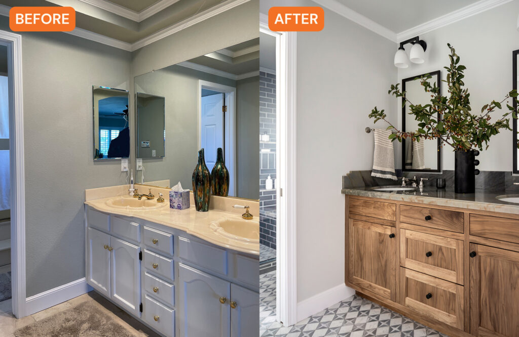
The bathroom in the primary suite was stuck in the ‘80s—think decorative stepped ceilings, oak cabinets, a bulky tub, and a frameless beveled mirror.
“There was no door between the bedroom and bathroom, only between the vanity area and shower room, which was typical for new-built homes of that era,” Melinda says. “This layout isn’t practical for the way we live these days, and it doesn’t provide the privacy and flexibility that we aim to give our clients in our floor plan layouts.”
Thomas Kuoh
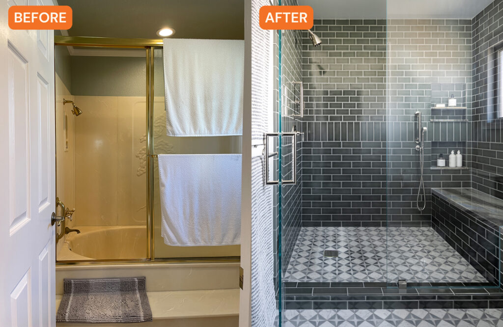
Melinda’s clients wanted a fresh and updated experience/environment in the primary suite, with the bathroom being the key to whole remodel. “Our goal was to update the space with warm and interesting finishes, and create better flow and function with the layout, and do some future-proofing,” Melinda says. “This included clear separation between the bedroom and en-suite bath, a spacious shower, and more functional storage.”
Thomas Kuoh
Melinda and team changed the bathroom entrance from an outdated arch opening to a door, which added more privacy. They got rid of the ceiling soffit, added a pocket door between the sink are and shower room, installed a pair of recessed medicine cabinets with outlets (yes, outlets for charging!), and converted the tub to a big shower.
Thomas Kuoh
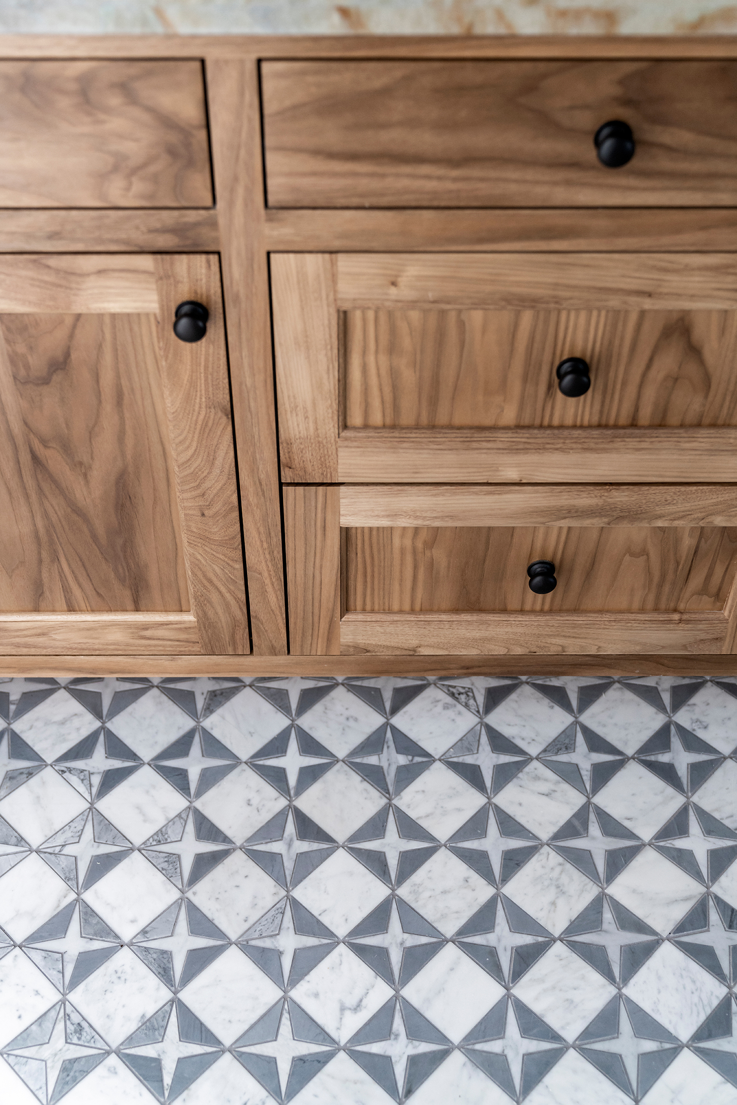
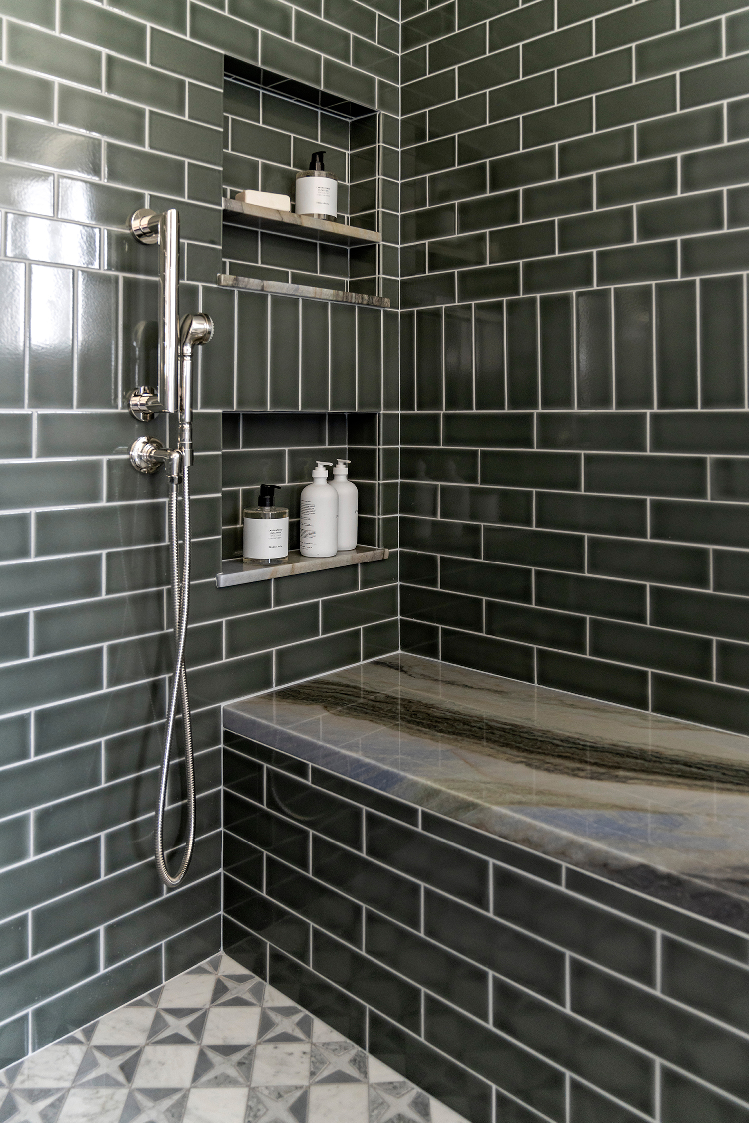
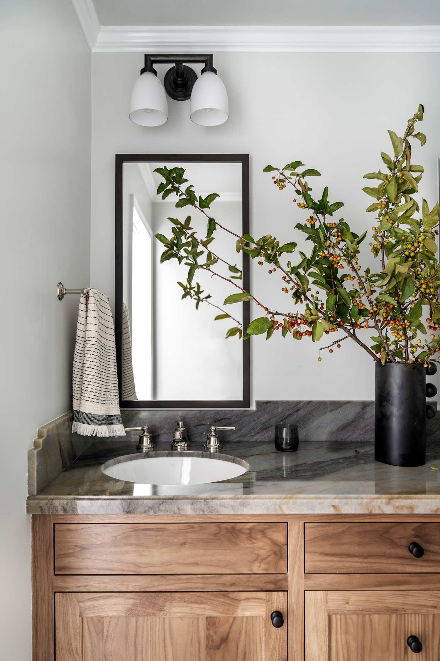
“The biggest shift though, was in the materials, where we introduced warm and balanced luxurious finishes,” she adds. “The unique quartzite slab and patterned marble mosaic floor brings interest, movement, and a hint of blue to the space. The bleached walnut vanity and bronze lighting add both warmth and contrast. The glass shower surround allows you to experience the spaciousness of the room and fully take in the beauty of the green handmade Fireclay tile and the sparkling polished nickel plumbing.”
Because her clients are getting older, Melinda added small grab bars in the shower, with the option to easily add more in the future if they need it. Bars were also installed on the wall by the toilet, as well—she says they added 3/4-inch plywood behind the drywall for that purpose.
Thomas Kuoh
The vanity lights were already owned by the clients, who had previously purchased them for another bathroom in the house but ended up not using them. “This was a situation where we could incorporate them seamlessly into the design instead of needlessly purchasing something new. They look like they were meant to be, just the way we planned it,” Melinda says.
The clients are so thrilled with their new luxe sanctuary. “They have been waiting to have their own serene and luxurious suite—and now they have it,” Melinda explains. “She feels so joyful and happy in the space, exactly the results we were aiming for!”
