8 Perfect Paint Colors That Prove the West Coast Is the Best Coast
From coastal grays to citrusy yellow, find inspiration for your next home refresh in the palette of the West.
Brzozowska/Getty
Written byChristine Lennon
March 31, 2021
Share this story
The landscapes of the Western states have always provided ample inspiration for painters and photographers who’ve tried their best to capture big skies, majestic trees, and vistas all across the region. There are plenty of resources to draw from color specialists at paint companies, too, if this year’s paint trends are any indication. Behr‘s color of the year is a dusty beige with a hint of pink called Canyon Dusk. Even Farrow & Ball, the distinctive, 75-year-old eco-friendly English paint brand, is getting in on the action with their California Collection, its first-ever designer collaboration that was created with Los Angeles interiors legend Kelly Wearstler. Here are eight of Sunset’s favorite colors—all pulled from the Western front—to pin to your mood board for your next home refresh.
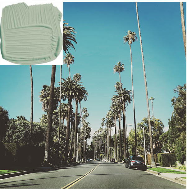
Palm by Farrow & Ball
Palm, from Farrow & Ball‘s California collection, is described as a “love letter to the iconic trees” that dot the Los Angeles skyline. It has what the brand calls a desaturated quality, meaning that it’s a green seen through bright, clear light that’s distinctive to Southern California.
Citrona by Farrow & Ball
Citrona by Farrow & Ball is a muted yellow, like the flesh of a lemon inside of its peel.
Getty, Farrow & Ball
Farrow & Ball Citrona was Inspired by lemon trees, more the soft, reflected light from the fruit trees than the bold yellow of the peel. Color consultant and interior design Teresa Grow suggests using yellow in small quantities for maximum impact, like on a front door, or for painted shutters against classic white.
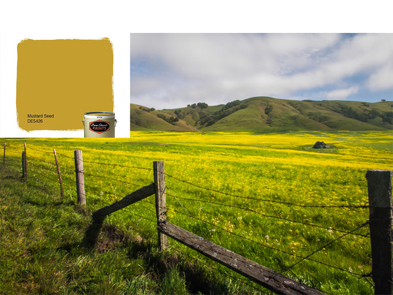
Mustard Seed by Dunn Edwards
Mustard Seed by Dunn Edwards is one of the brand’s many strong yellow paint colors. Wild mustard fields bloom in Sonoma County every spring.
Getty, Dunn Edwards
Mustard Seed by Dunn Edwards, inspired by the fields of wild mustard that grow in Sonoma County, is another one of Grow’s favorites for surprising accents in doses.
Terracotta by Farrow & Ball
Sun-faded tiles, like on these rooftops in downtown Santa Barbara, inspired Terracotta by Farrow & Ball.
Getty, Farrow & Ball
Tiles and pots baked in the sun fade to a pale coral color over time. This was Wearstler’s inspiration for Terracotta, one of 8 shades in her collection for Farrow & Ball. Grow loves using terracotta as an accent color to paint cabinets and shelving.
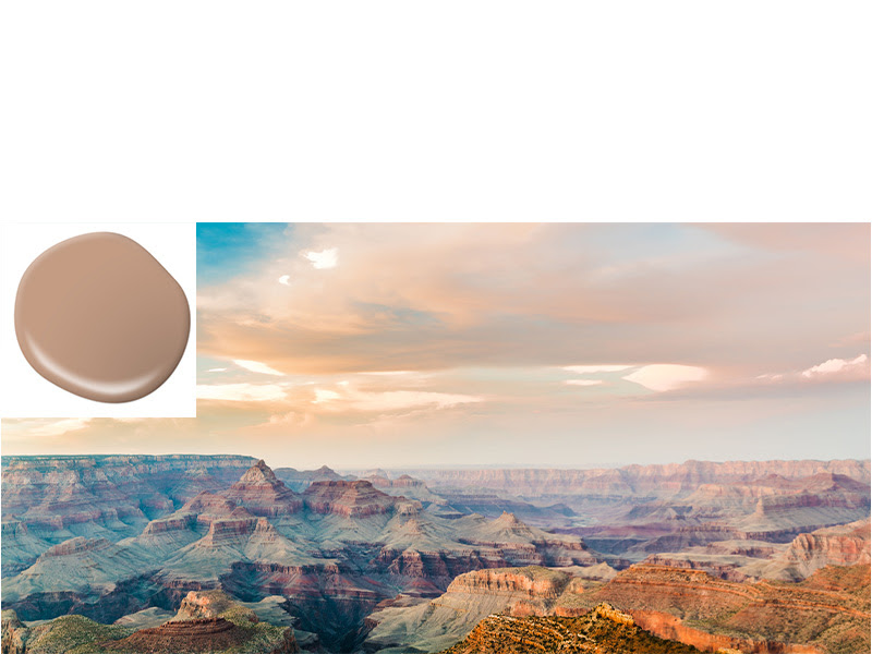
Canyon Dusk by Behr
Canyon Dusk by Behr is inspired by earth tones of the Southwest.
Getty, Behr
Described as grounding, calm, earthy, and warm, Behr’s Canyon Dusk is the chill and soothing color everyone needs in 2021. It’s pale enough for interior walls or floors, but has enough depth for furniture, cabinets, or shelving.
Ashland by Portola Paint
Portola Paints is eco-friendly and Los Angeles based, and many shades in their range—like Ashland, pictured here—are named for locations in the West.
Getty, Portola Pai
Portola Paint’s Ashland, a deep forest green inspired by old growth forests in Oregon, is a rich neutral that can keep these more ethereal pastels from floating away. Grow recommends using dark green as an exterior color, for doors, window trim, pergolas, and fences.
Seattle Gray by Benjamin Moore
A soothing, pale neutral, like Benjamin Moore Seattle Gray, is the shade of coast fog and morning light.
Getty, Benjamin Moore
Benjamin Moore’s Seattle Gray celebrates the area’s overcast, gray days. It’s a calming, neutral alternative to stark white walls, and makes a great backdrop for bold art or peaceful canvas in a room full of color and pattern.
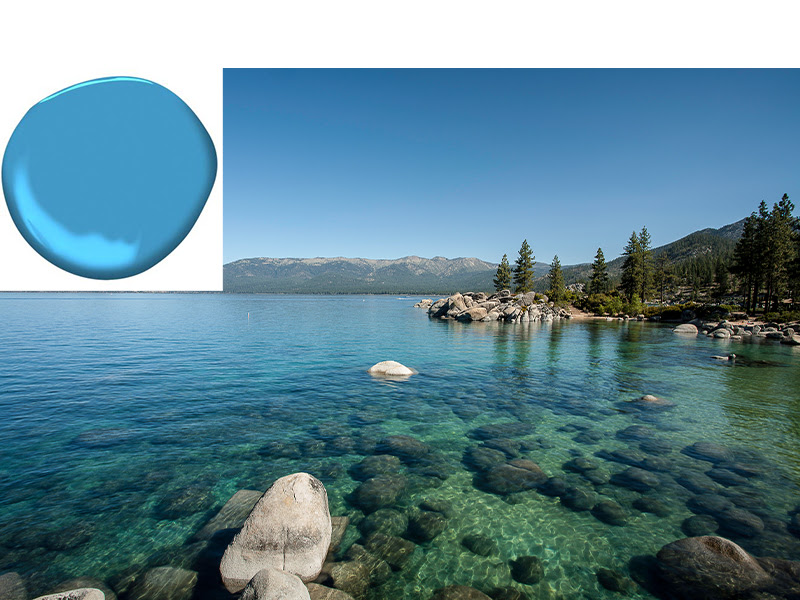
Tahoe Blue by Behr
Behr paint’s Tahoe Blue is the same, hard-to-pin-down shade of turquoise the lake is famous for.
Getty, Beh
Lake Tahoe‘s deep water is famously clear, cold, and blue. Scientists attribute this shade intensity is due to its unique concentration of algae. Used as an accent in small doses this intense blue-green looks like summer in a paint can.