How a Leaky, Dark, and Dated Bathroom Was Transformed Into a Spa-Like Space
Clever design decisions were made in the small space.

Gina Rachelle Design
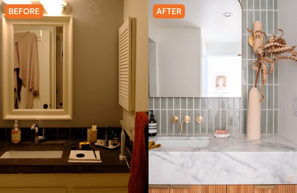
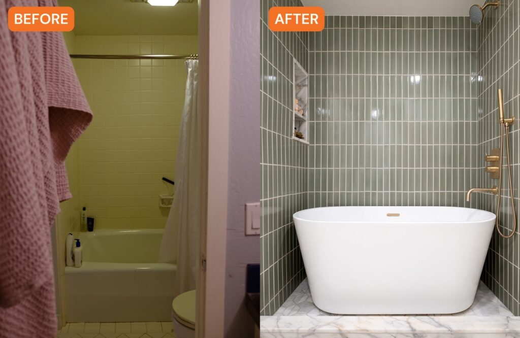
This bathroom was the only bathroom in a one-bedroom Oakland, California, condo, so it really had to be functional for the client, a first-time homebuyer. “At the start, the bathroom was very dated and the layout was choppy,” explains Gina Gutierrez of Gina Rachelle Design. “It had two entrances—one from the hallway and bedroom—so already there were too many doors to begin with. It also housed the laundry, and there were a lot of unnecessary walls. My client did not have the storage she needed; it did not have the luxury of feeling of a place of spa/relaxation; it was very dark; there were leaks in the bathroom; and things were just not functioning properly.”

Gina Rachelle Design
There was a lot to fix and they had the added challenge of working with limited space. Gina and the owner wanted to move the laundry room to another room and open up the space, but when they brought in a structural engineer, they found out they could only open up the bathroom to a certain extent. That shot down the homeowner’s dreams of creating a walk-in shower and separate soaking tub—the cost would increase significantly if they installed a new beam and moved the plumbing.

Gina Rachelle Design
“We worked with the structural engineer to understand how big we could go without tearing down walls,” Gina explains. “We also decided to keep the laundry room in the space, which made our job a little bit tricky. Her dream was to have the soaking tub, that was a non-negotiable so it became a big brainstorm to give her what she wants while keeping the laundry.”
So, Gina and team had to figure out the layout, which unsurprisingly was the biggest challenge. After going through five different possible design layouts, they ended up closing the door to the bedroom, which added another full wall in the bathroom. They kept the laundry in the same spot.

Gina Rachelle Design
Now, the focal point of the bathroom is the vanity with tile that goes floor to ceiling, which Gina says makes the small space appear larger. Marble floors were installed, plus a huge mirror that bounces off light, which adds more of it into a space that was originally dark. Around the corner is what Gina calls the “spa area.” The toilet is tucked away where the door to the bedroom used to stand.

Gina Rachelle Design
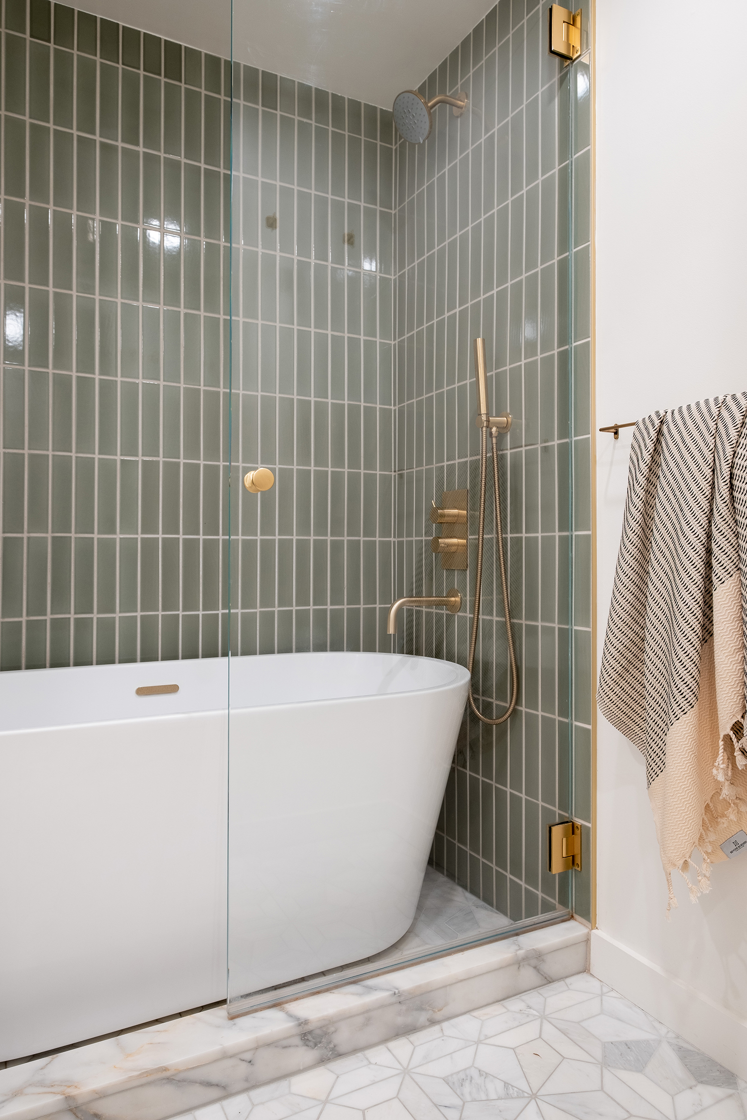
And the homeowner was able to get the soaking tub of her dreams, thanks to clever thinking by Gina and team. “We decided instead of doing a traditional shower over tub, we did a beautiful soaking tub in an alcove,” she says. “We created a beautiful shower that has marble so in case any water splashes over the tub it can land and drain properly. So the tub install was really reimagining how you would use these pieces in the bathroom and making it work for her.”

Gina Rachelle Design
The green color palette was the client’s idea. Gina had also renovated the client’s kitchen (which we covered here), but the two designs had different themes. “While the kitchen design was more Old World, this was more modern and fresh while erring on the side of classic so it would stand 10-20 years.”
The homeowner is so thrilled with the spa-like space. “She absolutely loves it. Our client was so patient during the renovations, which took place during the pandemic. We had a lot of delays but so happy she gets to enjoy it now,” Gina adds.
