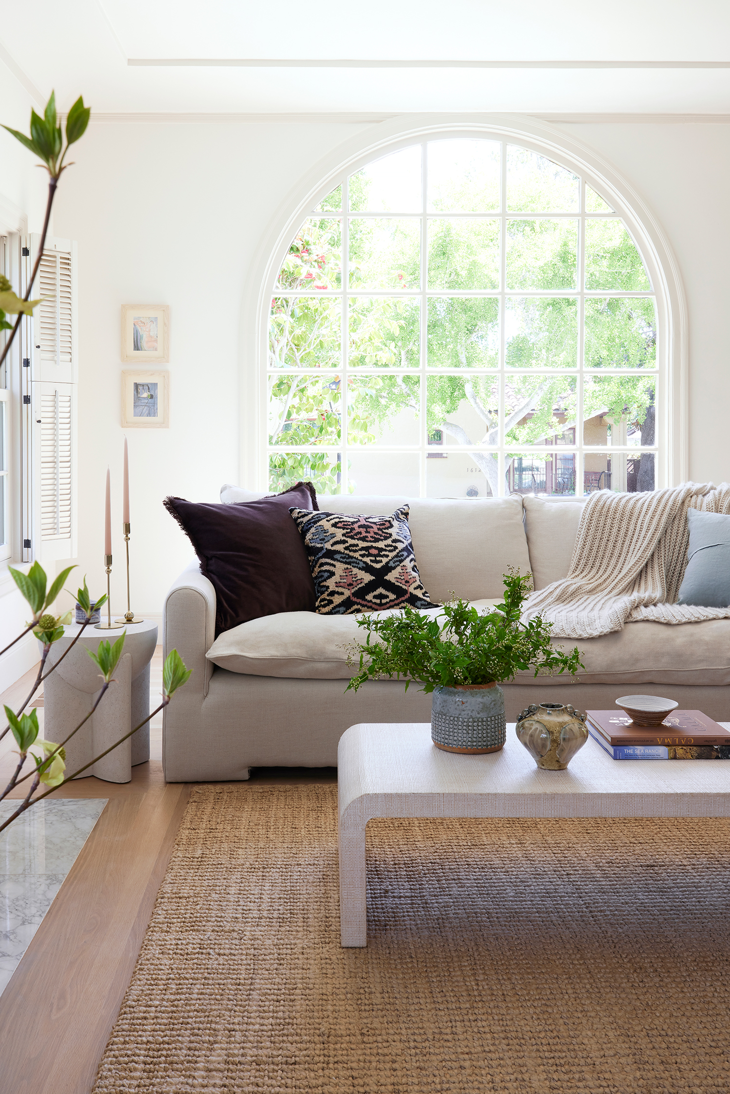
A 1920s French Normandy House with a Stuck-in-the-’80s Kitchen Gets a Major Update
It’s brought back to its full potential now.

Joy Coakley
When interior designer Jen McAnaney of Swoon Inside and her clients toured this 1929 split-level French Normandy-style house, they saw that it was neglected, but had plenty of potential. The three-bedroom, two-bathroom home, which is located in the historic Fernside neighborhood of Alameda, California, featured beautiful arched entryways and windows, tray ceilings, a plaster fireplace surround, and a special front door.

Joy Coakley
Jen’s clients ended up buying the house and wanted to turn it into “a peaceful and inspiring space to could support their girls through the important years leading up to their departure for college.” The couple also work from home and lead very busy lives, so the home really needed to be relaxing and welcoming. “‘Light and bright, with cozy moments’ became my guiding phrase for the design,” Jen says.

Joy Coakley
There was a lot to be done considering the home’s neglected state. “The kitchen hadn’t been touched since the 1980s—linoleum floors, oak cabinetry, tiled countertops, appliances that no longer worked, frilled-glass light fixtures, ruffled cafe curtains, and peeling calico stripe wallpaper,” Jen explains. “All the walls and ceilings in the home had been heavily textured at some point and the floors were stained a dark orange. The primary bathroom on the upper floor featured lovely but damaged Art Deco tile and a single pedestal sink with no storage, which we knew would be problematic given four people would be using it daily. The garden level had an uneven floor and an odd layout, rendering it somewhat useless.” Add to that, the exterior was whitewashed and devoid of personality, while the property needed fresh landscaping.

Joy Coakley
On the main floor of the home, the design team closed up two unnecessary doors—the first on the main entry wall which opened to a bedroom (for more bedroom wall space and a better-looking entryway), and the second in the kitchen (for more pantry and countertop space).

Joy Coakley
Jen and team gave the kitchen and bathrooms full remodels with improved floor plans, better plumbing placements, and fresh finishes. “The custom landscape mural in the breakfast room definitely set the tone for many of the design choices in the home,” Jen adds.

Joy Coakley
In the garden level, they leveled the concrete floors and reworked the floor plan. A seating area with a TV was added and custom arched built-in bookshelves were installed on another main wall.
And all of that weird texture on the walls and ceilings was removed. “After massaging the lighting placements throughout the home, we smoothed all of the walls and ceilings to eliminate the applied texture,” Jen explains. “This is a large and very messy task, but it was one of the most important things we did to improve the overall look of the home.”

Joy Coakley
A surprise was found when they examined the floors—and luckily, it was a good one. “We were thrilled to discover white oak floors hiding beneath the dated deep orange stain, and our wonderful refinisher installed new flooring in the kitchen to match,” Jen says. “We chose a high-quality clear matte sealant to maintain the look of the natural white oak, and replaced all of the metal floor vents with custom wood vents.”

Joy Coakley
And because her clients are also nature lovers who spend a lot of time in the Lake Tahoe area and absolutely love all shades of the color green, Jen made sure to prioritize the hue in the color palette. Warm whites were used in the rest of the home. “Throughout the main floor and connecting spaces, we chose a warm ivory wall and ceiling paint with a darker cream trim for all windows, doors, baseboards, plate rail, and shutters,” she says. “I love how the historic details of the space are subtly highlighted this way. The original fireplace had a decorative plaster surround that had already been painted, so we chose to accent the surround and the decorative niche with the darker cream trim. The hearth tile had been damaged, so we replaced it with flush large format marble tile.”
The exterior wasn’t forgotten, either. It got a new paint scheme, restored entry and carriage doors, upgraded lighting and house numbers, and new landscaping (like privacy hedges).

Joy Coakley
At the end of the project, Jen nailed her clients’ vision, something that they’re pleased with. “The owners are very happy with the outcome of our work together, and the home certainly feels peaceful and welcoming,” she says. “It’s wild to look back at the ‘before’ photos—the transformation is really dramatic! The kitchen, breakfast room, and saturated all-green movie room are standout spaces that get the most commentary from family and friends.”
